
Creating an Animated Bar Chart Component
In this article we will take a look at building a custom component with animations and custom attributes. It’s important to understand that this is not the ‘definite’ solution but simply an example. At the end of the articles you’ll find some suggestions on how this component could be improved on.
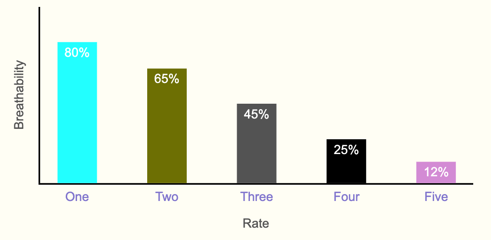
The Bar Chart
The bar chart component we’ll create will have the following features:
X and Y axises that animates to the right and up respectively
Editable X and Y labels
Bars that animate one after another, and after the axises are in place
Editable bar colors, labels and values
The component also has some limitations:
X and Y labels don’t animate
Only basic responsiveness (can’t handle too many bars on mobile)
Limited control of font colors and sizes
No way of controlling animation
We’ll discuss how to address some of these limitations at the end.
The Web Component
Below is the code for the full web component.
import { html, css } from 'lit-element';
import { FusionBase } from '../../../fusion/base';
import {
  applyMixins,
  SlideComponentBase,
} from '../../../fusion/mixins';
import {
  Container,
  Background,
  Dimensions,
  Typography,
} from '../../../fusion/mixins/props';

class AntBarChart extends applyMixins(FusionBase, [SlideComponentBase, Container, Dimensions, Background, Typography]) {
  static get properties() {
    return {
      'bar-values': {
        type: String,
        prop: true,
        fieldType: 'String',
        propertyArea: 'settings',
        value: '80% 65% 45%',
      },
      'bar-colors': {
        type: String,
        prop: true,
        fieldType: 'String',
        propertyArea: 'settings',
        value: 'aqua olive #666',
      },
      'bar-labels': {
        type: String,
        prop: true,
        fieldType: 'String',
        propertyArea: 'settings',
        value: 'One Two Three',
      },
      'y-axis-label': {
        type: String,
        prop: true,
        fieldType: 'String',
        propertyArea: 'settings',
        value: '',
      },
      'x-axis-label': {
        type: String,
        prop: true,
        fieldType: 'String',
        propertyArea: 'settings',
        value: '',
      },
      ...super.properties,
    };
  }

  static get options() {
    return {
      ...super.options,
      componentName: 'ant-bar-chart',
      componentUIName: 'Animated Bar Chart',
      componentScope: 'custom',
      componentDescription: 'Animated bar chart component',
      componentDomain: 'slide',
      nestedComponents: [],
      isTextEdit: true,
    };
  }

  connectedCallback() {
    super.connectedCallback();
  }

  createBars() {
    const values = this['bar-values'].split(' ');
    const colors = this['bar-colors'].split(' ');
    const labels = this['bar-labels'].split(' ');
    const chart = this.renderRoot.querySelector('.abc-bars');

    if (values.length) {
      values.forEach((val, index) => {
        const bar = document.createElement('div');
        bar.classList.add('abc-bar');
        bar.style.backgroundColor = colors[index];
        bar.dataset.abcValue = val;
        chart.append(bar);
        setTimeout(() => {
          bar.style.height = val;
          bar.dataset.abcLabel = labels[index];
        }, (1000 * index + 1000));
      });
    }
  }

  updated(changedProperties) {
    const chart = this.renderRoot.querySelector('.abc-bars');
    if (changedProperties.has('bar-values') ||
        changedProperties.has('bar-colors') ||
        changedProperties.has('bar-labels')) {
      chart.innerHTML = '';
      this.createBars();
    }
  }

  static get styles() {
    return [
      super.styles,
      css`
        @keyframes grow-y-axis {
          from {
            height: 0;
          }
          to {
            height: 100%;
          }
        }

        @keyframes grow-x-axis {
          from {
            width: 0;
          }
          to {
            width: 100%;
          }
        }
        :host {
          position: relative;
          width: var(--width);
          min-width: 300px;
          height: var(--height);
          min-height: 300px;
          background-color: var(--background-color);
          font-family: var(--font-family);
          display: grid;
          grid-template-columns: 50px 2px 1fr;
          grid-template-rows: 1fr 2px 25px 50px;
          grid-template-areas:
            "yLabel yAxis chart"
            "origon xAxis xAxis"
            "origon barLabels barLabels"
            "origin xLabel xLabel";
        }
        :host .abc-y-label {
          grid-area: yLabel;
          display: flex;
          align-items: center;
          justify-content: center;
          color: #666;
        }
        :host .abc-y-label p {
          rotate: -90deg;
        }
        :host .abc-y-axis {
          grid-area: yAxis;
          width: 2px;
          background-color: black;
          transition: height 1s;
          animation-duration: 1s;
          animation-name: grow-y-axis;
          position: absolute;
          bottom: 0;
          height: 100%;
        }
        :host .abc-x-axis {
          grid-area: xAxis;
          height: 2px;
          background-color: black;
          animation-duration: 1s;
          animation-name: grow-x-axis;
        }
        :host .abc-x-label {
          grid-area: xLabel;
          display: flex;
          justify-content: center;
          color: #666;
        }

        :host .abc-bars {
          grid-area: chart;
          height: 100%;
          list-style: none;
          display: flex;
          justify-content: space-around;
          align-items: flex-end;
          gap: 20px;
        }

        :host .abc-bar {
          position: relative;
          display: flex;
          flex-wrap: wrap;
          place-content: flex-end center;
          align-items: stretch;
          height: 0;
          transition: height 1s;
          background-color: black;
          width: 50px;
        }
        [data-abc-value]::after {
          content: attr(data-abc-value);
          position: absolute;
          margin-top: 5px;
          color: white;
          place-self: flex-start;
        }
        :host [data-abc-label]::before {
          content: attr(data-abc-label);
          position: absolute;
          bottom: -25px;
          color: var(--color);
        }
      `,
    ];
  }

  render() {
    super.render();
    return html`
      <style>
        ${this.dynamicStyles}
      </style>
      <div class="abc-y-label">
        <p>${this['y-axis-label']}</p>
      </div>
      <div class="abc-y-axis"></div>
      <div class="abc-bars"></div>
      <div class="abc-x-axis"></div>
      <div class="abc-x-label">
        <p>${this['x-axis-label']}</p>
      </div>
      ${this.constructor.systemSlotTemplate}
    `;
  }
}

export { AntBarChart };
Let’s have a look at what the code does.
Creating a Component
This is the code involved in creating the component itself:
import { html, css } from 'lit-element';
import { FusionBase } from '../../../fusion/base';
import {
  applyMixins,
  SlideComponentBase,
} from '../../../fusion/mixins';
import {
  Container,
  Background,
  Dimensions,
  Typography,
} from '../../../fusion/mixins/props';

class AntBarChart extends applyMixins(FusionBase, [SlideComponentBase, Container, Dimensions, Background, Typography]) {
...
}

export { AntBarChart };
Here we import the necessary libraries and mixins. It’s possible to simply add props mixins in order to allow control of some other properties, e.g. borders.
Then we define the class ‘AntBarChart’ applying the mixins we have imported.
And finally we export the class.
Defining Properties
Next we define the custom properties this component should expose in the UI:
static get properties() {
    return {
      'bar-values': {
        type: String,
        prop: true,
        fieldType: 'String',
        propertyArea: 'settings',
        value: '80% 65% 45%',
      },
      'bar-colors': {
        type: String,
        prop: true,
        fieldType: 'String',
        propertyArea: 'settings',
        value: 'aqua olive #666',
      },
      'bar-labels': {
        type: String,
        prop: true,
        fieldType: 'String',
        propertyArea: 'settings',
        value: 'One Two Three',
      },
      'y-axis-label': {
        type: String,
        prop: true,
        fieldType: 'String',
        propertyArea: 'settings',
        value: '',
      },
      'x-axis-label': {
        type: String,
        prop: true,
        fieldType: 'String',
        propertyArea: 'settings',
        value: '',
      },
      ...super.properties,
    };
  }
The ‘prop’, ‘fieldType’ and ‘propertyArea’ are important in order to make sure the fields are available in the ‘Settings’ tab in Activator. It’s possible to leave out the ‘propertyArea’ key and then the fields will instead be available in the ‘Styles’ tab.
Configuring the Options
static get options() {
    return {
      ...super.options,
      componentName: 'ant-bar-chart',
      componentUIName: 'Animated Bar Chart',
      componentScope: 'custom',
      componentDescription: 'Animated bar chart component',
      componentDomain: 'slide',
      nestedComponents: [],
      isTextEdit: true,
    };
  }
This defines the options that specify how Activator should handle it. The ‘componentName’ should be same as the tag name, in this case <ant-bar-chart>.
The ‘componentScope’ defines in which section the component will be available in the UI.
‘nestedComponents’: [] specify that no other components can be used inside this component.
The Code
The rest of the code defines the actual functionality, i.e. HTML, CSS and JavaScript. It was first created as a CodePen and then added to this component wrapper. You can see the original code here:
https://codepen.io/jofan/pen/OJajbar
In the component we’re making use of the lifecycle method built into Lit: ‘updated’:
updated(changedProperties) {
  const chart = this.renderRoot.querySelector('.abc-bars');
  if (changedProperties.has('bar-values') ||
      changedProperties.has('bar-colors') ||
      changedProperties.has('bar-labels')) {
    chart.innerHTML = '';
    this.createBars();
  }
}
We’re checking if any properties that affects the building on the chart has changed, and if so we remove what’s already there and create the chart again.
The ‘createBars’ method simply add the bars into a <div> based on the bar properties registered on the component.
createBars() {
    const values = this['bar-values'].split(' ');
    const colors = this['bar-colors'].split(' ');
    const labels = this['bar-labels'].split(' ');
    const chart = this.renderRoot.querySelector('.abc-bars');

    if (values.length) {
      values.forEach((val, index) => {
        const bar = document.createElement('div');
        bar.classList.add('abc-bar');
        bar.style.backgroundColor = colors[index];
        bar.dataset.abcValue = val;
        chart.append(bar);
        setTimeout(() => {
          bar.style.height = val;
          bar.dataset.abcLabel = labels[index];
        }, (1000 * index + 1000));
      });
    }
  }
The rest of the code is basic CSS and HTML. The only thing special is that the bar labels and values are taken from the data attribute on each bar:
:host .abc-bar {
          position: relative;
          display: flex;
          flex-wrap: wrap;
          place-content: flex-end center;
          align-items: stretch;
          height: 0;
          transition: height 1s;
          background-color: black;
          width: 50px;
        }
        [data-abc-value]::after {
          content: attr(data-abc-value);
          position: absolute;
          margin-top: 5px;
          color: white;
          place-self: flex-start;
        }
        :host [data-abc-label]::before {
          content: attr(data-abc-label);
          position: absolute;
          bottom: -25px;
          color: var(--color);
        }
Improvements or Alternatives
As mentioned in the beginning, there are some limitations that we can solve by adding some more functionality. The way it’s built above should be fine for a component specific for a brand where styling is mostly set in the component itself, and not expected to be updated in Activator UI.
Here are some improvements or alternative solutions that can be considered.
Nested Bar Component
Currently the bars are created from text fields on the component (values, colors and labels). This is a bit error prone as it requires the user to input the values with spaces (add a comma and it will not work).
Instead a more powerful option would be to create a bar component that is nested inside the chart component. There are many example of similar solution is the standard components, e.g. tab group and list components.
There are several advantages with this:
Less error prone
Much easier to control properties of each bar (color, value, fonts, width etc)
Allows for arguably better user experience adding data to the chart
The downside would be that it’s a little bit more complex, especially to ensure the animations are running at the correct time.
Stateful Component
With the above solution it’s not possible to control when the animation runs (it runs as soon as it is loaded). By making the component stateful, using the stateful mixin, it would be possible allow control of this by running it when state becomes active.
Animated X and Y Labels
Currently the labels on the axis are displayed when loaded, but it would be possible to also animate those. It can be added to the above solution, or it’s also possible to make the labels as nested components.