CSS Variables
This documentation is valid for Activator version 2.7.2 and above.
Starting from version 2.7.2, Activator introduces support for CSS variables, allowing users to configure and apply custom styles efficiently. This feature simplifies content reskinning by centralizing styling properties in a new configurable file: variables.json.
Where to Find CSS Variables
CSS variables can be accessed in the Fusion Library within the variables.json file. Additionally, color-related variables are automatically mapped from a separate configuration file. The configured variables are available for use in the right panel of the Designer page.
How to Configure CSS Variables
The variables.json file is structured as an object containing a styles key. Each variable is defined within this key and follows web standards. A typical configuration looks like this:
{
  "styles": {
    "--box-padding-left": {
      "value": "10px",
      "type": "Number",
      "propertyGroup": ["padding"]
    },
    "--primary-text-color": {
      "value": "#333333",
      "type": "ColorPicker",
      "propertyGroup": ["background"]
    }
  }
}
Applying CSS Variables to Components
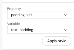
To use a CSS variable in a component, reference it using the var(--variable-name) syntax. For example:
<fusion-text padding-left="var(--box-padding-left)"></fusion-text>The platform automatically determines whether a variable can be applied based on the type and propertyGroup fields.
Color Variables
Color variables are managed in a separate file and automatically merged with variables.json.
These variables are categorized into specific property groups, including:
activeStateaudiobackgroundbordercontenterrorhandleinfotablinelinkseparatorscrollshapeslideshowIndicatorssortableListtabstabGrouptext
Since these are treated as ColorPicker types, they can be selected in the Designer interface but not modified visually.
For further assistance, refer to the Designer panel where these variables can be applied: