Responsive Web Development
Introduction
Here you’ll find documentation on how to develop responsive web content with Activator. Note that this documentation covers slides and briefs. Emails are built using the MJML framework which is always responsive.
Configuration
Responsive flag
In order to develop responsive content, the ‘responsive’ flag should be set to true in the shared resource config.json. This is the default value since 2.0.0.
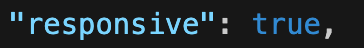
A shared resource should be setup for either responsive OR absolutely positioned content, and not used for both.
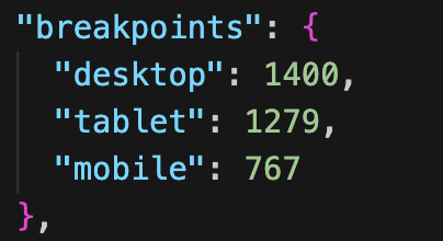
Breakpoints
The breakpoints configuration is used by the components defining responsive grids. Activator standard components use two breakpoints as defined here:
tablet: 1279px
mobile: 767px
(A third, unused breakpoint, might be seen in the config: desktop).
These breakpoints are what determines how the columns behave when setting up a responsive grid. With the default setup it means that anything 1280px and above is considered desktop, 768 to 1279px tablet and anything below 768px mobile. Change the values in config.json in order to have the grid use different breakpoints.
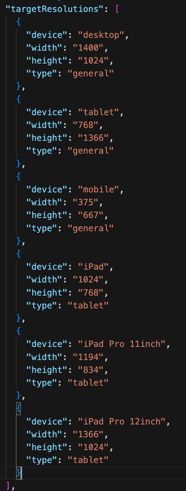
Targeted Resolutions
In Activator UI it’s possible to preview responsive documents at different resolutions. These resolutions are setup in config.js. Currently only the width and height values of the existing items in the list should be updated if necessary. In a future release it will be possible to add custom resolutions as well.
Responsive Structure
Let’s look at how we can use Activator web components to build a responsive slide or brief. We are going to work with the following components:
Row (fusion-section)
Grid (fusion-grid)
Column (fusion-column)
Full Width Content in all Resolutions
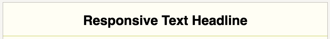
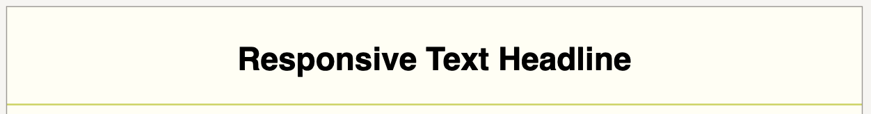
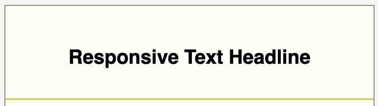
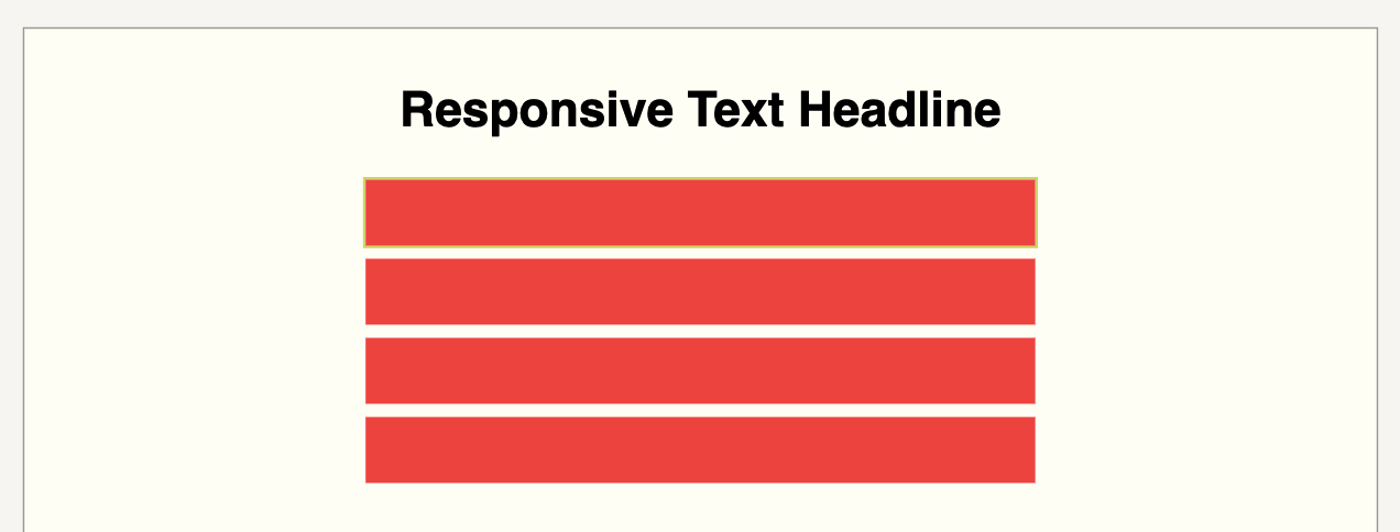
Let’s first cover the simple case of a row that should always display the full width of the device, e.g. a headline at the top of the document.
The components will be structured like this:
Row > Column
Here is an example of a headline having been setup:
Desktop:
Tablet:
Mobile:
Responsive Grid
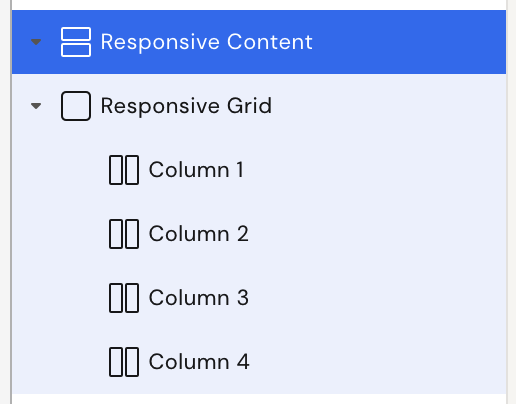
Now we’ll look at setting up a grid where we can configure how the columns will behave at different breakpoints.
The components will be structured like this:
Row > Grid > Column
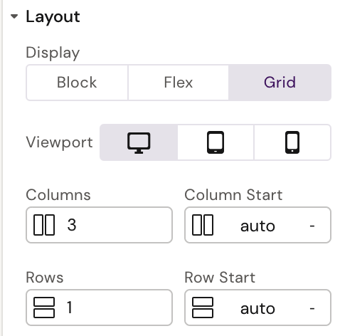
Let’s setup a grid with four columns:
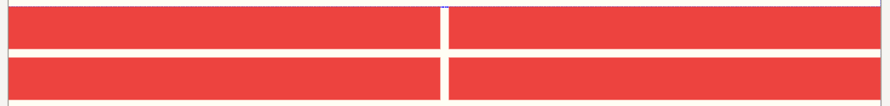
Desktop:

Four columns per row
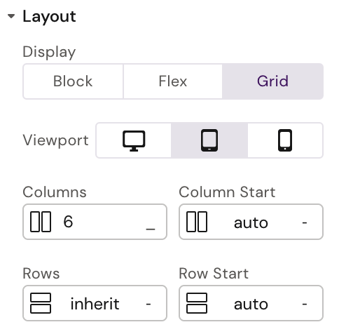
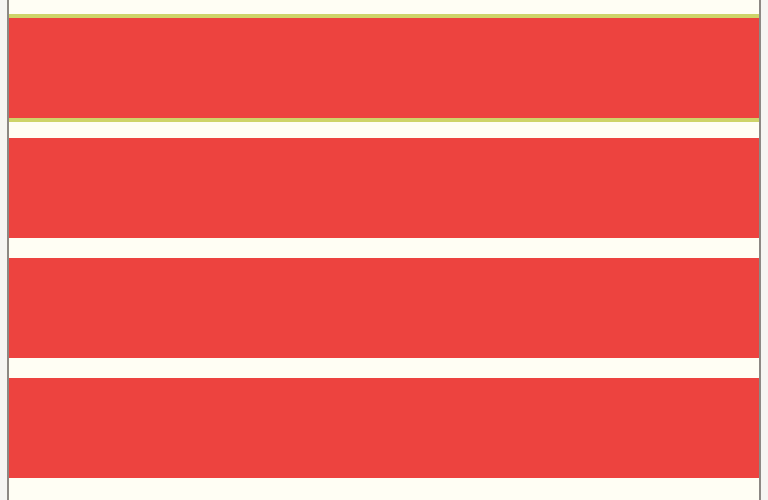
Tablet:
Two columns per row
Mobile:
One column per row
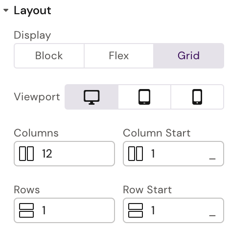
The Grid Component
Normally the grid component will act as a simple wrapper to the columns. It is however possible to configure columns and rows of the grid, and the gap between each:
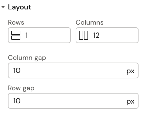
Currently the following CSS Grid properties are available in the Activator UI:
Grid Template Columns (Columns)
Column Gap (Column Gap)
Row Gap (Row Gap)
Notice that Rows are available in Activator UI but will not work as expected. This is a bug that will be fixed in future release.
To understand more about how to use CSS grids, please see the following article:
https://css-tricks.com/snippets/css/complete-guide-grid/
Behind the scenes
To understand what will happen when updating the values, here is how the Grid CSS is setup in the component:
:host {
          display: grid;
          grid-template-columns: repeat(var(--columns), 1fr);
          column-gap: var(--column-gap);
          row-gap: var(--row-gap);
        }
The Column Component
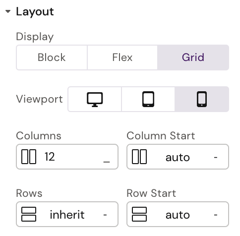
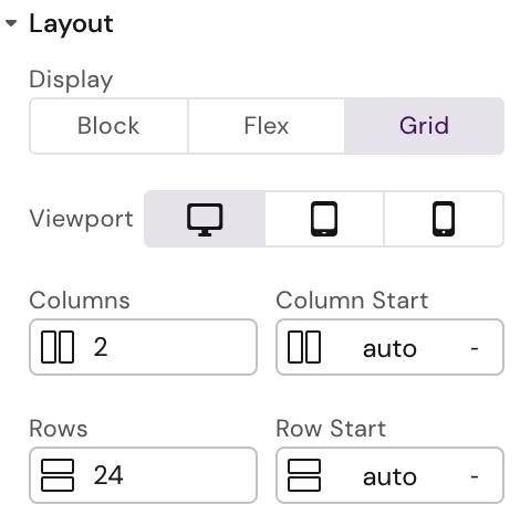
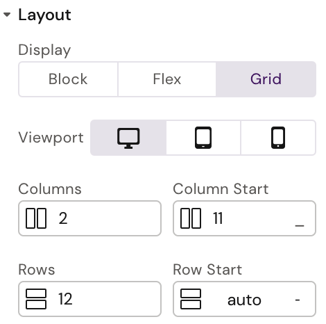
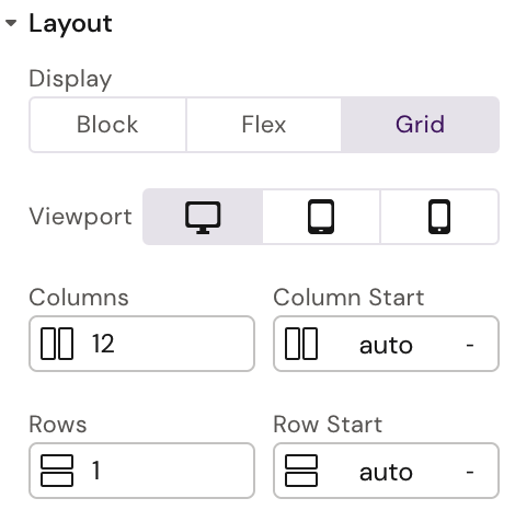
As seen in the above example, it’s possible to configure each column per breakpoint (desktop, tablet and mobile). Both the span of the column/row and at what position it should start can be set.
Here is an example where we start each column component at grid column position 4 in tablet resolution:
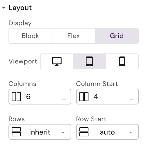
Each column has this configuration
For a more complicated grid setup, see Appendix 1.
Currently the following grid properties are supported via Activator UI:
Column span (Columns)
Row span (Rows)
Column start (Column Start)
Row start (Row Start)
Behind the scenes
To understand what will happen when updating the values, here is how the Column CSS is setup in the component:
:host {
        grid-column: ${this['grid-column-start']} / span ${this['grid-columns']};
        grid-row: ${this['grid-row-start']} / span ${this['grid-rows']};
      }
Responsive Text
Fluid font sizes are supported in all components using the default Activator text properties:
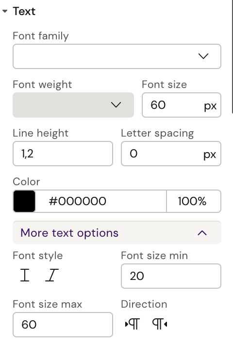
As seen above, under ‘More text options’ minimum and maximum font sizes can be set. When setting up fluid font size, the normal ‘Font size’ field should be set to the same as the maximum font size.
Using fluid font sizes means that the font will automatically adopt to the current width of the viewport.
If fluid font size isn’t the desired solution for the project at hand, there are two other solutions possible:
Custom Text Component
Custom CSS Classes
For a simple example of a custom text component, see Appendix A.
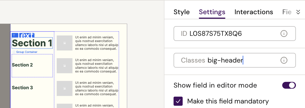
In the design system it’s possible to setup CSS classes that can be applied to any text element. Please see this document for the full process of adding custom CSS (and JavaScript if needed). Here is an example of CSS we could add (the file could be called anything or you could add it to an existing file):
src/styles/responsiveness.css
.big-header p {
  font-size: 60px;
}

@media (max-width: 1024px) {
  .big-header p {
    font-size: 40px;
  }
}

@media (max-width: 767px) {
  .big-header p {
    font-size: 20px;
  }
}
Once you have setup the classes you need (don’t forget to add the file to src/main.css if needed) it’s simple to apply them to text elements in the Activator UI via the settings menu:
Responsive Images
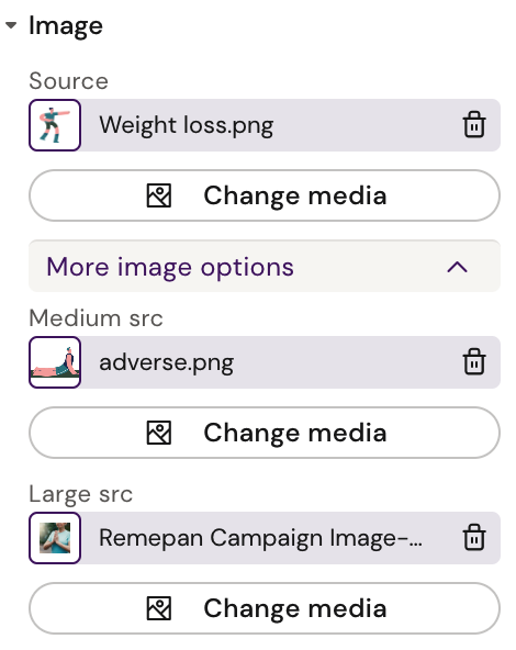
The image component in Activator support multiple sources in the ‘More image options’ section.
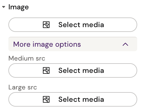
The normal source will be default and used unless larger resolutions are defined. Medium source will be used in tablets and up, and large source on larger screens. A default source is needed but both medium and large are optional.
Here is an example of three different sources used for the same image in different resolutions:
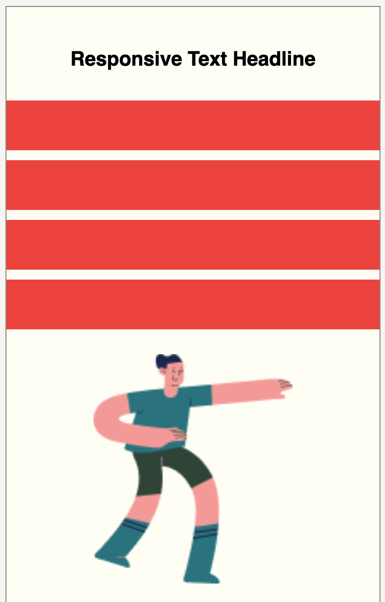
Desktop (large source):
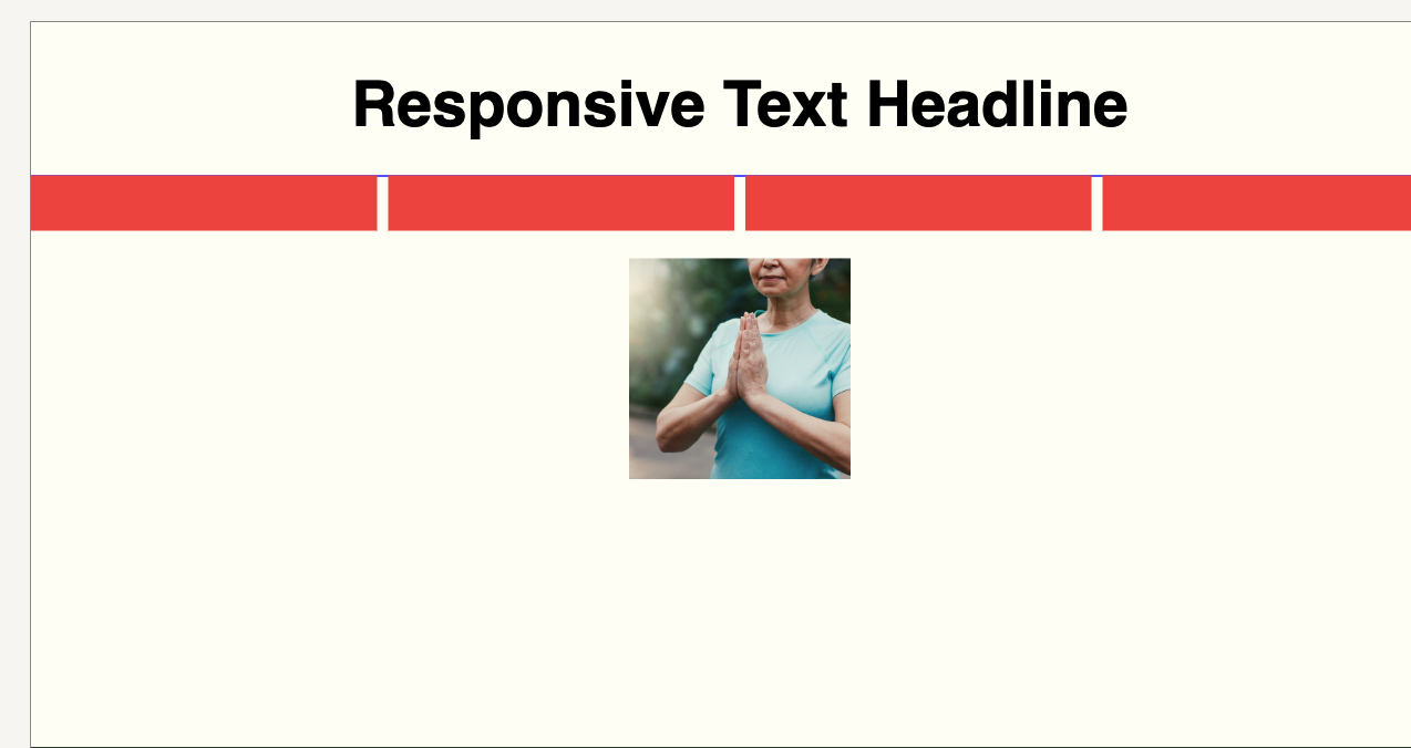
Tablet (medium source):
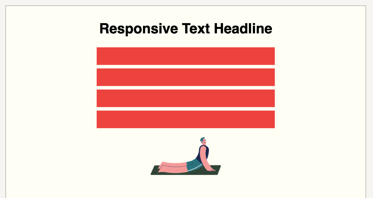
Mobile (default source):
Hiding Elements at Different Resolutions
Built into Activator is the possibility to hide elements at different resolutions. When an element is selected the following panel will be available in the Style menu:
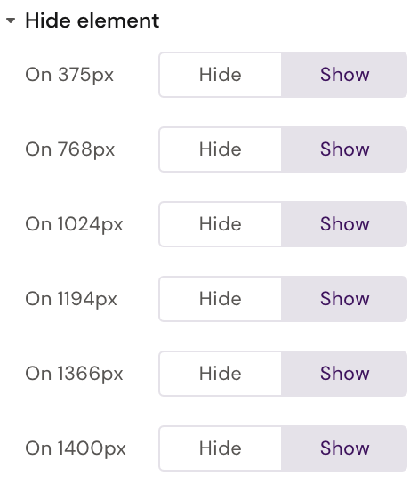
Clicking ‘Hide’ will hide the element at that resolution and below, until next breakboint. E.g. selecting ‘Hide’ at 1024px will means the element is hidden between 769px and 1024px.
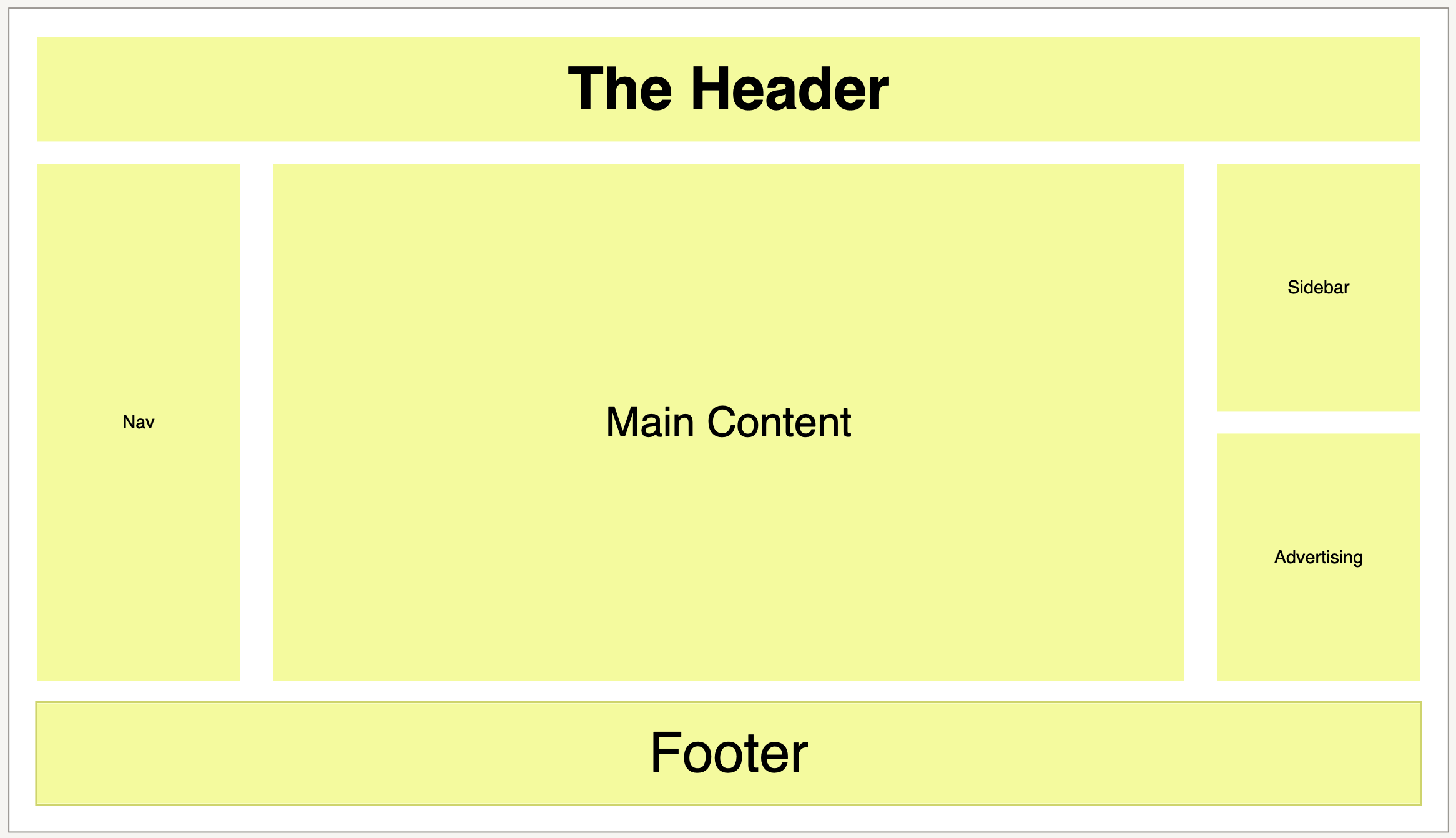
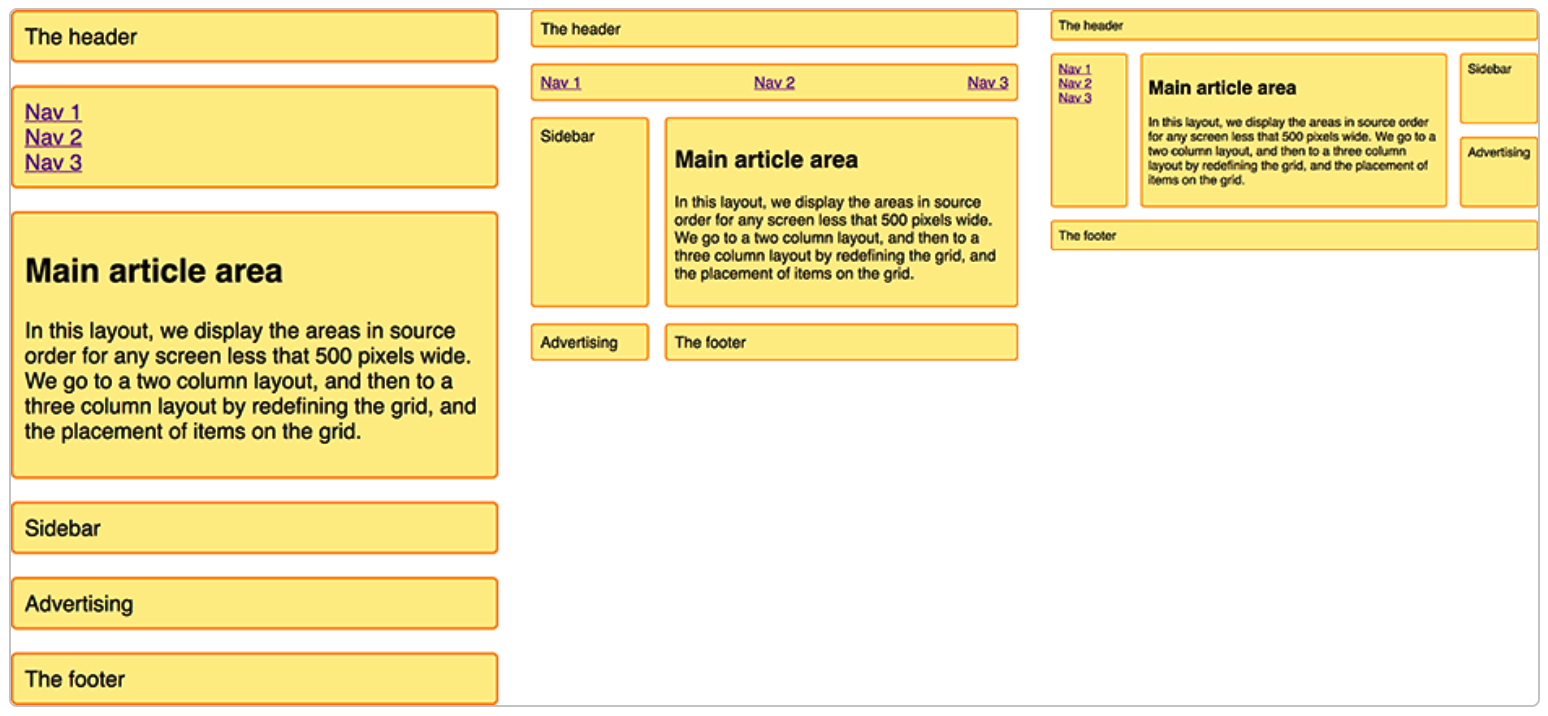
Responsive Template Example
In this more advanced example we’ll recreate this layout in Activator:
See https://developer.mozilla.org/en-US/docs/Web/CSS/CSS_Grid_Layout/Realizing_common_layouts_using_CSS_Grid_Layout for original article where this is created with plain HTML and CSS
The layout consists of 6 areas, which will be 6 columns components in a grid. The whole layout will be in a single row, although it would be possible to keep the headline in a row of itself.
The mobile grid setup is easy and the same as seen above, i.e. each column component will span the entire grid (12 columns).
For the other resolutions we’ll use the ‘Column start’ property and specify where on the 12 column grid the column element should begin (left edge). Here is the configuration for the large (desktop) resolution:
Header
Nav
Main Article

Sidebar
Advertising

Footer
This will give us this result in Activator (with background color and text added):