
Responsive Email Development
Activator makes use of the email framework MJML, which is designed to allow responsive content in all major email clients.
MJML Documentation: https://documentation.mjml.io/
Activator Compatibility
Activator currently supports the following MJML tags:
mj-button - https://documentation.mjml.io/#mj-button
mj-column - https://documentation.mjml.io/#mj-column
mj-divider - https://documentation.mjml.io/#mj-divider
mj-group - https://documentation.mjml.io/#mj-group
mj-image - https://documentation.mjml.io/#mj-image
mj-section - https://documentation.mjml.io/#mj-section
mj-spacer - https://documentation.mjml.io/#mj-spacer
mj-text - https://documentation.mjml.io/#mj-text
mj-wrapper - https://documentation.mjml.io/#mj-wrapper
Other MJML tags can be added manually but might not show up properly in Activator.
Responsiveness
Responsiveness in emails are limited due to limitations in current email clients but the MJML framework was built to offer responsive designs supported across all common email clients.
Structure
Responsive structure is what the MJML framework handles really well with the container elements:
mj-wrapper
mj-section
mj-column
mj-group
The main containers are the section and column and they are designed so that columns will stack in mobile views. All content should be in a column.
The group element prevents this stacking where it isn’t desired, e.g where you want to columns next to each other also in mobile.
The wrapper element is used to wrap several sections together so that you can control background and borders for example. The official MJML documentation explains all this rather well.
Text
Since media queries aren’t supported on all email clients/platforms, they need to be setup manually for a case by case basis. It’s possible to set this up in an email template in order to have it included in new emails created from Activator.
Media queries are setup in an mj-style tag in the head of the email. This needs to be done either from the built-in source code editor in Activator, or by downloading the source code and doing it locally before uploading it again.
<mj-style id="ACT_KGM8UYH0TU59L" data-mo-root-font="">
  @media all and (max-width: 590px) {
  	.body-text p {
    		font-size: 18px;
    	}
  	.header-text p {
  		font-size: 32px;
  	}
  }
</mj-style>
Those classes then need to be added to the MJML text tag with the css-class attribute (not yet supported in Activator UI):
<mj-text id="ACT_L4E0YSS80XMEH" css-class="mj-text-base body-text" show-in-editor="true">
  <p>Lorem ipsum dolor sit amet, consectetur adipiscing elit. Vivamus pretium condimentum leo, a facilisis elit fringilla a. Nulla feugiat posuere placerat.</p>
</mj-text>
Note that there ‘Classes’ are available in Activator UI but they will not currently be compiled with the MJML compiler. This will change in future release.
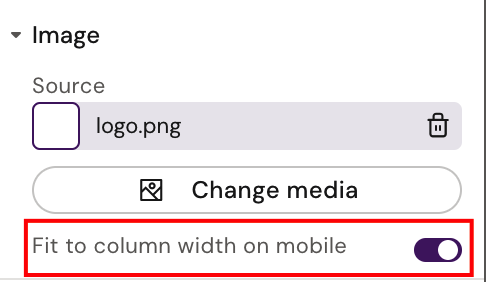
Images
The only responsive feature available for images is the MJML attribute ‘fluid-on-mobile’. Setting this to true will ensure that the image takes up the full width on mobile. This attribute is available via Activator UI as seen here:
Using media queries as described above for text, could also be used for images and any other element if needed.