
Design System Basics
What is the Activator Design System?
The Activator Design System is a combination of the following:
A folder accessible by any documents that relate to each other, e.g. in the same presentation, same brand, product etc. In Veeva Vault this folder is referred to as Shared Resource. This folder will contain the templates, layouts, helpers etc.
Fusion Library - a library created to allow communication between content and Activator. This is what enables editing of documents in Activator
Custom assets - any assets required to set up the design system, e.g. stylesheets, images, scripts etc
Configurations - the rules setup for the specific brand or presentation, which the Design System is intended for. This is where colors, fonts, and other properties are defined.
On a basic level, you can think of the Design System as a box full of Lego blocks which can be used to build the content on the Slides, Emails or Briefs connected to it.
This document will describe the principles of the Design System without diving into the technical details.
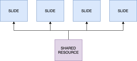
The Design System content is contained in a folder accessible by the documents, e.g. slides.
How to Create a Design System
A standard template for a Design System will be provided by Anthill. This template can then be configured as desired in Activator as described below. It’s also possible to duplicate an existing Design System in Activator and update the configuration to fit a different brand/project.
What are the components of Design System?
Fusion Library
The Fusion Library is folder in the Design System with code developed by Anthill that enables the connection between the content and Activator application. It also provides the standard components and helpful tools for developers setting up the technical side of Design Systems, e.g. custom components.
The Fusion Library is described in a separate document, which goes in to deeper technical details.
Templates
Templates are HTML designs that are used when creating new Vault documents from Activator. Currently it’s possible to create templates for Approved Email Templates, Slides and Briefs.
Templates can contain any HTML code, including web components. It’s also possible to include JavaScript, CSS and assets.
Usually templates are kept simple and include header, footer and columns with more detailed structures provided via layouts.
Layouts and Helpers
Layout and helpers are similar to templates but instead of being used to create new documents, they are used to quickly add new designs and content to a document. You could think of them as modular layouts for pieces of content inside a document, that can be easily used to build out new templates or designs.
What is the difference between a helper and a layout?
Layouts are generic design objects, that are meant to be used as building blocks for creating sections of content. Helpers, on the other hand, already contain all the proper assets and text (e.g. modular content) and are intended to be used as they are. Helpers are created by using a layout and populating it with the correct text and assets, e.g. from a content module.
Slide Fragments
Slide fragments are similar to layouts and helpers but instead of directly putting the content into the document where it’s used, a fragment will only reference the file. This means that fragments are great for content that should remain the same across documents, as updating a fragment will automatically ensure all documents serve the same content. They are often used for menus of different kinds.
Assets
As the Design System is a basic folder, any type of assets that could normally be used with web content, can be placed in it to be used by documents. There is a specific assets folder where image, videos and fonts are placed and made accessible to the Activator UI.
Content developers can also add any stylesheets, scripts and other assets as needed in the Design System.
Configurations
Using the Activator UI, it’s possible to configure the Design System to fit different brands, projects and presentations. The following is currently possible to configure:
Colors
Fonts
Menus
How do you manage Design Systems
Different strategies for how to apply a Design System can be adopted. Here are some examples:
One Design System is setup per brand/product and all content created based on this brand/product will use it as a shared folder
A Design System is setup per product, country and language
Individual projects/presentations will have it’s own Design System defined
Although it’s recommended to have a clear strategy for how to make use of Design Systems, there is nothing preventing any of the examples from being combined as desired, e.g. the general strategy is to have a Design System per product and country, and then have certain presentations have their own Design System setup.