Updated Design System UI introduced with Activator v2.6.0
A new view to get you started
With Activator version 2.6.0, we introduced some changes to the user interface and -experience when working with Design Systems. These changes are fundamental for future enhancements and updates that Anthill has planned for Design Systems.
When opening a Design System file in Activator, you are greeted with a new UI.
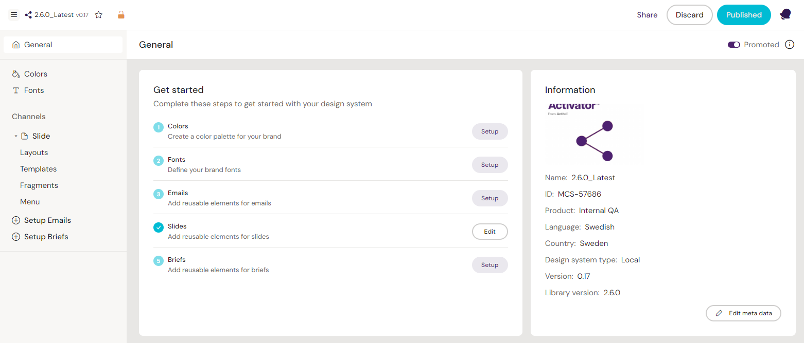
The new view to get you started working with a Design System
You can easily see Design System metadata from the new screen and set up your channels, too. A channel can be set up from the Design System or is automatically set up once you generate layouts for this channel.
To set up a channel for a document type in the Design System, you can click the corresponding setup button either on the canvas' ‘Get Started’ section, or use the “Setup X” button in the left-hand panel under the channel section. Once initiated, subitems will appear below each channel.
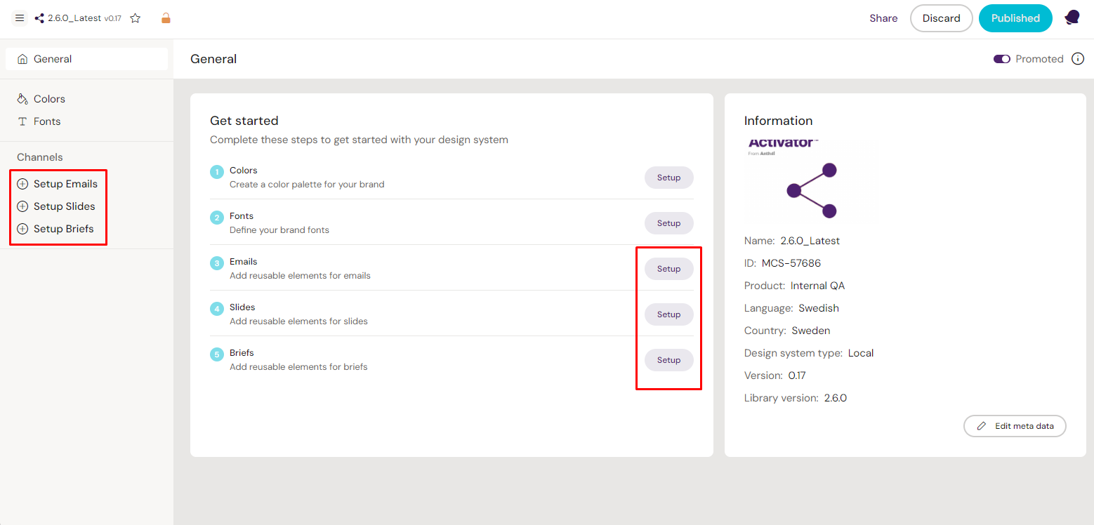
Click the buttons to initiate a content type for your Design System
If a new version of our Fusion Library is available, a button will appear at the bottom of the side panel. Clicking it will give you more information about the upgrade, as well as the possibility to view the changelog before upgrading.
Working with fonts and colors
Colors
Similarly to document types, you can set up colors in the Design System from the new view.
Clicking on the setup button for colors, or selecting “Colors” in the left-hand panel, takes you to the overview of colors defined for the Design System. Here you can add and remove colors to the Design System.
To add a color, click on the ‘New color’ button. Use the color picker or define a HEX or RGB value and press ENTER on your keyboard to add the defined color to the Design System. The system will indicate when the color has been successfully added.
To remove colors, hover over any color tile and a selection box appears. Ticking this box selects the tile and lets you tick additional tiles to select and delete multiple colors if desired. Finally, click the red ‘Delete’ button and confirm your action in the prompt.
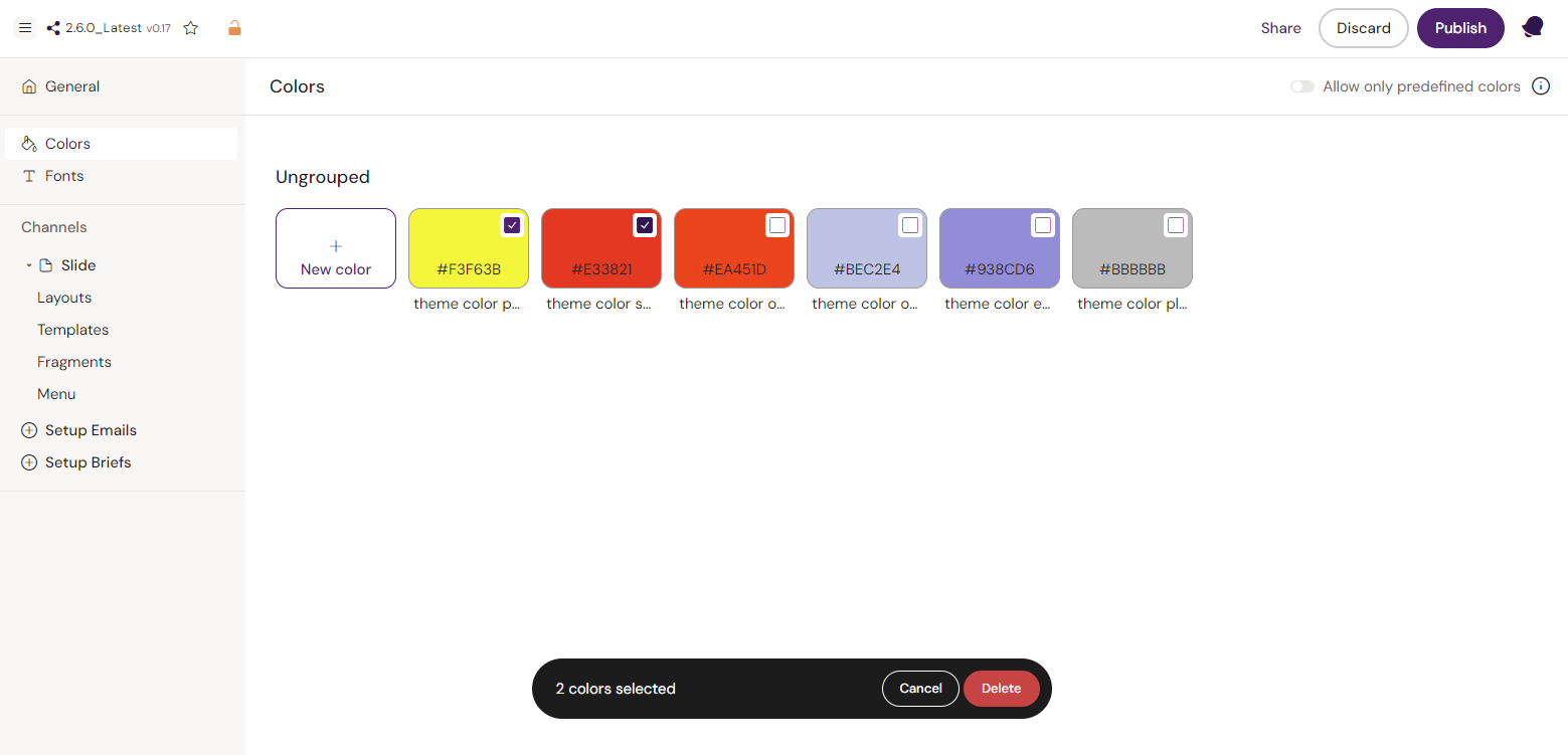
Create new colors for your Design System, or select one or more colors to delete them
Fonts
To view the fonts available as part of the Design System, click the ‘View’ button for fonts, or select “Fonts” in the left-hand panel. This brings you to the font overview.
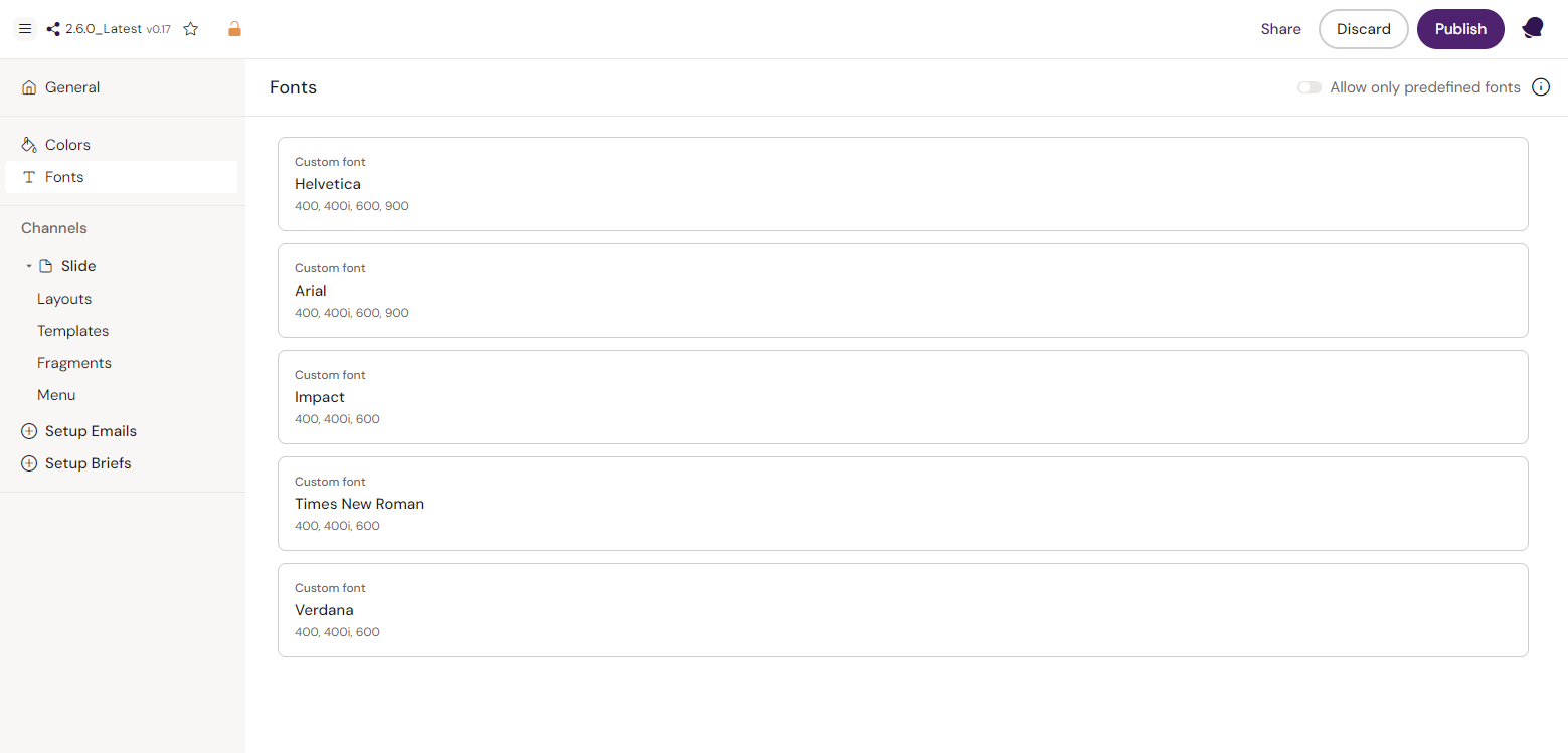
An overview of the fonts that are available in your Design System
This list contains default and custom-configured fonts, font weights, and font styles for this Design System. Other fonts may be available for emails.
Navigation
Same as in the old UI, there is a navigation item in the menu. From here, you can toggle on and off the use of DocNavigationID and custom swipe functionalities.
Channels
Emails and Briefs
Once Emails or Briefs have been initiated, you will have the items ‘Layouts' and ‘Templates' listed underneath. Selecting either shows all the layouts or templates associated with the Design System.
Layouts are shown in groups, which have been created, when the layouts were saved. Moving a layout to another group will currently still happen as part of the saving process. When hovering over a layout card, you are presented with options, such as preview, see layout description or select. You can select and delete multiple layouts at once. This will not affect existing content, but the layout will no longer be available for future use.
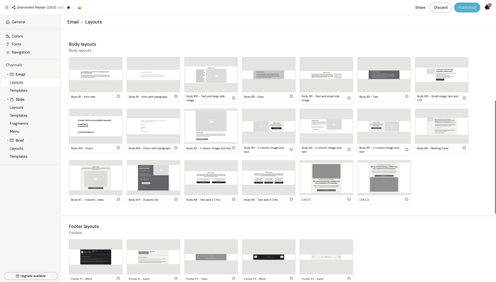
An overview of available layouts for the specific channel divided into groups
Slides
Aside from layouts and templates, the Slides channel has two additional items: 'Fragments’ and 'Menu’.
‘Fragments’ lists the slide fragments available when building slides linked to this Design System. You can also generate new slide fragments from here by clicking the ‘New fragment’ button in the top right corner.
Within 'Menu', you can configure the links to binders and their slides, which are then used in all instances of the menu component for documents using this Design System. Hover over a menu item to reorder, duplicate or delete. Add more new items on the button below.
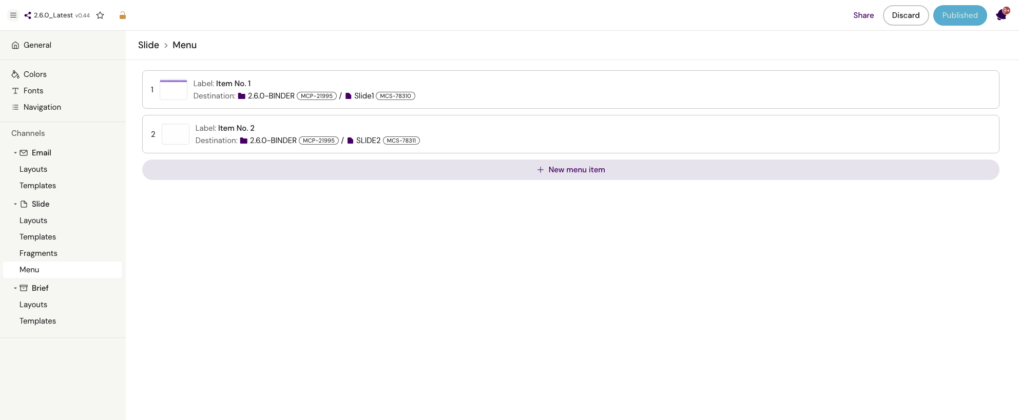
Configuring menu items
