
Email Components
Components are the building blocks of an email. Whether you’re starting from scratch, expanding an existing template, or using layouts, components are essential. The Activator Content Designer indicates which components can be added, based on the component you currently have selected.
Let's take a look at the different components that are available when creating Email Layouts.
Only users that work with the Activator Content Designer can access Components.
Containers
Layout and Row containers are the outermost containers you can work with. All other containers, the Columns, and Group containers, go inside them. Finally, you can add visible end-user elements like text, images, and button elements.
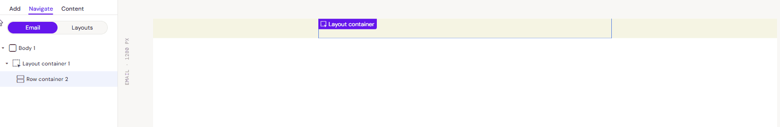
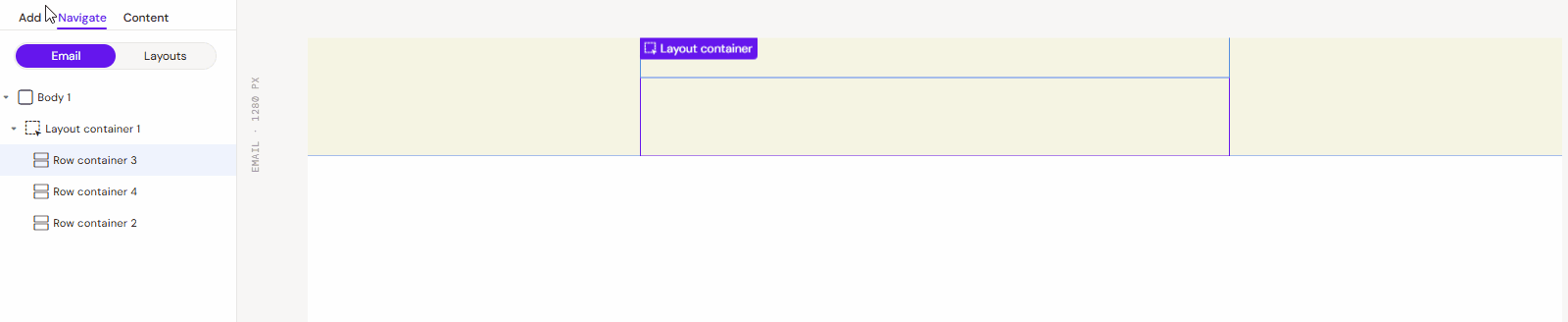
Layout Containers

Rise - Image & Text
This is the only container available when you start designing for emails. It automatically adds a Row container to your canvas.
The content inside a Layout Container can be saved as an Email Layout to allow your Content Editors to use it in the Emails they create.
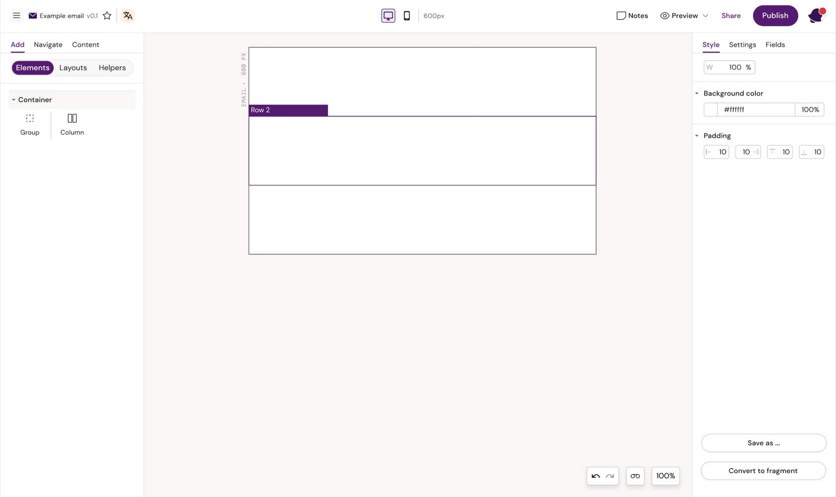
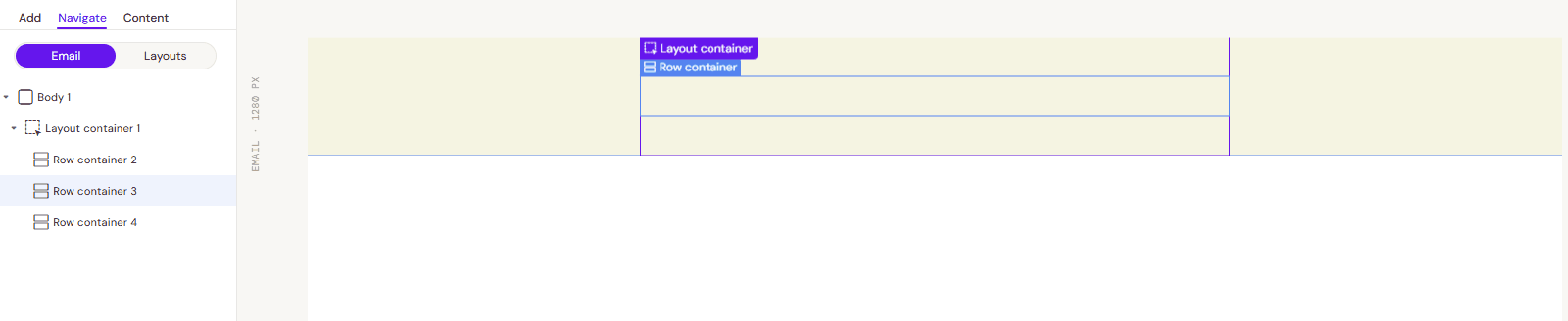
Row container

Rise - Image & Text
This is the first actual component you start with, and an email usually consists of multiple rows stacked horizontally. The only two container components you can insert into a Row container are Column and Group.
A row is typically 600px wide, and anything you add into it should therefore add up to 600px at the end. Remember to consider padding or use percentages to define the width of, e.g., columns.
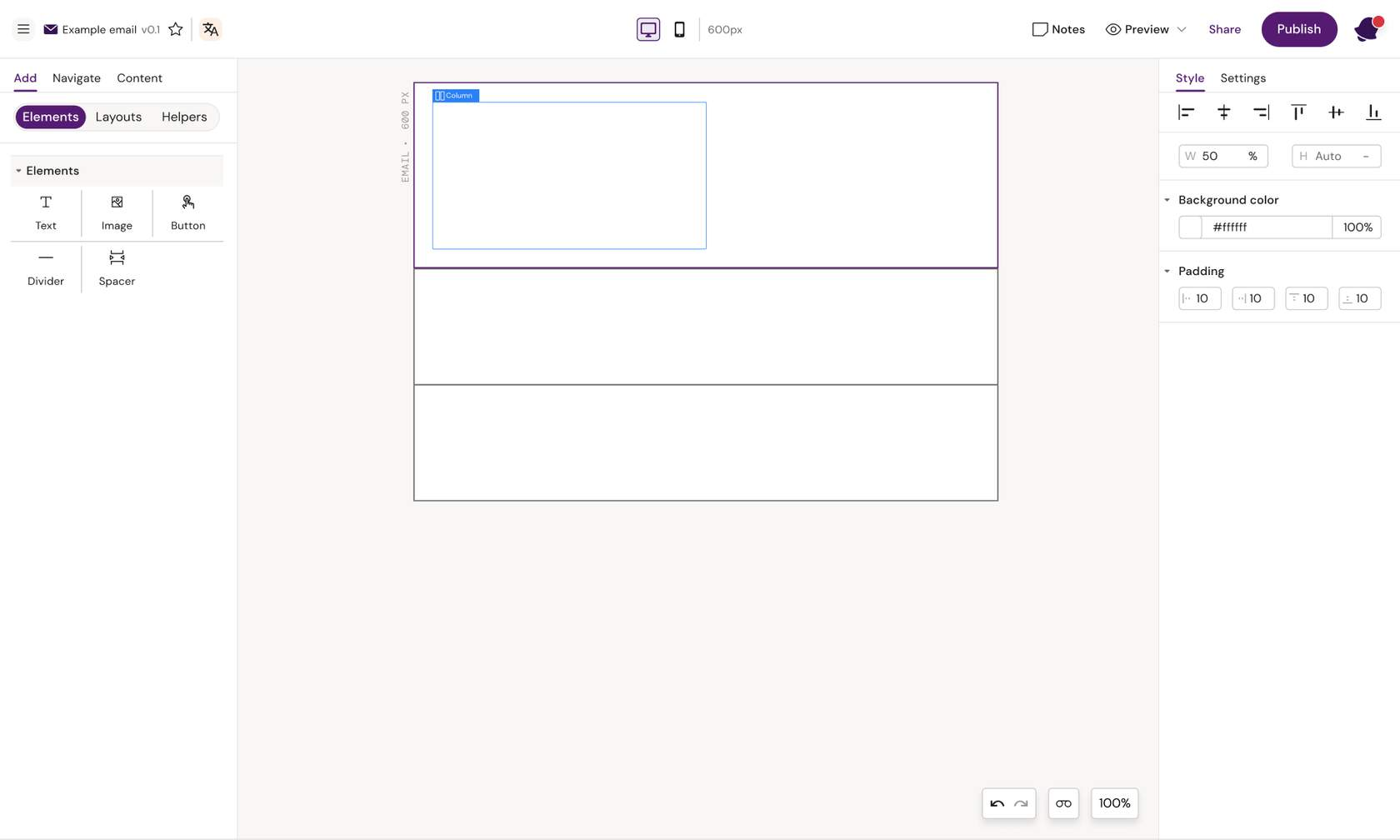
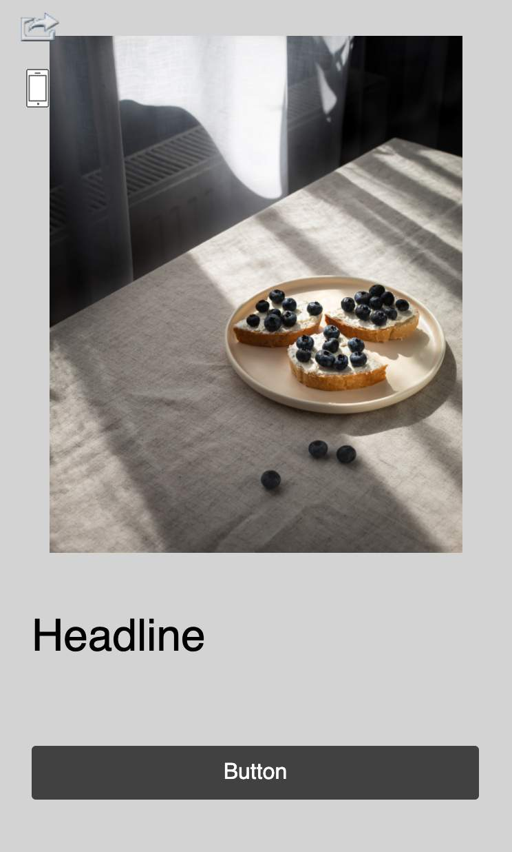
Column container

Rise - Image & Text
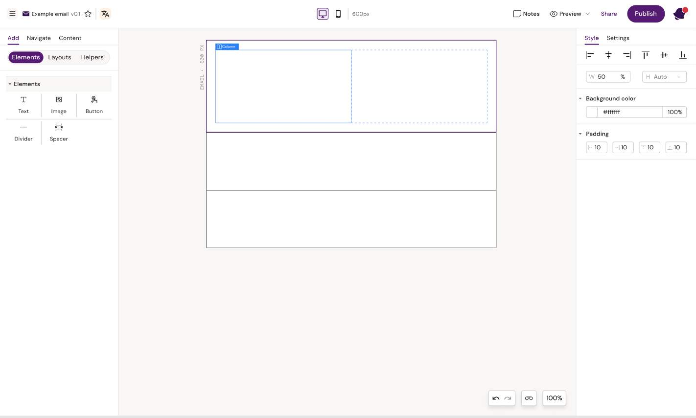
The column container can take up any amount of space inside a row. You can add just one column inside a row and set it to take up 100% (or 600px minus padding), or you can add multiple columns and set them to take up 50-50%, 30-70%, 40-60% or whatever you like as long as it adds up to 100% or 600 px.
Rise - Two Column Grid
Here we have added a 50% width column.
Here we have two columns in one Row.
Note: The sum of your column widths does not add up to 100% (or 600 px) the columns will be placed underneath each other instead of next to each other.
Rise - Carousel
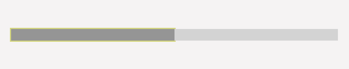
Columns 50/50 %
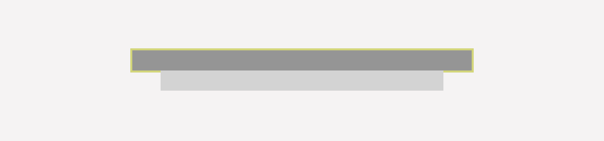
Columns 60/50%
Group Container

Rise - Image & Text
A group container is helpful if you want two elements to stay next to each other. Usually, a row with two columns will stack on mobile, so column 1 is shown on top, and column 2 below. If the columns are placed within a group container, they will not stack.
A group container can only be placed inside a row container and usually takes up 100% of the row width. Once the group container is added, you add columns and elements.
The group container should be used if you have a row you do not want to stack
The group container should be used when you do not want the group contents to reflow responsively when the display window decreases in size.
Example of content in a Column versus a Group Container when the display size decreases.
Rise - Two Column Grid
Columns directly inside a row
Columns inside the group container do not reflow
Rise - Continue Button
Elements
Elements represent the components that can be used to add content to containers.
Let's review the different elements available for building Email Layouts.
Text
Rise - Image & Text

A text component can only contain text. A default font might be set for the whole document, but with the text elements selected, the Designer can define font, size, color, and decoration for that specific text element.
Changes to individual text pieces within the text element can be made by highlighting the text and selecting the change from the toolbar that appears on highlight. The user can also insert tokens by highlighting a text piece and selecting 'insert' from the toolbar. A list of tokens will appear for the user to select. The token will be inserted into the text field, but will not delete the text that was selected.
Rise - Two Column Grid
Change overall text settings in the right panel
Highlight text and make changes to specific parts of the text
Button
Rise - Image & Text

The button component is a simple element that can be styled in multiple ways. Once styled by the Designer, an Editor can click directly on the button text to edit the text. A link can be added to the button by clicking the link icon next to the button tag or opening the button settings in the right panel.
Rise - Note - Be aware that button borders and rounded corners are not supported by all email clients
Rise - Image Centered
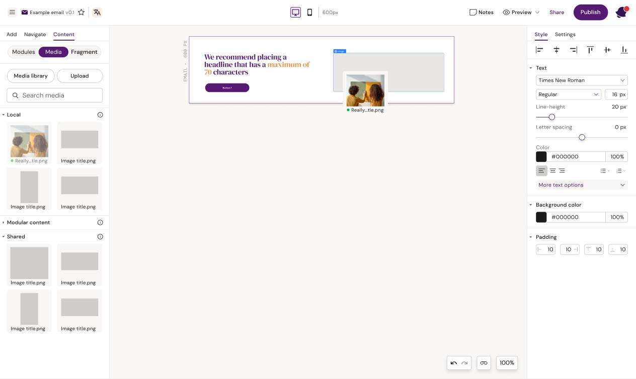
Image
Rise - Image & Text

In order to add an image to the design, the image container must be added. The image container will by default take up 100% of the width of the container it is placed within. The Designer can add padding or change the width of the container in the style panel.
Rise - Two Column Grid
Add an image container
Drag an image into the image container
Divider
Rise - Image & Text

A divider is a horizontal line with predefined padding which can be used to e.g. split up different sections in a design.
Rise - Image Centered

Caption - Divider added to design
Spacer

A spacer is an element that creates a specific amount of space between two elements. The Designer can use it to ensure consistent spacing between two text elements or between text and buttons.
Rise - Image Centered
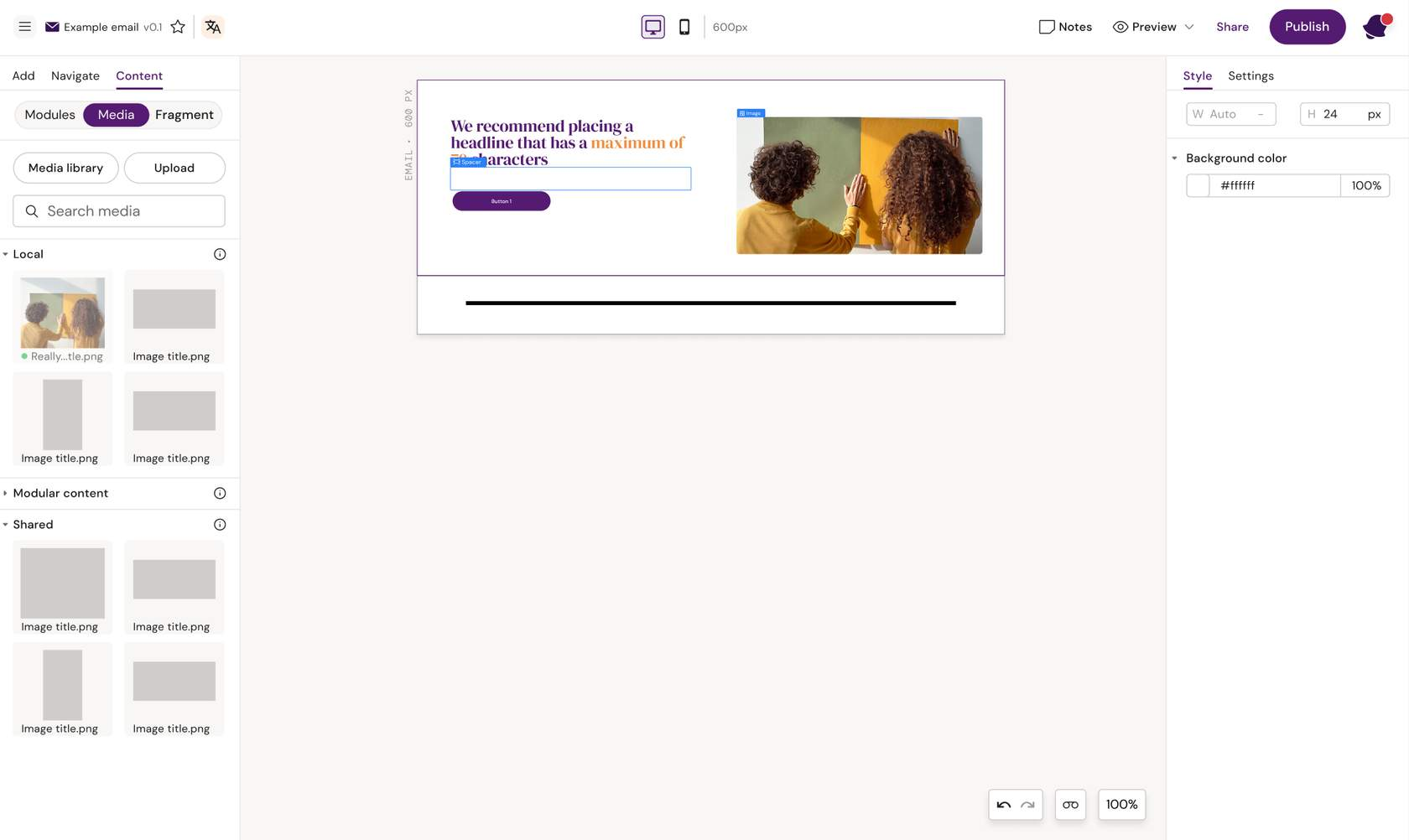
Caption - Spacer added between headline and button
HTML Component

The HTML Component in Activator can be used to insert custom code directly into an email or content template, giving you more design and functional flexibility than the standard drag-and-drop components
Here is what they can be used for in practice:
Add custom design elements
Apply fine-tuned styling
Important Notes
Custom HTML should be used sparingly, since non-standard code might not render consistently across email clients.
It’s best for advanced users or developers familiar with email-safe HTML.
You can make it editable for end users (by enabling “Show field in editor mode”) or lock it down so only template creators can modify it.
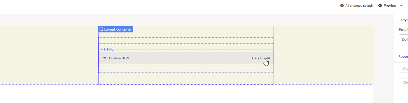
Custom Divider Line with Label
In the example above the wish was to visually separate sections in an email with something more interesting than a plain <hr> line.