Responsive email
Responsive layouts
Adaptation for devices in emails works according to several basic rules:
Columns inside a row are always moved to a new line on mobile, regardless of the element's width, and take up the full width of the parent element.
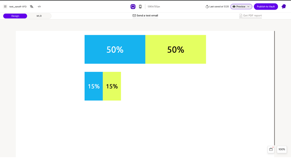
Example:
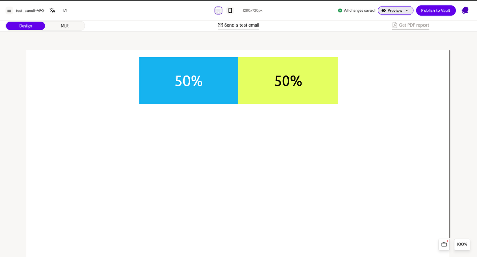
Layout 1 Columns 1 and 2 have a width of 50%
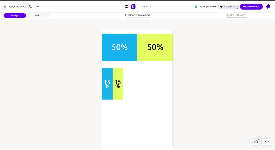
Layout 2 Columns 1 and 2 have a width of 15%
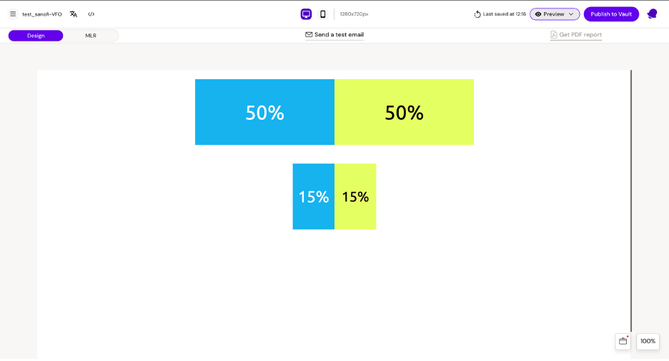
Desktop
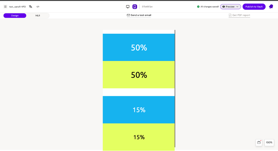
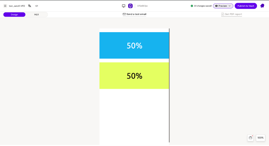
Mobile
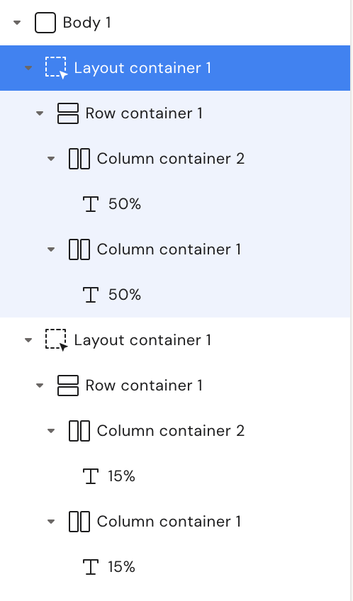
Structure
As we can see on mobile, the column stretches to the full width of the parent container.
To prevent the column from moving to a new line on mobile, we need to use a group container.
Structure
Desktop
Mobile
Best practice
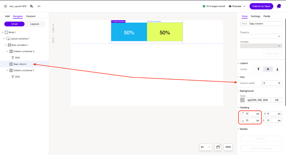
To create spacing between columns after they move to a new line on mobile, you need to use an additional column as a gap between the columns.
Example: As we can see in the example, the column has a width of 0% but has a height (implemented using padding) of 20px.
Desktop
Mobile
We can also implement spacing between columns on desktop. To do this, we need to add a column between the columns.
Example:
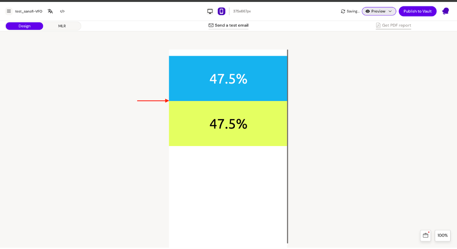
The gap column between the 2 main columns has a width of 5%
Column 1 and column 2 have a width of 47.5%
The height of the gap column is 0 (since no padding is set)
47.5% + 5% + 47.5% = 100%
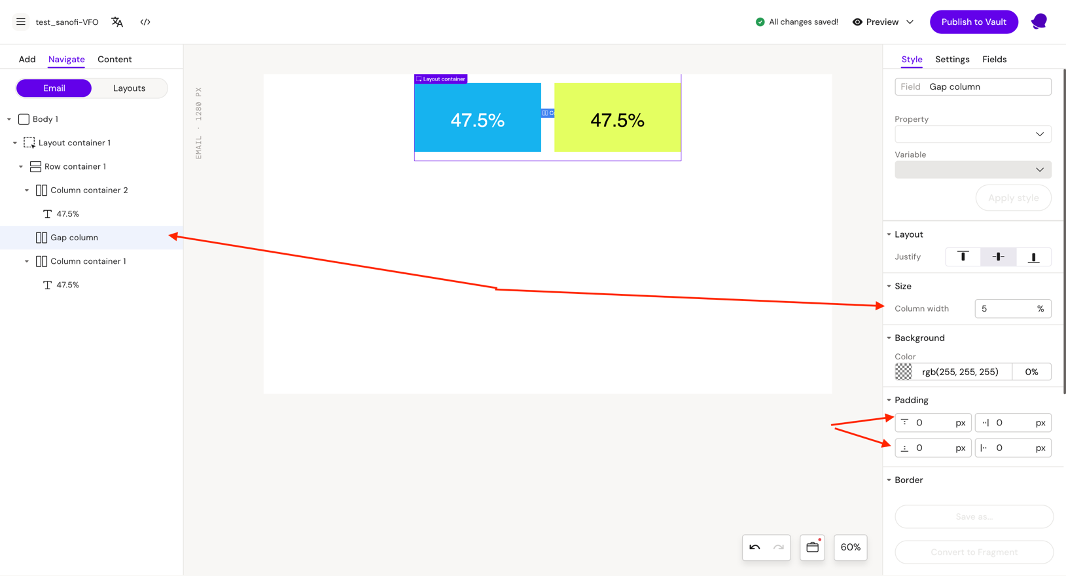
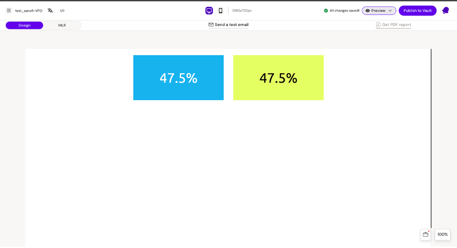
Desktop
Mobile
Similarly, you can create spacing on both mobile and desktop by setting both the width and height.
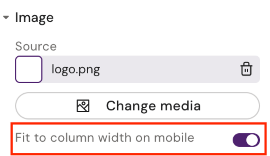
Images
The only responsive feature available for images is the MJML attribute ‘fluid-on-mobile’. Setting this to true will ensure that the image takes up the full width on mobile. This attribute is available via Activator UI as seen here: