
Responsive slide
Responsive layouts
What is this and what is it for
Responsive layouts - these are layouts that adapt to the size of the parent container.
Problem
For example, let's take a simple card layout. If we hard-code the layout width to 250px
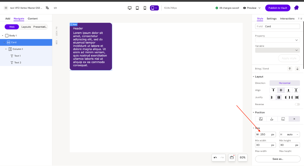
So for example, when adding a Card layout to a column (with the "Allow to place Layouts" field enabled), we will have empty space, because the layout won't take up the full width of the parent column - the layout width will remain 250 pixels.
Solution to the problem
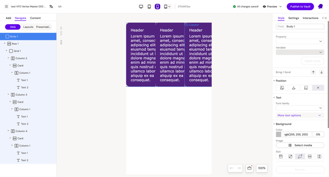
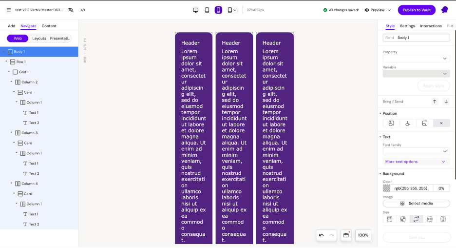
In order for the Card layout width to occupy the full width of the parent container, we need to set the width to 100% for the main row.
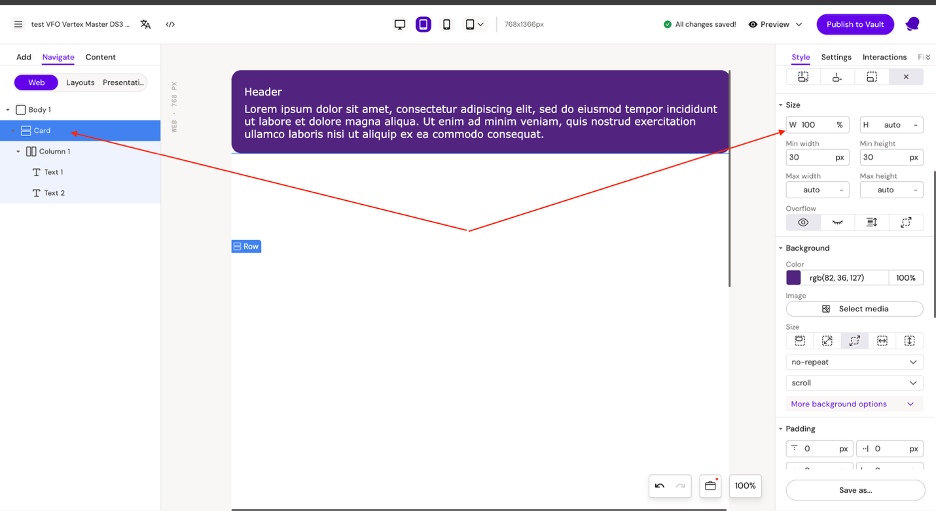
This way, the layout will always take up the full width of the parent container.
Responsive units
Auto - where the element size is not set explicitly, but is calculated automatically by the browser based on available space, element properties, and its content.
% - this is a unit of measurement where the element size is calculated as a percentage of the corresponding size of the parent element.
vh and vw These are percentages of the screen height or width
vh can only be set for height
vw can only be set for width
vmin and vmax
vmin – this is a value from the smaller side of the screen
For example:
On a phone (vertical) — this is the width
On a monitor (horizontal) — this is the height
If the screen is 1000px × 600px → 1vmin = 1% of 600px
vmax - this is a value from the larger side of the screen
Example:
On a phone (vertical) — this is the height
On a monitor (horizontal) — this is the width
If the screen is 1000px × 600px → 1vmax = 1% of 1000px
px - this is a fixed size that is set in pixels (not responsive)
Resolutions
To add or change the resolution, we need to edit the file responsive.json. Allows you to add new device resolutions to Activator Preview and Edit mode.
{
  "responsive": true,
  "breakpoints": {
    "desktop": 1400,
    "tablet": 1279,
    "mobile": 767
  },
  "targetResolutions": [
    {
      "device": "desktop",
      "width": "1280",
      "height": "720",
      "type": "general",
      "primary": false
    },
    {
      "device": "tablet",
      "width": "768",
      "height": "1366",
      "type": "general",
      "primary": false
    },
    {
      "device": "mobile",
      "width": "375",
      "height": "667",
      "type": "general",
      "primary": false
    },
    {
      "device": "iPad",
      "width": "1024",
      "height": "768",
      "type": "tablet",
      "primary": true
    },
    {
      "device": "iPad Pro 11inch",
      "width": "1194",
      "height": "834",
      "type": "tablet",
      "primary": false
    },
    {
      "device": "iPad Pro 12inch",
      "width": "1366",
      "height": "1024",
      "type": "tablet",
      "primary": false
    },
    {
      "device": "iPad Pro 13inch",
      "width": "1440",
      "height": "1152",
      "type": "tablet",
      "primary": false
    }
  ],
  "defaultResolutions": {
    "slide": "",
    "brief": ""
  }
}
responsive - this flag defines if the presentation will have responsive features enabled. By default, it’s enabled. We don’t recommend you disable it. Non-responsive iVAs are very rare and it’s more like a backwards compatibility flag for older iVAs.
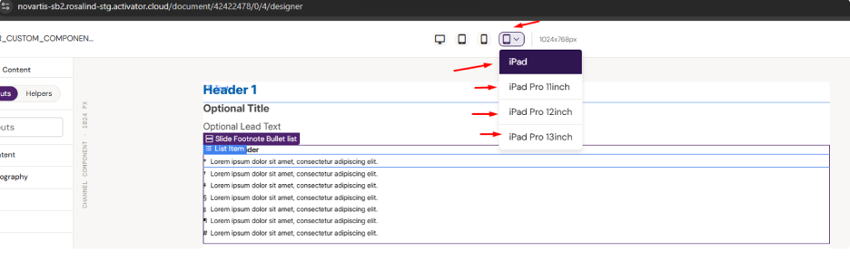
targetResolutions - you can add new target resolutions to Activator view. Here is an example:
{
  "device": "iPad Pro 13inch",
  "width": "1440",
  "height": "1152",
  "type": "tablet",
  "primary": false
}
In this way, you can add new devices if needed.
Note: We do not recommend changing resolutions that are already defined. If you need custom device resolution, just add a new device to the responsive.json, don’t edit existing devices.
Responsive fonts
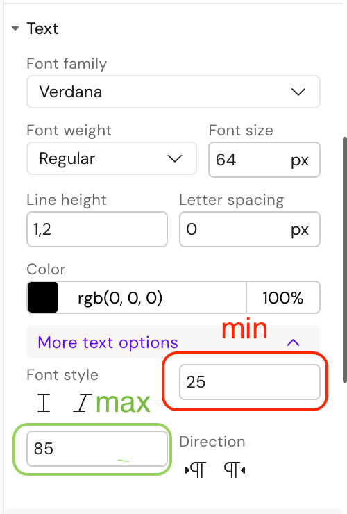
For font adaptation, we have 2 fields: min and max
Font adaptation works approximately like this:
If we use the values specified in the example:
375px (phone) -> 25px (minimum)
800px (tablet) → ~50px
1366px (desktop) → 85px (maximum)
This is calculated using the following formula:
font-size: calc((100vw - 375px)/(1366 - 375) * (--font_size_max – --font_size_min) + (--font_size_min * 1px)));Mainly 2 types of coefficients are used for font adaptation, namely 1.2 and 1.3
In font-size min, as is customary, it should equal the base font size
That is, font-size 64: min 64, max (with coefficient 1.2 = 77)
Tables with coefficients
Font sizes (min and max) coeff 1.2
Font sizes (min and max) coeff 1.3
Responsive Structure
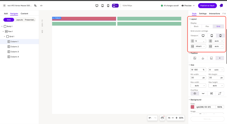
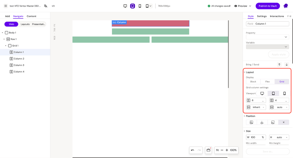
For developing responsive structures, we can use the grid component, which will give us the flexibility to configure the structure on desktop, tablet, and mobile devices. By default, the grid component is created with 1 row and 12 columns (we can change these parameters here).
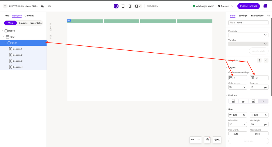
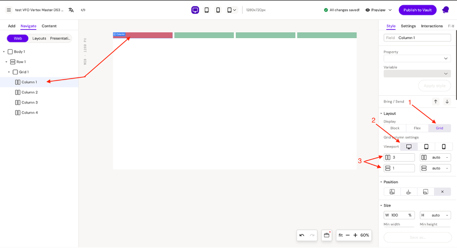
To configure the grid parameters for each device, you need to switch the display (1) to columns and also adjust the rows and columns parameters (3) for each device (2). This should be done for each column.
Desktop
Tablet
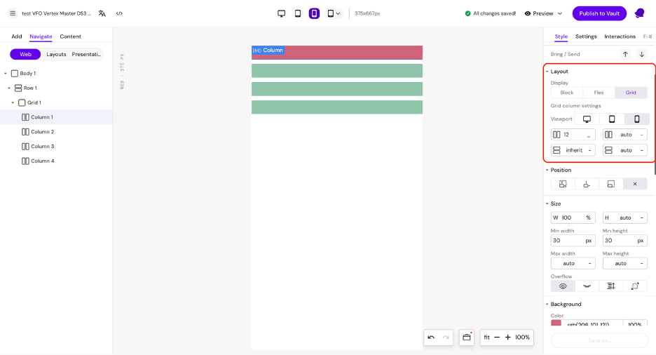
Mobile
Also, the column has properties for column start and row start, which are needed so we can configure the starting position for each column.
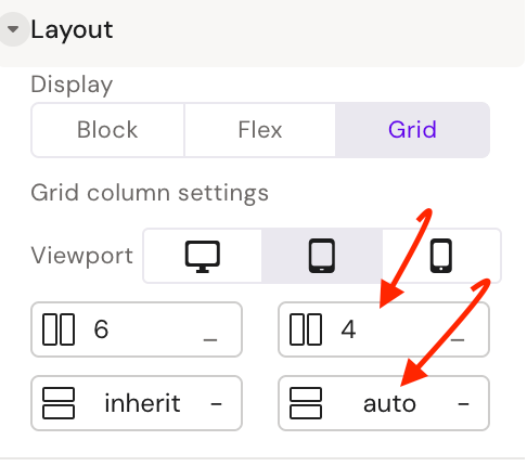
The example demonstrates the column start configuration for tablet, for the first 2 columns.
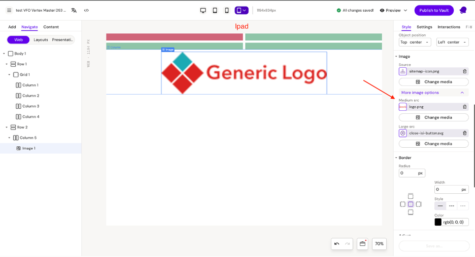
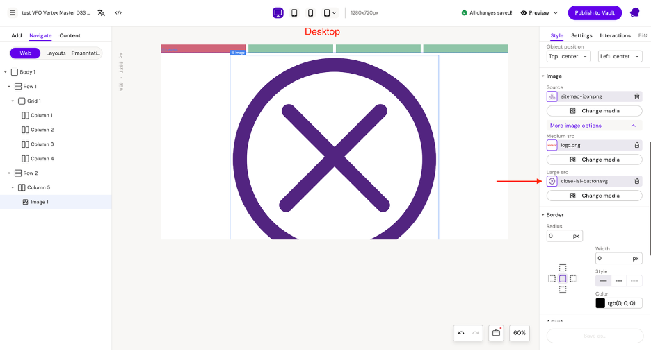
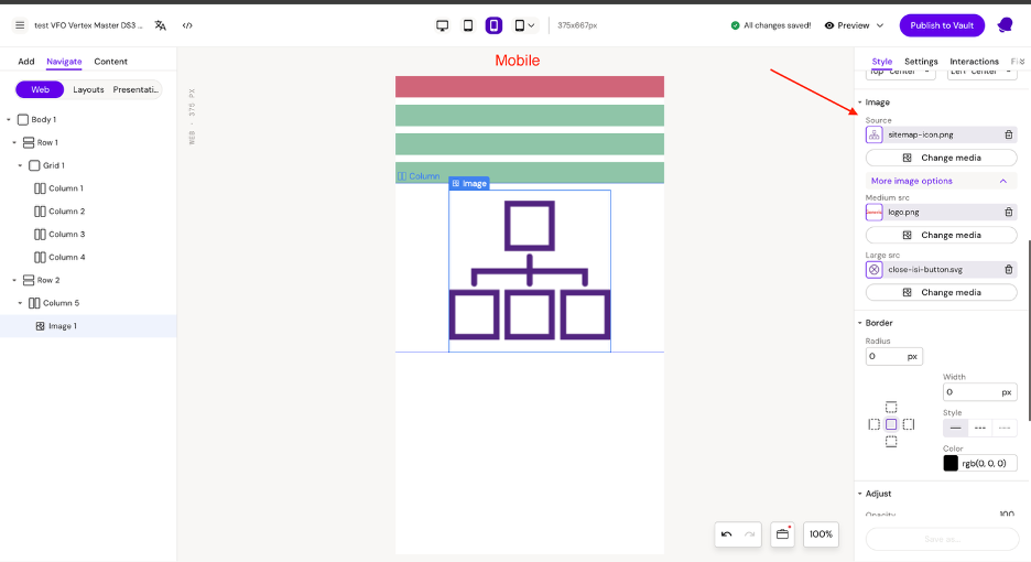
Responsive images
For configuring images, we have 3 fields: Source, Medium src, and Large src. Using these fields, we can set different images for different devices.
By default, the image in the large src field is used. On desktop, the image in the medium src field is used. On mobile, the image from the source field is used.
Hiding Elements at Different Resolutions
Built into Activator is the possibility to hide elements at different resolutions. When an element is selected the following panel will be available in the Style menu:
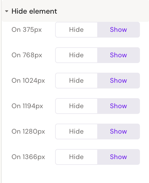
Clicking ‘Hide’ will hide the element at that resolution and below, until next breakboint. E.g. selecting ‘Hide’ at 1024px will means the element is hidden between 769px and 1024px.