
What the Design System Is and Where to Find It
On a conceptual level, you can think of the Design System as a box full of Lego blocks that is used to build the content on the Slides, Emails, or Briefs connected to it. All Activator documents must have a connection to a Design System.
Design Systems for Activator 3 also feature a top-down hierarchy, where assets, such as colors, layouts, templates, and slide fragments, are passed down from parent to child systems. These inherited elements can be applied directly, copied for local customization, or hidden if they are not required.
In addition, the Design System offers a predefined repository of colors, fonts, layouts, and components that the Designer can leverage to create layouts for a specific brand.
In other words, it is a kind of content-building kit. You decide which elements are required, set the rules for their use, and ensure that the different pieces fit together.
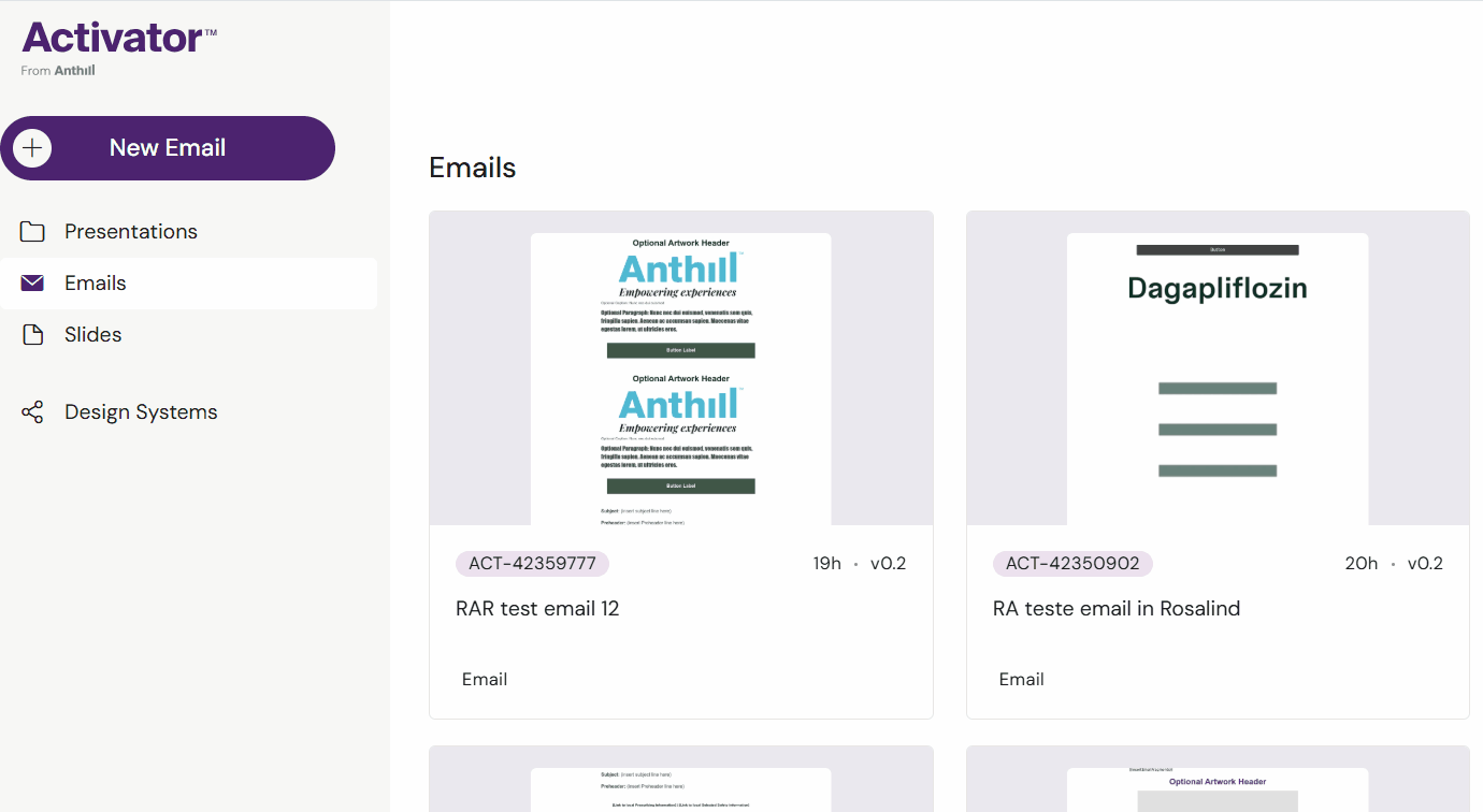
The purpose of Design Systems is to steer your brands and keep them consistent and easy to roll out across different channels (Presentations, Briefs, and Emails) with templates.
-20251110-093830.png?inst-v=975cbeae-2139-404a-860f-6b520655945d)
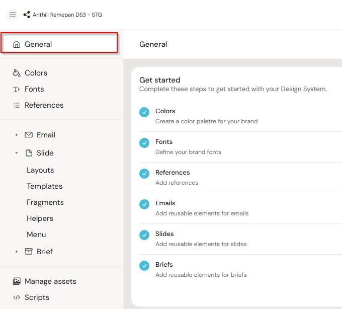
Accessing the Design System
You can access Design System UI in Activator 3 different ways:
From the Dashboard (if available)
From the Burger menu-> Settings-> click link
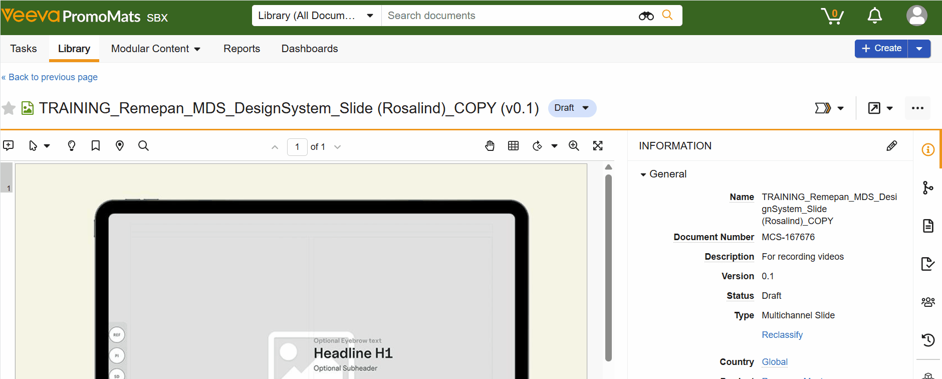
From your DAM using a webhook button - Veeva Vault PromoMats and Aprimo are shown in this example.
Design System UI Capabilties
At the moment, the Design System user interface in Activator is limited, offering a simplified view of core elements. This is an intentional first step, and more capabilities will be introduced in upcoming releases.
Currently, within the Design System UI, you can:
Define and add colors for brand-consistent theming
Preview inherited content, including colors, layouts, templates, slide fragments, and helpers
Copy groups of inherited content for local customization
Create new content directly within the system
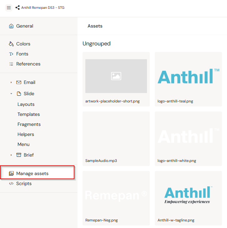
Manage shared image assets used across layouts and templates
Download and upload script packages for advanced configuration or migration
See available fonts from the typography settings
Configure global navigation, if the Design System is used for slide-based content
While the UI doesn't yet support all advanced editing features, Content Developers can further configure the Design System using the underlying configuration files. This allows for deeper customization beyond what’s available directly in the interface.
For more details on how to technically configure and extend a Design System, we recommend referring to the Content Development section in the Knowledge Base, which outlines structure, options, and best practices.
We’ll continue to expand the UI’s capabilities over time, making it easier to manage and update your Design System directly within Activator.
What does a Design System contain?
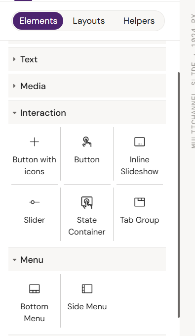
Components
Components are the fundamental elements that designers use to construct emails and eDetailers.
Common components include:
Structural Components:
Rows: Horizontal containers that hold other components.
Columns: Vertical sections within rows, used to organize content.
Dividers: Lines or spaces to separate content visually.
Content Components:
Text Elements: Areas for adding headlines, body copy, and other text.
Image Containers: Spaces to insert images of various sizes and formats.
Interaction Components
Buttons: Interactive elements that link to other pages or trigger actions.
Slideshow and Tab groups: Elements that encourage user interaction.
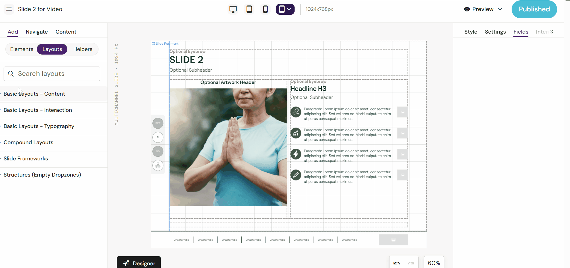
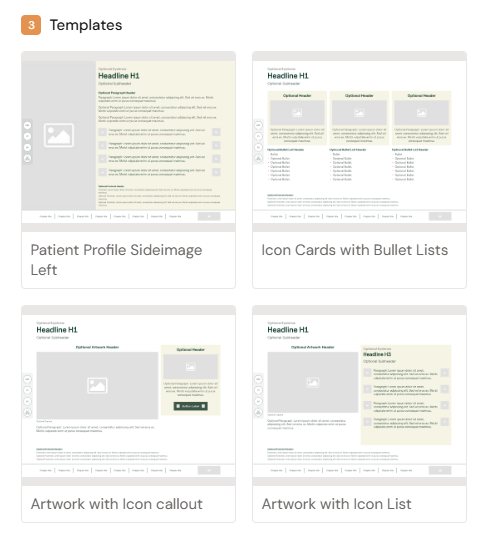
Templates
Templates are HTML designs used when creating new documents in Activator such as Email, Slides, and Briefs. They make it easy for the users to create content. They are typically built using available Layouts.
Templates can contain any HTML code, including web components. It's also possible to include JavaScript, CSS, and assets.
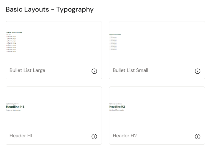
Layouts and Helpers
Layout and Helpers are similar to templates, but instead of being used to create new documents, they are used to add new designs and content to a document quickly. You could think of them as modular layouts for pieces of content inside a document that can be easily used to build out new templates or designs.
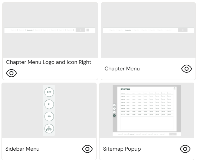
Slide Fragments
Slide fragments are similar to layouts and helpers, but instead of directly putting the content into the document where it's used, a fragment will only reference the file. This means fragments are great for content that should remain the same across documents, as updating a fragment will automatically ensure all documents serve the same content. They are often used for menus of different kinds and global popups.
Assets
Access to shared Assets, such as images and video. These are files that are available to any document connected to the Design System.
Configurations
The user interface for the configuration of Design Systems allows users to:
Define and add brand colors
View available fonts from typography settings
Create references
Preview inherited content (colors, layouts, templates, slide fragments, helpers)
Copy groups of inherited content for customization
Create new or edit existing content within the system
Configure global navigation (for slide-based content)
All other configuration is done outside the Activator UI and is typically performed by the team responsible for the design and setup of the Design System. This will typically be the job of a Brand Designer/Developer team.
Fusion Library
We will not go into details regarding the Fusion Library in this article. Should you want more information on this topic, please contact your Activator responsible team.
The Fusion Library is a folder in the Design System with code developed by Anthill that enables the connection between the content and the Activator application. It also provides the standard components and helpful tools for developers setting up the technical side of Design Systems, e.g., custom components.