
Add Interactions
Introduction
When editing slides or briefs in Activator, it’s possible to add interactions to elements. To add an interaction, select an element in the editor and click the ‘Interactions’ located on the right side next to the canvas.
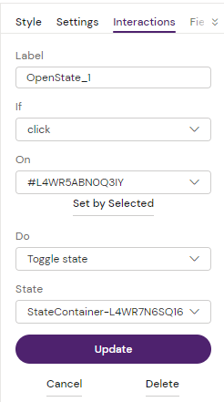
When clicked, a menu appears with the following options:
Once the action has been saved a mouse-click symbol has now been placed next to the element it was put upon in the Navigate menu:
Field description
Here is a description what the different fields mean.
Label
Add a descriptive label to the interaction so that you can easily find it again later.
If
In the if select menu you’ll find a list of events to react to in order to trigger the interaction. The most common is ‘click’ but here is a full list of the available ones:
click - mouse click on an item (standard JavaScript event)
dblclick - double click on an item (standard JavaScript event)
enter - when entering a state, e.g. opening a popup
exit - when exiting a state, e.g. closing a popup
focus - when an element is focused (standard JavaScript event)
blur - when an element loose focus (standard JavaScript event)
scroll - when scrolling an element (standard JavaScript event)
animationStart - when an element starts a CSS animation (standard JavaScript event)
animationEnd - when an element stops a CSS animation (standard JavaScript event)
transitionStart - when an element start a CSS transition (standard JavaScript event)
transitionEnd - when an element stops a CSS transition (standard JavaScript event)
dragstart - when an element starts being dragged (standard JavaScript event)
drag - when an element is being dragged (standard JavaScript event)
dragend - when an element stops being dragged (standard JavaScript event)
loadNotification - a custom event triggered when the slide is done loading
$custom - listen to a custom event created in web component
On
This is a reference to the element triggering the above if event.
The most common action is to select the element on the canvas then click on “Set by selected” which will add the ID of the element you selected.
When focusing the field, you’ll also see three options:
root - the slide root element, usually <article class=”slide”> element
$element - deprecated
notifier - a built-in notifier for the slide loading event. Used together with the ‘loadNotification’ event.
Do
If above element happens on the selected element, then something should happen. This is what we select in the do menu. Here are the options:
Navigate - select binder and slide to navigate to
Next slide - if slide is in binder
Previous slide - if slide is in binder
Apply state - select an available state to apply, e.g. open a popup
Remove state - select an available state to remove, e.g. close a popup
Toggle state - select available state to toggle on and off
Set states - select multiple states that should be active
Activate next state
Inactivate current state
Bounce animation - CSS animation
Fade-in animation - CSS animation
Fade-out animation - CSS animation
Pulse animation - CSS animation
Slide-in from left - CSS animation
Slide-in from right - CSS animation
Slide-in from top - CSS animation
Slide-in from bottom - CSS animation
To
This is the element the above event action should be applied to. Just like the ‘on’ element, this is by default set to the selected element. It’s possible to select any other element and click the ‘Set to by selected’ button.
When the field is focused, the following options are also available to select:
target - the ‘on’ element (the element that triggers the event)
$element - deprecated
$parent - the parent to the ‘on’ element
$closest - closest parent element matching query supplied, e.g. '$closest .slider'
$find - find descendent element matching supplied query, e.g. ‘$find .slider’
$children - find immediate children matching query, e.g. ‘$children .odd’
$slide - the slide element
$binder - deprecated
The to field isn’t always available to select from, e.g. if a navigation or state action was selected from the do options, then other fields will be displayed instead. Those other fields will allow you to select binders and slides to navigate to, or available states.
Actions
Bringing it all together it means that we have a formula like the following to define an action:
If [event] On [element] Do [action] To [element]
Examples:
Open a popup:
If click On #popup-button Do Apply state popup-info
Slide in some text from the left when slide loads:
If loadNotification On notifier Do Slide-in from left To #summary-text
Navigate to a slide in a different binder:
If click On #link-button Do Navigate [Remepan] [Overview]
Other Ways of Adding Interactions
Sometimes more advanced interactions, with delays and durations, are needed. Those can be setup in components. One component that is available for this is the State Container. It is a basic container element where you can apply effects. Currently the following effects are available:
fade-in
slide-left
slide-right
slide-up
slide-bottom
Duration and a delay can be set for the effects. It’s also possible to decide if the effect is active or inactive when slide loads.
It’s possible to extend state-container, or to build own custom effect components.
Limitations
It is not possible to use Interactions for binder/slide navigation for slide fragments such as this slide fragment side menu:
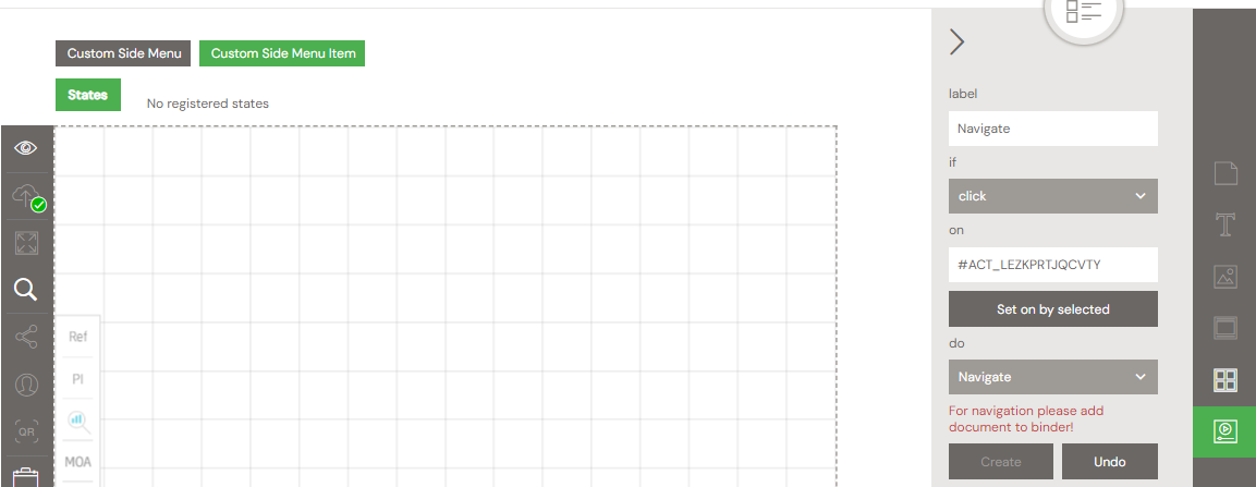
Instead, use the properties for the side menu item to navigate to binder ID and Slide ID:
.png?inst-v=c5a32e3d-d096-4281-978f-d06d88e43c09)