
The Activator Content Designer provides a layout builder that enables users with Designer role permission to build predefined page structures and layouts. By using the suite of available Activator containers, elements and style settings available in the Design System / Shared Ressource, the Content Designer can be used to create standardized content layouts like Call-To-Actions, Header and Footer Menus or FAQ’s. The Layouts created in the Designer are available for reuse and localization by users with Content Editor role permissions.
The Designer comes with a library of avilable containers and elements out of the box as part of Activator like a text element, image container, button element or divider. Each container or element has individual styling options and settings available from the Shared Resource, to easily apply the desired page structure, visual identity and branding to the layouts. You can read more about the available components in the List of Standard Components & their use
-
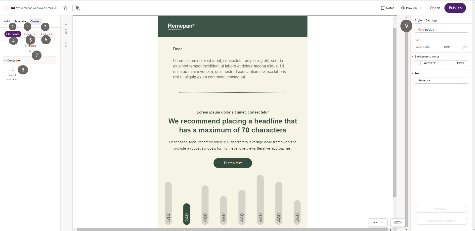
Add section will showcase the available library of elements from the Shared Resource. In the add section you will also find your available Layouts if any has been created within the Shared Resource. Elements and Layouts can be drag and dropped into the layout canvas.
Layouts in Activator can only be created with the Designer and is a way to create predefined page layouts and structures that helps you build your Emails Faster. For more information on Layouts please visit Creating Layouts -
Navigate illustrates the entire page structure of the content piece that is open in the Designer, and the elements it has been built from. It is possible to navigate between the different containers and elements by clicking on them in the Navigate page structure.
-
From the Content menu it is possible to import different pieces of content like content modules from Veeva Vault PromoMats, Media assets either local or from Vault or content type dependent assets like email fragments or slide fragments.
-
Elements shows the available list of elements or containers that can be added into the canvas, depending the container or element you are currently navigating.
-
Layouts shows the list of available Layouts in the Shared Resource. Layouts are described in the section on Creating & Editing Layouts
-
Helpers shows the list of available Helpers in the Shared Resource. Helpers are described in the section on Activator Helpers
-
By clicking the Add and Elements tab this section shows the container or element you are currently navigating.
-
By clicking the Add and Elements tab this section shows the list of available containers or elements that are possible to add to the layout canvas as a result of the container or element that you are currently navigating.
When navigating between different containers or elements, Activator automatically renders the list of available containers or elements that are possible to add to the layout canvas. The list is generated as a result of the container or element that is currently being navigated. As an example, navigating to a Row Container would render the Column container and Group Container in the list of available containers, as these are the only containers that can be added to a Row Container. -
Style and Settings show the available styling options and settings of the container or element you are currently navigating. Find more information on Values in input fields (Position, Size).