Creating & Editing Layouts
This page introduces the concept of Layouts and how to work with them.
Learn more about how to work with Layouts if you are a Content Editor here: Activator Content Editor | Add-Panel
What are Layouts?
Layouts are reusable modular design objects that a Designer has created for Editors to use when creating their final content pieces. Typical Layout elements could be call-to-action elements, chart containers that include captions and summaries, accordions or FAQ boxes. Layouts are created by Content Designers to be re-used by Content Editors who are able to drag Layouts into their content and fill in data in the predefined content areas in the Layout, toggle fields on/off and much more.
Types of Layouts?
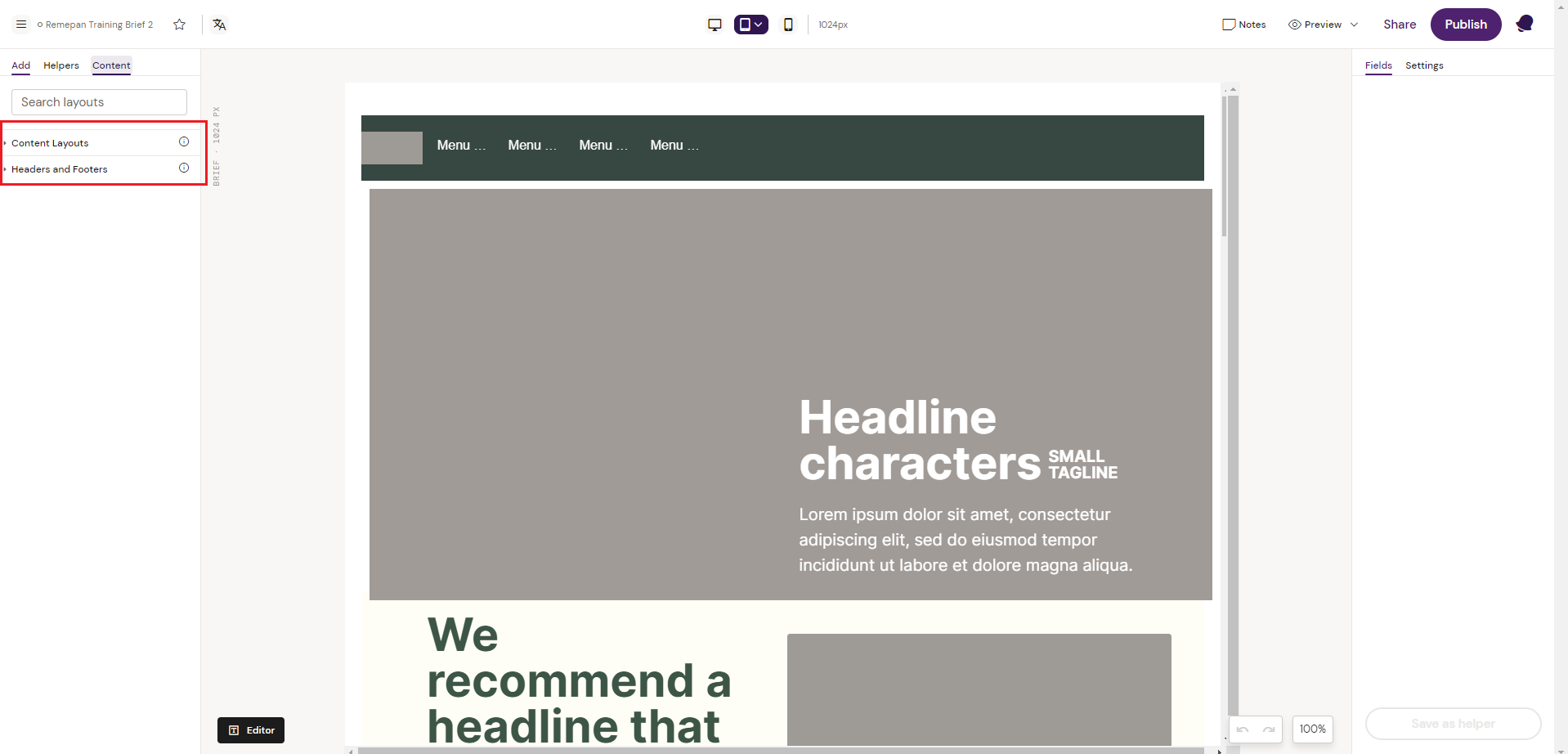
When creating and structuring your Layouts it is recommended to group your Layouts into categories, to make it easy for the Editors to navigate and find the right Layout. It is recommended to group your Layouts into categories depending on where these Layouts would usually sit during content production.
In the example below, the different Layouts have been grouped into “Content Layouts” and “Header & Footer Layouts”. This structure makes it easy for the Editor to quickly navigate and find the right Layout, depending on the region in which the Editor is creating content for.
Notice how the Layout has been generically designed with placeholder text and image. Remember that Layouts are created by Content Designers, to be used by Content Editors. In this process the editors will use the Activator Editor to assemble different layouts into final content pieces and replace the text and images to transform them into production content.
Types of Layouts
Header Layouts
Header Layouts are typically Layouts that would sit in the content top/header region. In the below example, a Site Header Layout has been created to add a top navigation bar to content pieces.
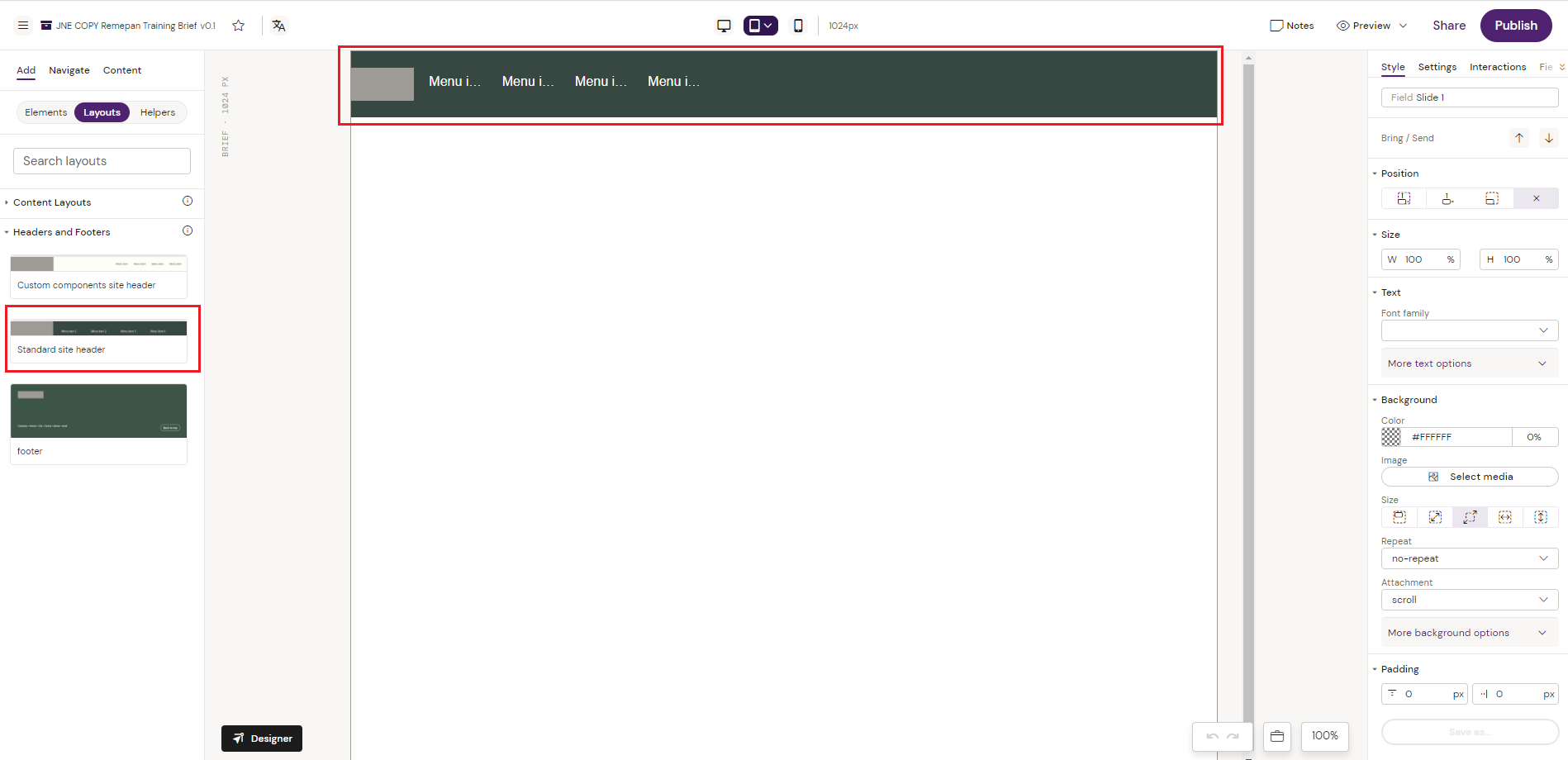
Site Header Layout
From the “navigate” tab the element structure of the actual Layout is shown. The Layout has been created from a Row/Grid structure with columns placed inside the grid to add a logo placeholder and 4 menu items.
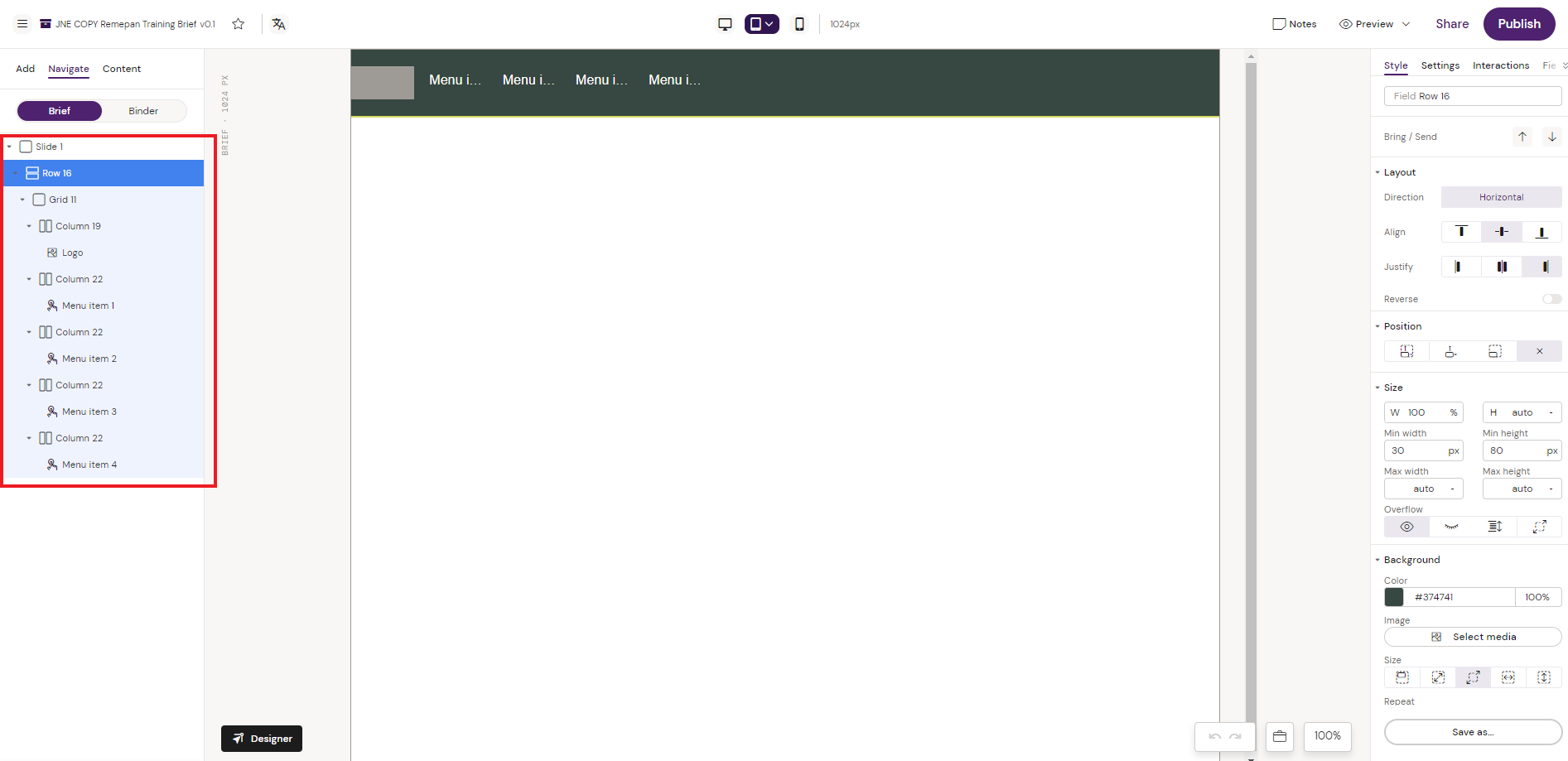
Site Header Layout Structure
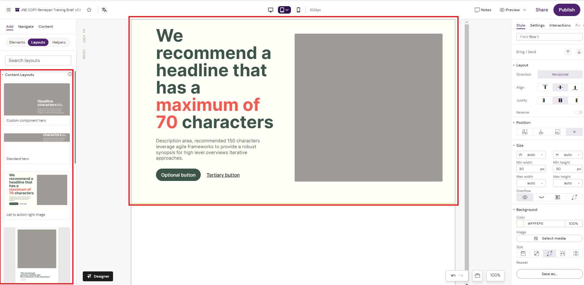
Content Layouts
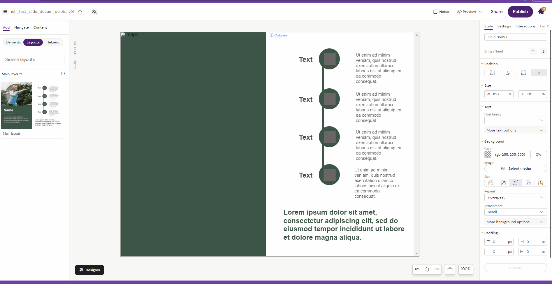
Content Layouts are typically the Layouts that are placed in “content” area which sits between the header/footer region. Examples of Content Layouts could be Hero’s, Callout Statements, Call To Action Right/Left Image, Centered Call to Action and much more. The list and options are almost endless and the Layouts can be created to fit any detailed and specific requirements if needed.
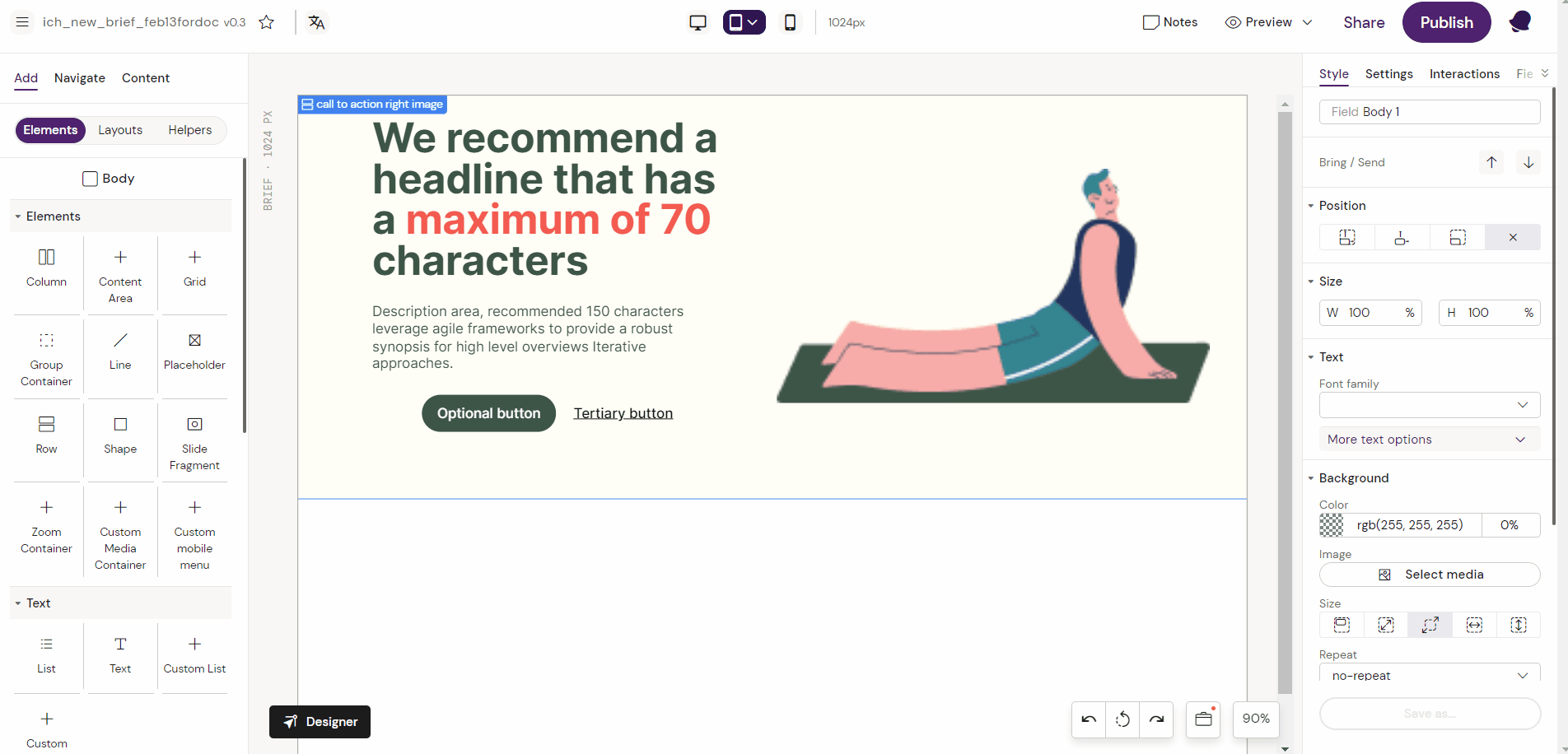
The example below shows a Call To Action Right Image.
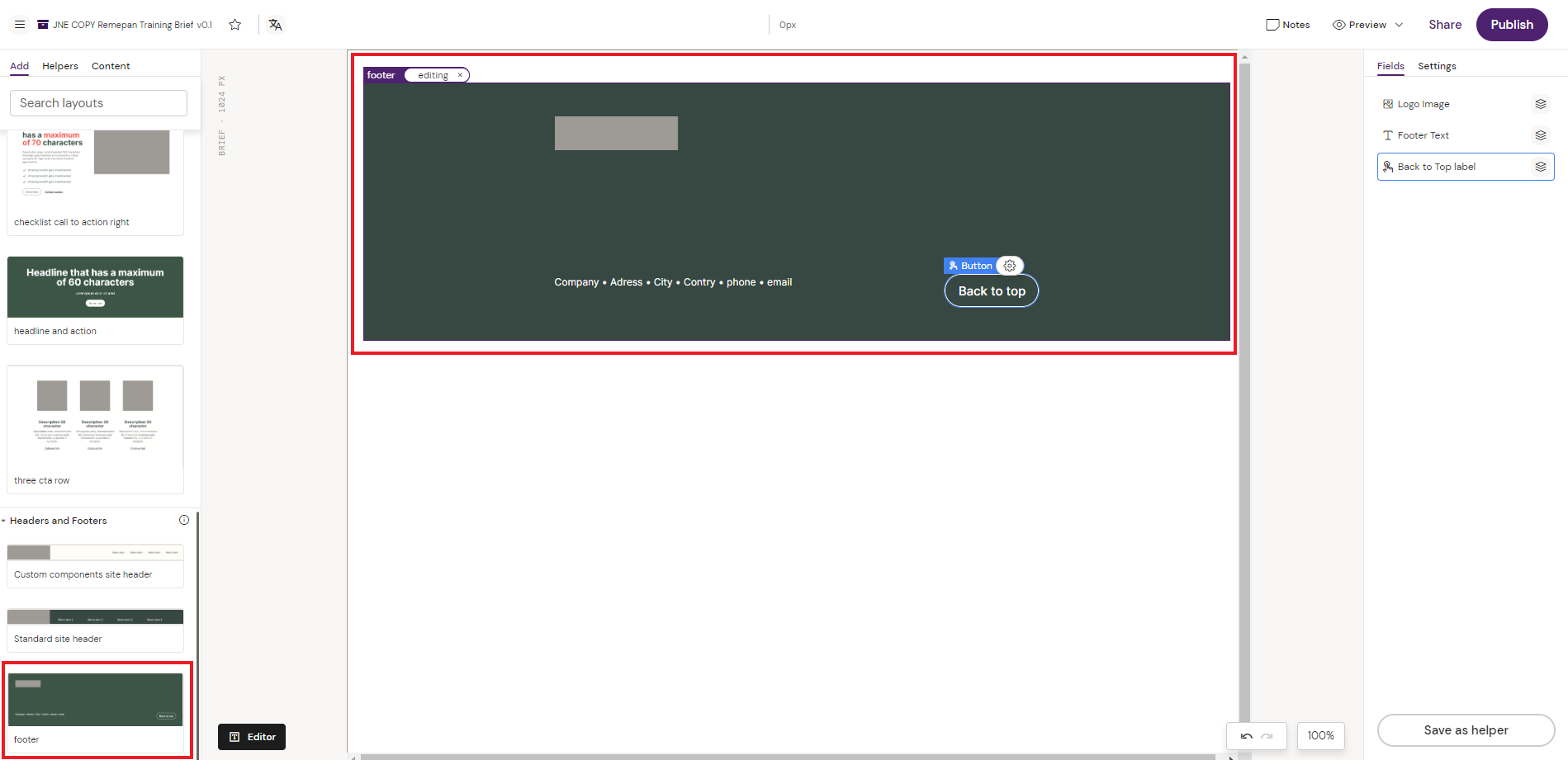
Footer Layouts
Footer Layouts are Layouts that would typically sit in the content footer region. In the below example, a footer Layout has been created, which includes the footer region look and feel, some meta data text fields for adding contact information and a image field for adding a logo.
Creating and Editing Layouts
To create and edit Layouts, you need to have the right permissions to enter the Designer in Activator. The Designer is a Layout builder that enables you to create generic reusable Layouts. The Designer has a suite of different tools for creating the desired Layout. You can read more about the different components available in Activator here List of Standard Components & their use
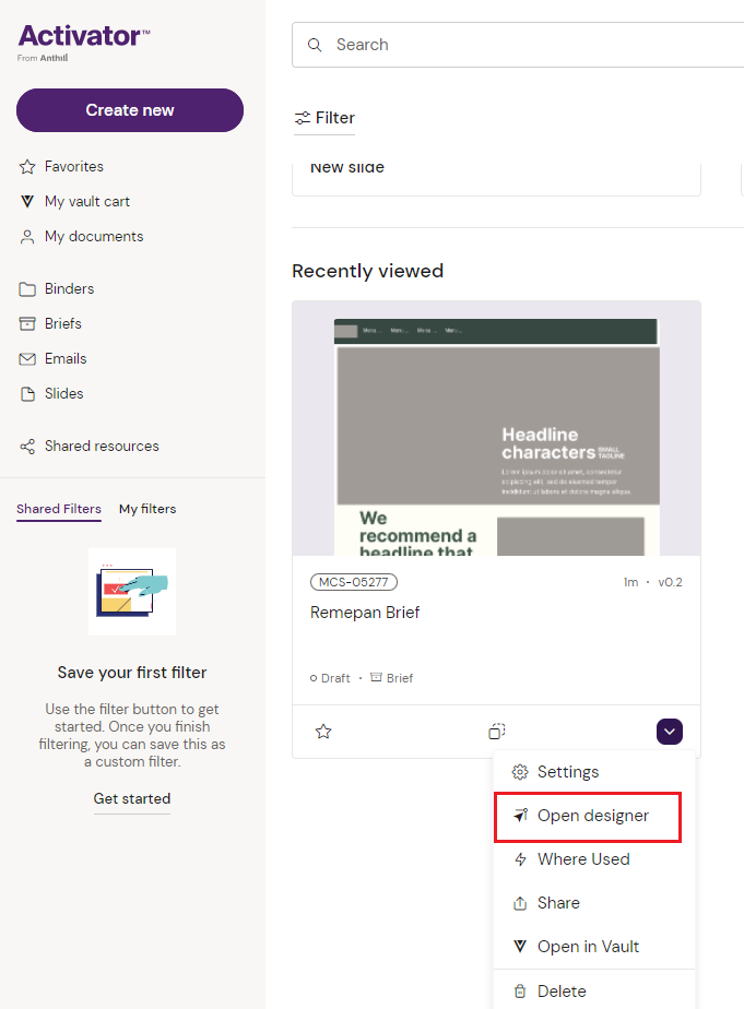
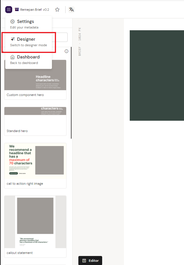
Open Designer
To enter the Designer you can either search for your content from the dashboard and click “Open designer” from the dropdown
Or you can open the designer from the editor view by clicking the top left burgermenu
Build the Layout
The designer has a suite of components available that can be assembled into the desired Layout. Each component can be individually configured to apply the desired branded look and feel, as well as being equipped with required the fields for text and images. To learn more about the available components in Activator, please visit List of Standard Components & their use or Email Components depending on which document type you are building layouts for.
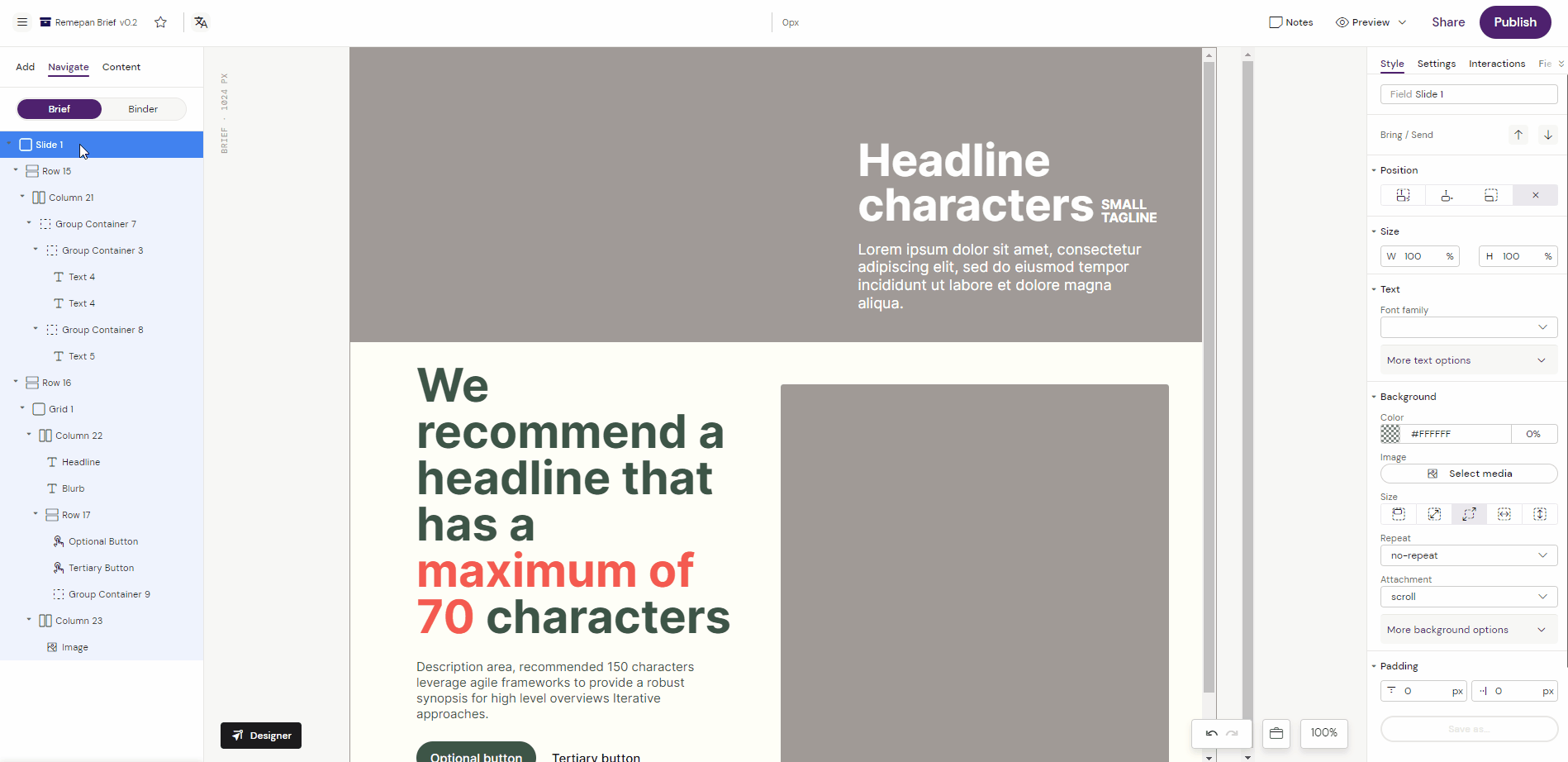
In the below example, we are assembling a Hero Layout that should go into the available Content Layouts for Briefs in the Design System.
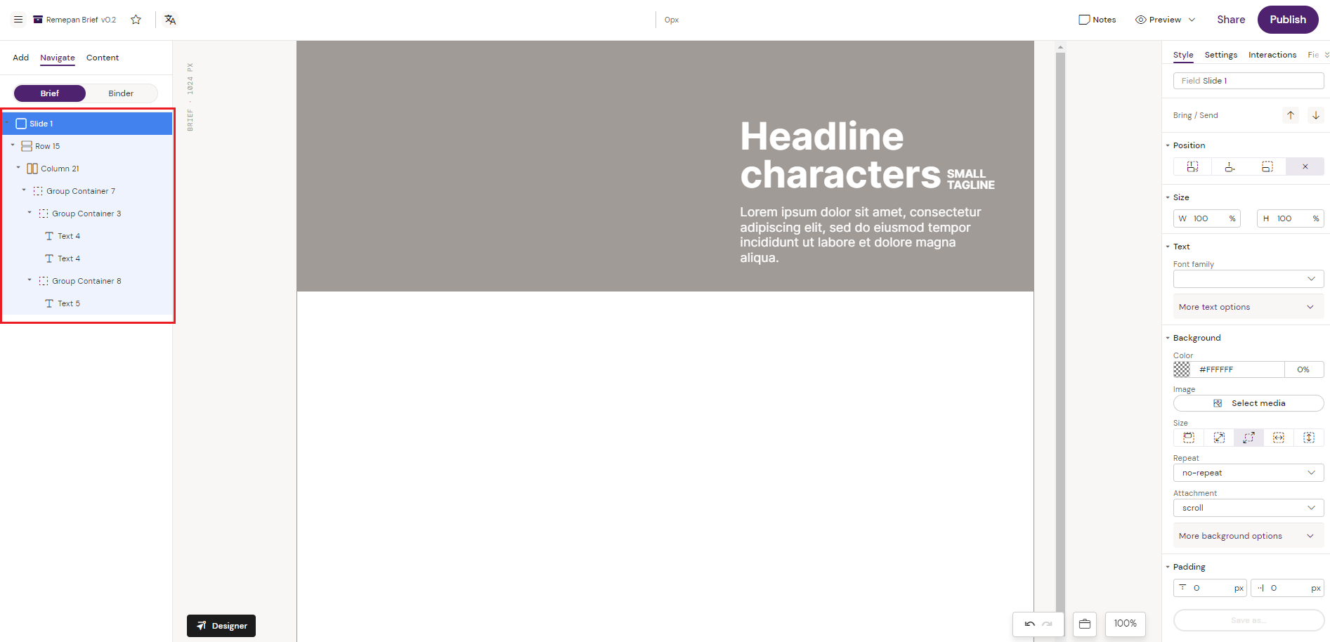
The Hero Layout is assembled by using the standard components in Activator, and is build in a Row/Column structure with Group Containers that have Text Components added in the containers. Adding components like text and images into a Group Container, makes it easy to move the components that are placed inside the Group Container around as a single object.
Save the Layout
Activator only allows to save an element structure that is placed inside a Row or a Layout Container, depending on which content type you are creating the Layout for.
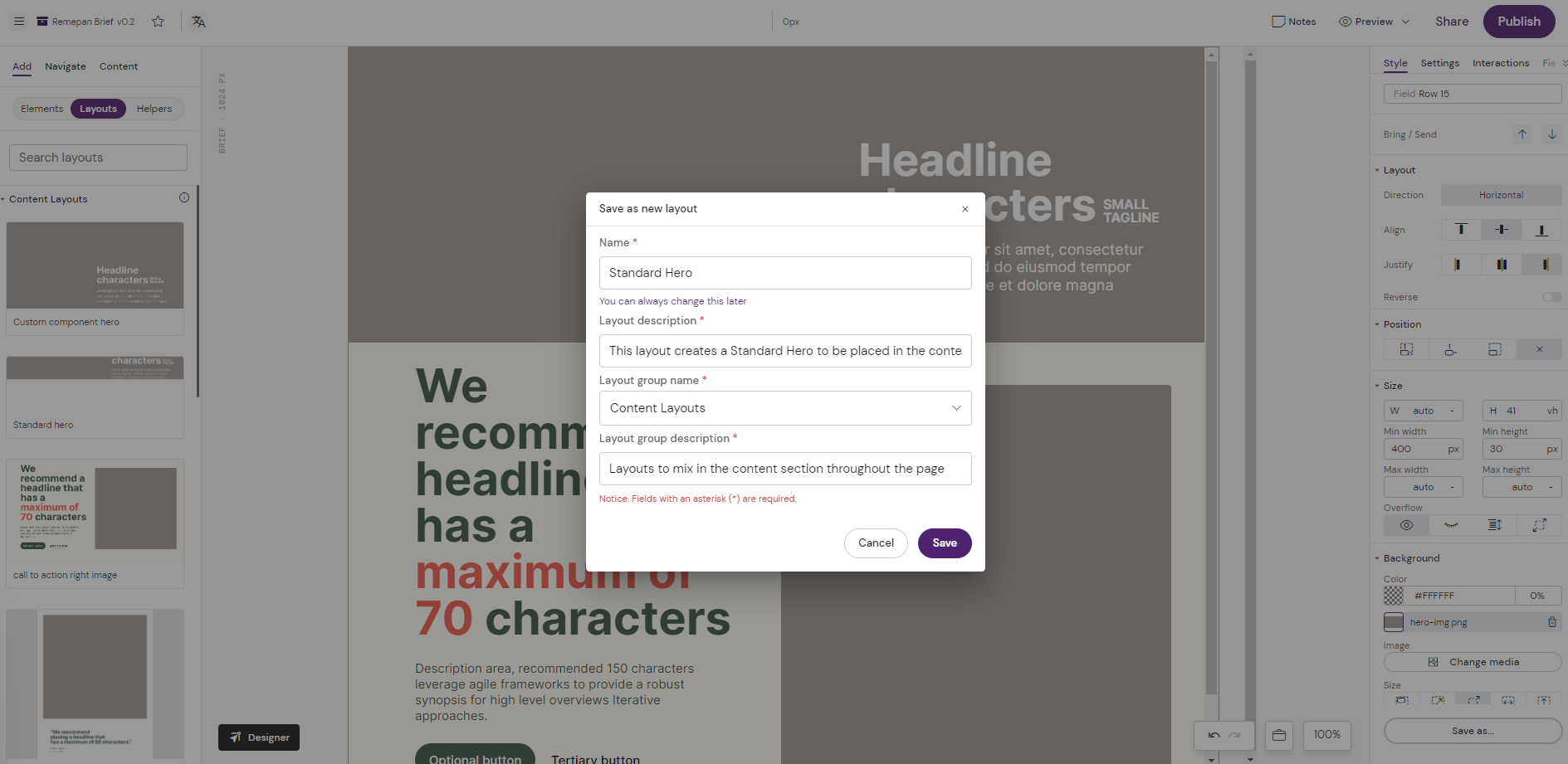
To save a Layout, you always have to navigate to the top Row or Layout Container in the element structure you want to save as a Layout. As illustrated below the “Save as” button is only enabled when navigating to a Row.
Select the Row which has the element structure placed inside that you want to save as a Layout.
Click on the “Save as” button in the right bottom corner and pick “New Layout”.
Fill on the meta data for you Layout
Name e.g. “Standard Hero”
Layout description e.g. “This layout creates a Standard Hero to be placed in the content section.”
Layout group name e.g. “Content Layouts”
Layout group description e.g. “Layouts to mix in the content section throughout the page”
Click “Save”
Your Layout is now available in the Editor and Designer and can be reused across the Design System for the specific content type is was created for (Brief, Email or Presentation)
Deleting an Element
In the Designer, the popup points out which element will be deleted.
Previewing Document Thumbnail
After editing the layout i.e., importing a new image and publishing, you could see the document thumbnail from Activator Dashboard or Settings Modal.