Overview
The Activator Content Editor is used by most users to create Briefs, Emails and Slides.
It provides an intuitive UI that allows you to build your final content piece by assembling Layouts and Helpers, as well as import and link your Modular Content and Vault media assets.
The Burger Menu
Starting from the top left corner, we have the Burger Menu. You can use this to open The Settings Panel for your document, return to The Activator Dashboard or switch between Designer and Editor mode if you have access to both roles.
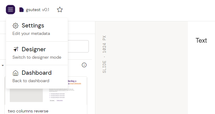
You can learn more about User Roles by visiting the User Roles in Activator page.
The Bring-in panel
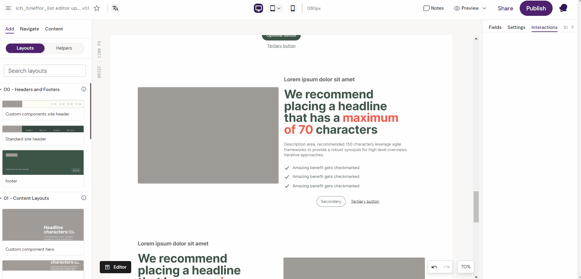
The bring-in panel contains the ability to work with different types of content assets, Layouts or Helpers. It contains the following sub-panels: Add, Helpers and Content.
The Add Panel
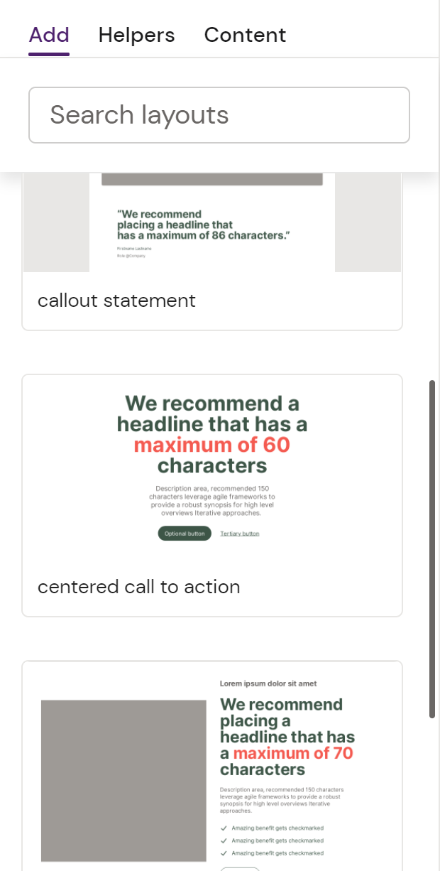
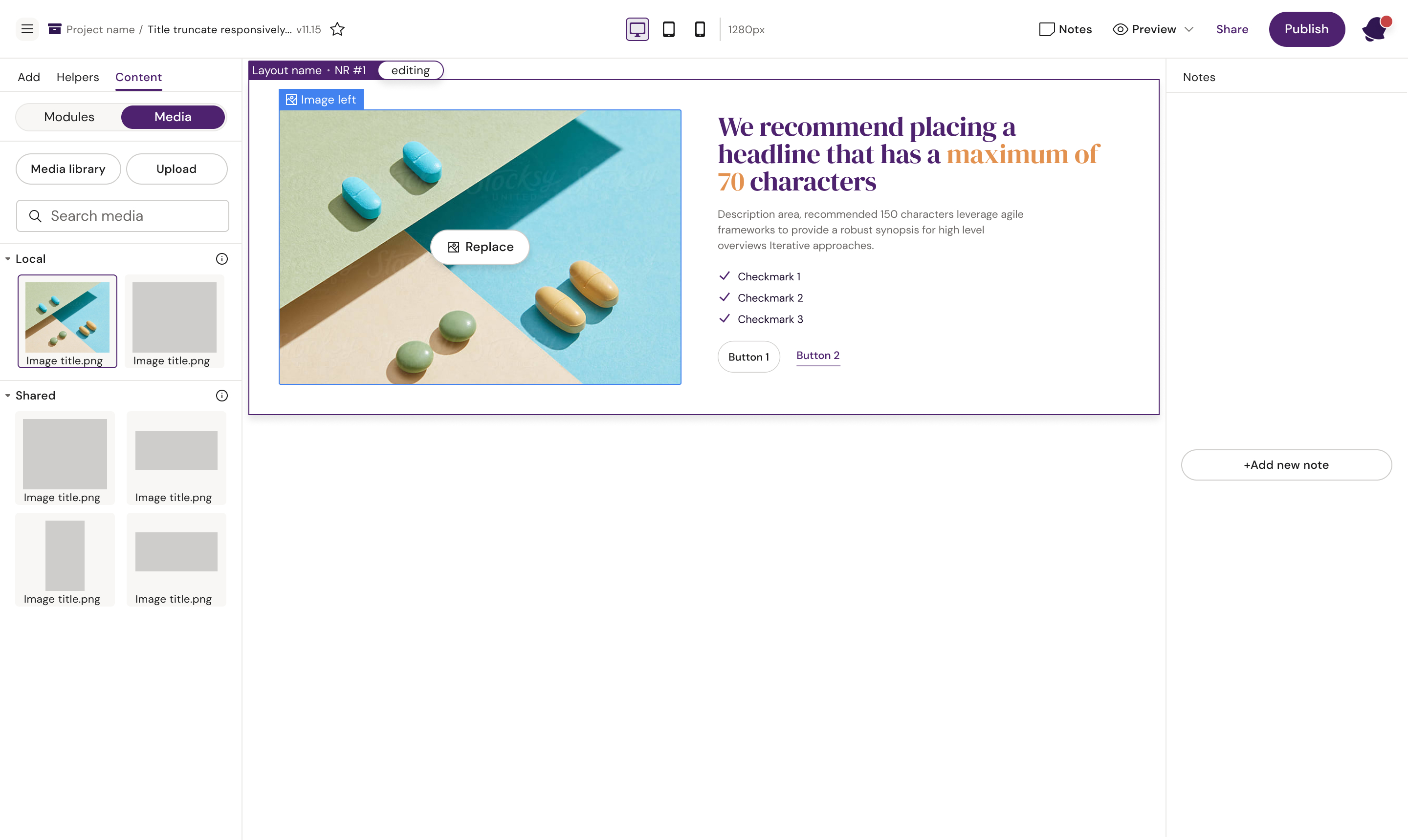
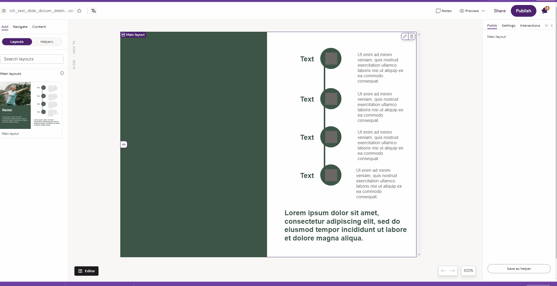
The Add Panel is where you find your available Layouts.
A Layout contains visual elements that have been composed in line with your Brand Guidelines, and are ready out of the box for you to add your text and media to.
You can use the Search Layouts input to filter your available Layouts or expand and collapse the Layout Groups in the Add menu.
Drag and drop a Layout from the Add panel into your content area to add it and begin editing.
Layouts can be created by Designers and reused by anyone. They are tied to a Shared Resource, and the specific document type it was created for.
Each type of content you manage in your Design System (Slides, Emails and Briefs) has their own list of Layouts and Helpers.
Who can create a Layout
The creation of Layouts usually sits with a user which is allowed a Designer or content creator role within Activator. This means that there’s a distinction between “Content creator” users that are allowed to create Layouts and “Content editor” users that are only able add or edit content in the Layouts. The permission schemes and roles in Activator might differ depending on the Activator and PromoMats configuration in your organization.
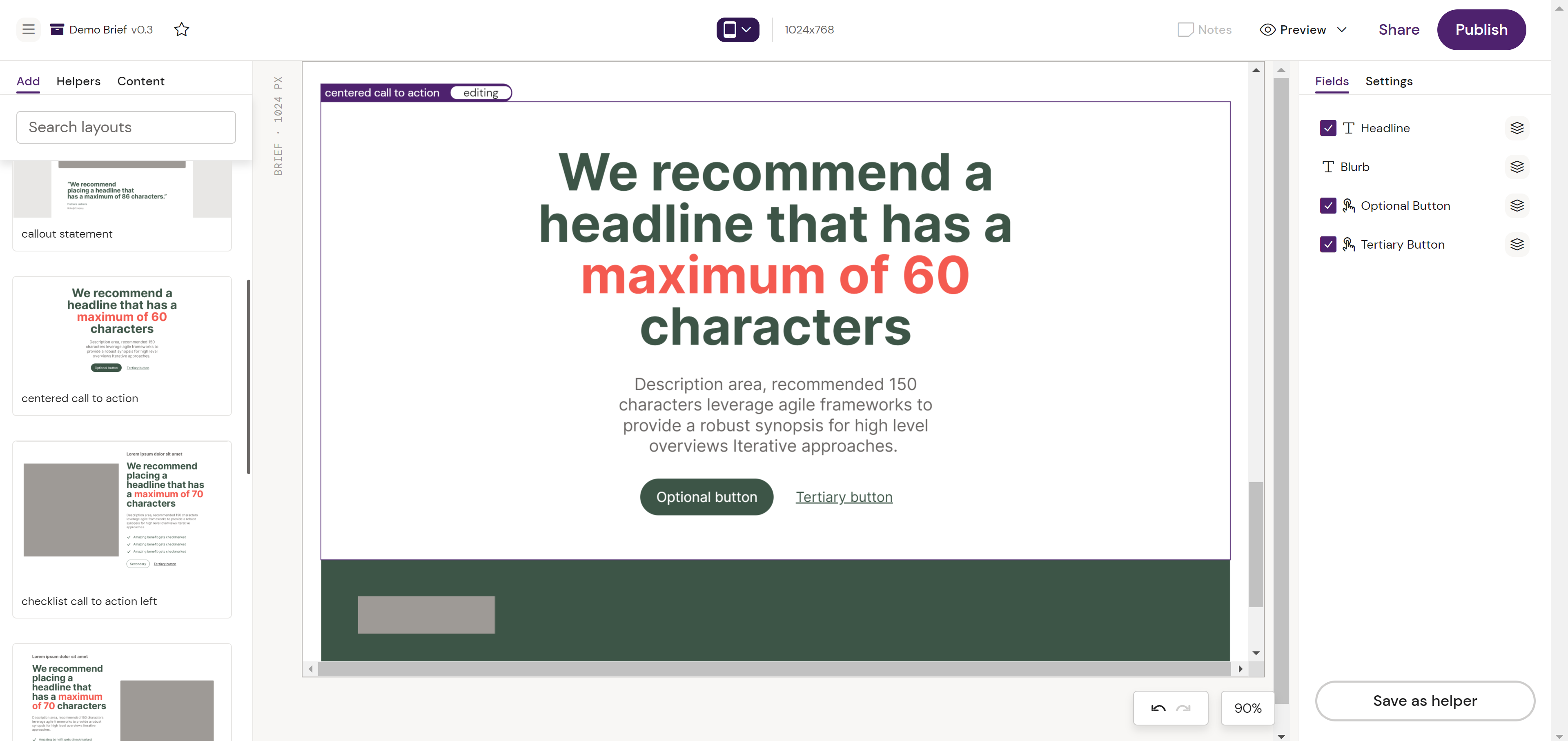
Adding Content to your Layout
Once you’ve added a Layout to your Slide, Email or Brief, you can double click into it to change text, or replace images.
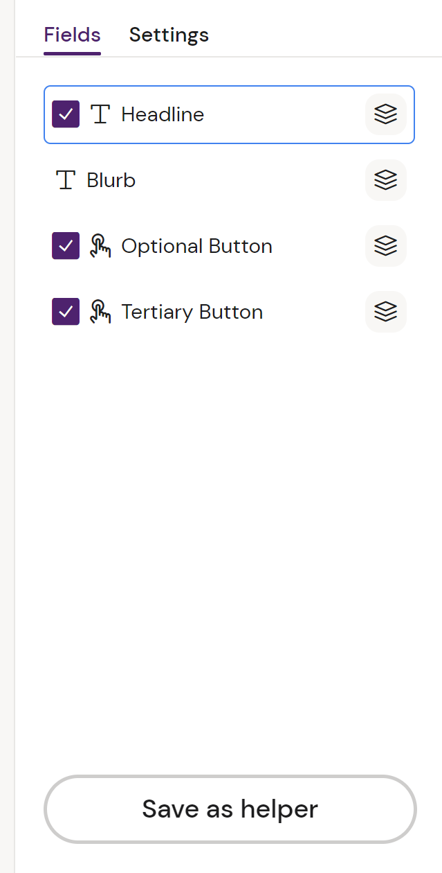
You can use the Checkbox icon to the left of the Field name to show & hide a particular Field if the Designer has made it optional
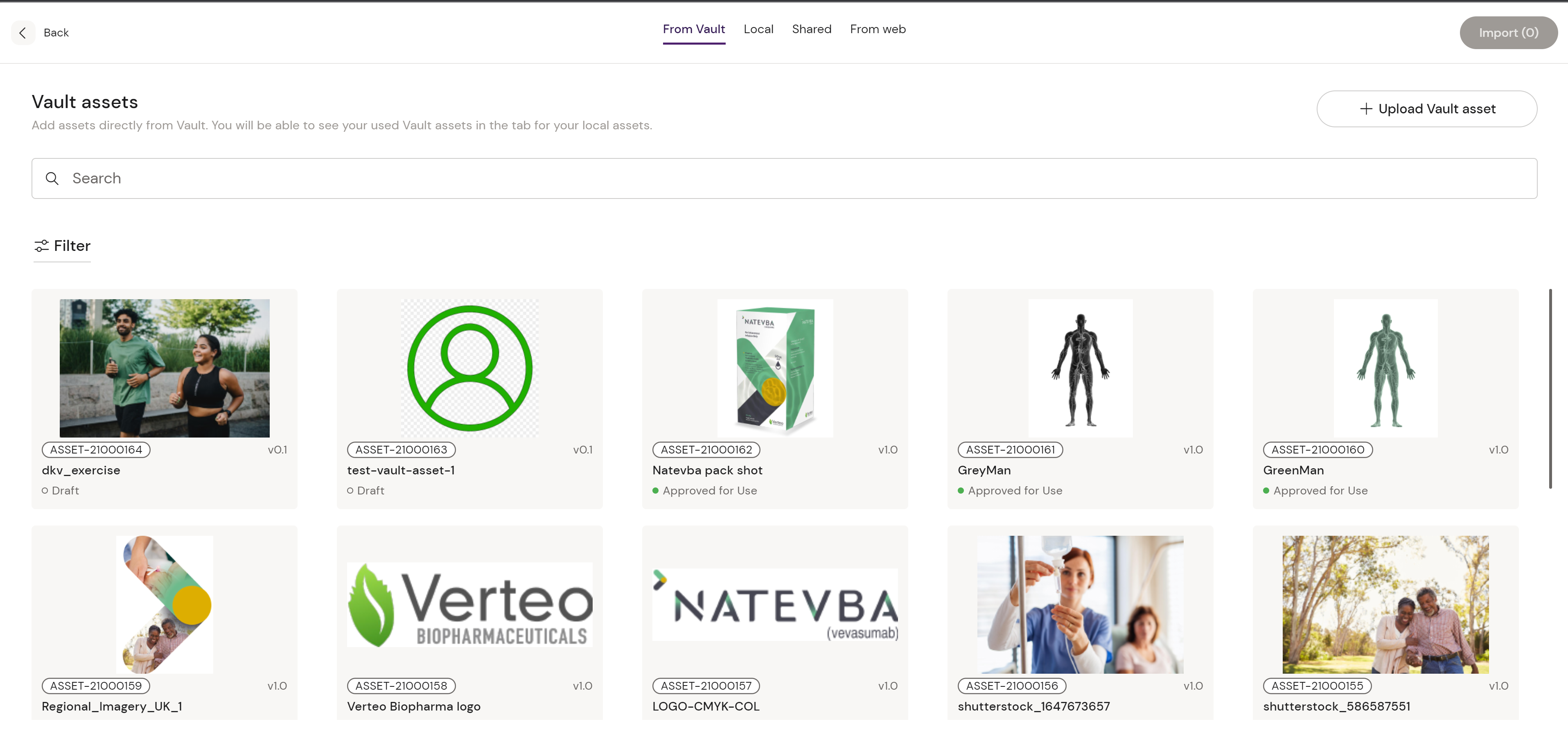
You can also use the Modular icon to the right of the Field name to bind Modular Content to your Layout Fields.
New Layouts are created in the Activator Content Designer by users with the appropriate user rights - typically this might be your Creative Agency or Content Factory team.
When a Layout is created the Design System you are using, it becomes immediately available via the Add tab.
Add/Remove New field property in a Layout
In the Editor, you can add/remove more fields into a Layout from the Right Panel. For example, the feature allows users to add additional list items and remove them again as a Brief or Slide Editor.
Deleting a Layout
In the Editor, the popup points out that a layout will be deleted. Also, the specific layout that is currently selected is still pointed out in the right side-panel.
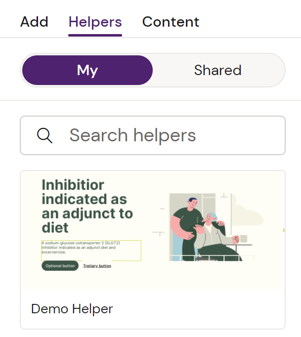
The Helpers Panel
A Helper is a Layout that you’ve filled in with Content and would like to reuse in other documents.
As a Content Editor, you and your colleagues can save Helpers to reuse and share as you create your content pieces.
Helpers that are linked to Modular Content will stay linked, letting you reuse that Helper and it’s relationship to your Content Module in the next document you create without needing to re-import that Module!
Working with Helpers
Step 1 - Add a Layout
Step 2 - Add your Content
Step 3 - Save your Helper
Done!
The Content Panel
Content contains access to your different types of assets that you’ll want to use in your Layouts: Video, images and modular content. If you open the panel, you’ll see two different sub tabs for you to choose: Modules and Media. Modules is your access to import Modular Content and Media gives you access to drag in and use approved and un-approved assets.
The Modules View
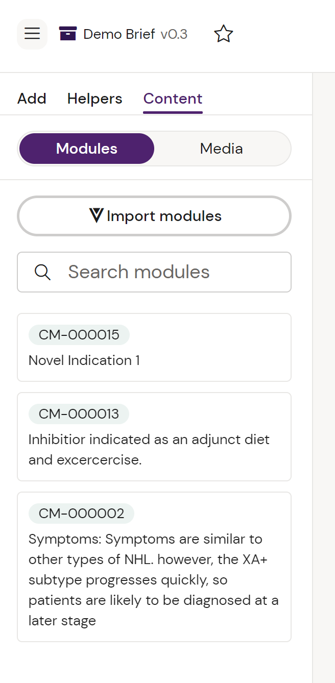
If you have available and imported Modular Content, this panel provides an overview of each module.
You can also import new modules that you might need by clicking the Import modules button.
Until a module is imported, it will not be available for mapping in any of your Layouts.
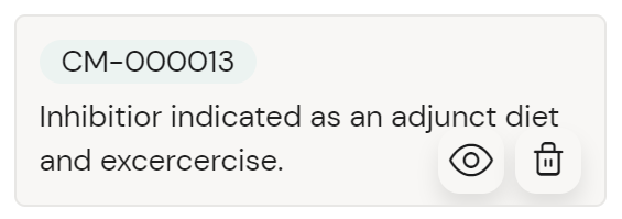
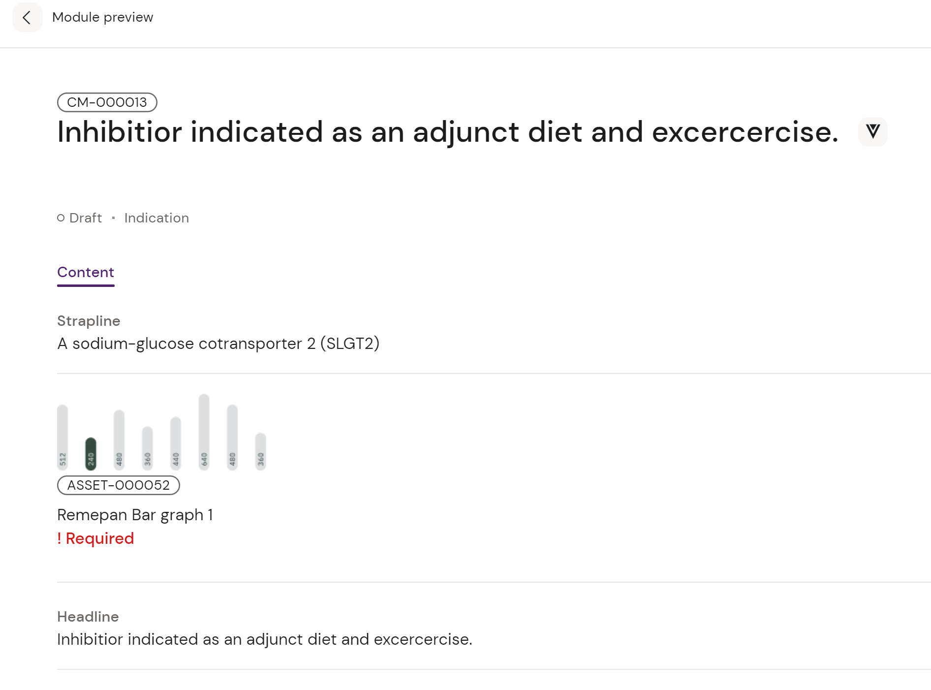
If you have imported a Module, you can preview it easily by hovering your mouse over it and clicking the Eye icon.
The Media View
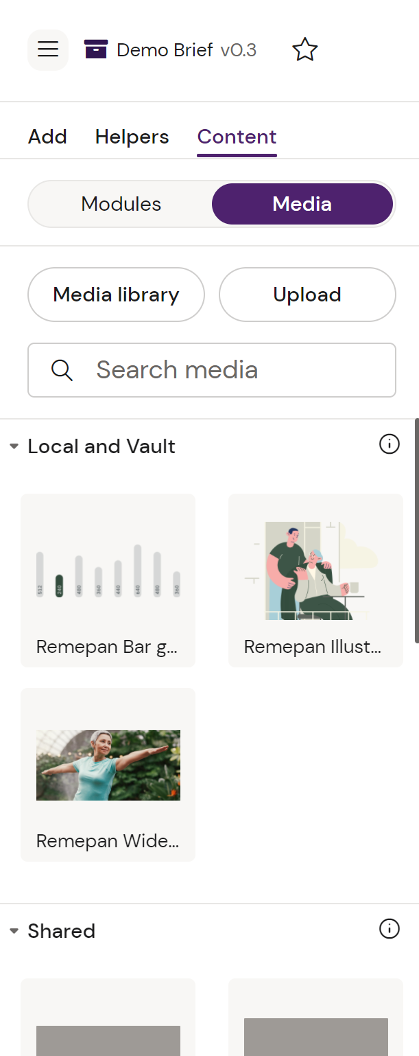
The Media view gives you quick access to your Media Library and upload of new local assets that you might want to use.
You can Search media that you’ve imported by name, and see which media assets are imported from Vault or are available from your Design System.
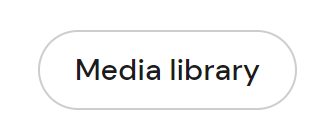
Clicking Media Library gives you a quick overview of the available media assets from: Vault, Local and Shared, as well as “From Web” where you can add an asset from a third-party source via a URL.
Tailor panel
The tailor panel on the right of the screen contains the following tabs: Fields & Settings.
These become available when you select a specific Layout in your document.
Layout Fields are the editable parts of the Layout, such as a Headline, Description area or Image placeholder.
The Fields Pane
The Fields Pane gives you the ability to select specific fields from a list and add content to specific fields through the Modular Content icon, as shown in the figure above.
You can also just click the Layout in the content area and the Field you’ve clicked on will be highlighted.
The Settings Pane
Here you have two different settings available: Name of the Layout and a Description field, which is valuable if you want to add specific usage descriptions, rules or any other specific descriptions related to the Layout.
These are currently set by the author of the Layout in the Design System.
Responsive controls
Notes
Notes are specific annotations you’d like to add, where you can reference other team mates and provide guidance and comments specific to a Layout.
You click the notes menu item in your navigation bar to enable Note-mode:

When Note mode is active, your mouse cursor becomes a note. You can now click anywhere in a Layout to leave a note.
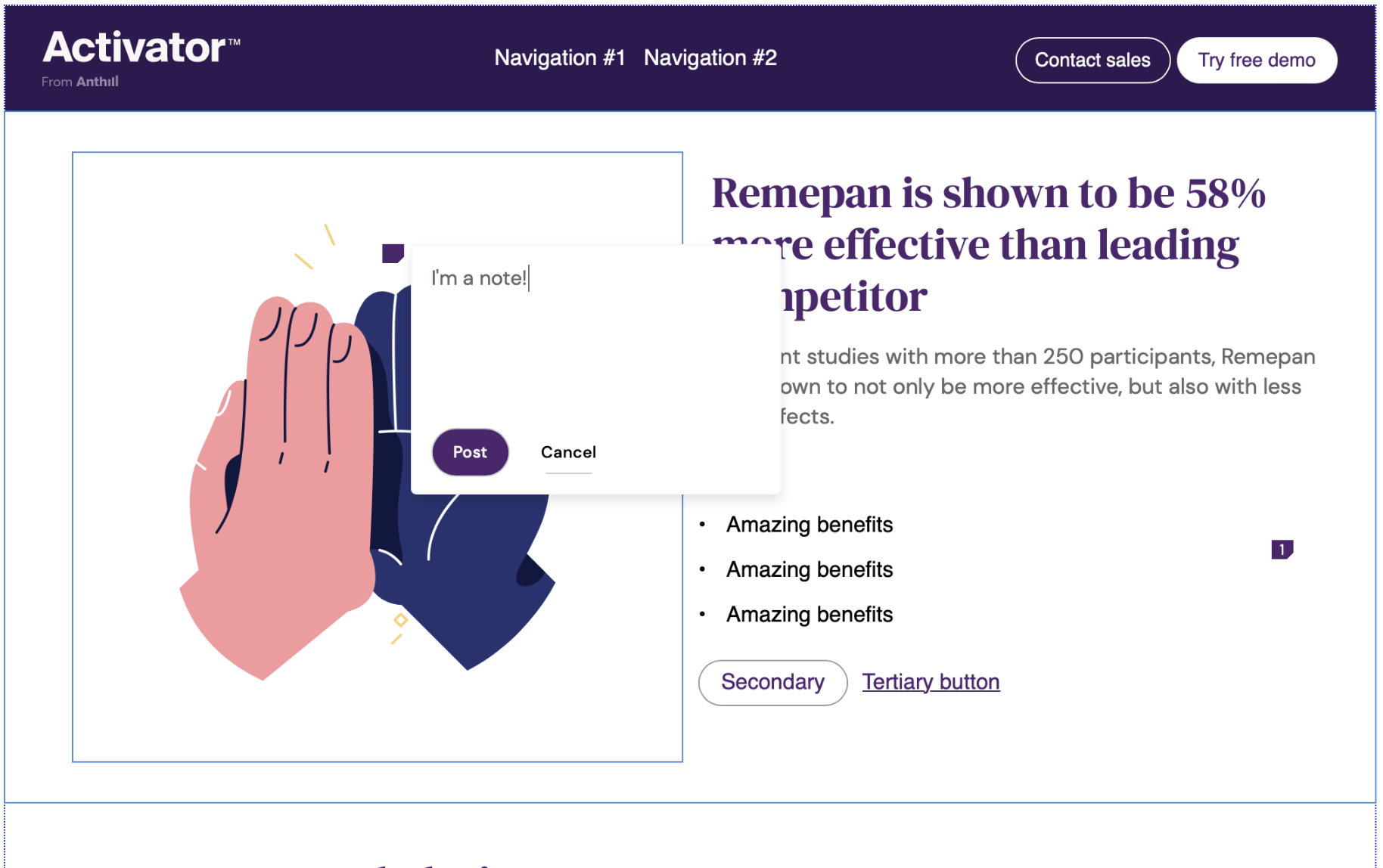
or select ‘Cancel’ should you want to cancel this action.
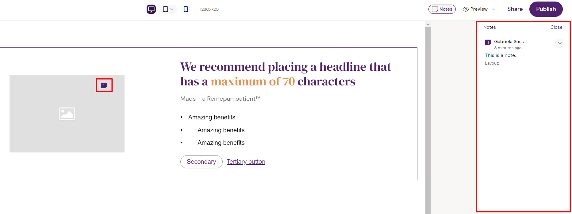
When your note is posted, it becomes visible in the right side panel. If you want to notify a user of the note, type “@username” and you will be able to select the appropriate user and tag them in your note. They will then receive a notification to call their attention to this action.
Tagging users is not yet available and are awaiting release in 2022. Please check your current version of Activator or the latest Activator release notes for availability.
Editing or deleting existing notes
If you want to remove any existing notes from your content slide, first select the ‘Notes’ button from the top right of your Slide Editor view. This will highlight the ‘Notes’ button and reveal all the notes that exist for your slide, and list them in the right-most column. You can also see a visual representation of where the note is placed on the slide.
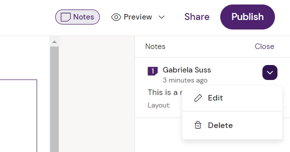
To manipulate an existing note, select the drop-down arrow next to the relevant note. From here you can choose to either edit or delete the note.
Please note that in Slides, responsiveness is only available if your current Design System supports it. Please refer to the settings of your currently attached Design System.
The responsive controls are located in the navigation bar in the middle. Here you can change between different view modes to test and adapt your Layouts to specific devices and viewport sizes.
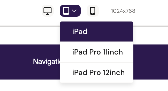
Clicking different viewport icons changes the viewport size in your Editor screen area and enables you to work with them individually.
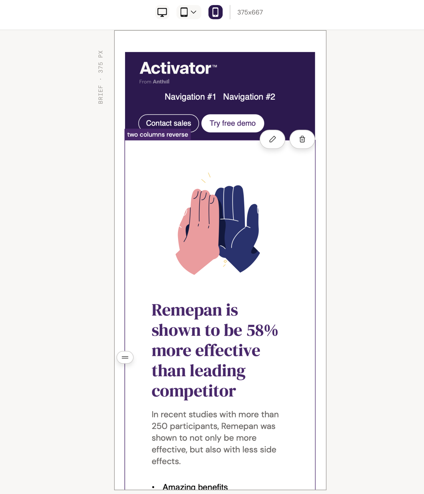
Normally, your view will be adjusted to match the device that you are currently editing the slide on. If you want to change the resolution to a different device’s size, click on the relevant icon.
Typically you will be able to choose between:
-
Desktop (1920x1080 px)
-
iPad
-
iPad (1024x768 px)
-
iPad Pro 11” (1194x834 px)
-
iPad Pro 12” (1366x1024)
-
-
Mobile (375x667 px)
This will shrink or expand the view port to match the break point of the selected device.
Previewing Content
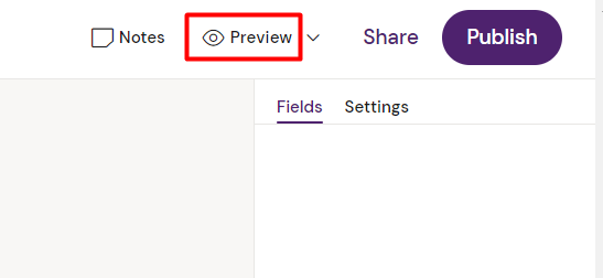
To hide some of the Activator User Interface and preview your slide in full, click the ‘Preview’ button in the top-right corner of the Slide Editor view.
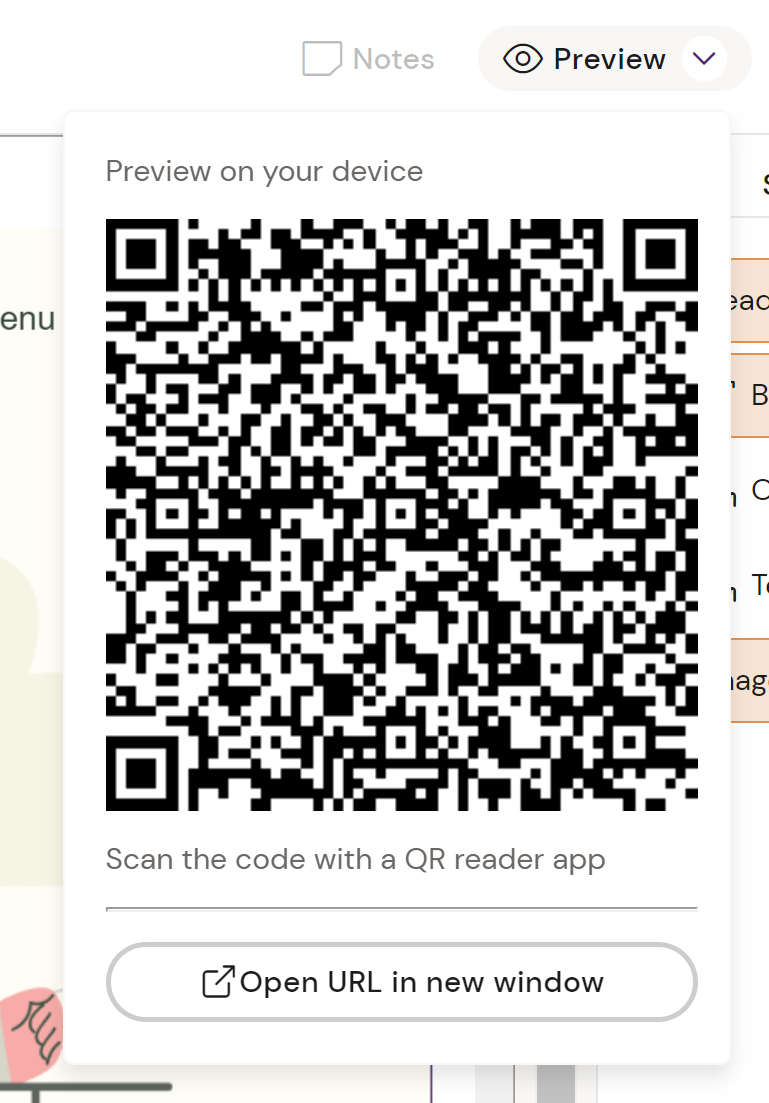
If you want to preview your content on a different physical device, you can use arrow next to the ‘Preview’ button in the top-right corner of the Slide Editor view.
This will expand the section to display a QR code.
Scan the QR code with the camera of the device that you want to view the content on.
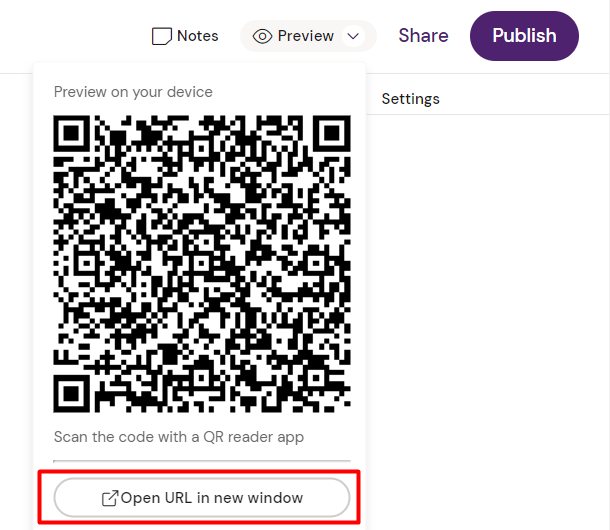
Alternatively, you can also click the arrow next to the ‘Preview’ button to expand the section with a few more options. Click on the button ‘Open URL in new window’ to get a full preview of the slide free from any of the Activator User Interface.
Share Content
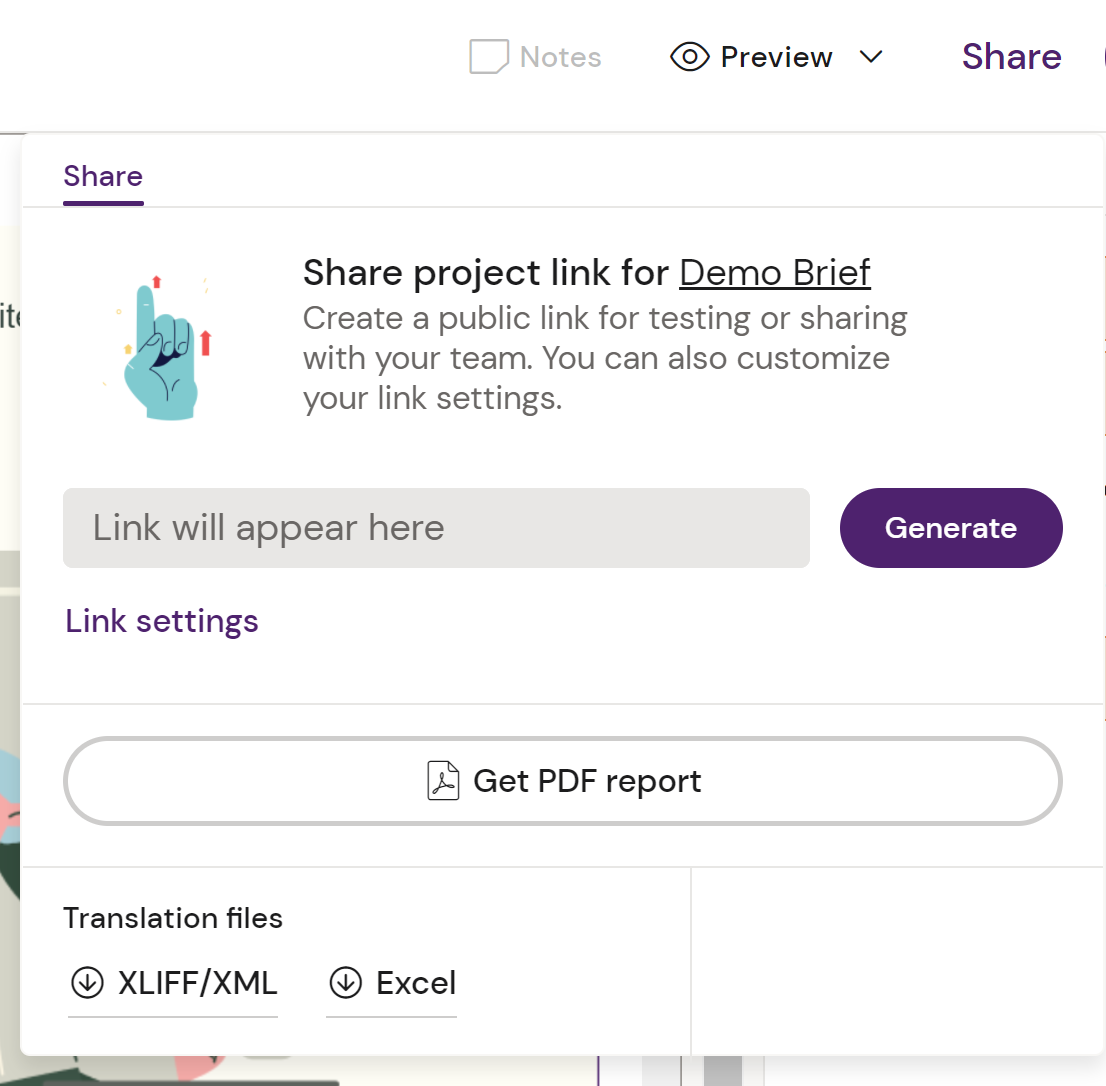
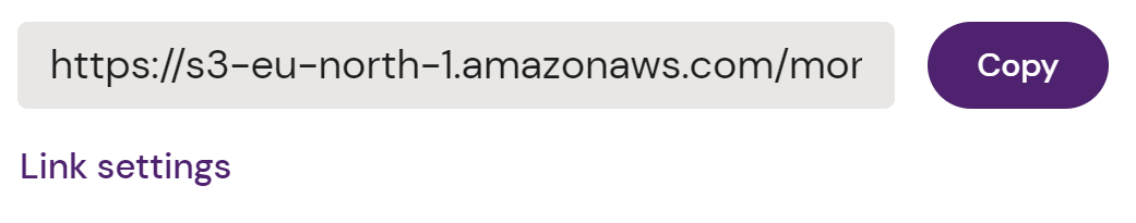
Link Sharing
The Share button in the Top Menu allows you to generate a Link for your content that you can share with colleagues. You can set whether this link expires or requires a password.
PDF Report
You can click Get PDF Report to have Activator create a PDF of your content.
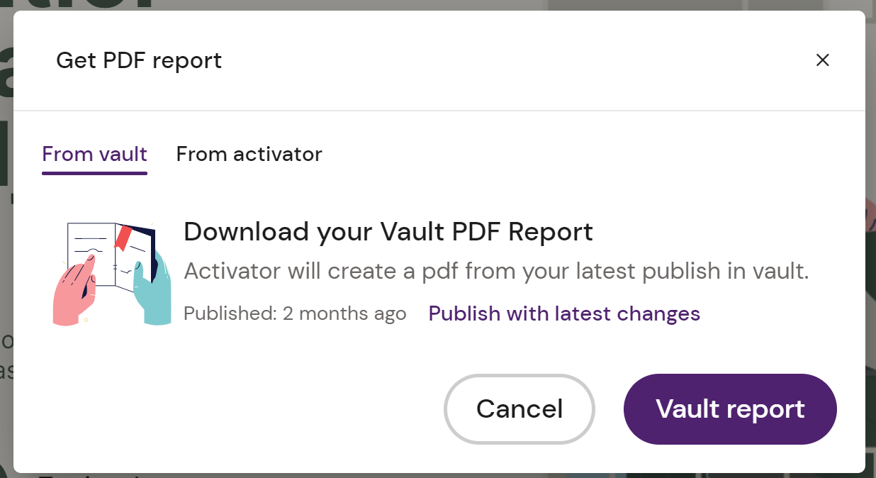
You can decide if the PDF is created from the version you are currently editing, or should be based on the latest version saved in Vault.
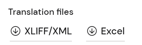
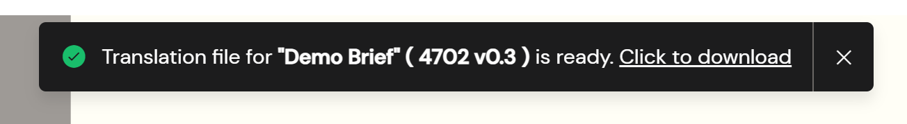
Translation Files
You can also export the text from your content as XLIFF or Excel. This can then be shared to a translation agency and reimported to seamlessly update your content!