
List of Standard Components & their use
This page contains a list of the standard components that comes out of the box with Activator. The components are a suite of different tools, that allows for creating responsive designs in the Designer. To learn more about the Designer in Activator please visit Activator Content Designer
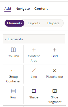
List of standard components
What are components?
Components are the tools Activator uses to create content. They can be used with any JavaScript library or framework that works with HTML and will work across modern browsers.
The most basic components users will employ in their projects are text components, image components and group containers.
The components described in this section are the standard components that are included in all Design System delivered by Anthill.
How to use components
Every Component has a main menu that, when selected, is shown in the right-hand side and contains the Component ID name and various settings for the component like style settings, field settings or interactions.
To get a full view of all the components added to your page, chose the “Navigate” tab in the left side of the Designer.
It is always a good idea to give your components recognizable names as you are creating them.
Components can create states which basically are different moments in a slide and a slide can have several states depending on actions taken by the user.
Find use-cases for the components on each respective component page
For developers
You can read more about the shared resource in our Design System Basics section.
All the source code is available in the shared resource. Here you can see how a component works, you can make your own popup which works differently, or you can copy one or extend from it. It's all web components, where we import content from Lit-Element: https://lit-element.polymer-project.org/
Activator, which is a content design tool, does not itself track any data or insert tracking functionality in the HTML that is created. However, you can insert tracking code using the default components we offer and in custom-built components by using Call ClickStream via Vault’s Javascript API. We refer you to use Veeva’s own documentation on how to implement this in your eDetailers
Custom components should be placed in the src/components/slide path in the shared resource
Do NOT make any changes to the files in the ‘fusion’ folder. This will make the auto upgrade fail!
In the Design System you can control which components are available by editing the file “fusion.json” which is the main config file for the build. Documentation can be found under “shared-->README.md”
There are three labels available for components: “standard” / “custom” / “brand”, and this can be specified in the component’s index.js file under “componentScope”. When creating new custom components or brand components, we advise to label them correctly to make it easier for the end users to distinguish them from the standard components and to filter according to type.
As of the newest updates to our own components, a lot of the options are inherited from the parent component.