
Email Components
Intro
This article explains how the Activator Email Designer lets you use Components to create great Emails and Email Layouts.
Only users that work with the Activator Content Designer can access Components, if you are working with the Activator Content Editor then you will use the Layouts available for your brand to create your Emails.
Components are the building blocks of an Email. When you start an Email from scratch, expand it from an existing template or use Layouts, you will be using components.
The Activator email designer will let you know which components that can be added, depending on which component you have highlighted.
Components
Containers
Rows and Layout containers are the outermost Containers you can work with. All other containers such as Columns go inside them.
Layout Containers

You can use a Layout Container to create a complex and reusable Email Layout by adding several Rows to it. This Layout Container can then be saved as an Email Layout to give your Content Editors the ability to use it in the Emails they create.
Row container

This is the first component you start with and an email usually consist of multiple rows stacked horizontally. The only two container components you can insert into a Row container is Column and Group.
A row is typically 600px wide, and anything you add into it should therefore add up to 600 px at the end. Remember to take padding into account, or use percentage to define the width of e.g. columns.
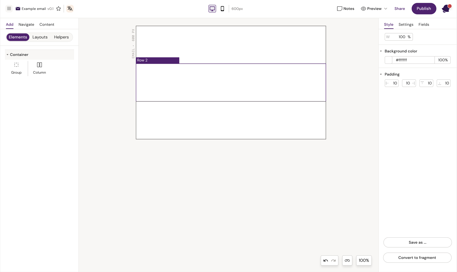
Example of several empty Rows in an Email
Column container

The column container can take up any amount of space inside a row. You can add just one column inside a row and set it to take up 100% (or 600px minus padding), or you can add multiple columns and set them to take up 50-50%, 30-70%, 40-60% or whatever you like as long as it adds up to 100% or 600 px.
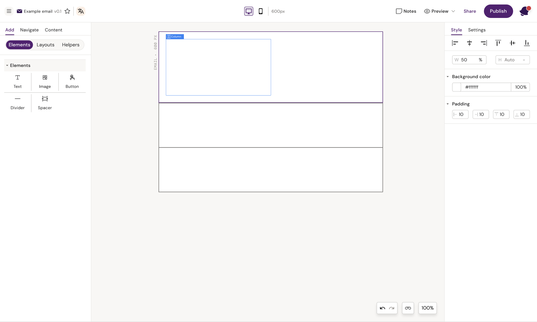
Here we have added a 50% width column
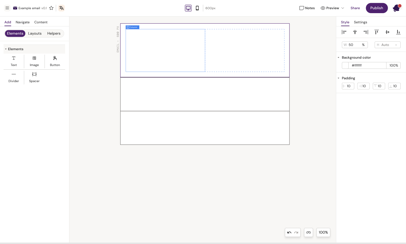
Here we have 2 columns in one Row
Note: sum of your column widths does not add up to 100% (or 600 px), the columns will be placed underneath each other instead of next to each other.
Columns 60/50 %
Columns 50/50 %
Group container

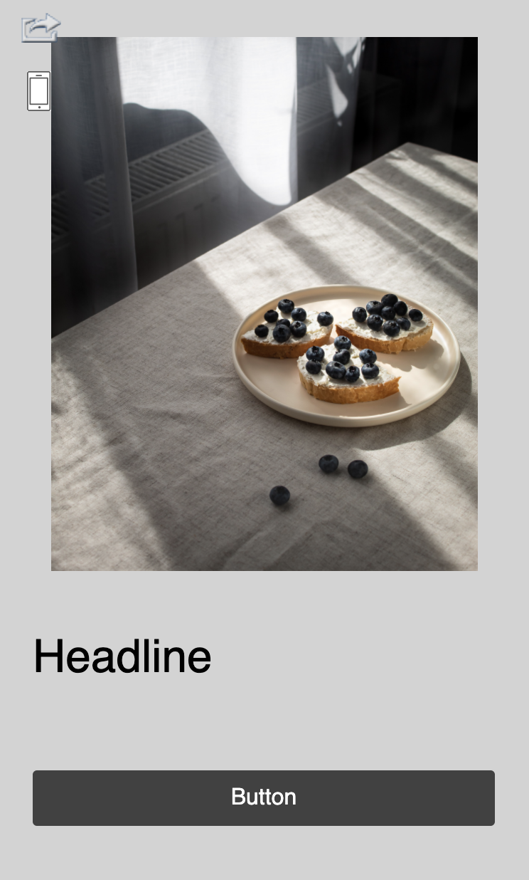
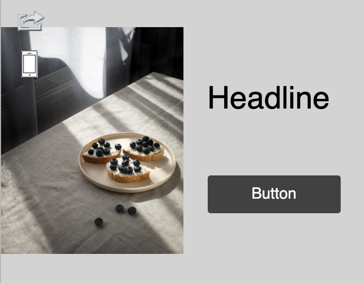
A group container is useful, if you want two elements to stay next to each other. Usually a row with two columns will stack on mobile, so column 1 is shown on top and column 2 is shown below. If the columns are placed within a group container, they will not stack.
A group container can only be placed inside a row container and will usually take up 100% of the row width. Once the group container is added, you add columns and elements just like you would otherwise.
The group container should be used if you have a row you do not want to stack
The group container should be used when you do not want the group contents to reflow responsively when the display window decreases in size.
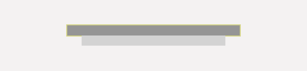
Example of content in a Column versus a Group Container when the display size decreases.
Columns directly inside a row
Columns inside group container do not reflow
Elements
Text

A text component can only contain text. A default font might be set for the whole document, but with the text elements selected, the user can define font, size, colour and decoration for that specific text element.
Changes to individual text pieces within the text element can be made by highlighting the text and selecting the change from the toolbar that appears on highlight.
The user can also insert tokens by highlighting a text piece and select 'insert' from the toolbar. A list of tokens will appear for the user to select. The token will be inserted into the text field, but will not delete the text that was selected.
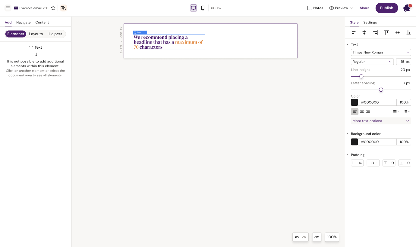
Change overall text settings in the right panel

Highlight text and make changes to specific parts of the text
Button

The button component is a simple element that can be styled in multiple ways. The user can click directly on the button text to edit the text. A link can be added to the button by clicking the link icon next to the button tag or opening the button settings in the right panel.
Be aware that;
a) button borders and rounded corners are not supported by all email clients (https://www.caniemail.com/search/?s=border-radius).
b) using % as the unit type for the width may compromise the clickable area (https://github.com/mjmlio/mjml/issues/2739).
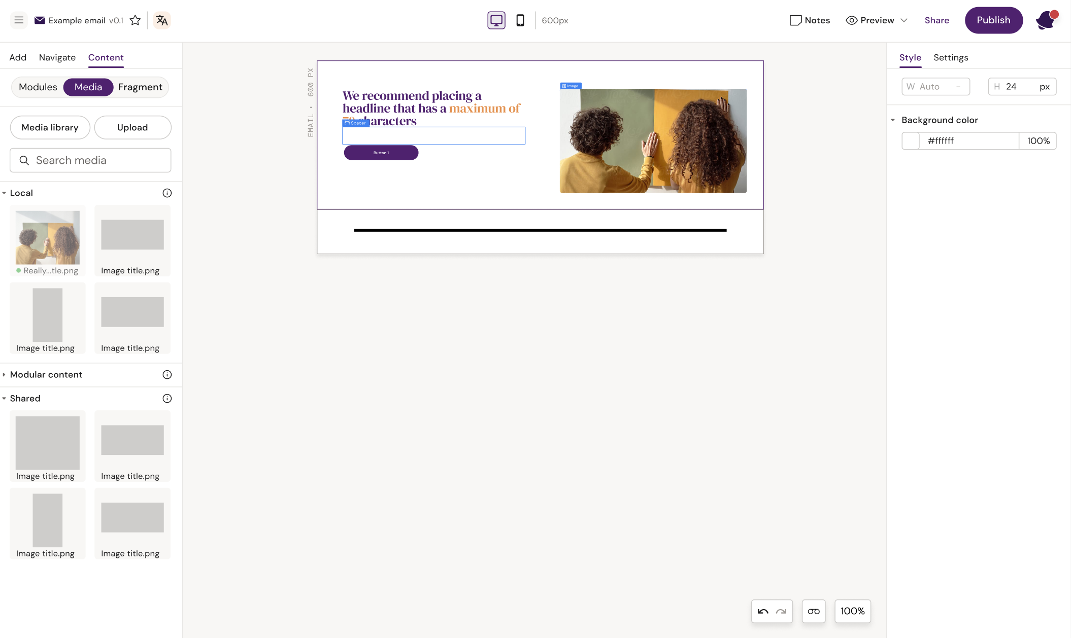
Image

In order to add an image to the design, the image container must be added. The image container will by default take up 100% of the width of the container it is placed within. The user can add padding or change the width of the container in the style panel.
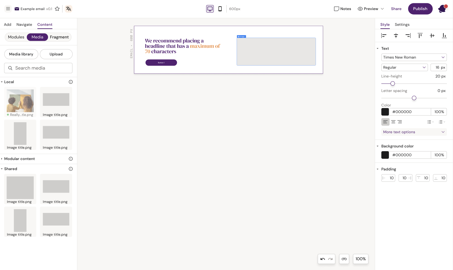
Add an image container
To add an image into the image container, the user must open the content panel on the left, select media, and drag in an image from the panel. Local and shared images will by default be shown in the panel, but the user can also import images from vault through the Media library or upload images from their computer as local, shared or vault assets.
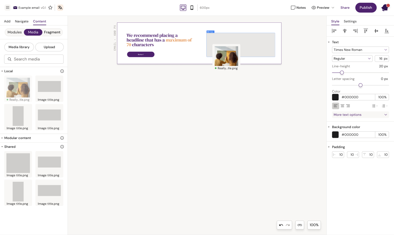
Drag an image into the image container
Divider

A divider is a horizontal line with predefined padding which can be used to e.g. split up different sections in a design.
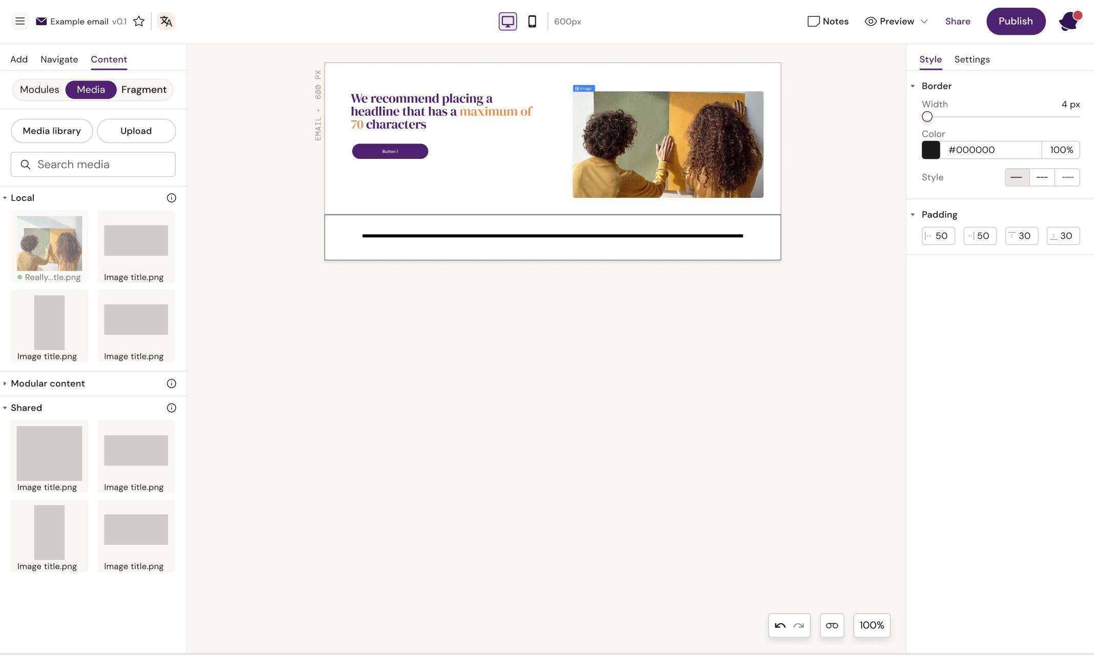
Divider added to design
Spacer

A spacer is an element that creates a specific amount of space between two elements. The user can use in to ensure consistent spacing between two text elements or between text and buttons.
Spacer added between headline and button