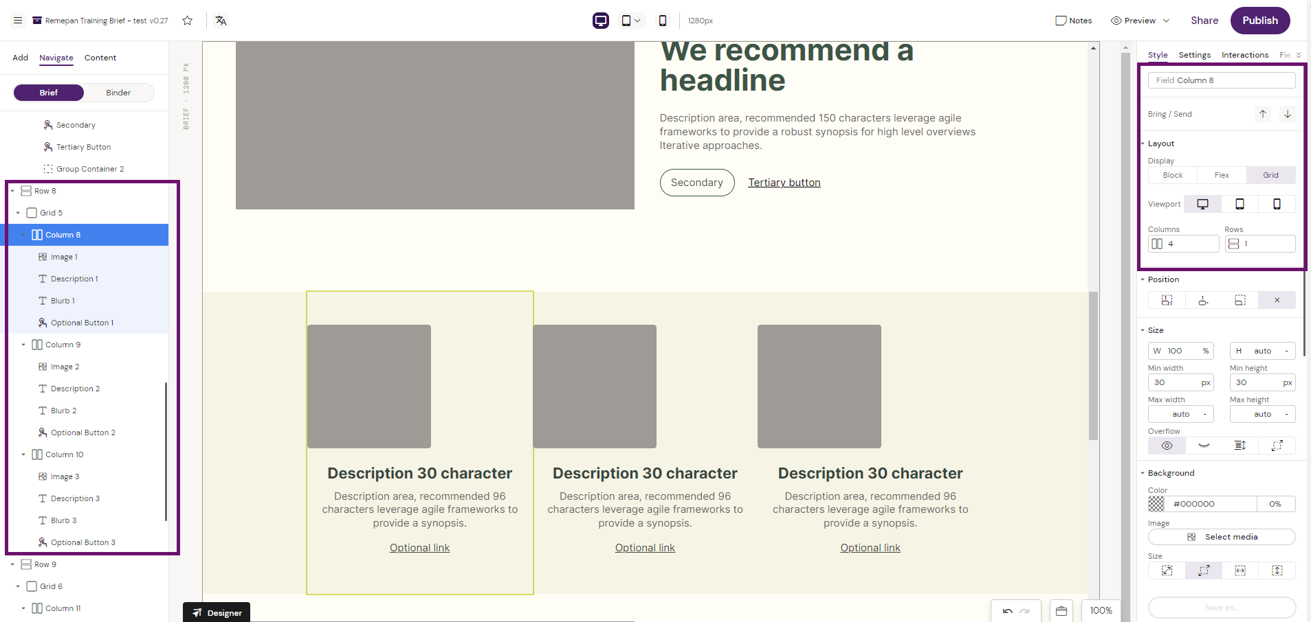
Grid
Adds a grid container to be used for creating responsive designs. The grid container will automatically stack elements based on the configuration of the columns added, and the breakpoint values that are set in the Design System.
How to use the Grid Container
Add a Grid container to a row container
Configure the Grid container as required e.g. 1 Rows 12 Columns
Add Column container(s) to the Grid container and configure tre Grid Layout in the Column container as required e.g. 4 Columns 1 Rows.
Start building content into your Column container.
Your content inside your Column container(s) will show responsive based on your specific configuration.