
Release 2.1.1
Release Version | 2.1.1 |
|---|---|
Release Date |
|
Previous Version |
Activator v2.1.1 is a maintenance version release of the product that includes bug fixes and exceptionally new features and improvements all around the system.
The label SHARED RESOURCE indicates that the change is done in the Shared Resource, which requires the Shared Resource to be upgraded.
New Features
Shared Resource
SHARED RESOURCE
Default design styles for component types can now be defined for Emails. This allows the user to have a custom default styling for e.g. a button in an email.
Please see Defining default styling for Components for further information.
Emails
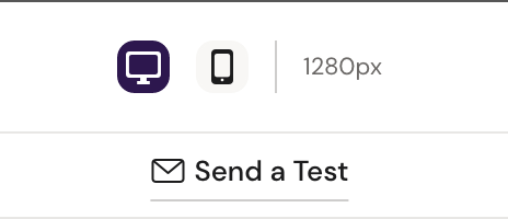
Users can now test-send Emails to a desired email address to test how the email will render in different mail clients. The button can be found in the top-middle in Preview mode.
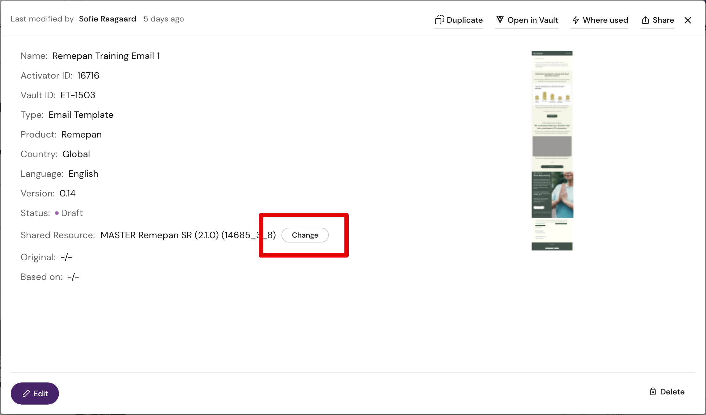
Functionality to change the assigned Shared Resource for emails was added. Users can do this in the properties for the email.
Binders
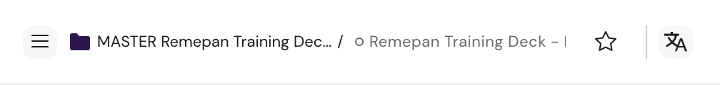
Navigational breadcrumbs have been added to Editor and Designer and include the Binder that contains the opened documents. Breadcrumbs are clickable.
Designer and Components
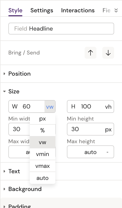
Besides percentage and pixels, users can now select the additional position units ‘
vh' and 'vw' from the unit drop down.SHARED RESOURCEComponents can now be reordered within the same parent via drag-and-drop in the left-hand Navigate tab in the Designer.
It is now possible to hide/show components depending on the device they are being viewed on, meaning that a component could be hidden on mobile, but shown when using the iPad viewport for example.
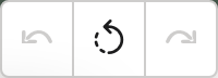
Any unpublished changes done in the Designer can now be removed in order to restore the last published version of a document. The discard button can be found at the bottom of the canvas between the Undo and Redo buttons:
Selecting an element now highlights the same element in the Navigate tab. Autoscroll is active in order to bring the selected element into view.
Users can now add Slides and Briefs, that are not yet part of any Binder, directly to a new Binder from the Navigate tab in the Designer.
Media Library
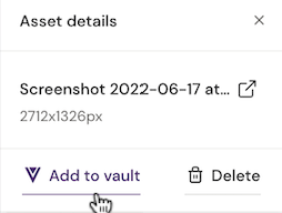
Users can now add Local assets to Vault directly from the Media panel to the left.
User Permission system
With the user permission system in place, user roles can now be defined that limit the user rights to use certain elements of Activator. E.g. a 'Designer' role grants access to create and edit layouts that Content Editors can use, without giving Content Editors access to the Designer part of Activator. User permissions are set on the user profile in Veeva Vault and dictate which features a user or user group can access.
Please see User Roles in Activator for additional information.
Notifications
System notifications are now gathered in the notification center where the user can review them. The notification bell icon can be viewed in the top right corner of the Activator Designer and Editor.
Any documents that cannot be edited due to issues with their Shared Resource, due to being in an incompatible file format, or otherwise, will now present the user with a notification that states that edits cannot be made.
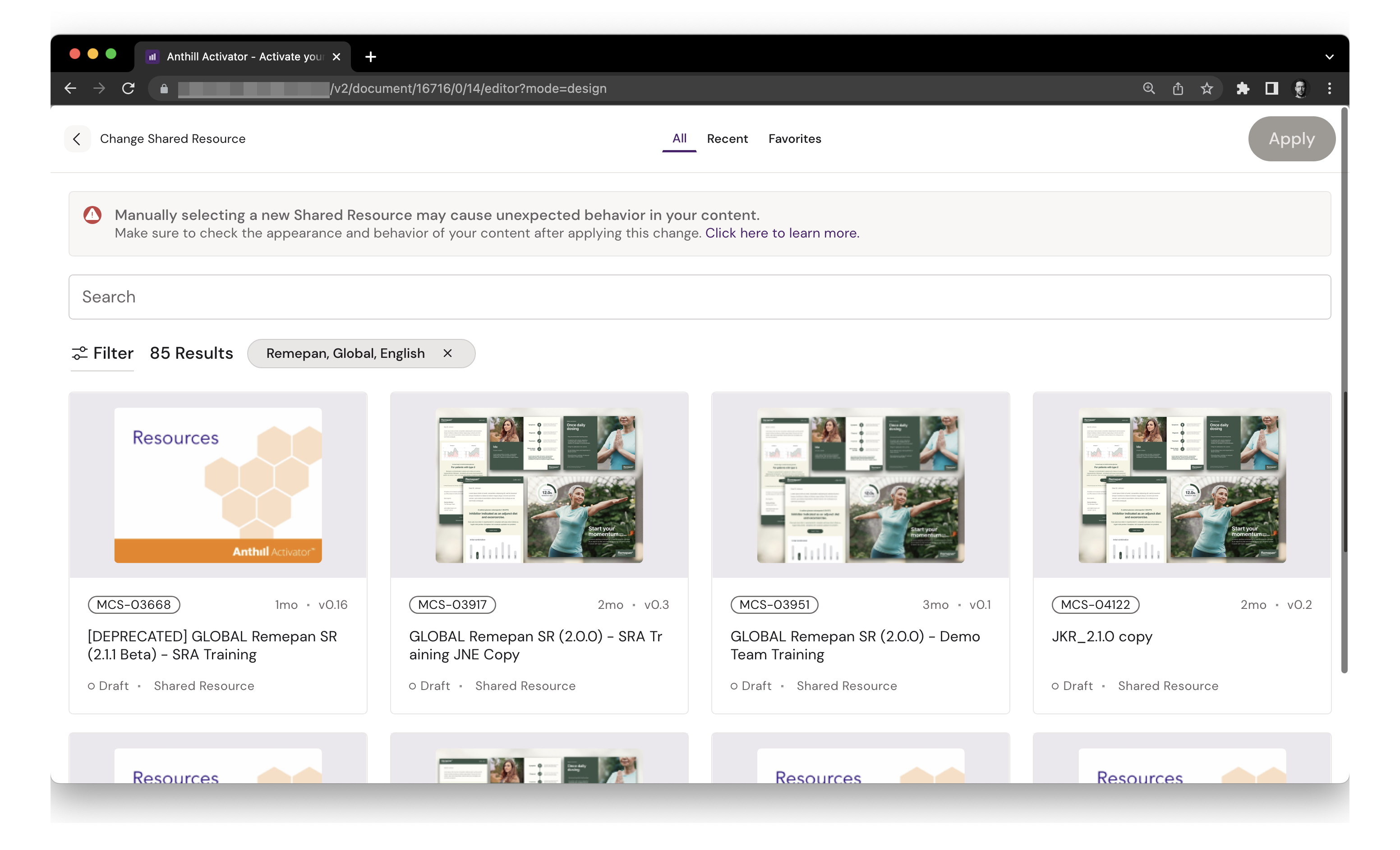
Shared Resource selection
Both during document duplication and when changing Shared Resource (email only) we updated the selection modal allowing users to select a different Shared Resource than the one used for the original (if duplicating) and not matching the meta-data of the related document:
Improvements
Dashboard and Search
The cards that allow users to start creating content in Activator will now be hidden when the user chooses to add filters to the view on the Dashboard. This prevents having a layer of content between the filters and the search results.
Content can now be found in Activator by searching for the Vault ID of any given content. Works in all of Activator's search fields, e.g. Dashboard, Binder, Media Library, etc.
Document creation, duplication and publish
When creating a Slide, Brief or Binder from Binder view, the Shared Resource of the Binder is now pre-selected.
We improved the creation wizard for all document types by auto-focusing on the name input when opening the wizard, including a “Select other” button in order to select a Shared Resource with different metadata than the document and adding an input field to filter in the current list of Shared Resources.
If a document is duplicated from Binder view, the success message now displays an option to “Go back to Binder” instead of the dashboard. When duplication is triggered from the dashboard, the options remain unchanged.
The Publish button inside the Editor / Designer will now be disabled out if no new changes have been made. A tooltip will inform the user if there are no changes to publish and when the last publish was done. The system also indicates whether a publication was successful or not. The “Publish” button for empty binders has now been disabled.
Document Cards
We only show the full title as a tooltip when hovering over the title when the title was truncated.
Tooltips on document cards are now only shown if the title of the document is truncated. If the length of the title fits on the document card, the tooltip will be hidden.
Emails
Assets in Content Modules with a production CDN URL are no longer imported as a local asset but instead use the production CDN URL. Note: This is only valid for Email documents.
The Fragments tab - which was previously only displayed in the Designer - is now also visible in the Editor.
It is now possible to add background images to row containers in Email documents.
Shared Resources
The user can now double-click on a Shared Resource from the Shared Resource selection menu to add it to the content element.
Previously the system would fall back to the Shared Resource’s default values whenever the user edited any of the attributes. This is no longer the case.
Document card for Shared Resources was introduced to be used for our creation and duplication modals. Cards shows a thumbnail, Vault ID and Status of Shared Resource.
We added the functionality to export the source code of a Shared Resource as .zip file. The action can be triggered from the Share tab in the Settings modal.
The old version of our footer section that was visible on Shared Resource pages is now hidden. The settings can still be found in the (newer) Settings modal.
Designer and components
SHARED RESOURCE
When opening the 'select fragment' popup, the thumbnail hover state and ‘open editor’ text have been removed.
We now allow the user to add CSS classes to elements by going to the Settings panel in the Designer.
An animated class field has been added to the Interactions panel from where the user can add, remove and toggle the animated class.
For our Grid component, we added new properties which are dependent on the viewport settings.
Images can now properly be repeated both along both the x- and y-axis.
When an interaction has been set up for a shape component, the cursor now changes to the hand cursor on hover in order to reflect that they can be clicked.
Indication option “dashed” has been added to our list component.
Editor
When in Editor,
mode=previewis now triggered to the URL when the user clicks outside the canvas.When hovering over the Edit, Delete or Reorder button as Editor text box appears displaying information about its functionality.
Layouts
The Layout group description in our Create / Update Layout modal in the Designer is now hidden unless the user decides to create a new layout group.
Media Library
We have made updates to the Asset ID Label. To improve the visibility of the assets approval status it is now highlighted in the same color as the respective status.
Display of selected images (f. ex. for image component) in the Style tab has been unified and media assets can now be selected by clicking on the full thumbnail size.
Improved user interaction for the Media Library tab in the Designer Mode.
Notes mode
Previously notes would be related to the document version, meaning that they would not be carried over when a new version of said document was published. Now, all notes are shown in the document no matter in which version of the document they were created.
Translation files
We added a toast message that pops up after the generation of translation files was triggered, in order to inform the user that the files are being created.
Veeva Monitoring
The user now has the possibility to configure tracking of certain components (like f. ex. inline slideshow states) with or without duration from inside the Designer in order to track components of a presentation separately from inside their Veeva app.
Improvements for 1.x contents
We made some changes to how users can view older 1.x contents in newer 2.x - these changes include:
Prevention of further creation of new 1.x contents,
Redirect from Editor to Designer was added as the Editor cannot be used for 1.x contents,
Adjustments to the Designer: States in States panel are displayed using IDs instead of Field names - as these cannot be set for 1.x contents, Media library can now be used, Style and Settings panel have been populated, some functionalities were disabled as these cannot be used (Helpers, Layouts, Notes etc.), Navigate tab shows selected component as well as the parent of that component, double-click was enabled in order to add components to the document.