
This Best Practice article describes topics an Email Designer should be aware of when building Layouts for Activator Approved Email.
Building the Basic Email Structure
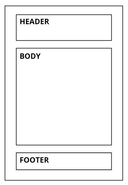
Begin by dividing your email into clearly defined sections.
A well-structured email typically includes:
-
Header section
-
Body section, containing:
-
Intro text
-
Main message(s)
-
Outro text
-
-
Footer section
This structure ensures clarity, readability, and consistent design across communications.
Email Width in Activator
All emails created in Activator have a fixed width of 600px.
This width is widely supported by most email clients on both desktop and mobile devices, ensuring consistent rendering and compatibility.
Creating Sections in Activator
After defining the content for each section, you can begin building the layout in Activator.
Each section is constructed using three core elements:
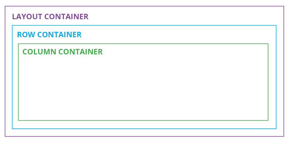
1. Layout Container (Purple Line)
The Layout container is the top-level container for a section.
-
It allows you to save your design as a reusable layout.
-
This element is mandatory.
-
Adding a Layout container enables the option to insert a Row container.
2. Row Container (Blue Line)
The Row container is placed inside the Layout container.
-
It allows you to structure content horizontally.
-
You can add multiple Row containers within a single Layout container.
-
This makes it possible to create multiple content rows within the same section.
3. Column Container (Green Line)
The Column container is placed inside a Row container.
-
It allows you to divide a row into multiple columns.
-
You can add multiple Column containers within a single Row.
-
This enables multi-column designs such as 50/50 or 70/30 layouts.
By combining Layout, Row, and Column containers, you can build structured, flexible, and reusable email sections that follow best practices for email design.
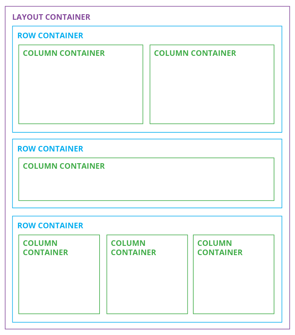
Working with Multiple Rows and Columns
You can use multiple rows and columns within a layout. However, incorrect structure may cause the email to render improperly on different devices.
Important Rule
A Row container can contain only one line of Column containers.
If your content requires:
-
One full-width column, and
-
One 50/50 column setup
You must divide them into two separate Row containers.
Each distinct column structure must have its own Row container. This ensures consistent rendering across devices and email clients.
Recommended Workflow
A best practice when building an email is:
-
Start by creating the container structure (Layout → Rows → Columns).
-
Once the structure is complete, add content elements such as:
-
Text
-
Images
-
Buttons
-
Lines
-
Dividers
-
Building the structural foundation first ensures proper spacing, alignment, and responsiveness.
You can read more about email components here: Email Components
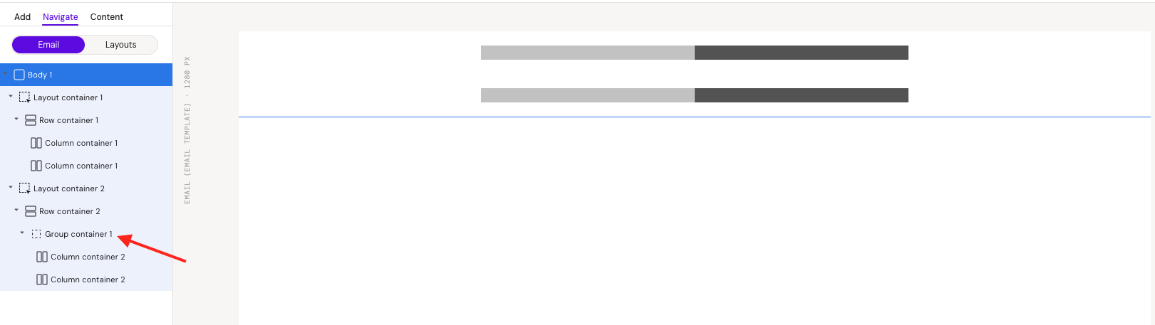
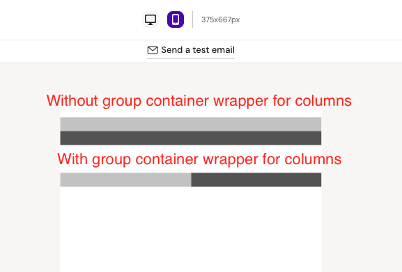
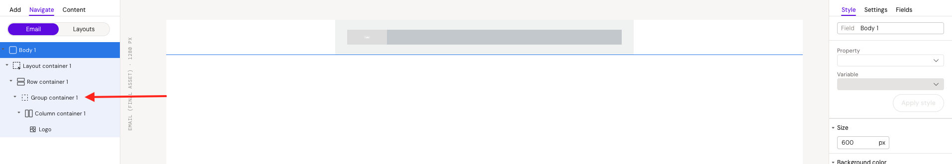
Using a Group Container Inside a Row
It is possible to insert a Group container inside a Row container and then add Columns within the Group.
The key difference appears in the mobile view:
-
Without a Group container wrapper:
Each Column will stack and fill 100% width on mobile devices. -
With a Group container wrapper:
Columns will maintain the same structure as in the desktop view.
Choose the appropriate approach depending on how you want the layout to behave responsively.
Working with text
When adding text to your email, selecting the correct font settings is essential.
The default font may appear as Arial. Many companies use Arial as their web-safe font because it is widely supported by email clients.
5 Tips for Font Settings
1. Font Family
This field should never be left empty.
Always select a font family to ensure your email displays correctly across email clients.
2. Font Weight
Use font weight to control emphasis.
-
Apply bold or italic styling to highlight important text.
-
Use consistent emphasis throughout the email.
3. Font Size
-
Default body text size is typically 16px.
-
Headlines are often around 30px.
-
Body text commonly ranges between 12–14px.
Choose sizes that ensure readability across devices.
4. Line Height
A good rule of thumb is:
Line height = Font size + 4px
For example:
-
If font size is 12px, set line height to 16px.
This creates proper spacing between lines and improves readability.
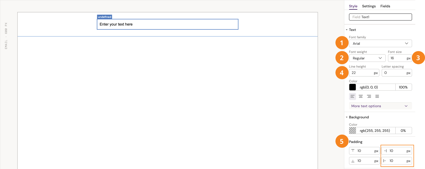
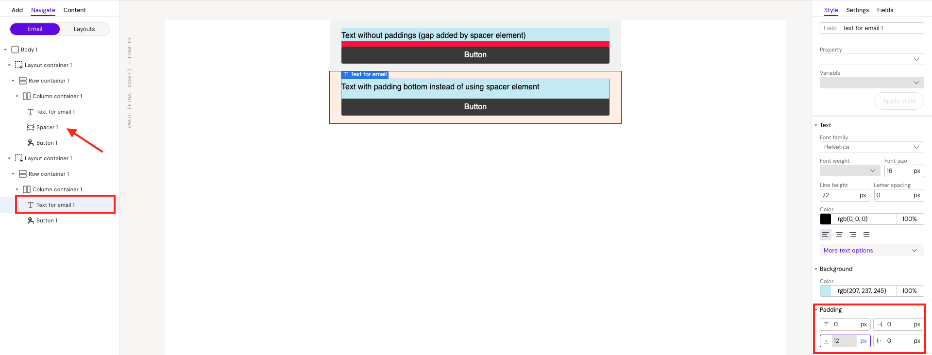
5. Padding
Adding padding directly to text elements is optional. However, spacing must be carefully considered for mobile devices, where screen space is limited.
Best practice:
-
Add padding at a higher structural level (such as the Row container).
-
This prevents text from touching the edges of the screen in mobile view.
Proper text configuration improves readability, ensures compatibility, and maintains a professional email appearance across devices.
Email Layout Best Practices in Activator
This guide outlines best practices for designing email layouts in Activator to ensure CRM compatibility, optimal performance, and a smooth approval process.
Keep Emails Short and Focused
CRM platforms enforce strict HTML size limits.
Both platforms apply a 128 KB limit (~131,000 characters) to the final compiled email HTML.
Important
-
The limit applies to the final compiled HTML, not only what is visible in the editor.
-
Every element added (rows, columns, text blocks, spacers, images, etc.) increases the total HTML size.
Design emails efficiently to avoid exceeding the limit.
How to Verify Character Count (Veeva)
To check the final HTML size in Veeva:
-
Push the email to Vault.
-
Download the HTML file from Renditions.
-
Open the file in a text editor that displays character count (for example, Sublime Text).
-
Verify that the total character count does not exceed 128 KB (~131k characters).
Content & Visual Hierarchy Best Practices
Hero / Full-Width Images
If your email begins with a full-width image:
-
Avoid making the image too tall, as it increases scrolling.
-
Consider hiding the image on mobile devices to prevent excessive scrolling before the recipient reaches the main message.
The goal is to ensure the message is visible quickly without unnecessary interaction.
Call-To-Action (CTA) Buttons
When using CTAs:
-
Place the primary CTA above the fold (before significant scrolling is required).
-
Limit the number of CTAs to a maximum of two per email.
Including too many CTAs (e.g., 4–5) reduces clarity and may decrease click-through rates.
Core Principles for Email Structure
Every structural element contributes to the total HTML size, including:
-
Rows
-
Columns
-
Text elements
-
Dividers
-
Spacers
-
Containers
Efficient structure reduces file size and improves maintainability.
Avoid Unnecessary Elements
-
Do not add empty rows, columns, or containers unless absolutely required.
-
Remove hidden elements instead of simply hiding them (unless hiding is necessary for responsive behavior).
This minimizes unnecessary HTML output.
Row and Column Rules
-
The total width of all columns within a row must equal 100%.
-
Prefer padding over spacer elements to reduce HTML size.
-
Keep structures simple to avoid unnecessary complexity.
Following these rules helps maintain compatibility and stay within HTML size limits.
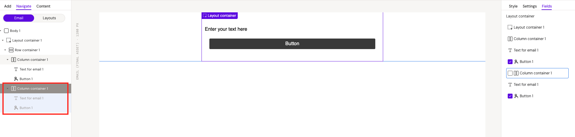
Image Handling
Image sources are critical when building layouts that will be rendered as email content in Activator.
Common but problematic image sources include:
-
Veeva Vault uploads
-
Local file paths
-
Internal Design System resources (e.g., private S3 buckets or restricted environments)
These sources often generate temporary or internal URLs that are not publicly accessible. As a result, images may break when recipients view the final email.
Recommended Approach
To ensure reliability and proper rendering:
-
Use public CDN URLs (preferred), or
-
Use Base64 image embedding when appropriate.
Always ensure image URLs are stable, persistent, and publicly accessible before sending the email.
Following these best practices ensures:
-
CRM compliance
-
Optimized performance
-
Reliable image rendering
-
Improved user engagement
-
Faster approval workflows
For more information: Image Handling in Design Systems – Activator Standards
Decimal Pixel Values
Avoid using decimal pixel values (e.g., 10.5px).
Although decimal values can help achieve pixel-perfect precision, they may cause rendering inconsistencies across devices and email clients. Elements with fractional pixel values can behave unpredictably due to rounding differences between systems.
Recommendation
If you encounter layout issues related to decimal values, round them to the nearest whole number.
Examples:
-
5.7px→6px -
6.4px→6px -
5.5px→ Choose the most appropriate value depending on the layout (either5pxor6px)
Using whole numbers improves consistency and cross-device reliability.
Recommended Design Improvements (Common Issues)
The following recommendations are based on real issues observed in Activator → CRM workflows.
Remove Unnecessary Group Containers
Group containers are often added around simple elements (e.g., a logo) without technical necessity.
If a Group container does not serve a structural or responsive purpose, remove it.
Benefits:
-
Cleaner layout structure
-
Reduced HTML size
-
Improved maintainability
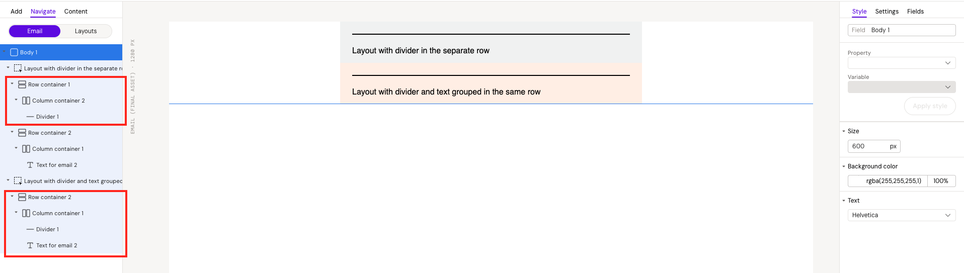
Combine Divider and Text in the Same Section
If a divider is placed in its own Row container, consider grouping it with the related text element within the same section.
Why:
-
Reduces unnecessary Rows and Columns
-
Simplifies the structure
-
Decreases total HTML size
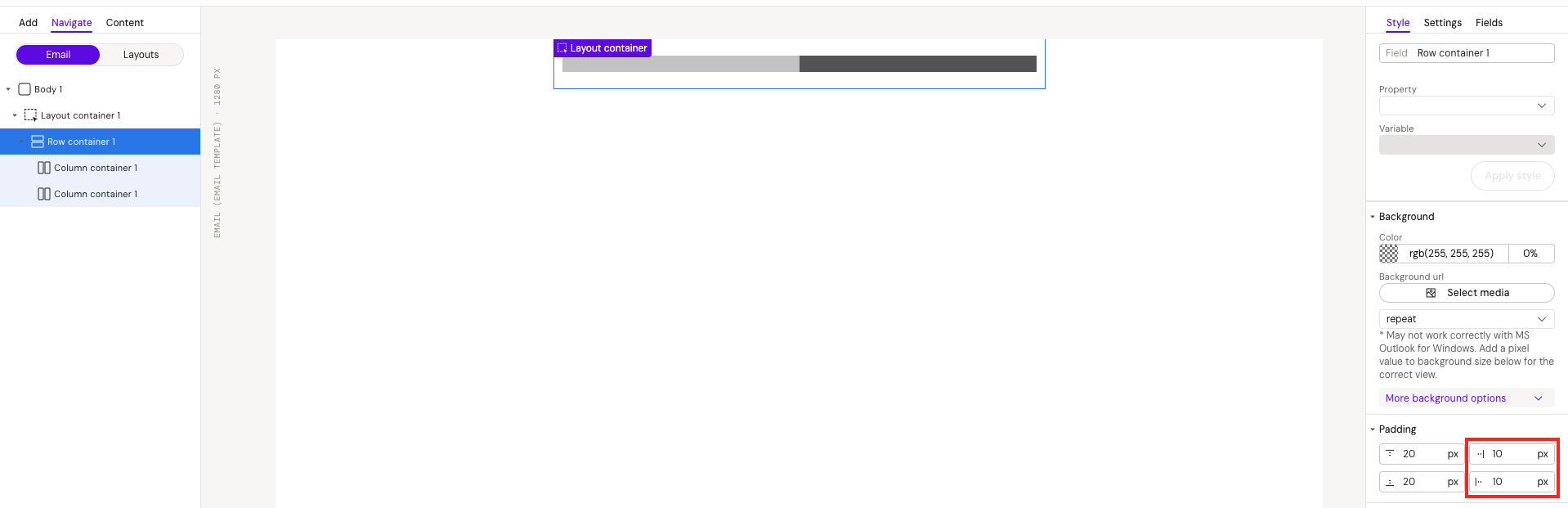
Replace Manual Spacing with Padding
Avoid using spacer elements solely to create vertical or horizontal spacing.
Instead, use padding on Rows or Columns.
Why:
-
Reduces total HTML output
-
Simplifies structure
-
Helps stay within CRM character limits
Technical Review Before MLR Approval
Always perform a technical QA before submitting the email for MLR approval.
Common issues to check:
-
Duplicate layouts that are not required
-
Overly complex structures
-
Unnecessary containers
-
Excessive HTML size (especially considering Veeva's character limits)
Optimizing before MLR reduces the risk of rejection or required revisions.
Consider Using Images for Complex Layouts
For visually complex sections, consider using a single image instead of building the structure with multiple Rows and Columns.
Advantages:
-
Significantly reduces HTML complexity
-
Helps meet CRM size constraints
Trade-off:
-
Localization becomes more difficult
-
Text inside images cannot be edited dynamically
Use this approach strategically when CRM compatibility is a priority.
Reviewing the Email Before Approval
Use Activator Viewable Rendition for Accuracy
Activator generates its own Viewable Rendition PDF within 2–3 minutes after publishing.
This version:
-
Avoids page-splitting issues
-
Prevents unnecessary spacing problems
-
More accurately reflects the final layout
Vault's default rendition may display layout inconsistencies. Therefore, wait for the Activator-generated Viewable Rendition before reviewing layout and structure for final approval.