Adds a Container for zoom functionality, i.e., to zoom concrete (selected by the user) dom element (image, text, block of content, etc.)
Users can configure what content should be zoomed, zoom value, where zoomed content should be displayed, and actions to show zoomed content (click on some button, double click on the content block, etc.)
Prerequisites:
-
The Activator version and Design System (DS) should be in version 2.2.0 or newer.
-
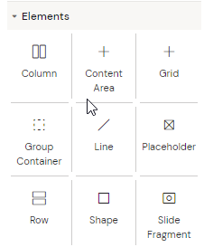
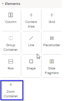
The component is created as customizable and an excluded Component by default. Hence, the component is not found initially in the left panel elements group in Activator Designer.
How to make the component available in Activator
The user needs to update the design system (DS) config to use it on the slides.
Steps:
-
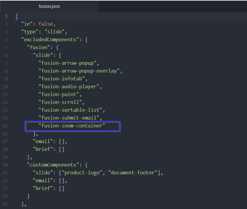
remove 'fusion-zoom-container' from excluded Components in fusion.json,
-
-
The edited fusion.json will look like this:
-
-
rebuild, and re-upload the DS to be used on slides (help: Fusion Library | How do I export the Design System to Activator?
After uploading the new exported DS to Activator, the ‘Zoom Container’ will be visible in the Elements left panel.
How to use the Zoom Container:
-
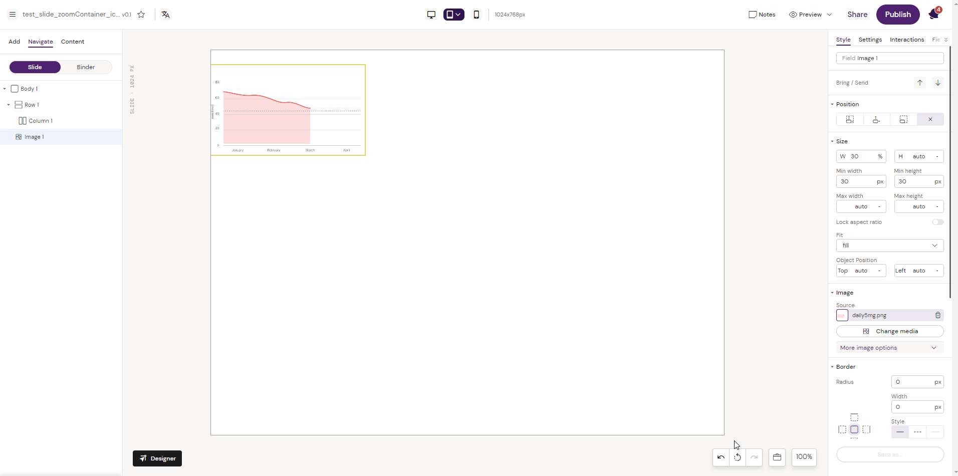
Take a sample image and reduce the width approx 30%.
-
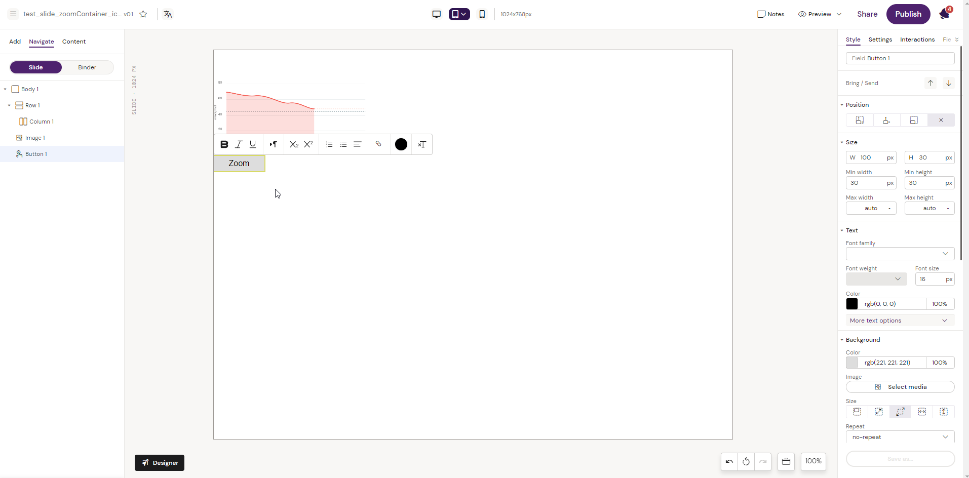
Add a Button element on which zoom interaction will be set
-
Add a Pop-up. Add a Custom Overlay to the Pop-up,
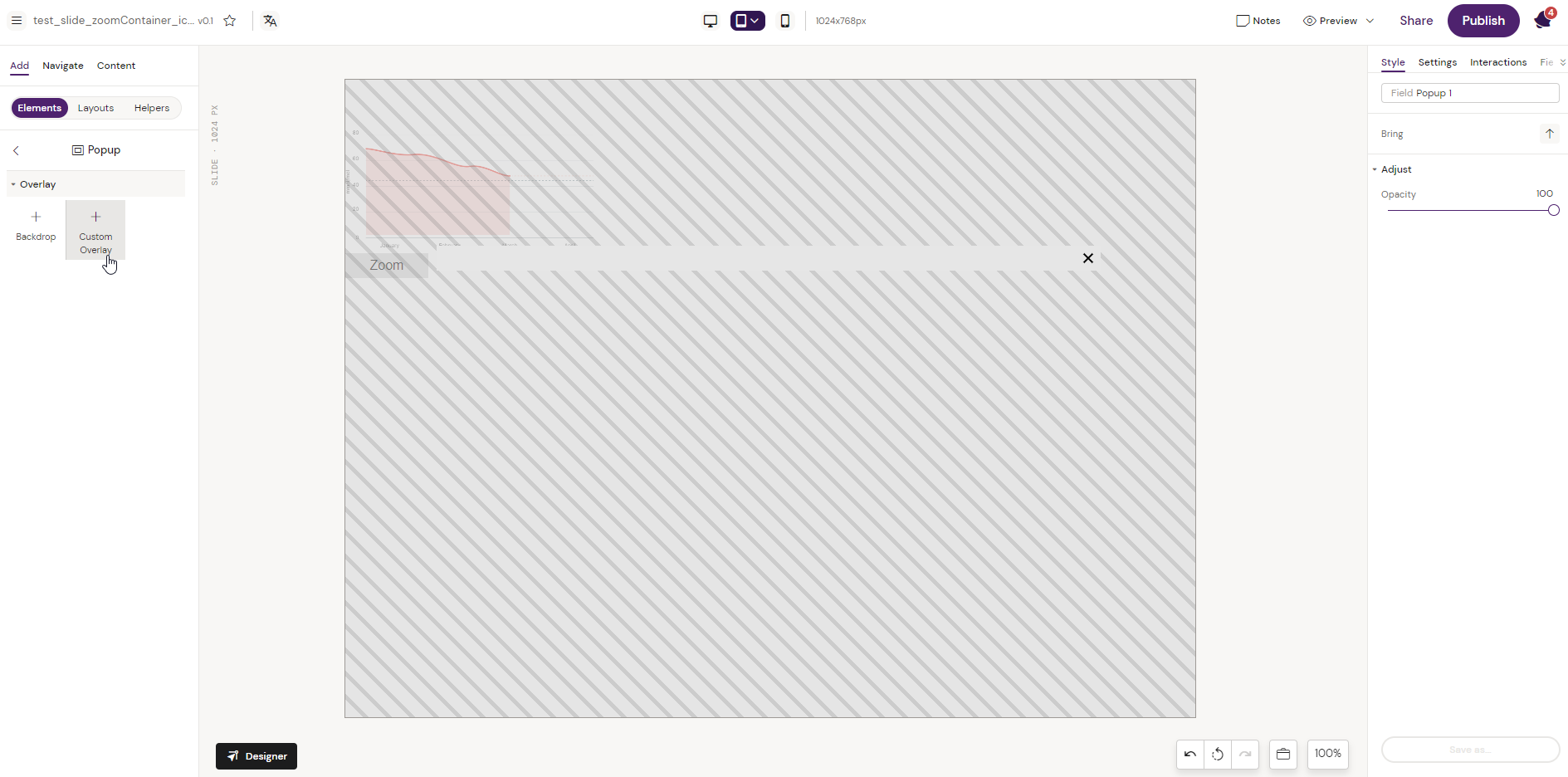
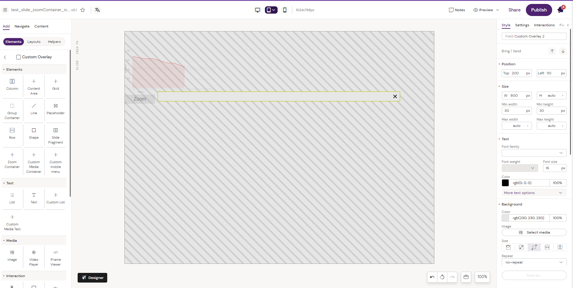
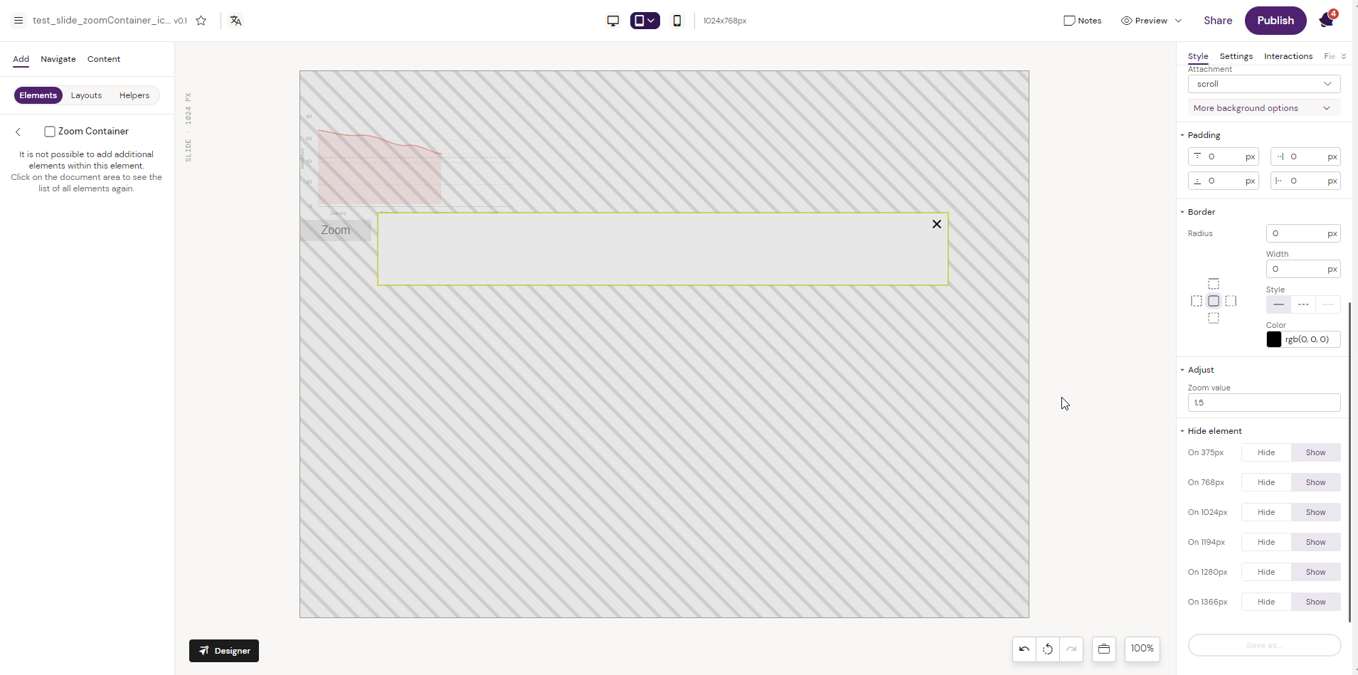
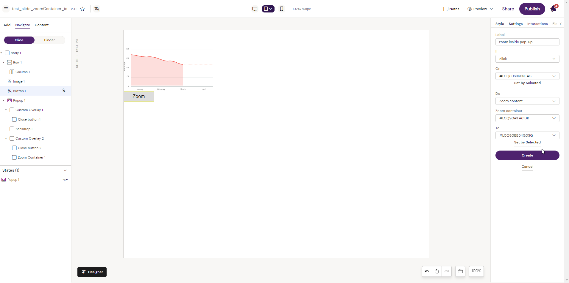
4. Add a ‘Zoom Container’ to the added overlay and adjust the Zoom value. (It is the zoom component where we should display zoomed content and configure zoom value in component properties (1.5 by default))
5. In this example, we are setting the zoom action inside a pop-up which is the most common use case of the zoomed elements (generally, in e-detailers, zoomed components are used inside pop-ups/state containers).
So there will be two interactions from this 'Zoom' button. First, the actions to apply the state pop-up.
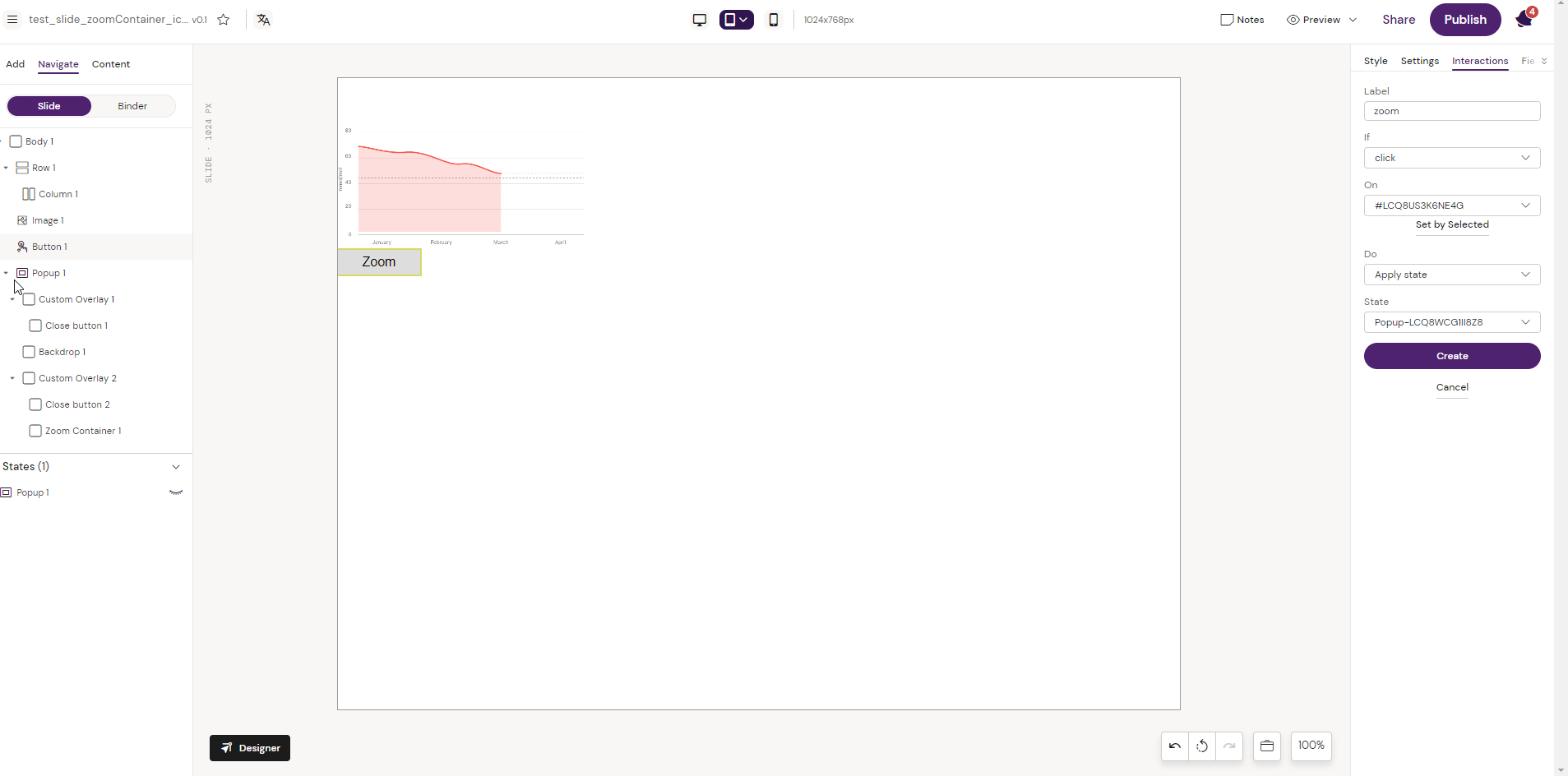
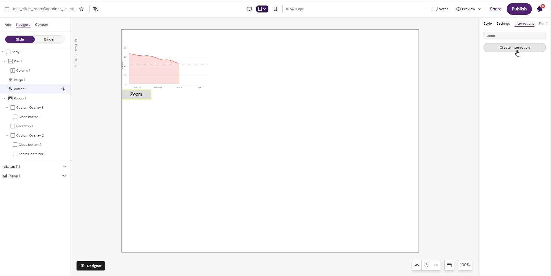
The second is to add the action 'Zoom content' where the user configures elements for zoom, zoom-container, action, and action target. In this example, it is inside the pop-up.
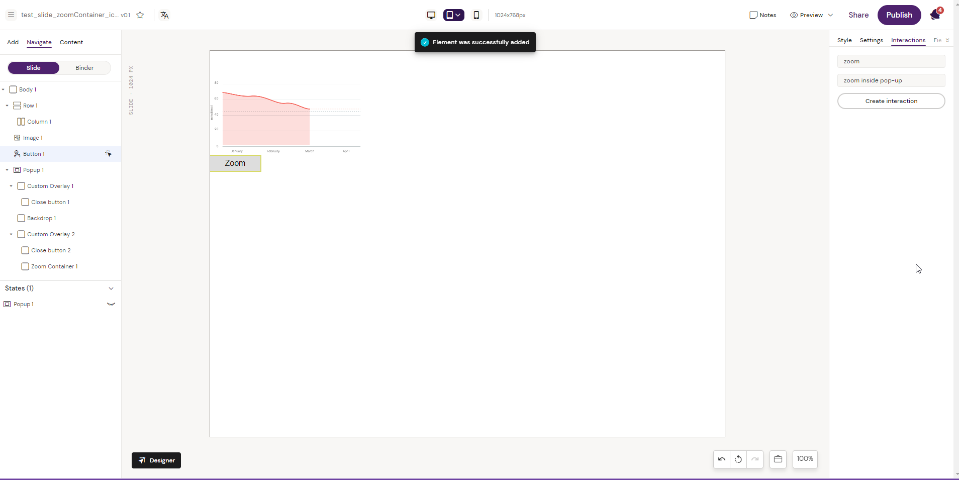
6. After creating the interactions, zoom functionality is visible in preview mode. Clicking on the ‘Zoom’ button Zooms the elements set in the interaction to the adjuster zoom values.
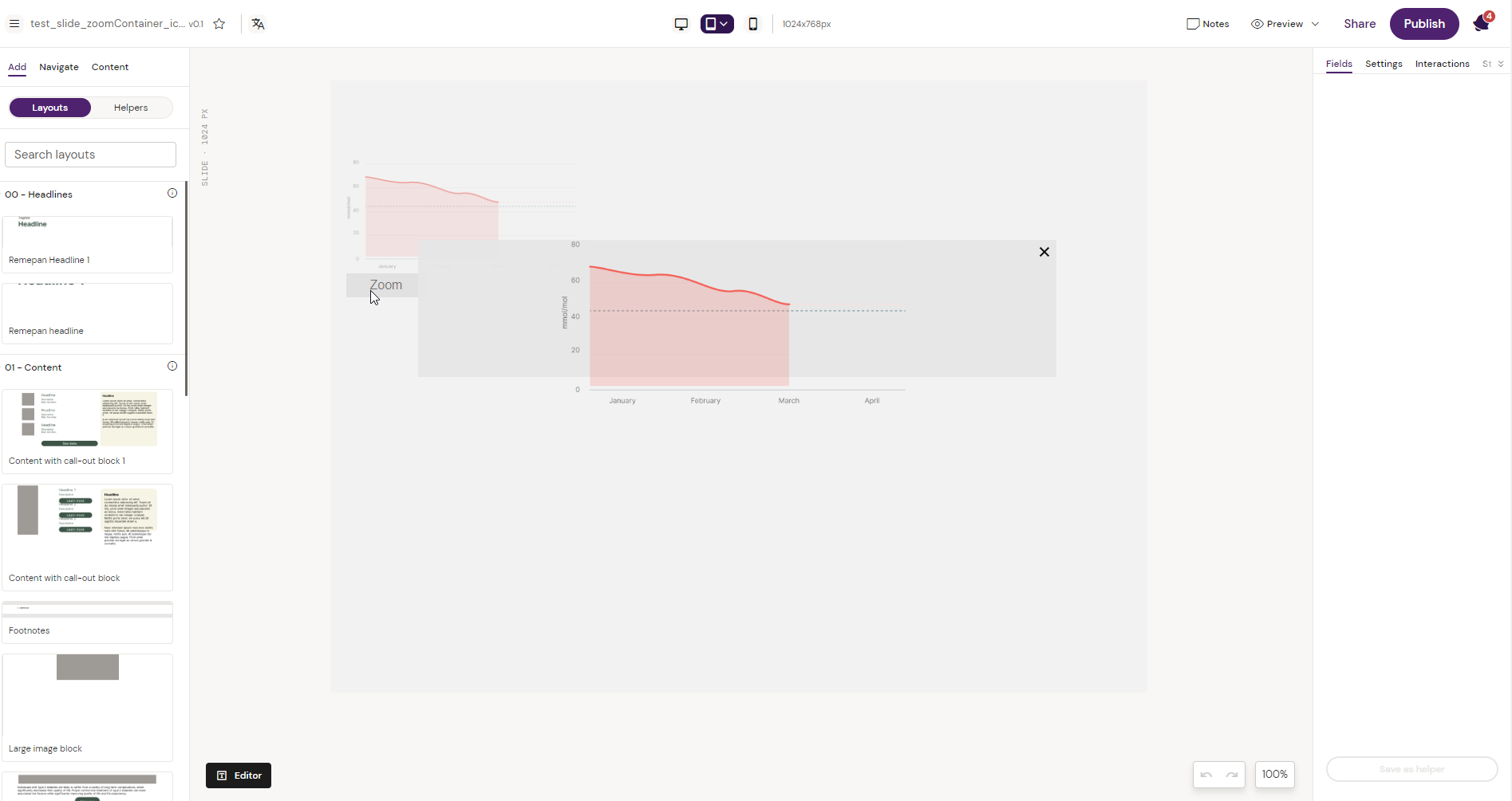
In Situ Example of the Zoom Container Component