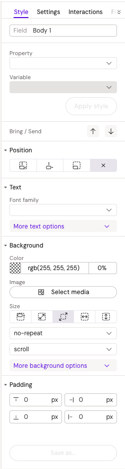
See the styles panel
Field
Specifies a field name for the element that will be displayed in the layout's fields panel when the element has "Show field in the editor mode" enabled from the Settings tab in the right panel.
Variables
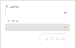
Property
The Property dropdown allows you to select different properties that can be added as variables for the element. Available property groups include:
-
Text group: color
-
Background group: background-color
-
Padding group : padding-top, padding-bottom, padding-right, padding-left
-
Border group: border-color, border-left-color, border-right-color, border-top-color, border-bottom-color
After selecting the desired property, the Variable dropdown becomes enabled for selection.
Variable
This option becomes available only after selecting a property.
-
For color-related values: You can add any color from the predefined colors in the Design System (colors.config)
-
For padding values: You can select from the predefined values in variables.config
All variables names in configs should start with '--', for example: '--primary-color-1' https://help.activator.cloud/v3/css-variables
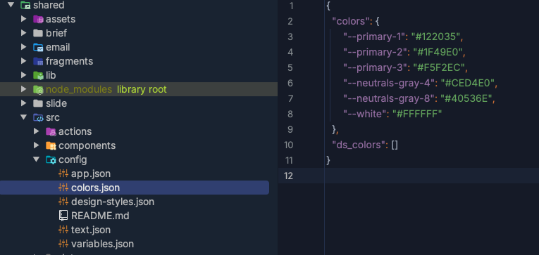
See the configs location in the DS v2
Colors config example:
{
  "colors": {
   "--primary-1": "#122035",
   "--primary-2": "#1F49E0",
   "--primary-3": "#F5F2EC",
   "--neutrals-gray-4": "#CED4E0",
   "--neutrals-gray-8": "#40536E",
   "--white": "#FFFFFF"
  }
}
Variable config examples:
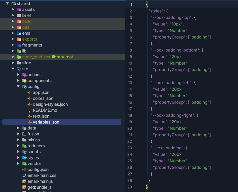
{
  "styles": {
    "--box-padding-top": {
      "value": "10px",
      "type": "Number",
      "propertyGroup": ["padding"]
    }
  }
}
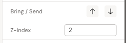
Z-index
Bring / Send
Bring the element to the top - updates the z-index for element.
After updating, the Z-index property appears with its value in the styles.
Z-index
Directly updates the z-index style for the element.
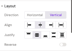
Layout
Layout styles group available for group containers, columns, rows, and grid elements.
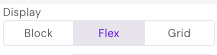
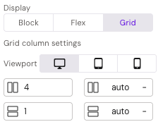
Display
Adds a display style for the container.
Options: block, flex, and grid.
Availability: Columns only
Direction
Updates the direction for containers by modifying the flex-direction style. The flex-direction CSS property defines the direction in which flex items are laid out inside a flex container.
-
For columns: flex-direction is vertical only
-
For rows: flex-direction is horizontal only
-
For group containers: flex-direction is adjustable (both horizontal and vertical)
Align
Applies alignment to elements based on the direction:
-
When direction is vertical: aligns elements horizontally
-
When direction is horizontal: aligns elements vertically
Options: start (flex-start), center, end (flex-end), and stretch
Justify
Applies justify-content to elements based on the direction:
-
When direction is vertical: justifies elements vertically
-
When direction is horizontal: justifies elements horizontally
Options: start (flex-start), center, end (flex-end), space between, and space-evenly (space-around)
Reverse
Toggle button that applies reverse order to elements.
Viewport, Columns, Rows, Start-column and Start-row work when columns are added into a grid element.
Viewport
Allows configuration for different viewports: desktop, iPad, and mobile.
Availability: Columns only
Columns
Determines how many grid columns the styled column should fill, based on the defined number of columns in the grid (default: 12). Can be specified separately for each viewport, with a default of 4 columns that is then inherited for iPad and mobile. Controls the grid-column CSS property.
Availability: Columns only
Rows
Determines how many grid rows the styled column should fill, based on the defined number of rows in the grid (default: 1). Can be specified separately for each viewport with a default value of inherit. Controls the grid-row CSS property.
Availability: Columns only
Start-column
The grid-row-start property specifies a grid item's start position within the grid row. Can be separately specified for each viewport with a default value of inherit.
Availability: Columns only
Start-row
The grid-row-start property specifies a grid item's start position within the grid row. Can be separately specified for each viewport with a default value of inherit.
Availability: Columns only
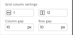
Grid column setting
Uses grid-template-columns: repeat(var(--columns), 1fr). The CSS grid-template-columns property defines the number and width of columns in a grid layout.
Availability: Grid elements only
Note: Rows are available in Activator UI but will not work as expected. This is a known bug that will be fixed in a future release. https://help.activator.cloud/v3/responsive-web-development#ResponsiveWebDevelopment-TheGridComponent
Column gap
Sets the size of the gap between an element's columns using the column-gap CSS property.
Availability: Grid elements only
Row gap
Sets the size of the gap between an element's rows using the row-gap CSS property.
Availability: Grid elements only
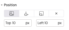
Position
Position
Sets the position property for the element with the following options: absolute, relative, fixed, and static. When selecting anything other than static, additional style properties (top and left) become available.
Top
Sets the top style for the element.
-
Units: px, %, vh
-
Availability: All positions except static
-
Default value: 10px
Left
Sets the left style for the element.
-
Units: px, %, vw
-
Availability: All positions except static
-
Default value: 10px
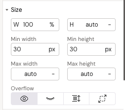
Size
Width
Sets the width for the element.
Units: px, %, vw, vmin, vmax, auto
Height
Sets the height for the element.
Units: px, %, vh, vmin, vmax, auto
Min-width
Sets the minimum width for the element.
Units: px, %, vw, vmin, vmax, auto
Min-height
Sets the minimum height for the element.
Units: px, %, vh, vmin, vmax, auto
Max-width
Sets the maximum width for the element.
Units: px, %, vw, vmin, vmax, auto
Max-height
Sets the maximum height for the element.
Units: px, %, vh, vmin, vmax, auto
Overflow
Sets how content that exceeds the element's box is handled.
Options: visible, hidden, scroll, auto
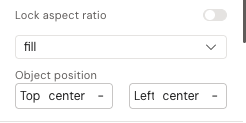
Lock aspect ratio
Toggle button that locks the aspect ratio to maintain the proportions of added images when image size is defined in pixels.
Availability: Image elements only
Object-fit
Sets object-fit for images.
Options: fill, contain, cover, none, scale-down
Availability: Image elements only
Object-position
Defines which part of the image is shown inside its box when the image is resized or cropped. Allows custom top and left positioning.
Units: px, %, or centered
Availability: Image elements only
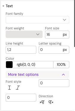
Text
Font-family
Specifies the prioritized font family names for the selected element.
Font-weight
Sets the weight (or boldness) of the font.
Font-size
Sets the size of the font.
Line height
Controls the vertical spacing between lines of text inside a text element.
Letter spacing
Sets the horizontal spacing behavior between text characters.
Font style
Sets whether a font should be styled with normal or italic appearance.
Font-size-min
Required property for responsive design. To enable responsive font-size, you need to add both font-size-min and font-size-max properties. Font-size-min should equal the font-size value and represents the core font-size for standard iPad (small or primary devices).
Font-size-max
Sets the maximum font-size for responsive design. After setting font-size-min (which should equal the base font-size), add font-size-max for larger devices (for example iPad 12). For devices between standard iPad and iPad 12 (such as iPad Pro), the system automatically calculates middle values. The design systems mostly use a coefficient of 1.2 for font-size-max (Font sizes (min and max) coeff 1.2).
How font adaptation works:
Font size adapts responsively using this formula:
font-size: calc((100vw - 375px)/(1366 - 375) * (font-size-max – font-size-min) + (font-size-min * 1px));
Example scaling:
-
375px (phone) → 25px (minimum)
-
800px (tablet) → ~50px (calculated middle value)
-
1366px (desktop) → 85px (maximum)
Best practices:
-
Two coefficient types are typically used for font adaptation: 1.2 and 1.3
-
Font-size-min should equal the base font size
-
Example: For font-size 64px, set min to 64px and max to 77px (using coefficient 1.2)
https://help.activator.cloud/v3/responsive-web-development#ResponsiveWebDevelopment-ResponsiveText
Direction
Defines the horizontal text direction inside an element, controlling whether text flows left-to-right or right-to-left.
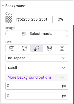
Background
Background-color
Sets the background color of an element.
Background-image
Sets a background image on an element.
Background-size
Sets the size of the element's background image.
Options: default, contain, cover, fit width, fit-height
Background-repeat
Sets how background images are repeated.
Options: repeat, no-repeat, repeat-x, repeat-y
Background-attachment
Sets whether a background image's position is fixed within the viewport or scrolls with its containing block.
Options: scroll, fixed, local
Background-position-x
Sets the initial horizontal position for background images.
Units: px, %, left, center, right
Background-position-y
Sets the initial vertical position for background images.
Units: px, %, top, center, bottom
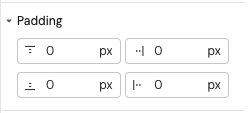
Padding
Padding properties set the space between an element's content and its border. All padding properties can be set independently for each side of the element.
Padding-top
Sets the height of the padding area on the top of an element.
Units: px, %, vmin
Padding-bottom
Sets the height of the padding area on the bottom of an element.
Units: px, %, vmin
Padding-right
Sets the width of the padding area on the right of an element.
Units: px, %, vmin
Padding-left
Sets the width of the padding area on the left of an element.
Units: px, %, vmin
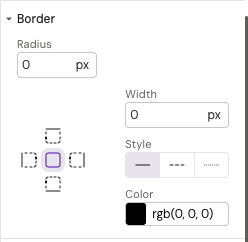
Border
Border properties can be defined separately for each side of the element or applied to the entire element at once.
Border-radius
Rounds the corners of an element's border box.
Units: px, %
Border-width
Sets the width of an element's border.
Border-style
Sets the line style of an element's border.
Options: solid, dashed, dotted
Border-color
Sets the color of an element's border.
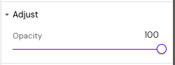
Adjust
Opacity
Sets the opacity (transparency level) for the element. Values range from 0 (fully transparent) to 100 (fully visible).
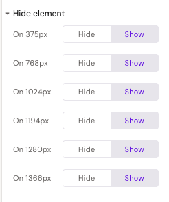
Hide element
Toggle button Hide/Show for different viewports
Configures element visibility across different viewports (desktop, tablet, mobile), allowing you to show or hide elements on specific devices. This is useful for creating responsive designs where certain elements should only appear on specific screen sizes.