The Workspace UI is the canvas editor used to create and edit a single document (Email, Slide, Brief, Fragment, Content Module).
Note
Presentations are containers and have their own flow. The Editor described here is the canvas editor for a single document.
Layout
-
Top bar: document actions (save status, preview, publish)
-
Left sidebar: building and navigation tools (Add / Navigate / Content)
-
Canvas: the document surface
-
Right sidebar: properties for the selected item (Style / Settings / Fields)
Varies by tenant (Anthill-managed)
Tabs and actions depend on role and tenant configuration. Learn more.
Top bar
-
Save status shows last saved time
-
Preview opens the preview options
-
Publish creates a new published version in the connected repository (when enabled)
Left sidebar
-
Add: insert components/elements
-
Navigate: select and inspect structure (tree)
-
Content: channel/document-specific panels
Right sidebar
-
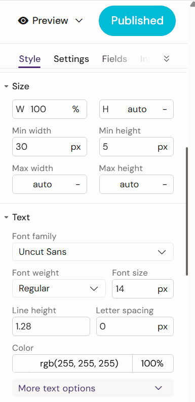
Style: visual properties
-
Settings: behaviour/configuration for the selected item
-
Fields: document metadata fields (when applicable)
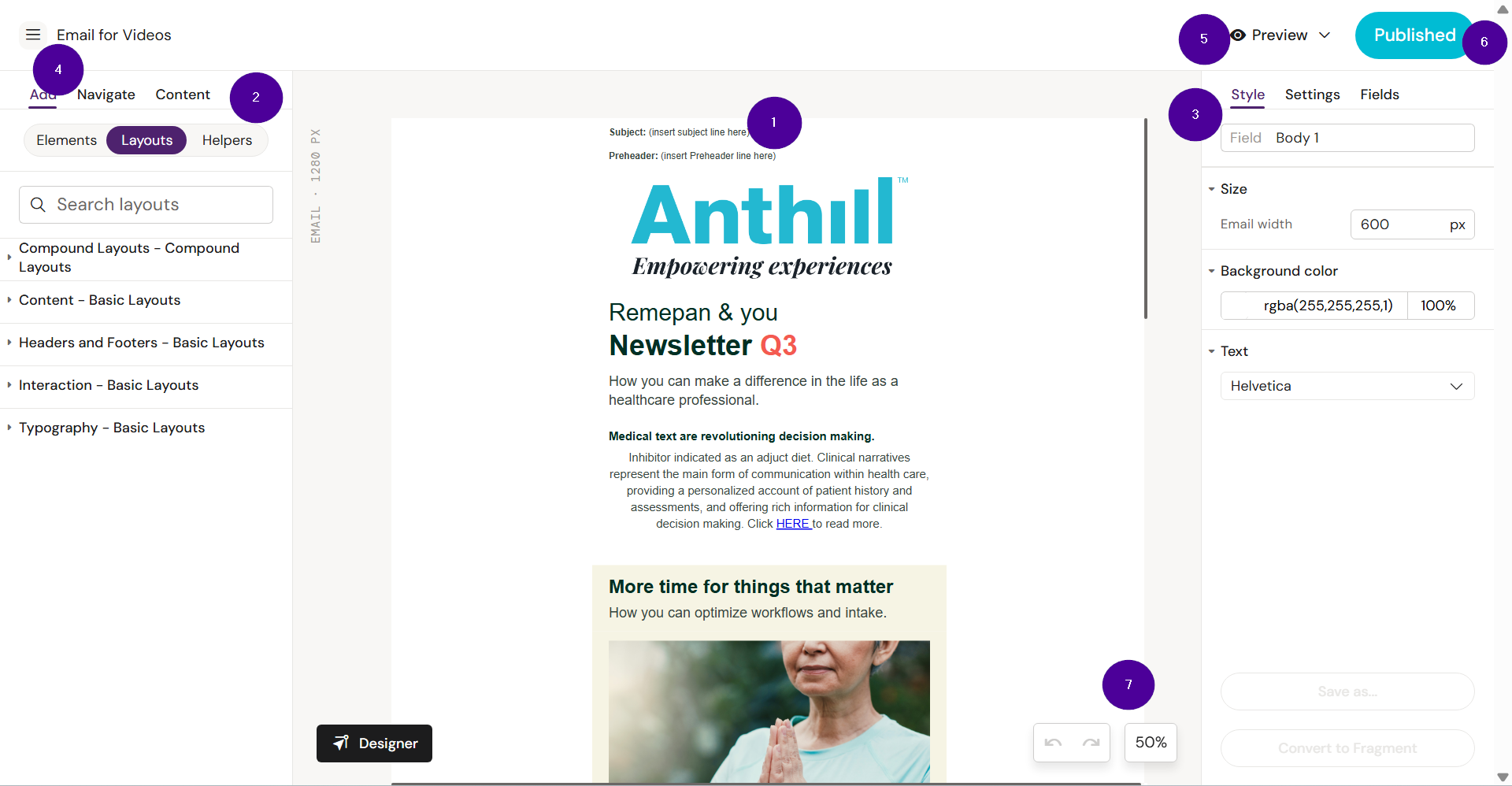
❶ Canvas is the main area in the center of your screen where you build and edit your content. Whether you're creating emails or slides, this is where you see your layout come together. You can add text, images, and other elements directly into the Workspace.
❷ Left sidebar is where you will find ready to use content and tools to build new content.
❸ Right sidebar is where you find tools to customize the content placed in the Workspace.
❹ The burger menu. Click on it to access the settings for the document, to view the document in your DAM, and go back to the Dashboard.
❺ Preview. Create a QR or link to preview (arrow down icon, or click the eye-icon to open the Activator Preview view.
❻ Publish button. When there are no changes to the document, this button is blue. Upon changes, it becomes purple and clicking it creates a new version of the document in your DAM.
❼ Undo/redo buttons and zoom.
Left sidebar ❷: Add / Navigate / Content
The left sidebar is used to build and inspect the document.
Common tabs
-
Add: insert components/elements
-
Navigate: see and select structure (tree)
-
Content: document-specific panels (varies by channel)
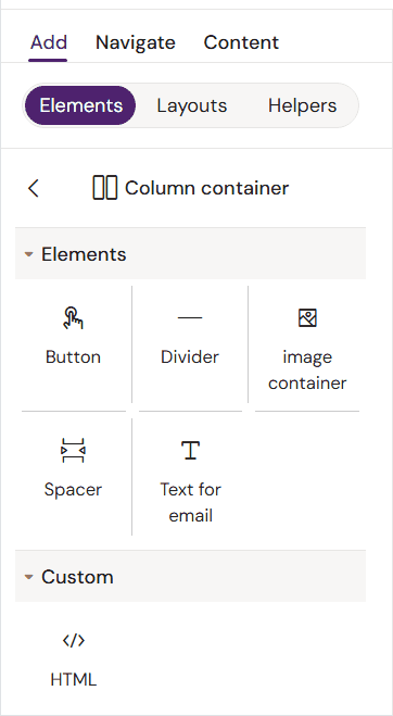
Add
Contains 3 sub-menus:
-
Elements - The smallest building blocks that are available to a user
-
Layouts - Prebuilt blocks of designed content, ready to use in your workspace
-
Helpers - A list of saved Layouts that already have text and images added
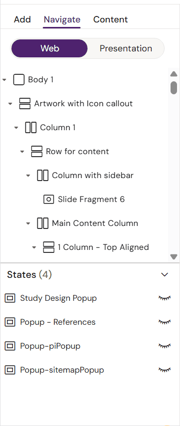
Navigate
Content contains 2 sub-menus.
-
Navigate/Web - This menu allows you to navigate the structure of your document.
-
Presentation - (Slides only) Shows which Binders the Slide is added to.
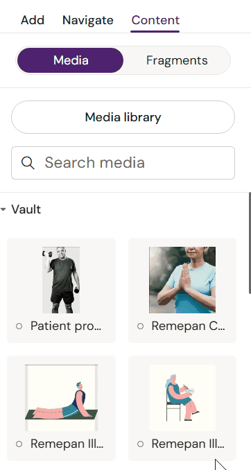
Content
Content contains 2 sub-menus.
-
Media - Import approved media and modular content.
-
Fragments - (Emails only) Contains a list of linked email fragments.
Canvas
The canvas is the document surface. You select elements on the canvas to edit their properties.
-
Click to select elements
-
Some elements are nested inside containers/rows/columns
-
The structure in Navigate mirrors what you see on the canvas
Right sidebar ❸: Style / Settings / Fields
The right sidebar shows the properties for the currently selected element.
Typical tabs
-
Style - Displays styling options for the selected container or element.
-
Settings - Displays configuration options for the selected container or element.
-
Fields - Displays the available fields in the selected Layout. Fields can be optional or mandatory.
-
Interactions - (Slides only) Program interactions on the Slide or review existing interactions.