
The examples presented are drawn from the Anthill Remepan Design System. Some projects may include custom elements not found in these examples. Consult your internal documentation to identify the navigation types used in your project.
Using Interactions for navigation
In continuation with the article “how to create and trigger interactions” the Interactions feature can also be used to program navigation on a component, such as, but not limited to, a button or an image.
Use the Interactions menu to setup the action.
Option 1: Default Setup - can navigate to Collection using the same Design System
-
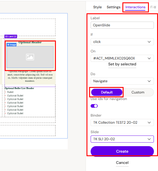
Label = A suitable name for the action
-
If = Click
-
On = Click on “Set by selected” which will add the ID of the element you already selected.
-
Do = Navigate
-
Type = Default
-
Binder = Drop-down menu displaying all the Collections that are connected to the Design System that is being used for the project.
-
Slide = Drop-down menu displaying all the Slides within the selected Collection.
Option 2: Custom - can navigate to Collections using another Design System.
-
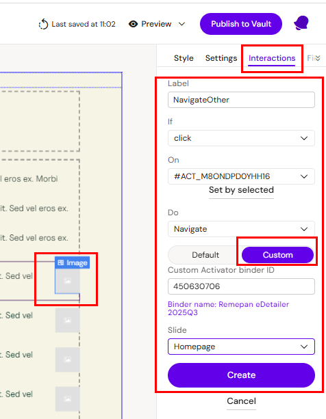
If = Click
-
On = Click on “Set by selected” which will add the ID of the element you already selected.
-
Do = Navigate
-
Type = Custom
-
Custom Activator Collection ID = Insert the ID of the Collection.
-
Slide = Drop down menu displaying all the Slides within the selected presentation.
Click create to save the action and go to preview to test.
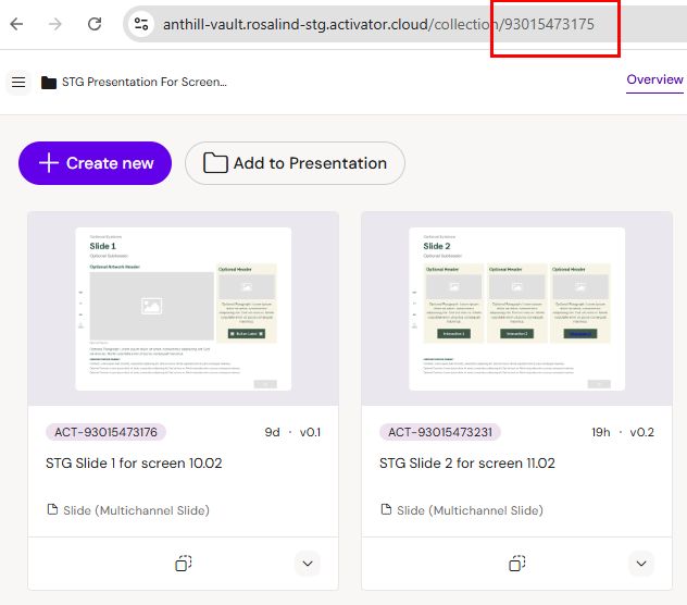
How to find the Activator Collection ID:
Go to the Collection i Activator and copy the unique collection ID found in the URL into the Custom Activator Collection ID field:
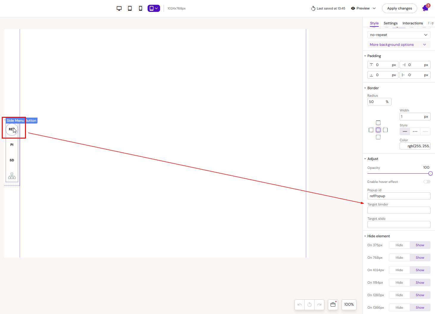
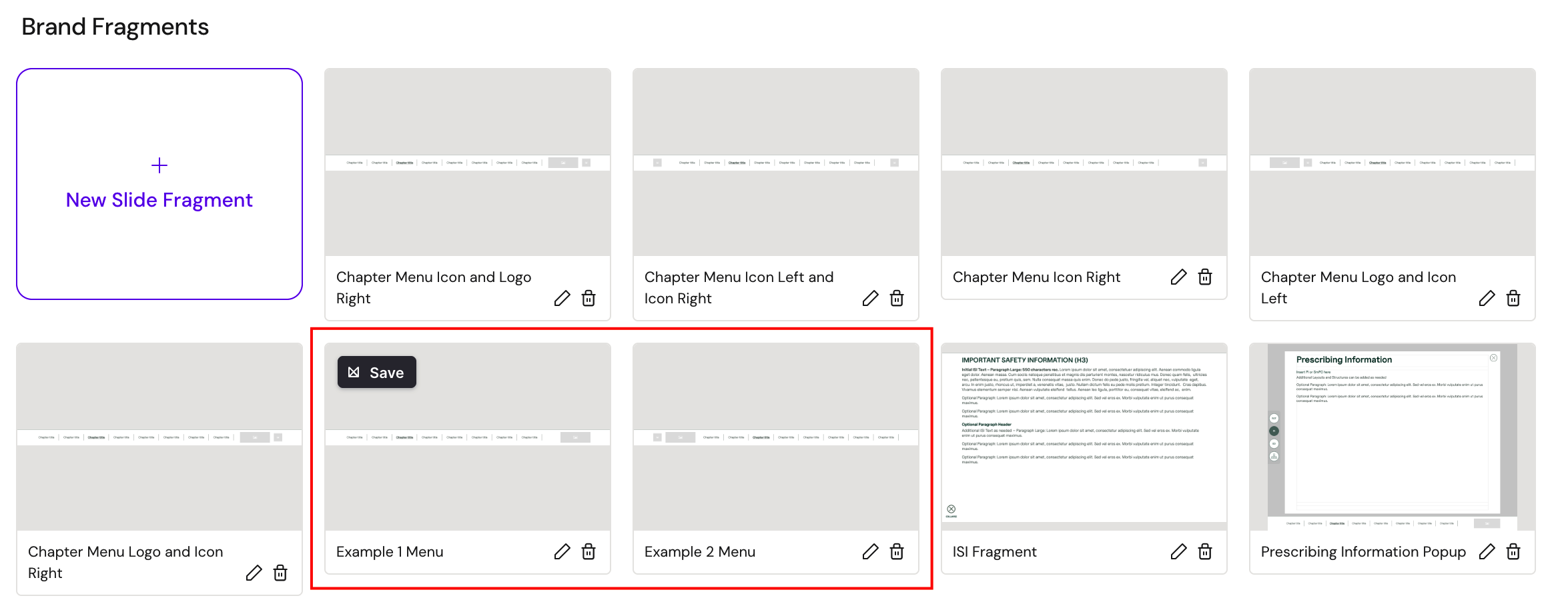
Side Menu
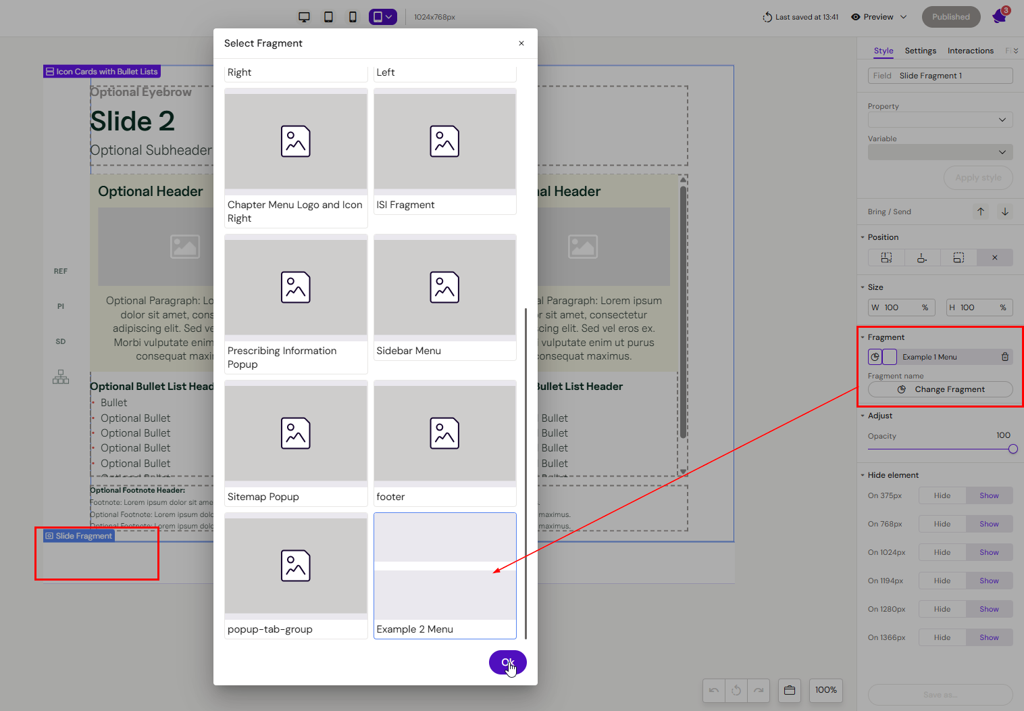
This example is of a slide fragment menu that can be used for both navigation and opening popups.
How to configure
Open the slide fragment from the Design System UI, select a button and define which presentation(binder) you want to navigate to and define which slide the button should open.
The button can also be used to open a popup if a value (popup name) is defined in the Popup Id field.
The location of these IDs depend on your DAM.
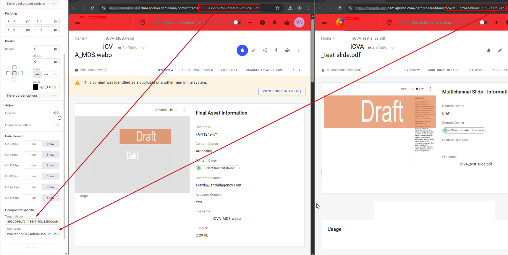
For Aprimo
In Aprimo copy the ID of your binder and slide from the URL. The ID is presented in the end of the URL after /contentitems/ l
https://organization.dam.aprimo.com/dam/contentitems/ 3932266c751f486f9140b32f00de652f
The add these IDs into Target binder and Target slide fields:
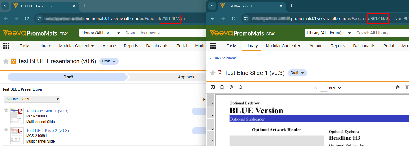
For Veeva Vault PromoMats
Find the target binder/presentation global ID in the URL in Veeva Vault PromoMats, copy and paste it into their respective fields in Activator:
Saving Changes to Slide Fragments.
When you edit a Design System in Activator, there are two different actions you can take:
Save to Design System (Activator)
When you make changes to an item such as a layout, template, or fragment, the changes are saved by clicking Apply changes.
Afterwards, when you return to the DS3 UI, the Design System is automatically rebuilt. Any additional changes, such as configurations, are also saved automatically through the Build Design System feature, which applies your updates.
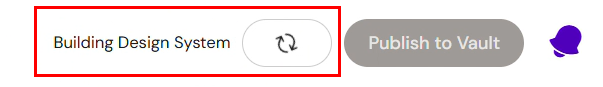
These changes are stored only in Activator and are not sent to the DAM.
Publish to DAM
When you publish, your changes are pushed from Activator to the DAM. This updates the official version of the Design System in the Digital Asset Management system and makes the changes available outside Activator.
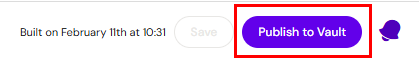
Important: Saving changes does not automatically publish them. To ensure your updates are reflected in the DAM, you must explicitly publish them.
As an Editor, you may not have the permissions needed to publish a Design System. In that case, it’s good practice to coordinate with a team member who can finalize and publish the updates.
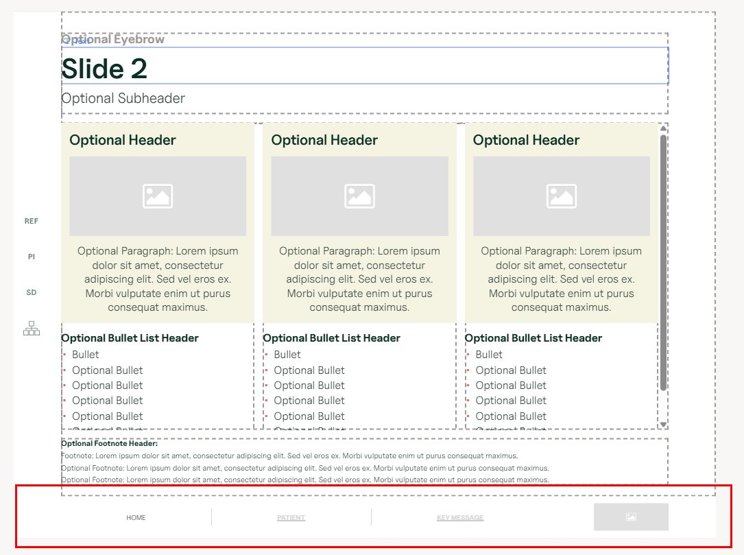
Global Menu navigation
The global menu is a component that can either be used directly on a Slide or within a Slide Fragment.
It is mostly used as a menu that appears at the bottom of a Slide, such as in the following example:
How to configure
Several menus can be setup in the Design System UI. Each menu is a separate configuration.
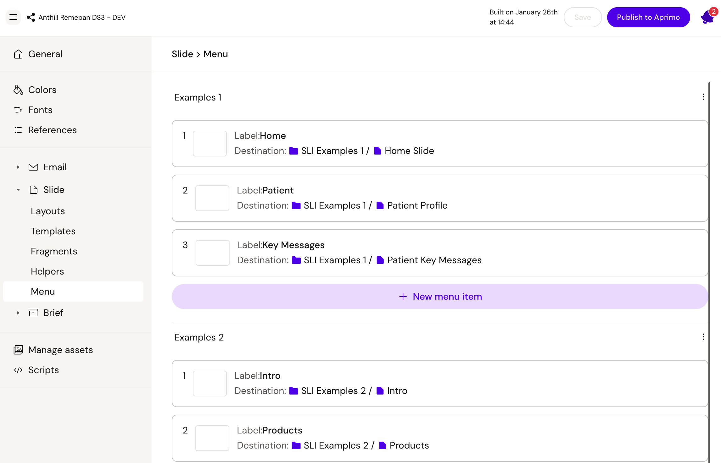
Menu Component
With the new fusion-menu component, it’s possible to select one of the menu configurations setup in the design system.
In the menu component settings, select the configuration that should be applied:
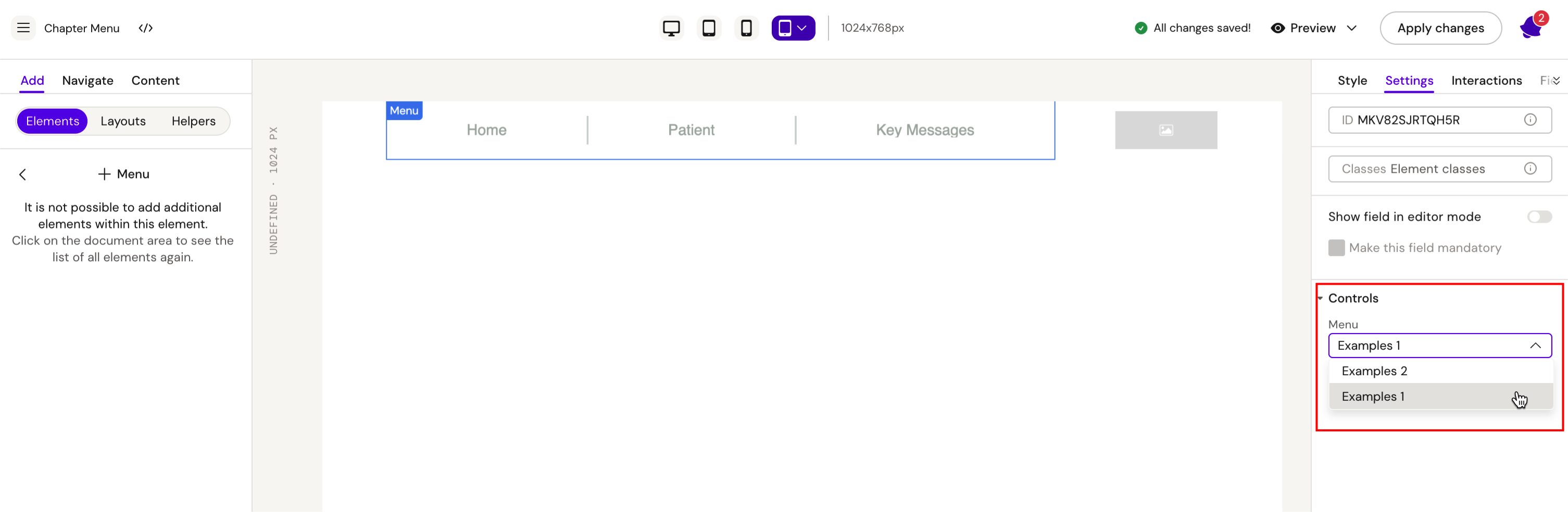
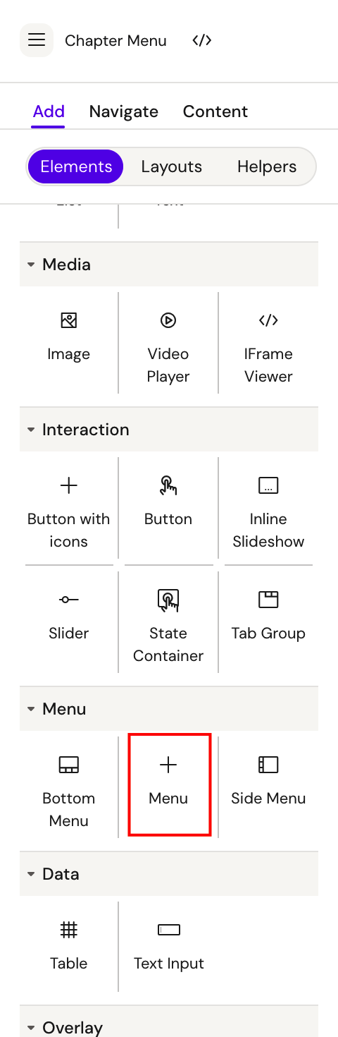
Set this up in fragments to ensure that the correct menu is used in a document.
From the Slide, select the Slide Fragment with the menu you wish to use:
These examples demonstrate how navigation can be implemented in practice. Use them as a reference, but always adapt your approach to the specific requirements of your project.