
Layout Structure Overview
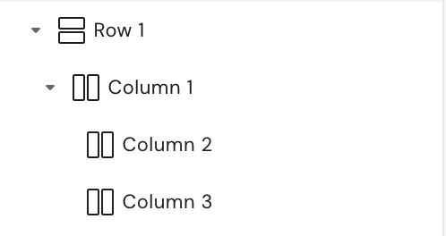
Layouts are built using the Row element as the root container. Within a Row, you can place Column or Grid elements to define the layout structure.
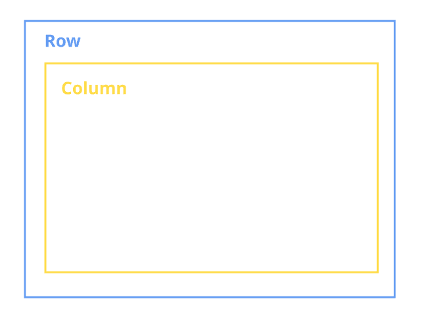
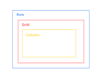
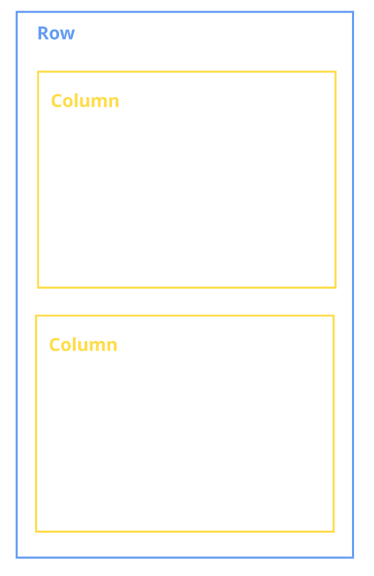
Row (Blue Container)
The Row container is required to create and store the layout structure. It serves as the root element of the layout.
-
Multiple Column containers can be placed inside a Row.
-
Columns inside a Row are positioned side by side.
-
The Row element uses
display: flexwithflex-direction: row, which ensures horizontal alignment of its child elements.
Column (Yellow Container)
The Column container is used to structure and organize layout content.
-
Any elements can be placed inside a Column.
-
Columns define the vertical structure within the layout.
-
Columns placed inside a Row are arranged horizontally.
Grid (Red Container)
The Grid container is designed for more advanced layout scenarios.
-
Use Grid when building complex layout structures.
-
It is particularly useful for advanced responsiveness and adaptation across different device types.
Basic Layout Structures
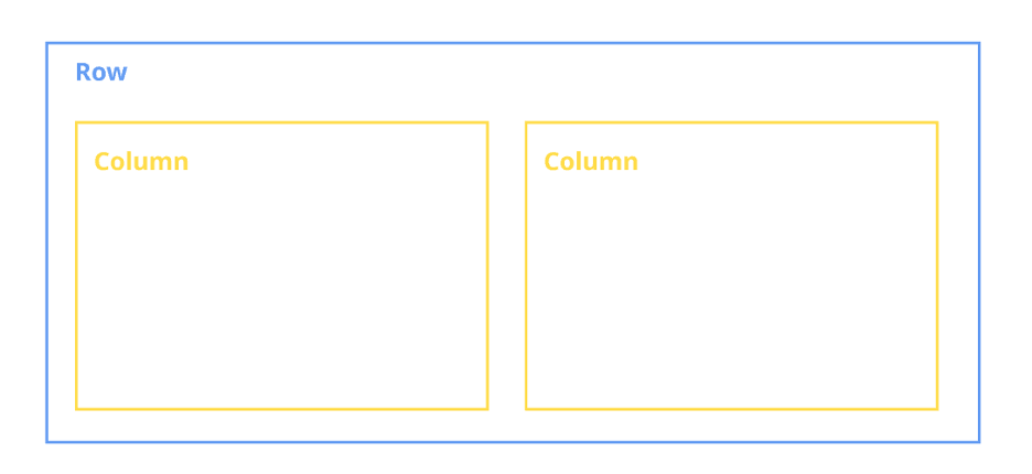
Structure 1: Side-by-Side Columns
To display columns next to each other:
-
Place multiple Column elements inside a Row.
-
Because the Row uses flex layout with horizontal alignment, all Columns will appear side by side.
Result: Columns are always aligned horizontally within a Row.
Structure 2: Full-Width Column
To make a column span the entire width of a row:
-
Place a Column inside a Row.
-
Inside that Column, add another Column.
The inner Column will occupy the full width of the available row space.
Result: The nested Column spans the entire row width.
Group container
The Group container combines the directional behavior of both Row and Column elements.
Unlike Row and Column, the Group container allows you to explicitly control how child elements are positioned. You can define:
-
Horizontal alignment, or
-
Vertical alignment
This flexibility makes the Group container useful when you need more control over element direction without switching between Row and Column structures.
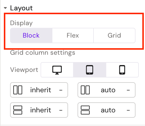
Column Display Options
The Column container includes advanced display settings that are not available in other containers.
For a Column, you can select the display type:
-
block -
flex -
grid
This provides greater flexibility when defining layout behavior and internal element alignment.
Saving a Layout
To save a layout, complete the following steps:
-
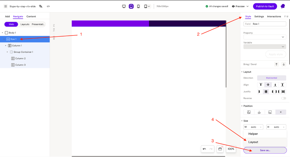
Select the Row element (the root container of your layout).
-
Open the Style tab.
-
Click the “Save as…” button.
-
Select “Layout”.
-
Enter a name for the layout.
-
Assign the layout to a group.
After completing these steps, the layout will be saved and available for reuse.
For more detailed instructions on creating and saving layouts, refer to the documentation here Step-By-Step Build a Slide Layout
Responsive units
Using responsive units is essential when developing layouts.
Slides may be displayed on a variety of devices with different screen sizes and resolutions. If fixed units such as pixels (px) are used for width and height, the layout may appear inconsistent across devices. Elements that look correct on one screen resolution may appear too large, too small, or misaligned on another.
To ensure consistent appearance and proper scaling, always use responsive units (such as percentages or other relative units) instead of fixed pixel values.
Note: You can read more details about responsive units here Responsive slide | Responsive units
Responsive layouts
Layouts should be designed to be as responsive as possible.
As mentioned above, layouts are displayed on devices with varying resolutions, which can affect their appearance. In addition to device differences, layouts must also function correctly within Structures (Empty Dropzones).
A layout may be placed inside different drop zones with varying widths. Therefore, it must adapt dynamically to the available space.
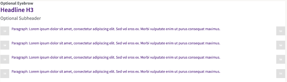
Example: Compound Layout
Consider a compound layout composed of multiple sub-layouts:
-
One header layout
-
Four icon list item layouts
In this structure:
-
Each sub-layout (the header and the icon list items) uses responsive width units.
-
As a result, each element occupies the full width of its parent container.
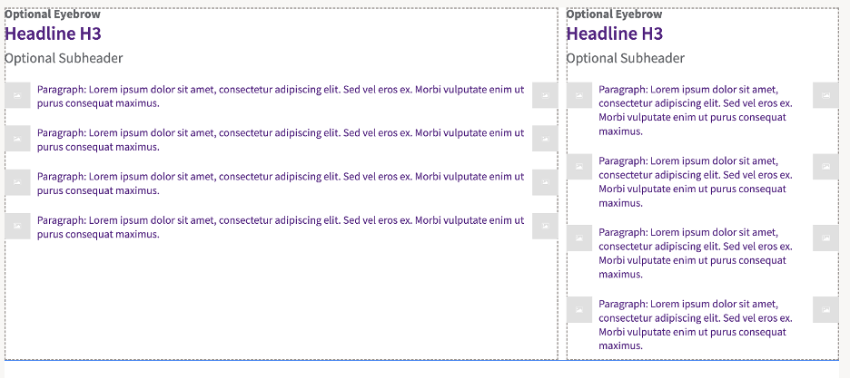
Because responsive units are used:
-
The layout adjusts correctly across different devices.
-
The layout displays properly inside various Structures (Empty Dropzones) with different widths.
Designing layouts in this way ensures flexibility, consistency, and correct rendering in all usage scenarios.
Note: You can read more details about responsive layouts here Responsive slide | Responsive layouts
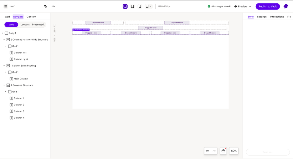
Structures (Empty Dropzones)
Structures are layouts that contain predefined areas called dropzones, where other layouts can be inserted.
Dropzones make it easier to build consistent and reusable layout compositions.
When to Use Structures
Structures are particularly useful when working with multiple similar layouts, such as:
-
Two-column layouts (50/50 width)
-
Two-column layouts (70/30 width)
Instead of recreating spacing and proportions manually each time, a Structure ensures:
-
Consistent column sizes
-
Preserved spacing between elements
-
Uniform alignment across layouts
This approach improves efficiency and maintains design consistency.
Dropzones in Content Layouts
Dropzones are also used inside content-based layouts.
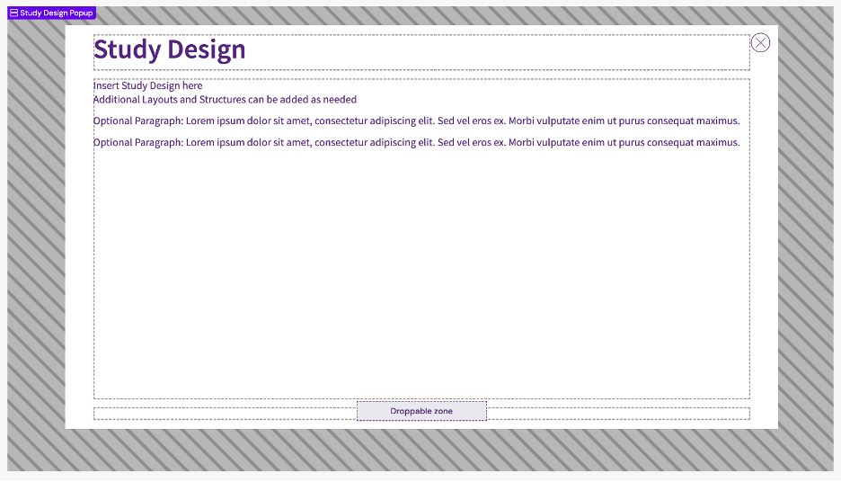
For example, consider a layout designed for a pop-up. The pop-up may contain predefined dropzones for:
-
Header
-
Body
-
Footer
Each of these sections functions as a dropzone, allowing you to insert additional layouts inside them.
This is especially useful when working with multiple similar pop-ups that share the same structure but differ in content. Instead of recreating the layout, you can reuse the same Structure and simply replace the content inside the dropzones.
Using Structures with dropzones ensures flexibility, consistency, and efficient layout management.
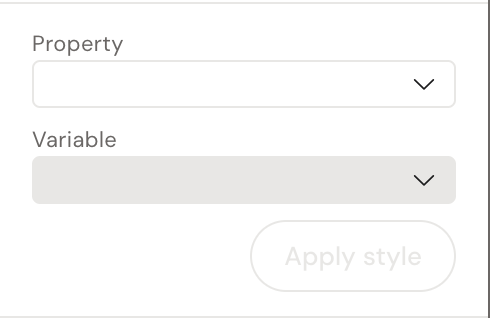
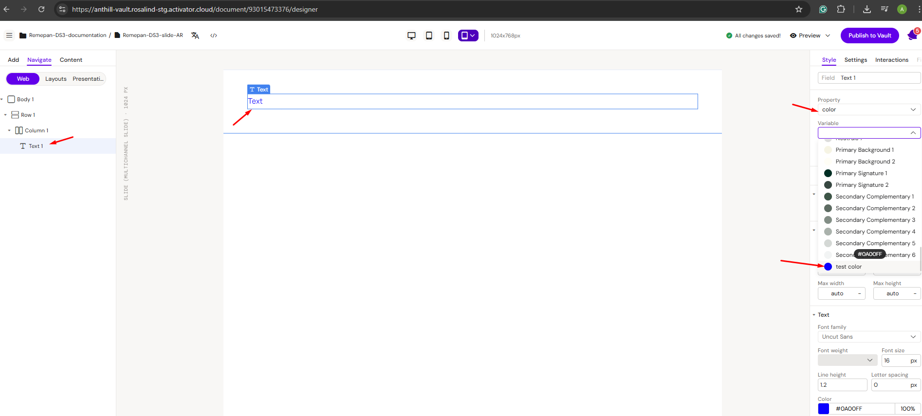
How to Configure a CSS Variable
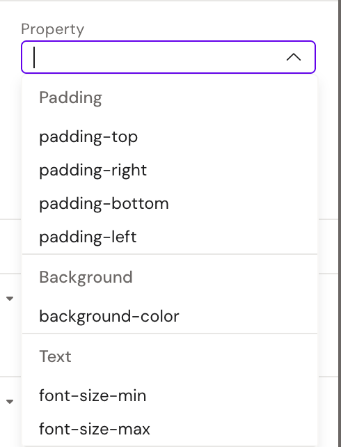
To apply a CSS variable, use the following two fields:
1. Property
In the Property field, specify the CSS property to which the variable will be applied (for example, color, background-color, font-size, etc.).
2. Variable
After selecting a Property, the Variable field becomes available.
In this field, assign the corresponding CSS variable that will control the selected property.
In the Property field, set the property to which the variable will be applied
After selecting the property, the Variable field becomes available.
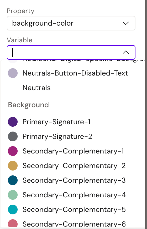
Example: Using a CSS Color Variable
Step 1: Assign a CSS Variable to a Property
Set a CSS color variable for the text color property.
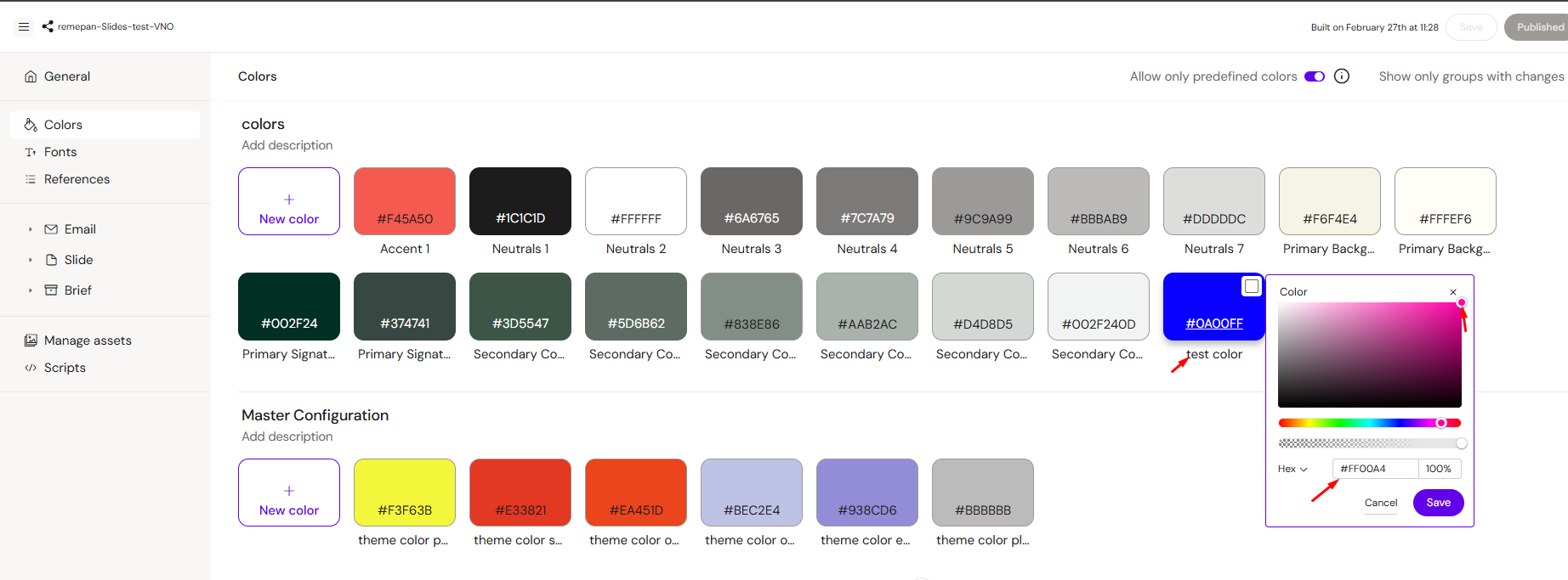
Once the variable is assigned, navigate to the Design System → Colors settings and modify the color value there.
Step 2: Save and Rebuild
-
Click “Save” in the top-right corner.
-
Wait for the rebuild process to complete.
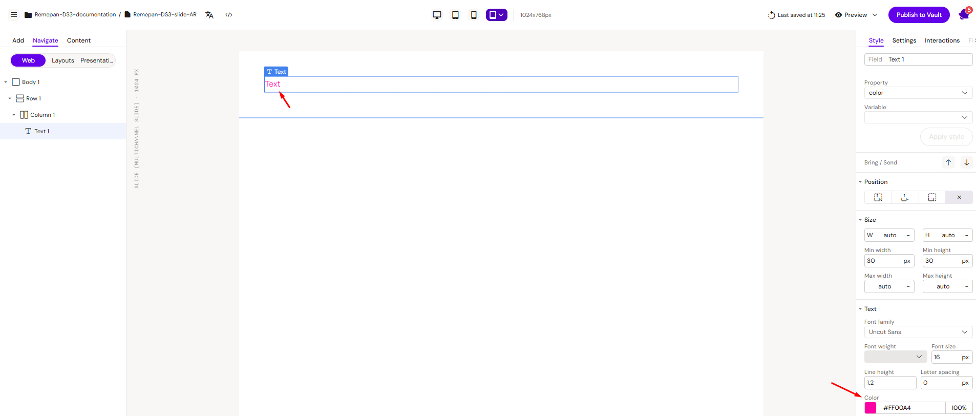
Step 3: Verify the Changes
Return to your slide and confirm that the text color has updated automatically.
Because the text color is controlled by a CSS variable, any changes made in the Design System are applied across all layouts where the variable is used.
Note: Currently, only color variables are fully supported. Support for additional properties such as font-size, padding, and others will be added in future updates.