
This feature is only available to the Activator Brand Designer role.
Create a Layout Placeholder
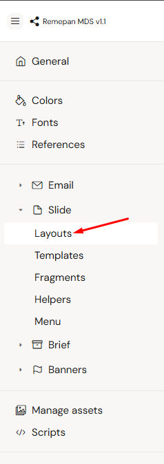
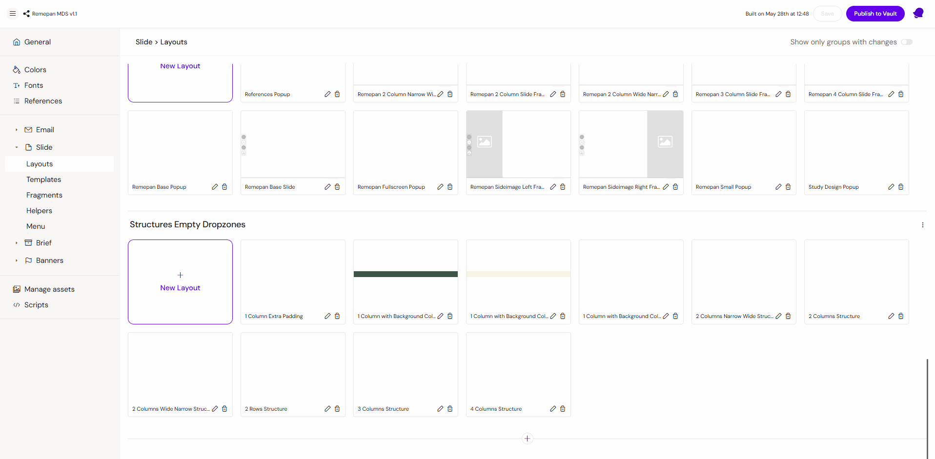
As a first step, you need to create a new layout placeholder. To do that, please go to your Design System UI, then go to Slide > Layouts section
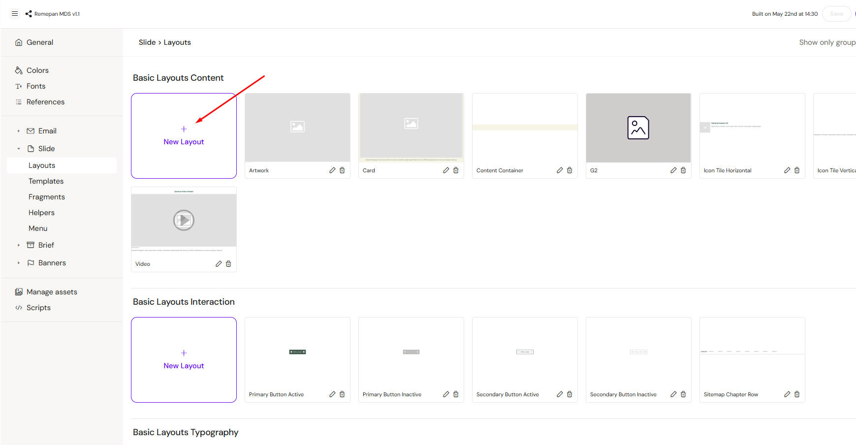
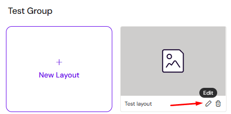
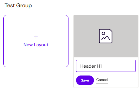
In the Layouts section, you will see all layout groups and existing layouts. Select the appropriate group for your layout and click the + New Layout button.
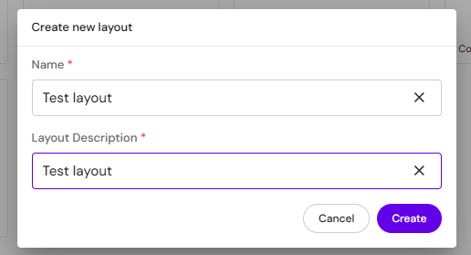
Then a pop-up will appear. Fill in Name and Layout description, and click Create
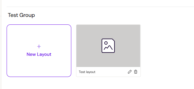
After these steps, you will see an empty layout placeholder
Note: If you need to add a new group for your layout, please scroll all the way down and click on the + button.
Open Layout Editor
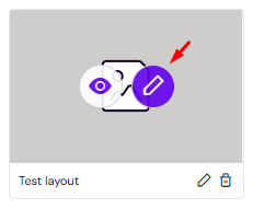
After you have created a new empty layout, open it in edit mode. To do that, hover over the new layout and click on the Pencil button.
You will see the same editor interface as you have for slides and emails, with the same elements and settings.
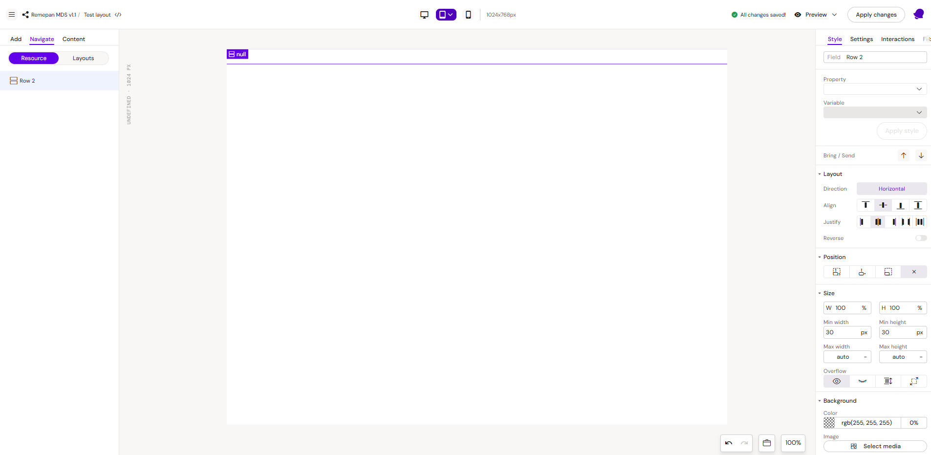
RESTRICTIONS: In the layout editor, you can not use already existing layouts. You can add only the basic elements to the editor canvas to create a new layout.
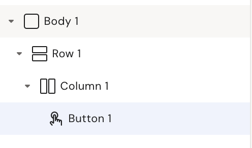
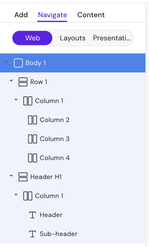
Add Basic Layout Structure
Every layout must start from a Row element. Your initial structure should look like this
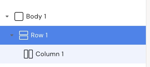
Make sure your layout looks like this before adding any other elements to it
Create a Layout
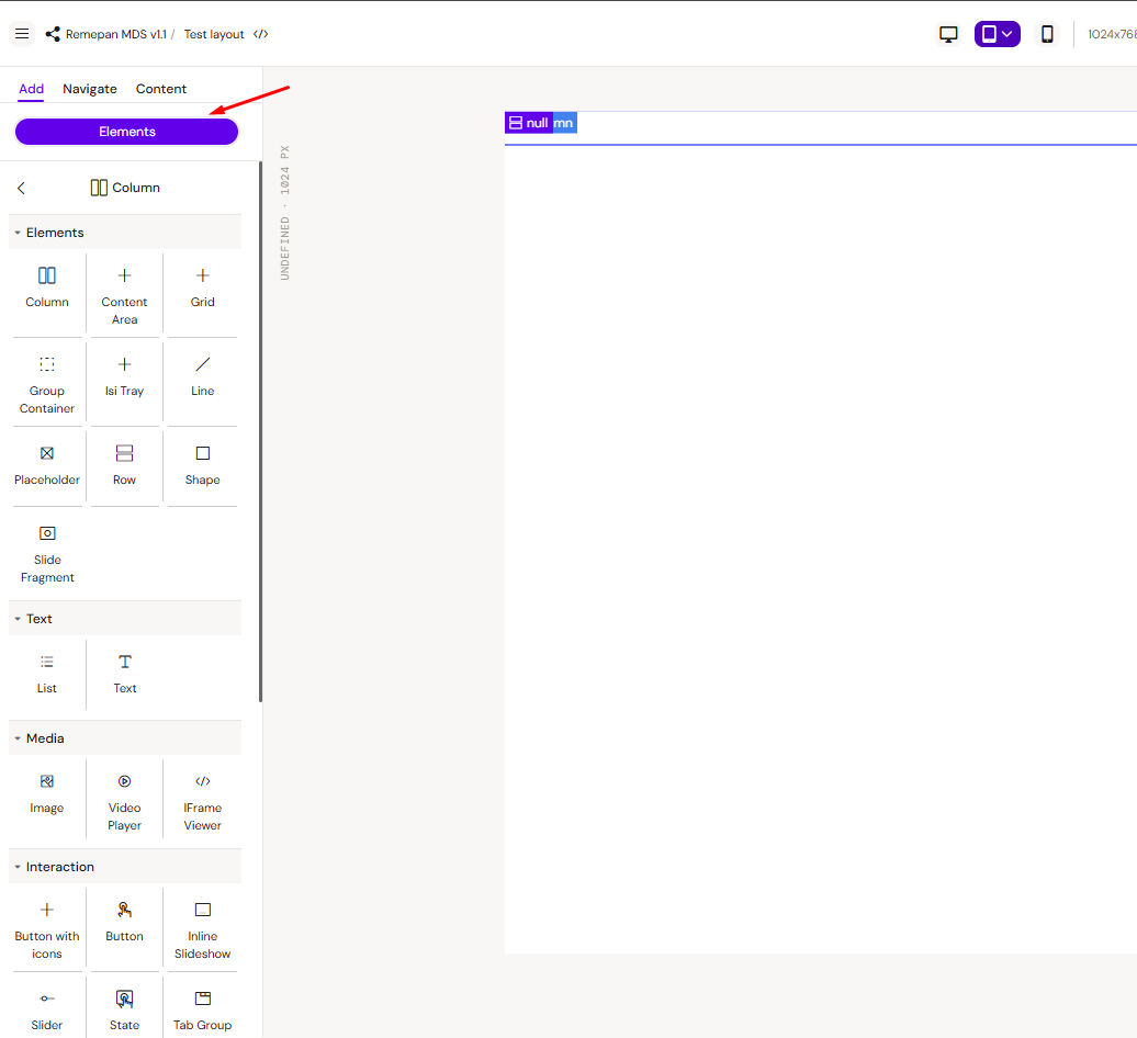
Now you can build the desired layout by adding elements to the editing canvas and adjusting properties such as width, font size, and others for each element.
Note: The CSS values used in the examples below (e.g., 10px padding, font-family=Verdana) are strictly illustrative. You should configure all styling attributes to meet your design specifications.
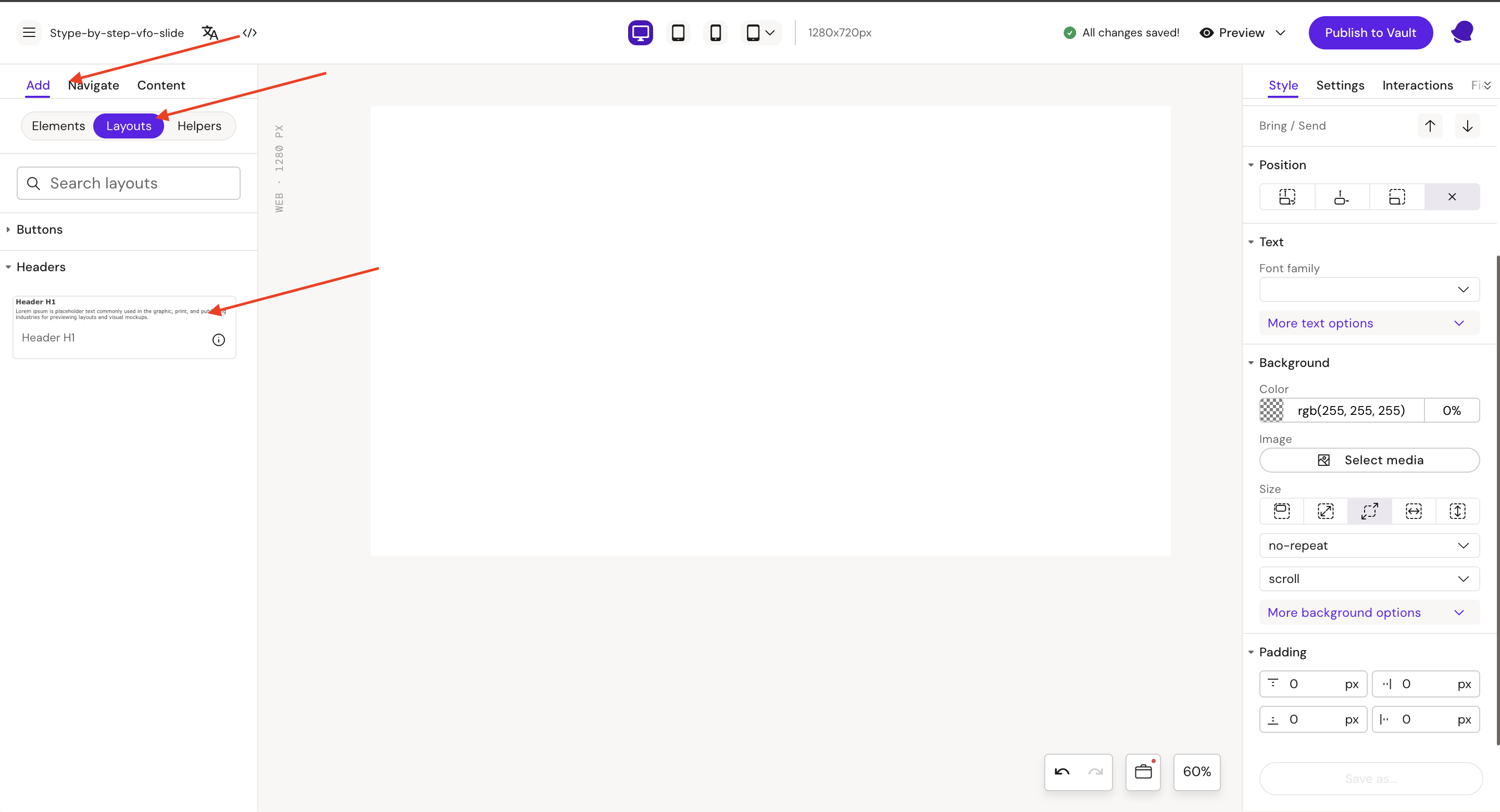
Header H1 - Layout Example
Step 1: Add a row on the canvas, then add a column into row, select Row 1 field.

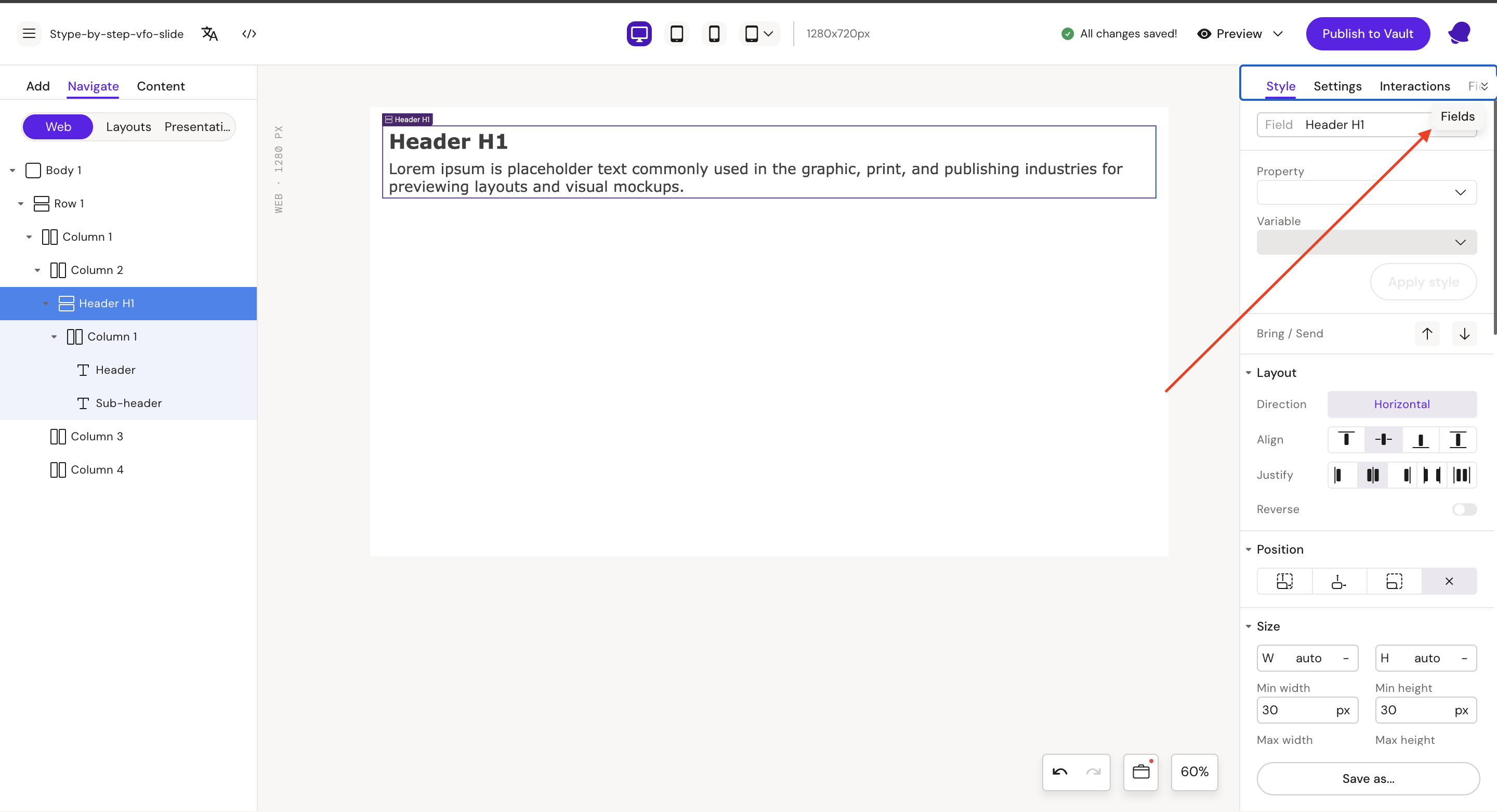
Style
Field: Header H1
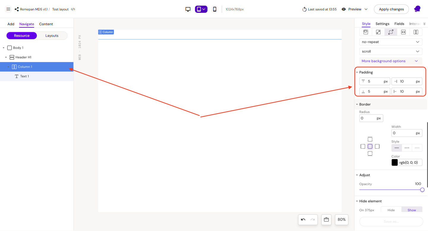
Step 2: Select Column 1
Style
Padding:
-
Left = 10px
-
Right = 10px
-
Bottom = 5px
-
Top = 5px
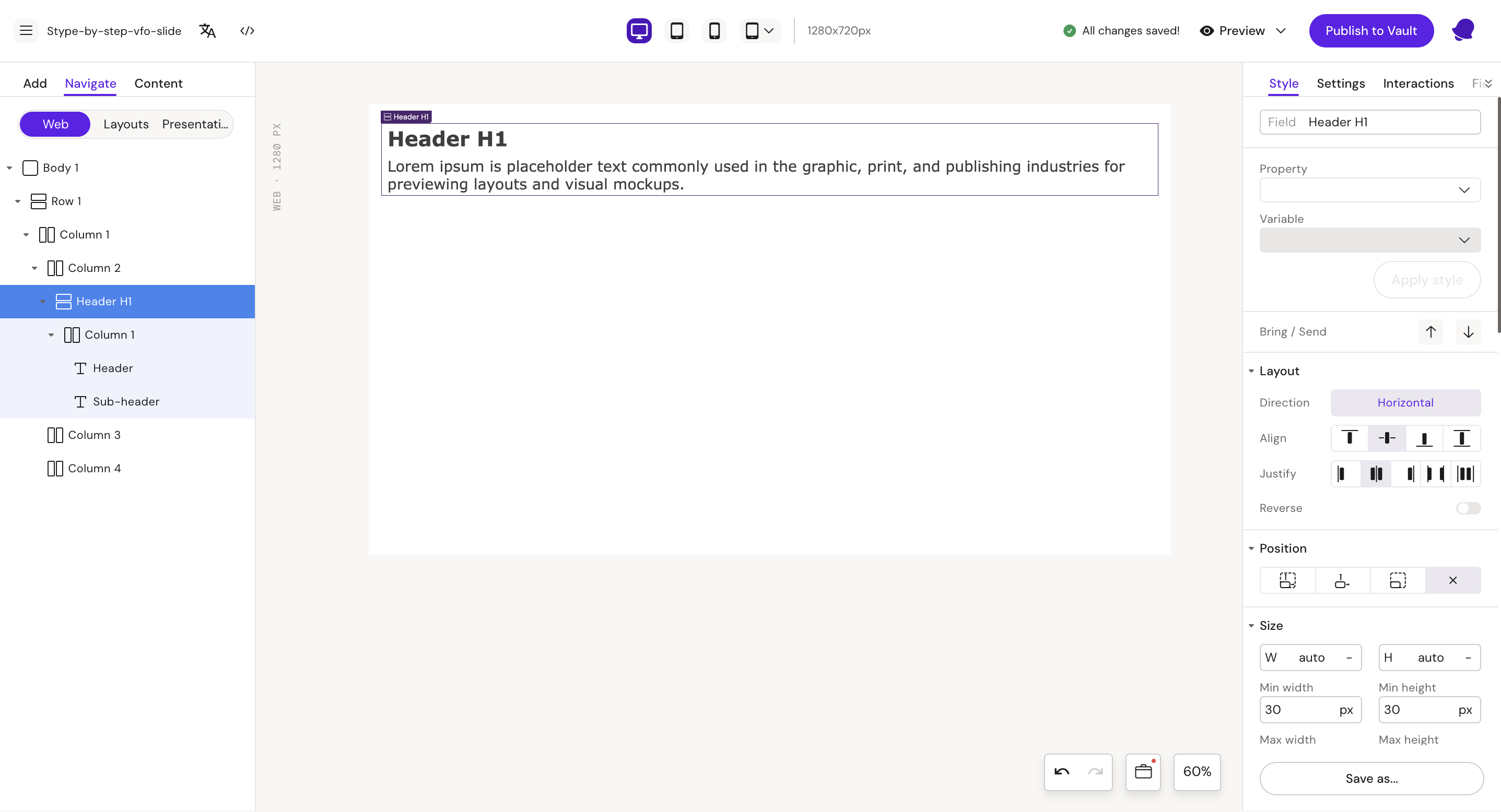
Step 3: Add a text component to the column and rename it
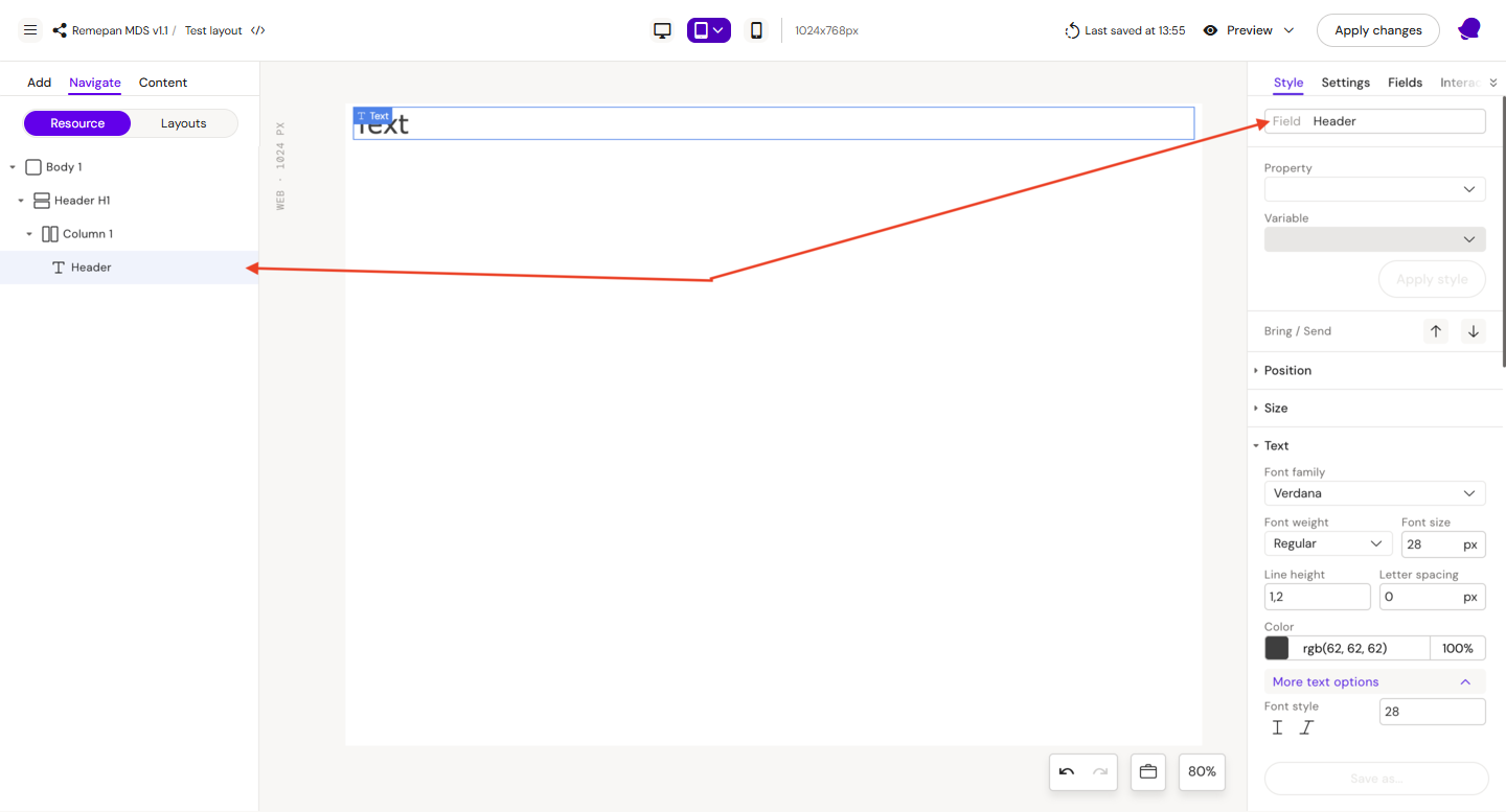
Style
Field: Header
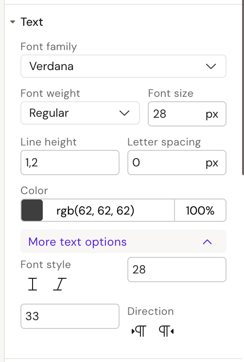
Font
-
family = Verdana
-
weight = Regular
-
size = 28px
-
min size = 28
-
max size = 33
-
color = rgb(62, 62, 62)
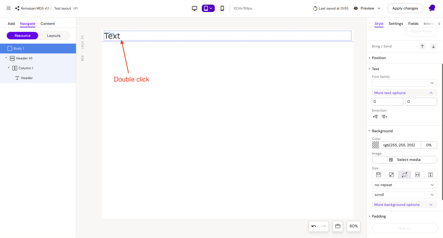
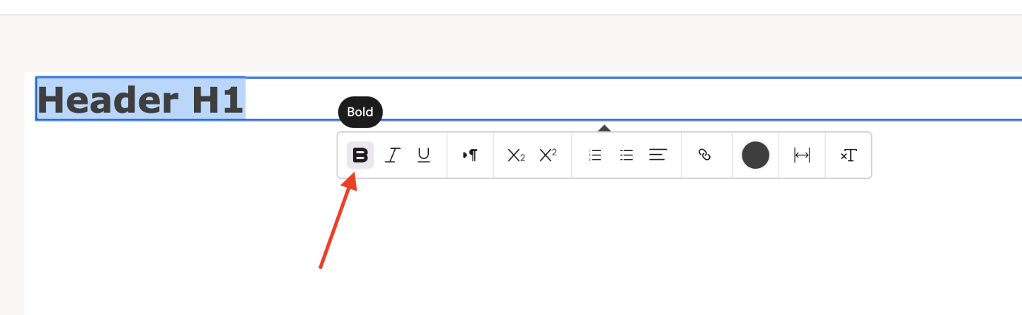
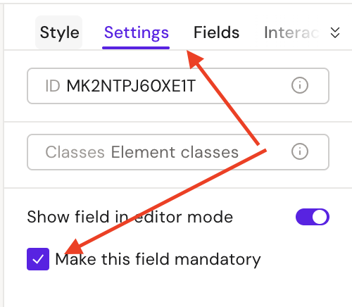
Double click on the text field and change the default text to Header H1, after that select the text (Ctrl + A) and choose bold font
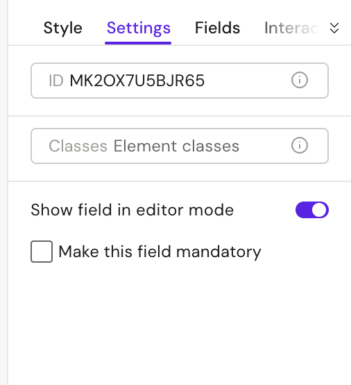
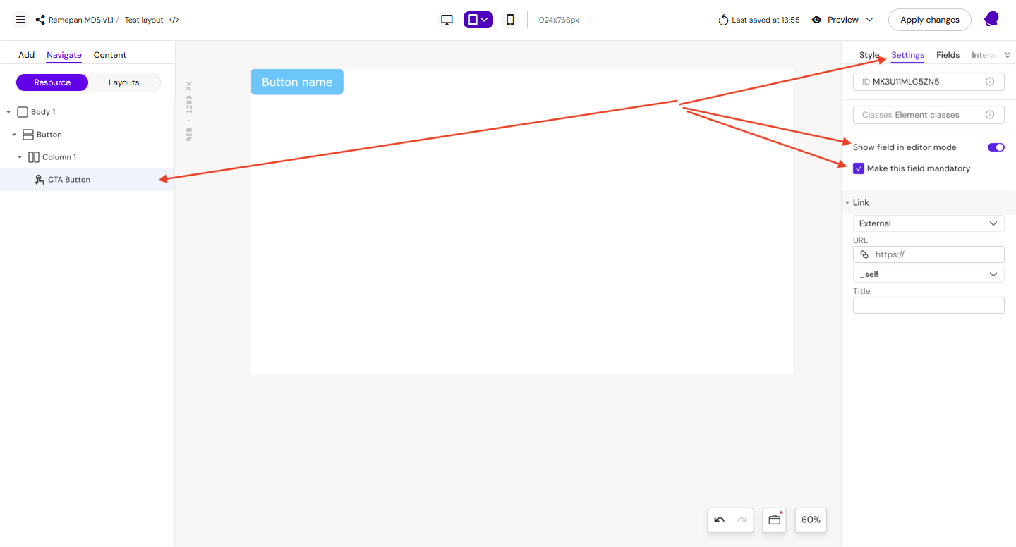
Settings
-
Make this field mandatory = true
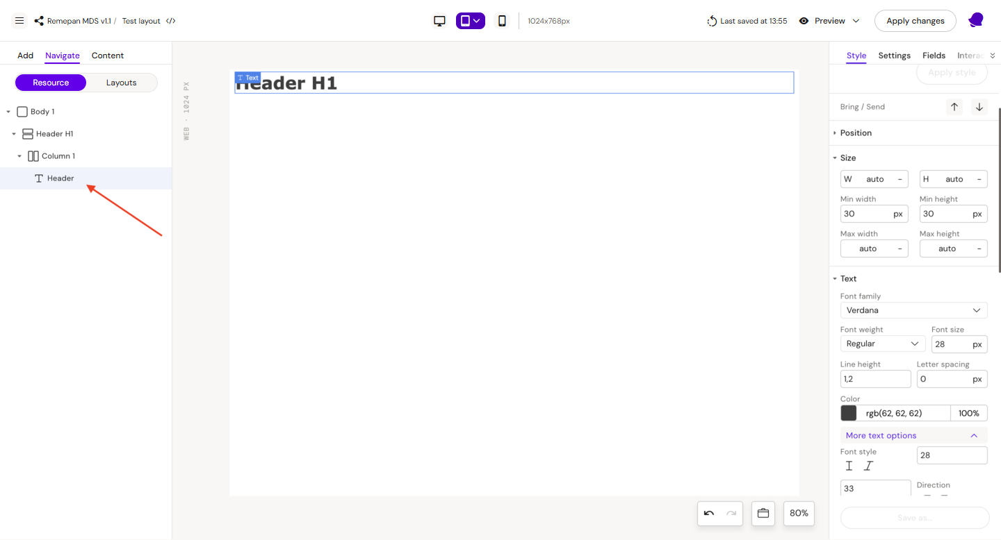
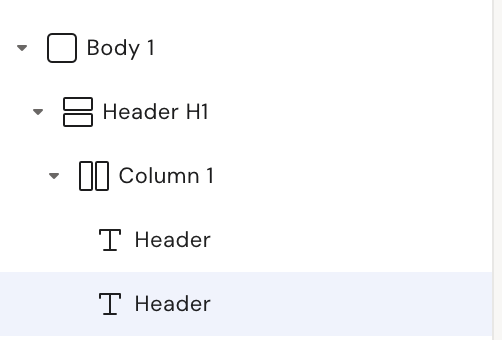
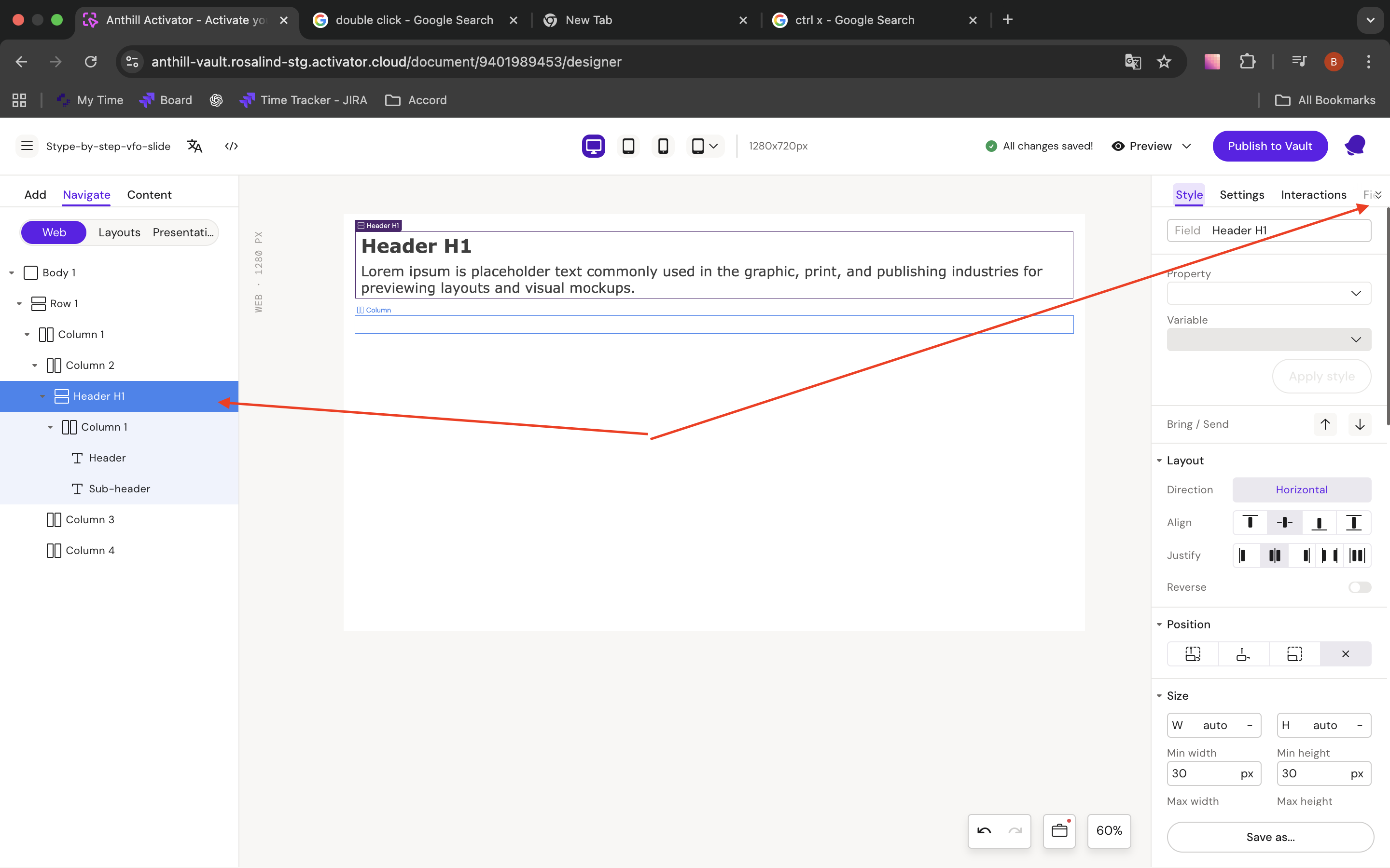
Step 4: Select the text component with the new name Header
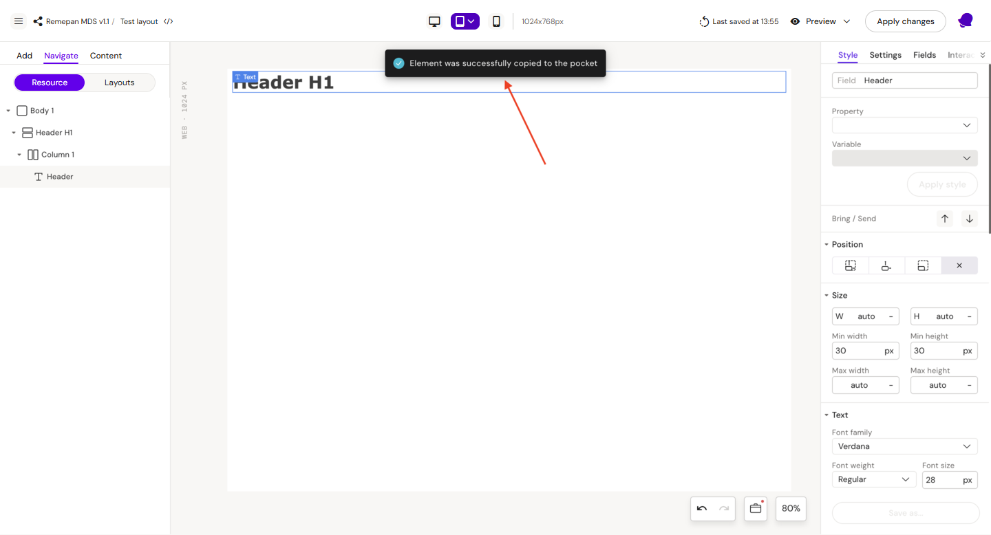
Step 5: Press Ctrl + C (to copy it), after this you should see a notification that the component was successfully copied
Step 6: Select Сolumn 1 and press the key combination Ctrl + V, after which a copy of the text component should appear
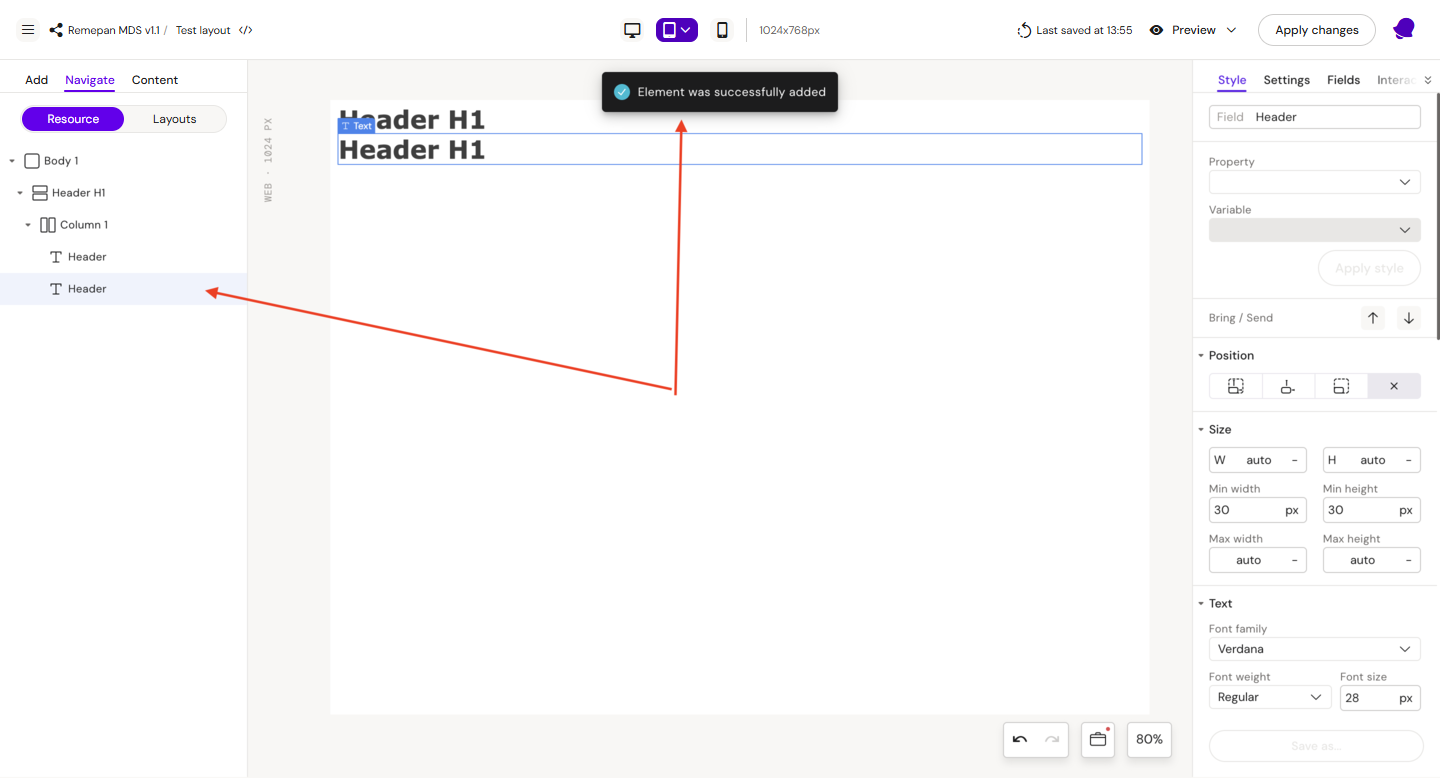
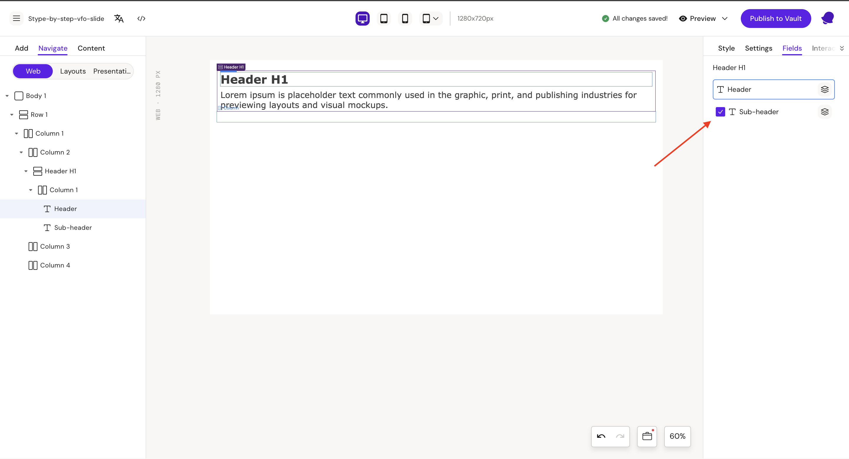
Step 7: Select the second Header
Style
Field: Sub-header
Font:
-
size = 20px
-
min size = 20
-
max size = 24
Padding:
-
top = 10px
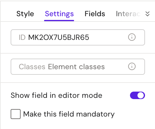
Double-click on the text field and change the default text to “Lorem ipsum is placeholder text commonly used in the graphic, print, and publishing industries for previewing layouts and visual mockups.“
Settings
-
Make this field mandatory = False
Step 8: Save layout by clicking “Apply Changes“

Step 9: Rename layout in the Design System UI, if needed.
|
|
Button - Layout Example
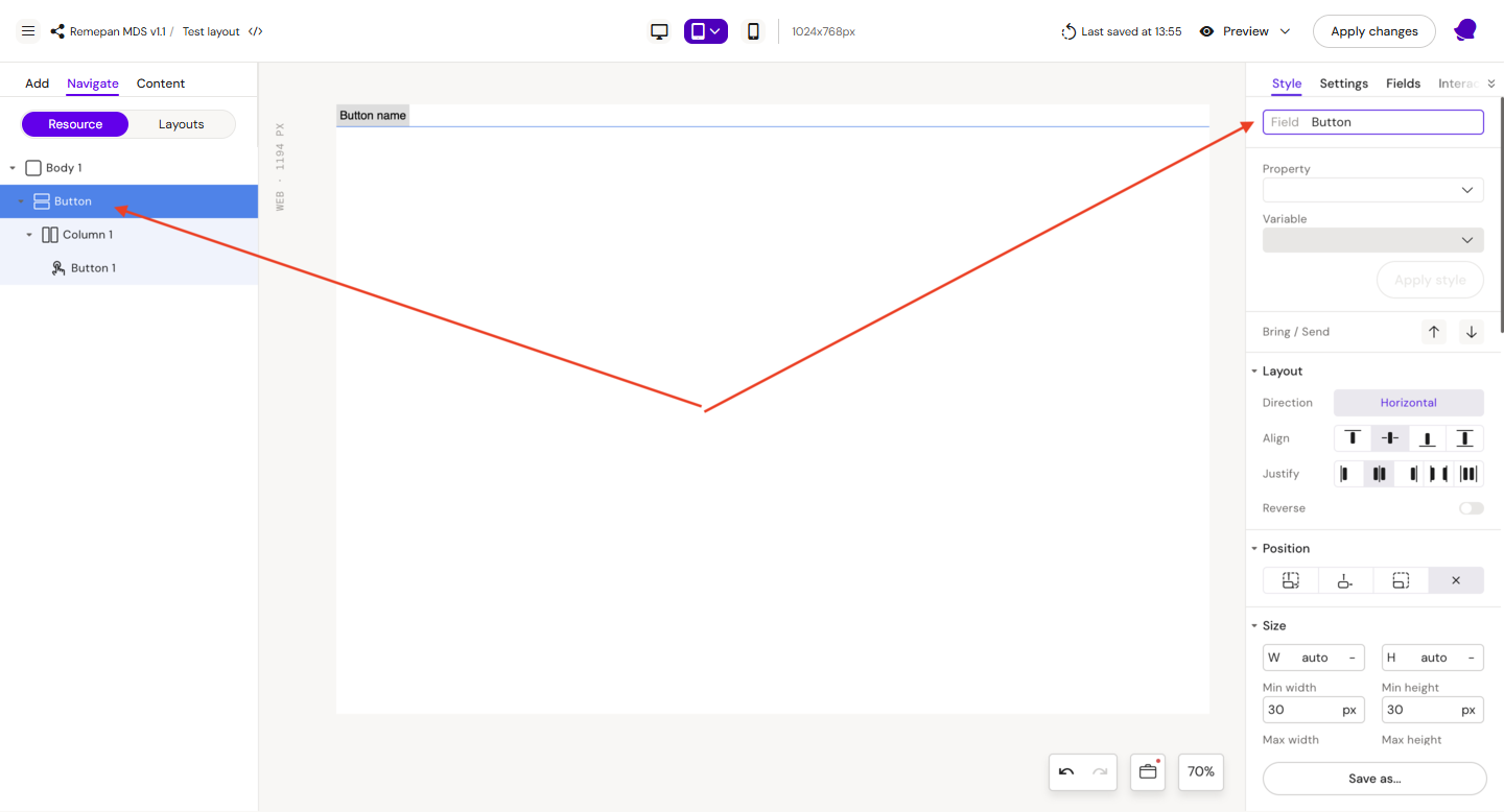
Step 1: Add a row on the canvas, inside the row add column, after this add button inside the column.
Step 2: Select Row 1
Style
Field: Button
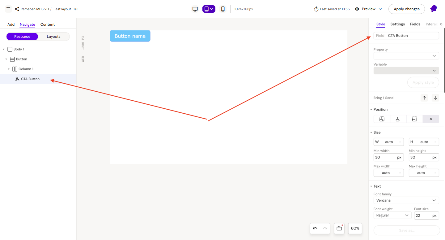
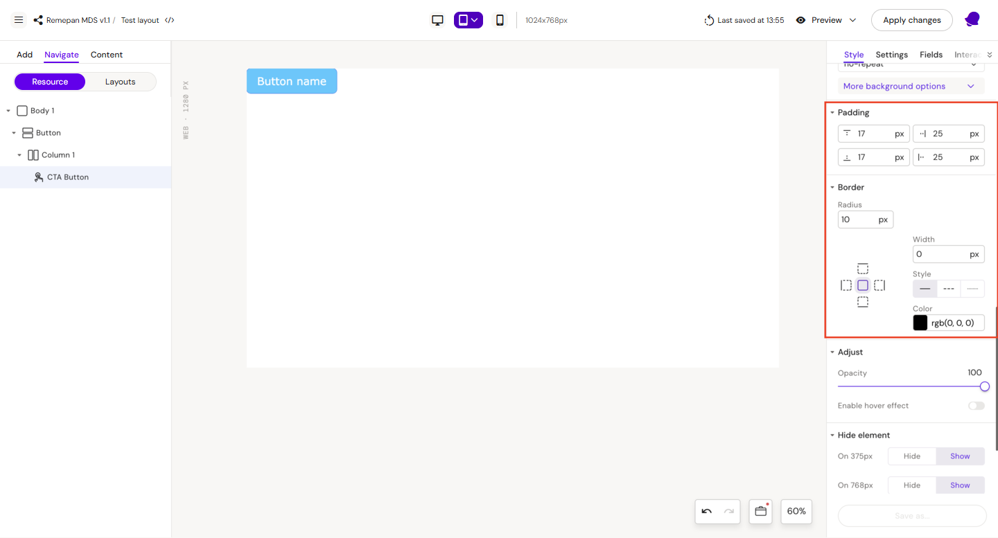
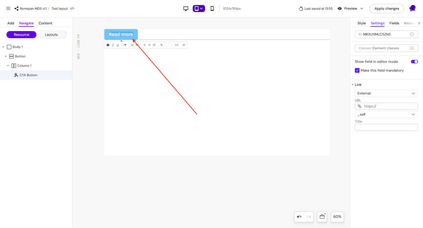
Step 3: Select Button 1
Style
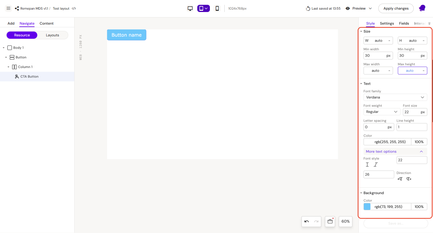
Field: CTA Button
Height = auto
Width = auto
Min height = auto
Font:
-
family = Verdana
-
weight = Regular
-
size = 22px
-
color = rgb(255, 255, 255)
-
min size = 22
-
max size = 26
Background color = rgb(73, 199, 255)
Padding
-
top = 17px
-
bottom = 17px
-
left = 25px
-
right = 25px
Border
-
Radius = 10px
Step 4: Update button text to “Read more”
Step 5: Save layout by clicking “Apply Changes“
Step 6: Rename layout in the Design System UI, if needed.
|
|

|
Compound Layouts
Compound layout - is a layout built from other layouts. For example: Card layout can contain H1 Header, and Button layouts.
How to Create a Compound Layout
Due to the layout editor restrictions, you can’t use existing layouts in the layout editor. Because of this, compound layout creation will look different.
Compound layout can be created only from the slide, not from the DS layout editor.
To create Compound layout, you need to open any slide that uses your target Design System. Then you need to create a basic layout structure mentioned here Step-By-Step Build a Slide Layout | Add Basic Layout Structure
Then select Column 1 element, and in the right panel, click Settings and then click Allow to place Layouts
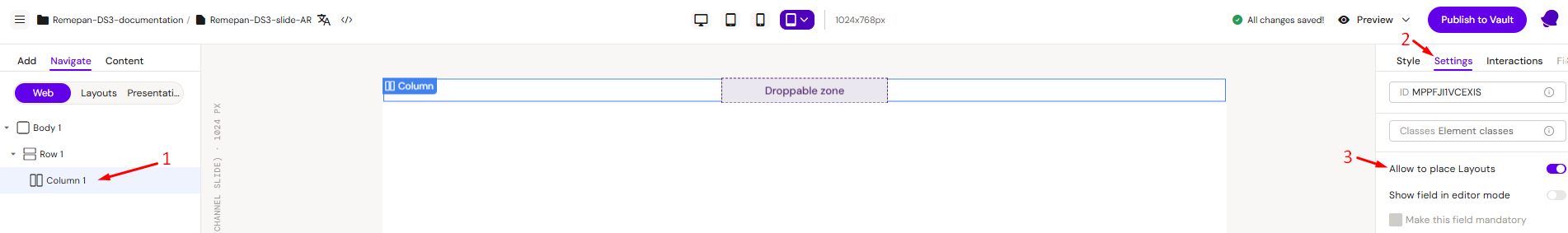
This will create a Dropable zone. Now you can drag & drop any layout inside it.
To save your Compound layout, please select the root Row and in the right panel click Save as... → Layout
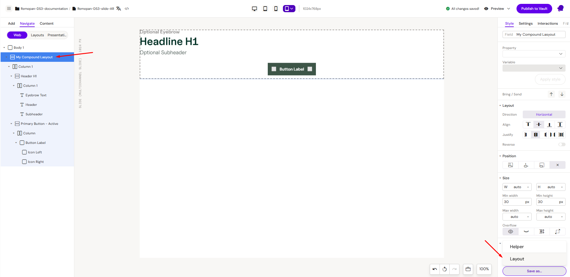
Note: It’s important to start your layout from a Row element, because only Row elements can be saved as layouts.
Card - Layout Example
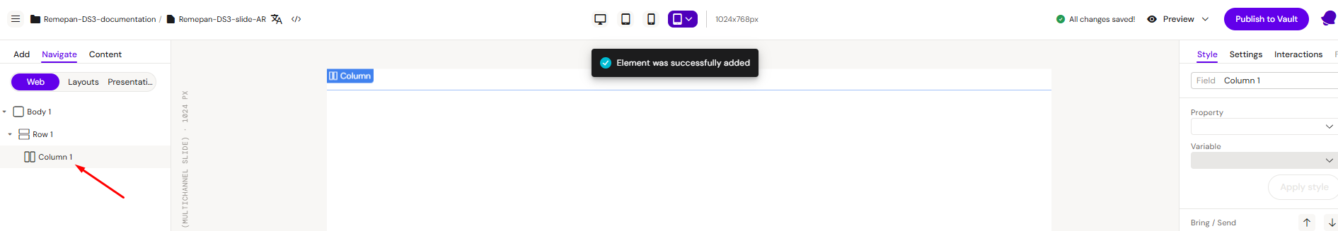
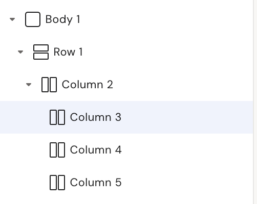
Step 1: Add a row on the canvas, inside the row add 1 column, inside this column add 3 columns. It should look like this:
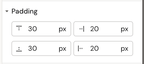
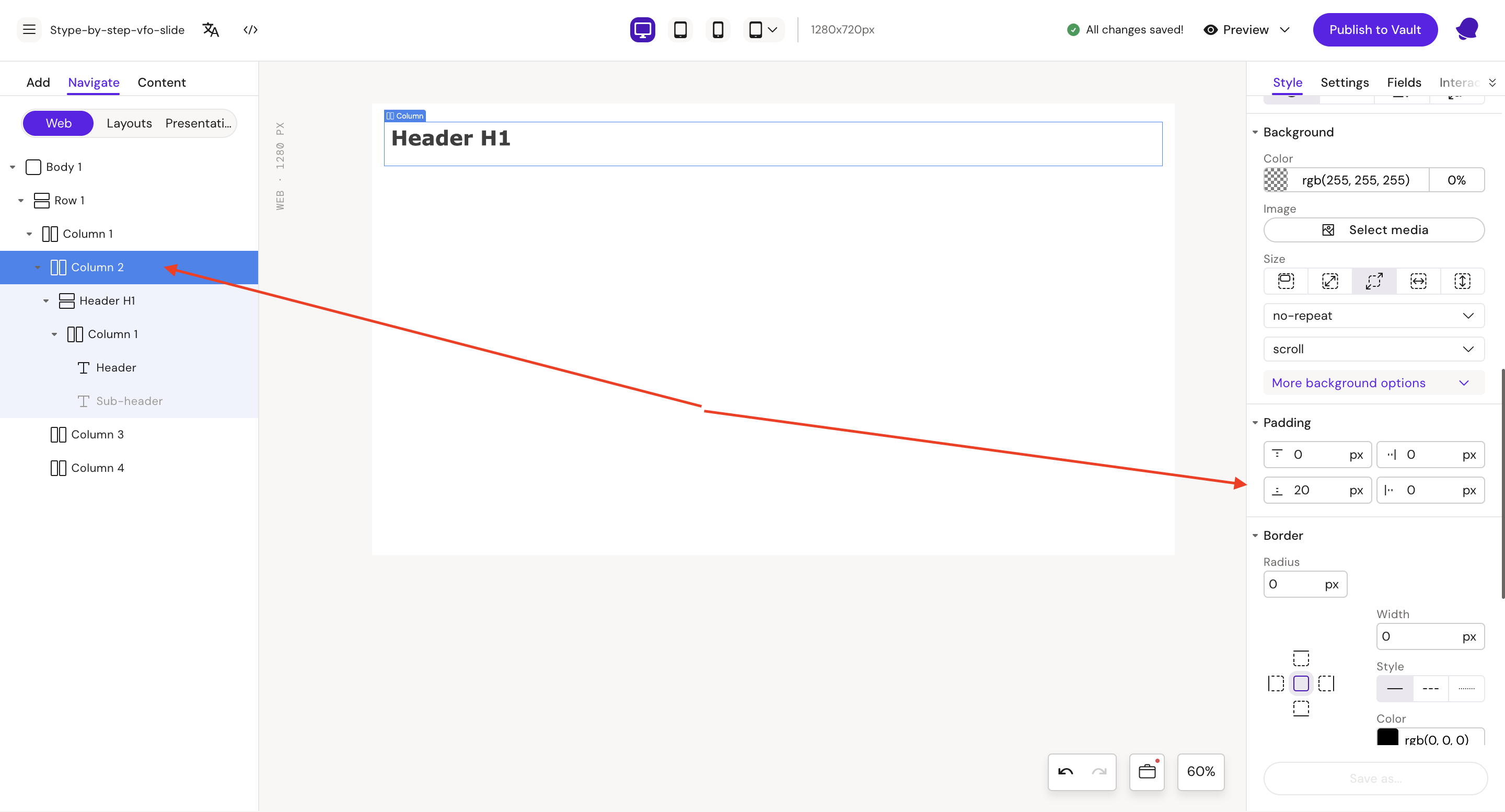
Step 2: Select and update column 2
Style
Padding
-
left = 20px
-
right = 20px
-
top = 30 px
-
bottom = 30px
Step 3: Add Header H1 layout
Go to Add -> Layouts → Headers
Drag the Header H1 layout onto the canvas
Go back to Navigate → Web
You should have this structure
Step 4: Select Header H1 row
Cut (Ctrl + X) Header H1 row and paste (Ctrl + V) to Column 2
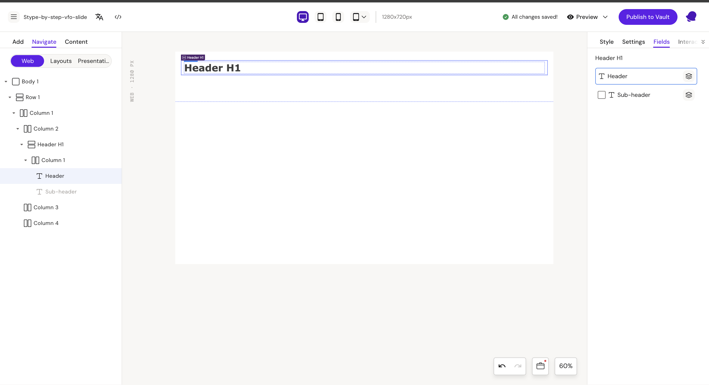
Step 5: Select H1 row and go to “Fields” tab
Disable Sub-header field
Step 6: Select Column 2
Style
Padding:
-
bottom = 20px
Step 7: Add List to Column 2 and add 3 List item to List
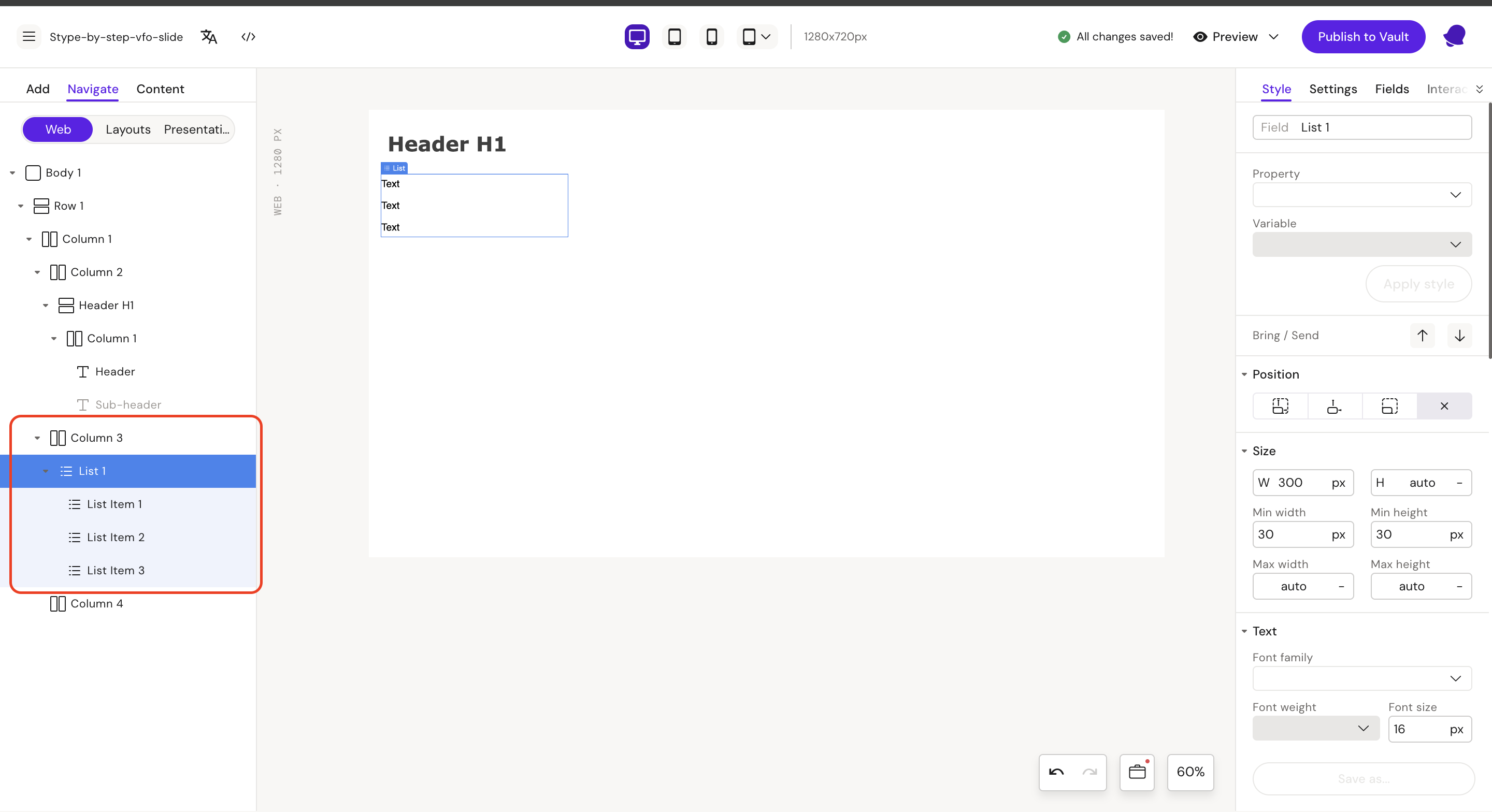
Step 8: Update text in List Items to Link
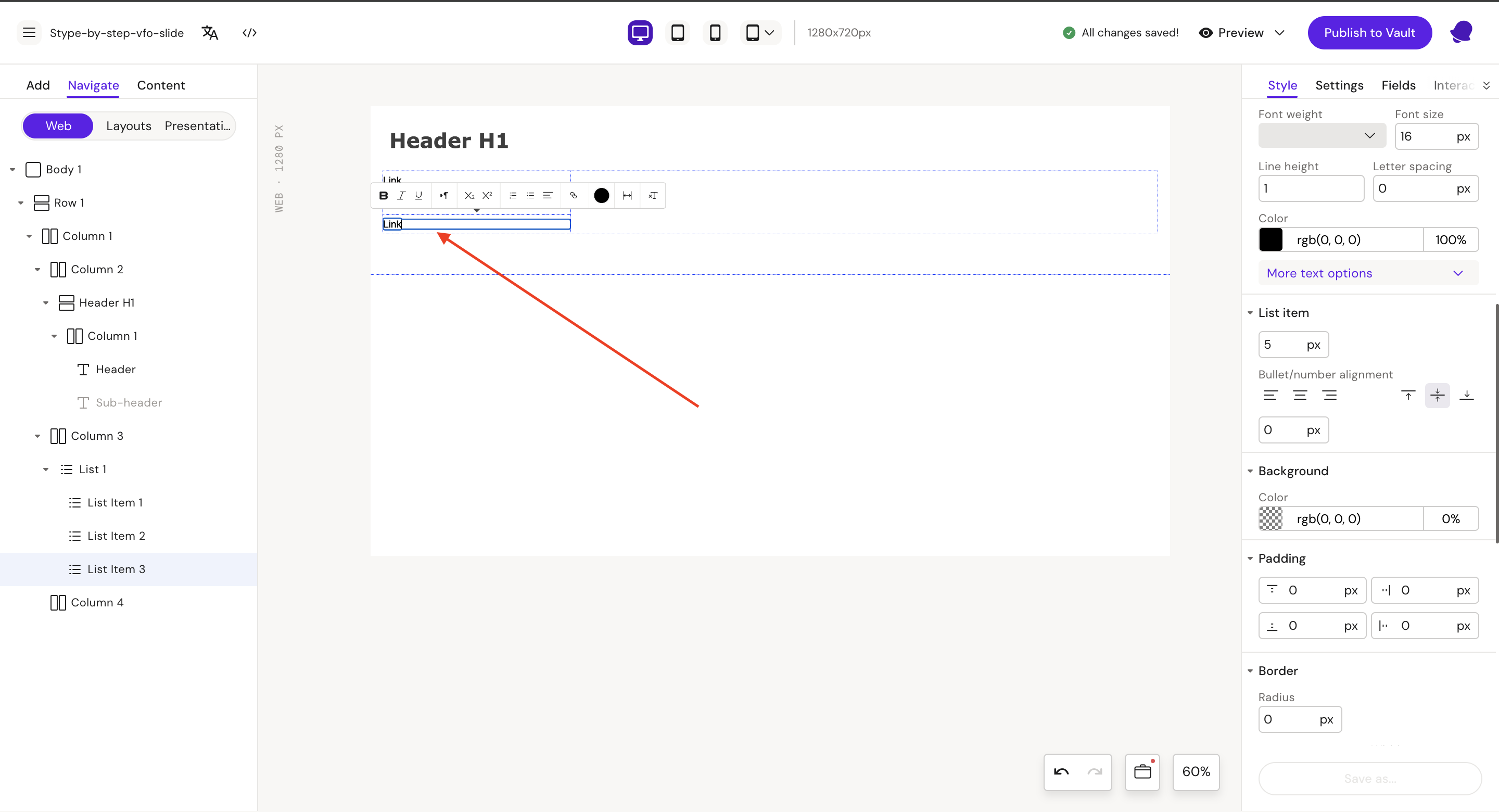
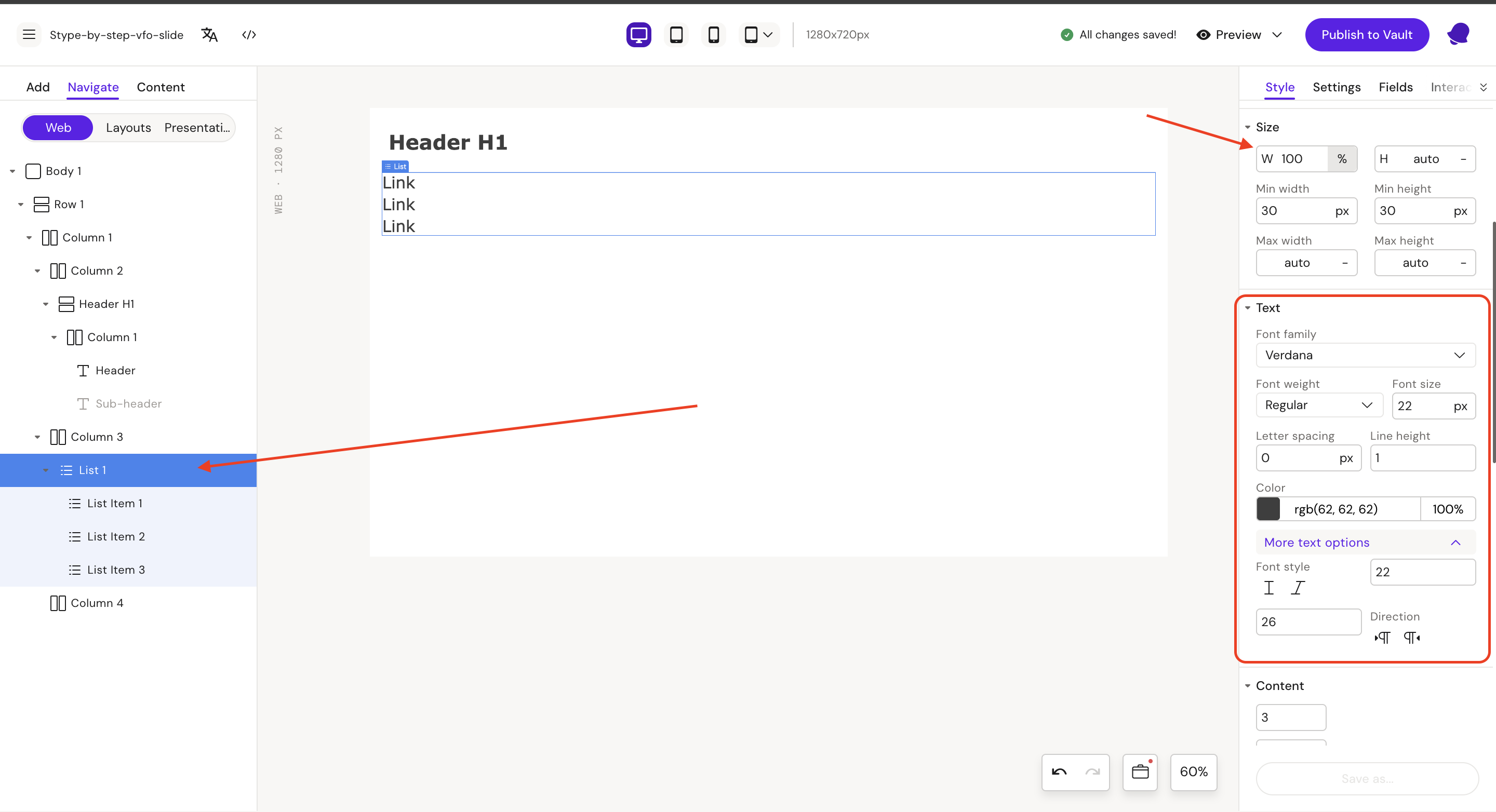
Step 9: Select and update List 1
Style
Width = 100%
Font:
-
family = Verdana
-
size = 22px
-
weight = Regular
-
color = rgb(62, 62, 62)
-
min size = 22px
-
max size = 22px
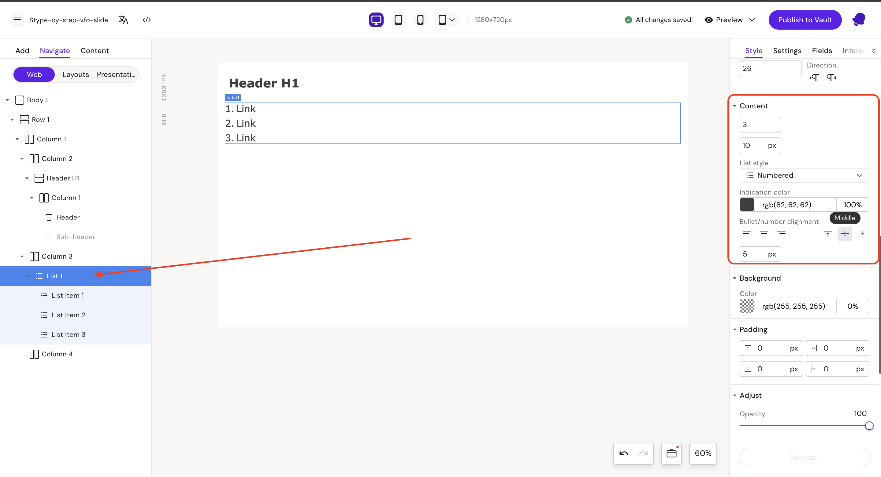
Content:
-
Margin = 10px
-
List style = Numbered
-
Bullet/number alignment = Middle
-
Text padding left = 5px
-
Indication color = rgb(62, 62, 62)
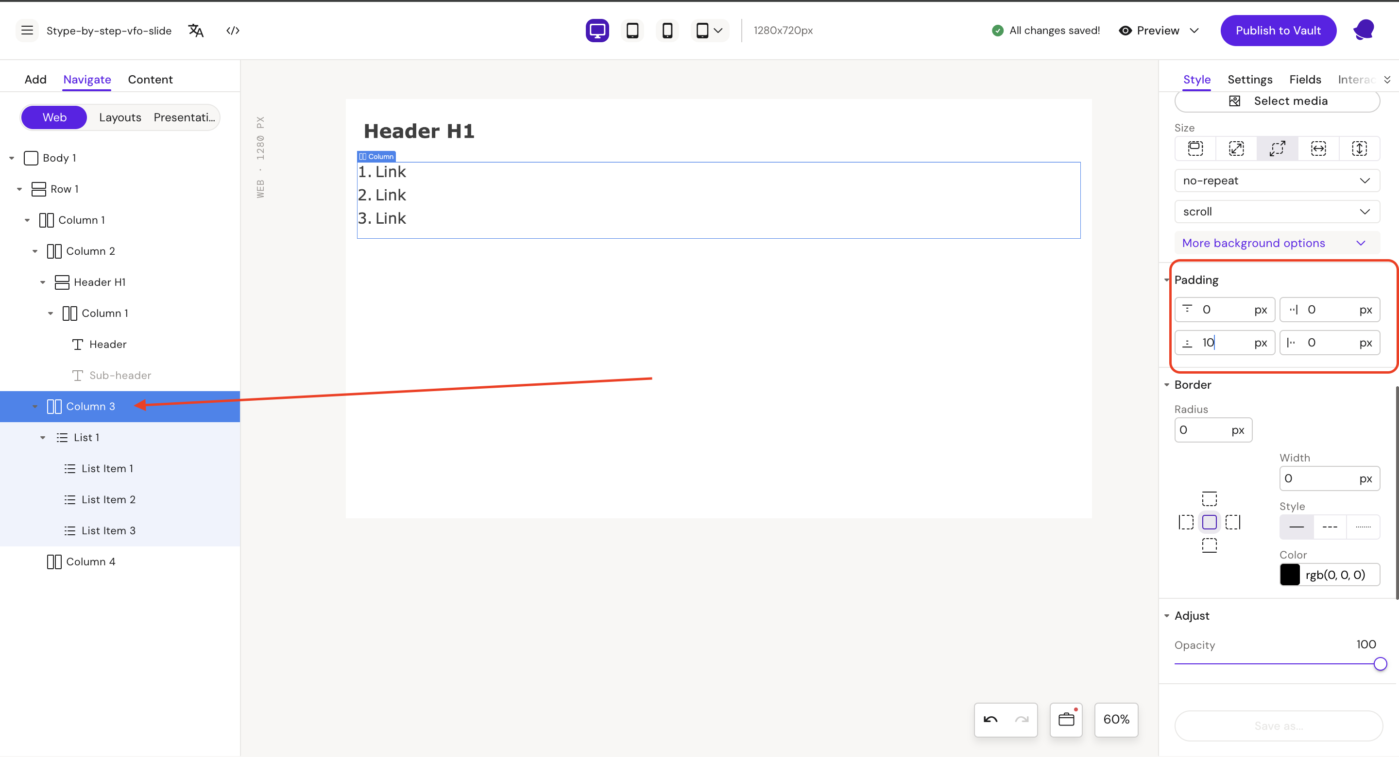
Step 10: Select Column 3
Style
Padding
-
bottom = 10px
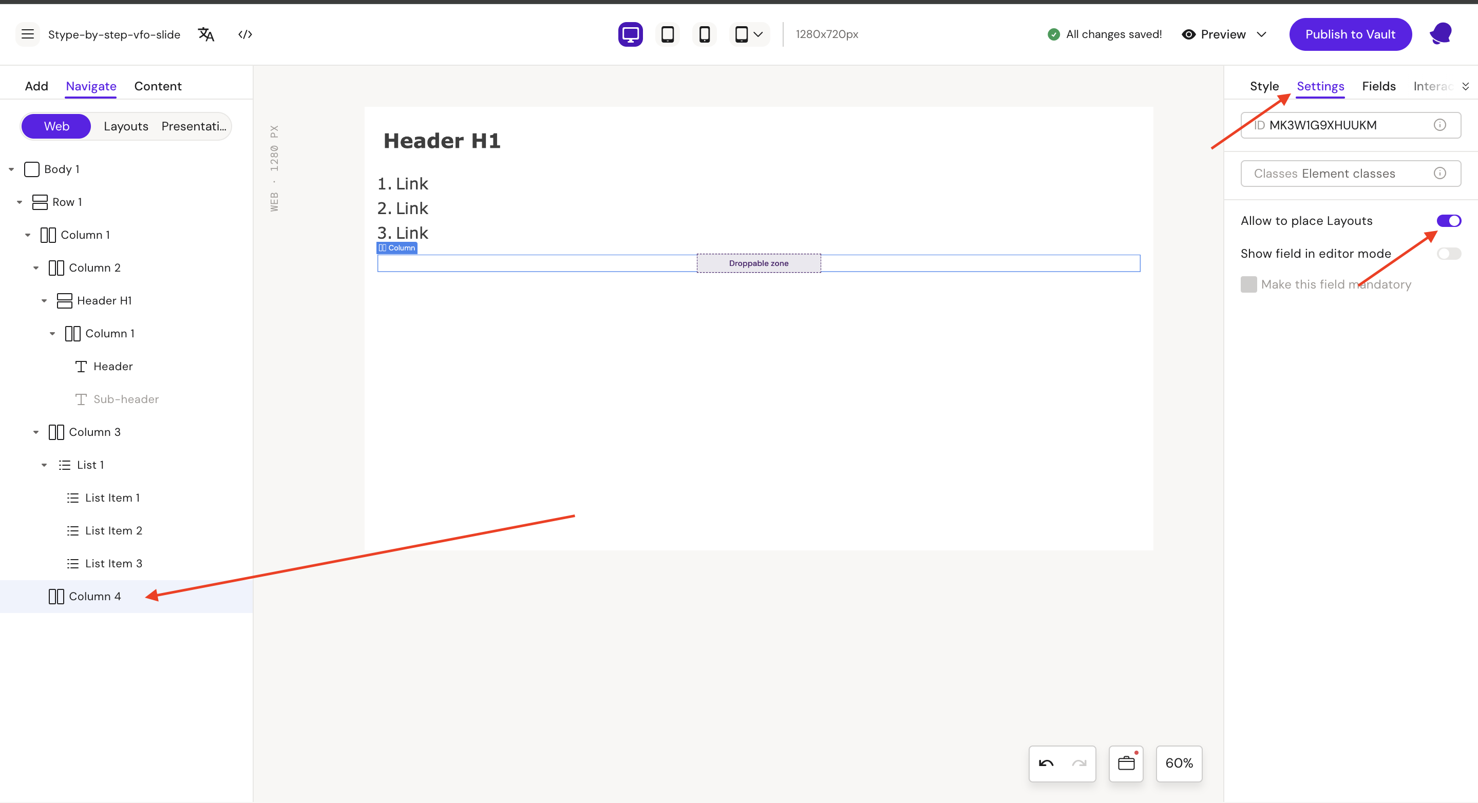
Step 11: Select Column 4
Go to the Settings tab and on “Allow to place Layouts“
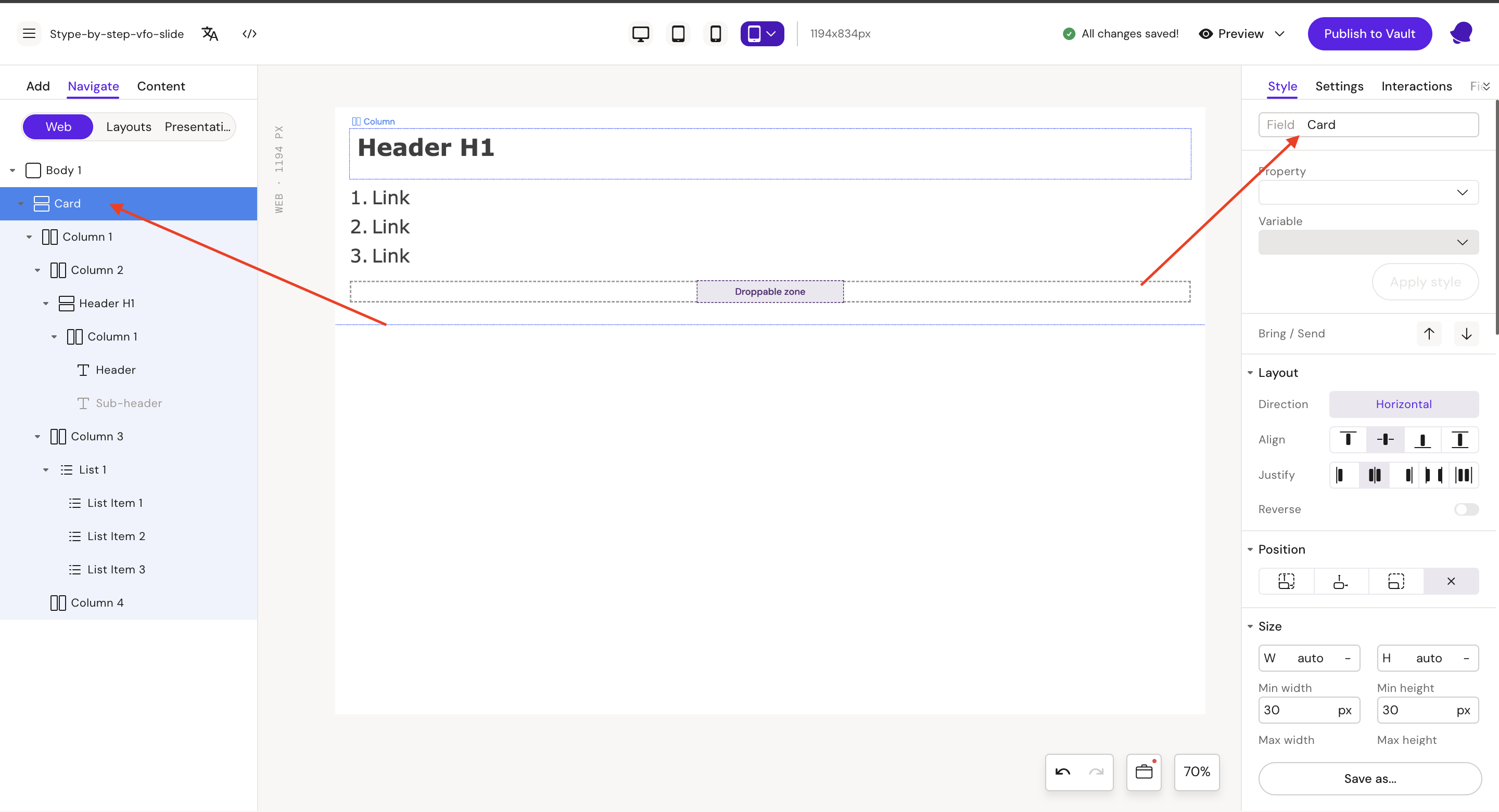
Step 12: Select Row 1 and update field name to Card
Style
Field: Card
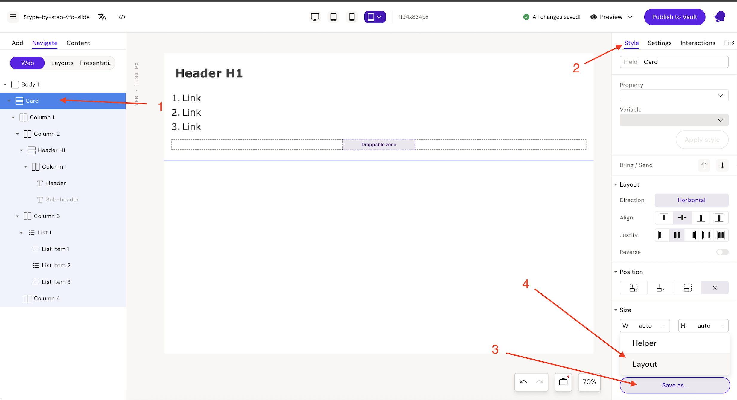
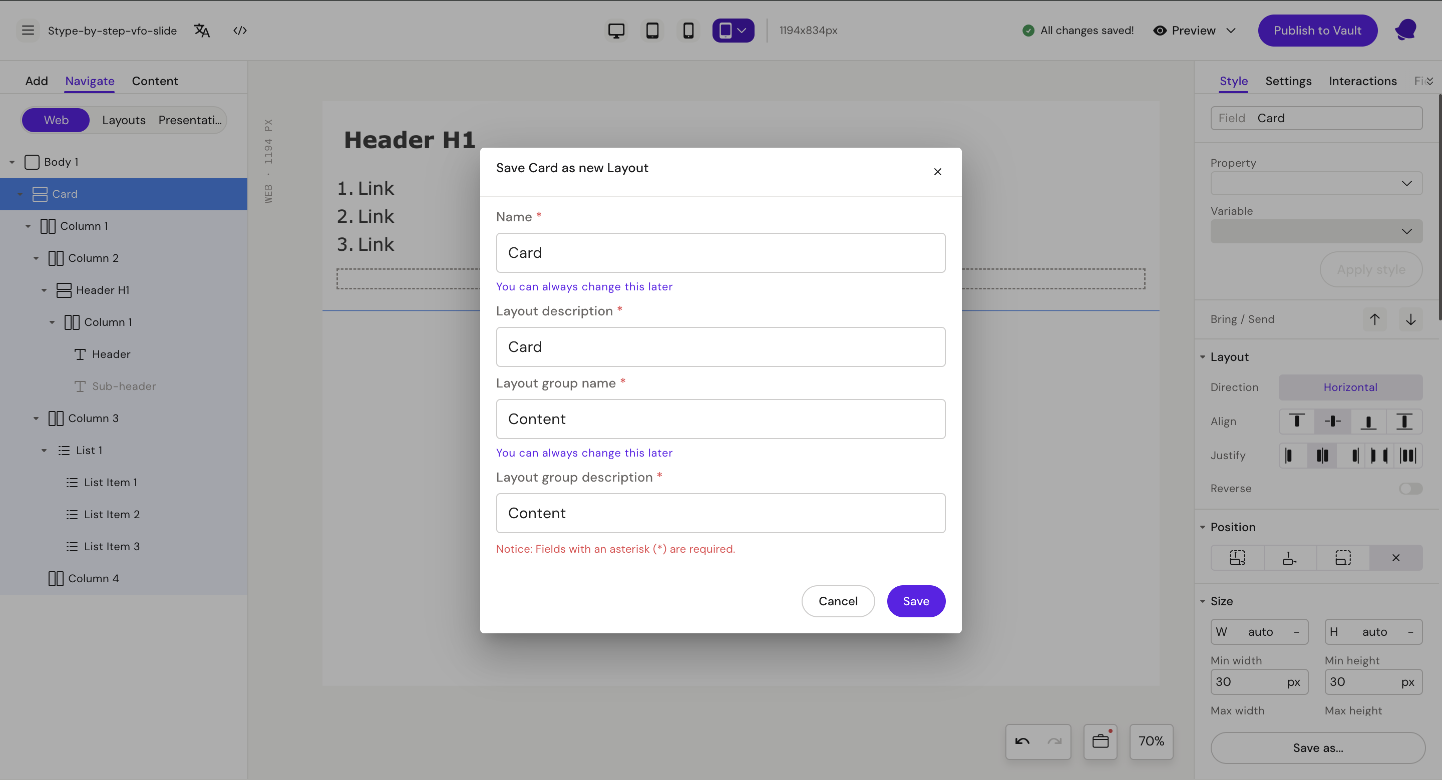
Step 13: Save layout
-
Select row (Card)
-
Go to Style tab
-
Click on “Save us…” button
-
Click on “Layout“ button
Name: Card
Layout description: Card
After create new Layout group.
Layout group name: Content
Layout group description: Content
After this click to save button
Step 14: Go to the Add → Layouts → Buttons (layout group) and drag Button layout to “Droppable zone”