
The Table component is used to display information in a structured tabular form, consisting of rows and columns. It is an essential tool for presenting clinical data, comparison charts, or organized lists.
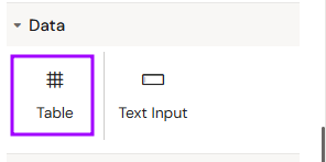
Add Table
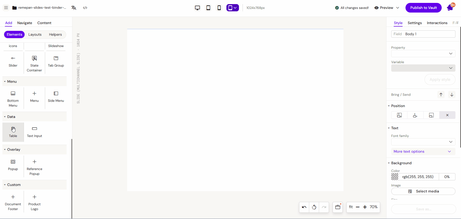
You can add a Table from the Left panel.
How to style Table
The right panel for the Table contains general properties:
-
Size
-
Fusion table width
-
-
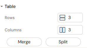
Table
-
Rows
-
Columns
-
Merge (Ctrl(WIN) Cmd(MAC) + select multiple table cells to merge)
-
Split (Ctrl(WIN) Cmd(MAC) + select merged cell to split it)
-
-
Background
-
Color
-
-
-
Border collapse (separate/collapse)
-
How to style Table Cell
The right panel for the Table Cell contains general properties:
-
Size
-
Fusion table cell width
-
Min width
-
Max width
-
-
Background
-
Color
-
Overview
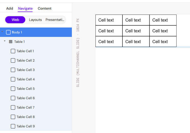
Tables in Activator consist of the main table container and individual table cells. Each cell functions as a sub-container where data or other components can be placed and styled independently.
How to Use the Table Component
Step 1: Adding the Table
Select the Table component from the components list. Upon placement, the system generates a default table structure consisting of 9 cells (3x3)
Step 2: Modifying Rows and Columns
You can adjust the table structure using the main settings menu:
-
Add/Subtract: Increase or decrease the number of rows and columns as needed.
-
Even Distribution: New columns and rows are added with uniform sizing by default to maintain layout consistency.
Step 3: Merge and Split Cells
For more complex layouts, you can modify the cell structure using keyboard shortcuts:
-
Merge Cells: Hold Ctrl (Windows) or Cmd (Mac) and select multiple adjacent table cells, then use the merge option to combine them into a single larger cell.
-
Split Cells: To revert a merged cell back into individual cells, hold Ctrl (Windows) or Cmd (Mac), select the merged cell, and choose the split option.
Step 4: Editing Cell Content
-
Click on an individual cell within the table.
-
A yellow outline will appear, indicating that you are now editing that specific cell.
-
You can now define the data inside the cell's text fields or style the cell (background, borders, alignment) independently.
Key Features
-
Cell-Level Control: Each cell can have its own unique styling and components.
-
Responsive Rows: Tables are designed to hold their structure across different screen orientations.
-
Header Support: Dedicated top-row functionality for naming columns.
Best Practices
-
Header Clarity: Always use the top row to clearly label the data categories.
-
Styling Consistency: While cells can be styled individually, maintain consistent padding and font sizes across the table for better readability.
-
Data Volume: For very large datasets on mobile devices, ensure the table is placed within a scrollable container or simplified to fit the screen width.