
The Grid element is a premium layout container designed for complex, two-dimensional structures. It provides a flexible system for aligning content across both rows and columns, offering high-level control over the interface.
Add Grid
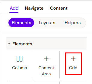
You can add a Grid from the Left panel.
How to style Grid
The right panel for the Сolumn contains general properties:
Core Concepts
1. Column-Based Structure
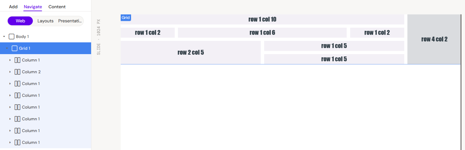
The Grid acts as a parent container where only Columns can be direct children. To add content to a Grid, you must first insert a Column, which then serves as the container for your specific elements.
2. Layout Dynamics (Flex-Wrap)
The blocks inside a Grid behave according to the flex-wrap principle. This means that if the combined width of the columns exceeds the available width of the Grid container, the columns will automatically wrap to the next line, ensuring a responsive and fluid layout.
3. Column Count and Sizing
Instead of traditional width settings, the size of each Column within the Grid is managed by the number of columns it spans. This allows for a proportional and consistent layout:
-
Column Span: Define how many tracks of the grid a single column element should occupy.
-
Responsive Scaling: As the grid width changes, the columns maintain their relative size based on the assigned column count.
-
Precision Control: Use specific column counts to create asymmetrical layouts (e.g., a 4-column main area next to a 2-column sidebar).
Interaction with Other Elements
Columns in Grid
As the primary building block, each Column occupies a specific position in the grid. You can configure individual column settings to manage the vertical flow of elements within that section.
Rows and Group Containers
While only Columns can be direct children of the Grid, you can nest Rows or Group Containers inside those Columns to further organize your horizontal or grouped content.
Key Configuration Options
-
Gap (Gutter) Control: Define the exact spacing between columns and rows within the grid to improve readability and visual consistency.
-
Content Spanning: Configure columns to span across multiple grid tracks.
Best Practices
-
Always use Columns as the immediate containers for any elements placed inside a Grid.
-
Rely on the flex-wrap behavior to create responsive designs that adapt to different screen widths.
-
Use Gap settings instead of individual margins to maintain uniform spacing across the entire grid system.