
The ISI Tray component is designed to display Important Safety Information (ISI) in eDetailer presentations. It provides a compact, expandable area that allows users to view safety information without taking up too much space on the screen.
Component Structure
The ISI Tray consists of three main parts:
-
ISI Container (Main Component)
-
The main wrapper that holds all ISI content.
-
Can be positioned anywhere on the slide (top, bottom, left, or right).
-
Features a white background by default and a minimum height of 50px for guaranteed visibility.
-
-
Isi Scroll (Scrollable Content Area)
-
Any elements and layouts can be placed. However, this usually applies to text containing safety information.
-
Supports two display modes:
-
Default (Collapsed): Shows a preview section (default height: 72px).
-
Expanded: Shows full content with scrolling enabled (default height: 144px).
-
-
-
State Button
-
A toggle button to open/close the ISI tray.
-
Displays "Open" when collapsed and "Close" when expanded.
-
Automatically closes the tray when a user clicks outside the component.
-
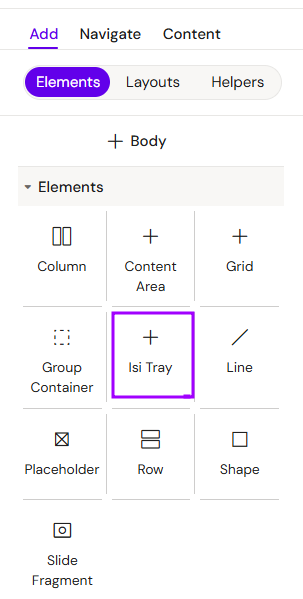
Add ISI Tray
You can add a ISI Tray from the Left panel.
How to style ISI Tray
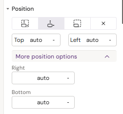
The right panel for the ISI Tray contains general properties:
-
-
added fields Right and Bottom
-
-
-
The width field changed to Fusion isi width
-
The height field was removed
-
How to style State button
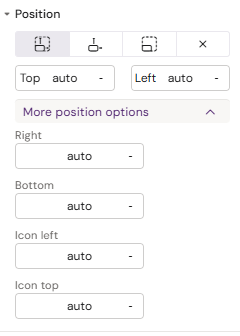
The right panel for the State button contains general properties:
-
-
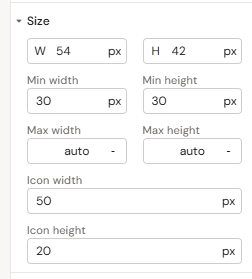
added Right and Bottom fields for the button, as well as Icon left and Icon top for the icon inside the button
-
-
-
added Icon width and Icon height fields
-
-
-
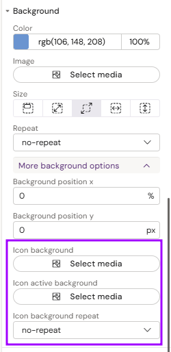
added Icon background, Icon active background and Icon background repeat fields
-
-
-
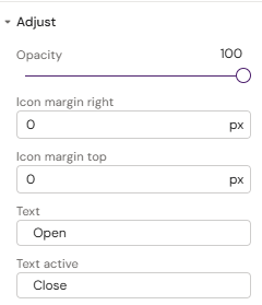
Added Icon margin right, Icon margin top, Text (for collapsed state), Text active (for expanded state)
-
How to style Isi Scroll
The right panel for the Isi Scroll contains general properties:
-
-
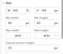
Added Closed section height field
-
-
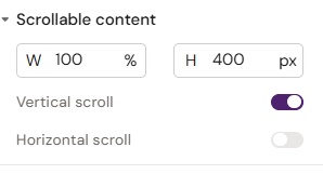
Scrollable content
-
fields Width, Height, Vertical scroll, and Horizontal scroll toggle
-
-
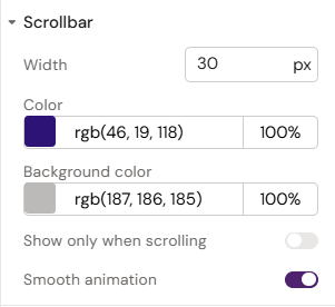
Scrollbar
-
fields Width, Color, Background color and Show only when scrolling and Smooth animation toggles
-
-
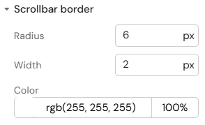
Scrollbar border
-
fields Radius, Width and Color
-
How It Works
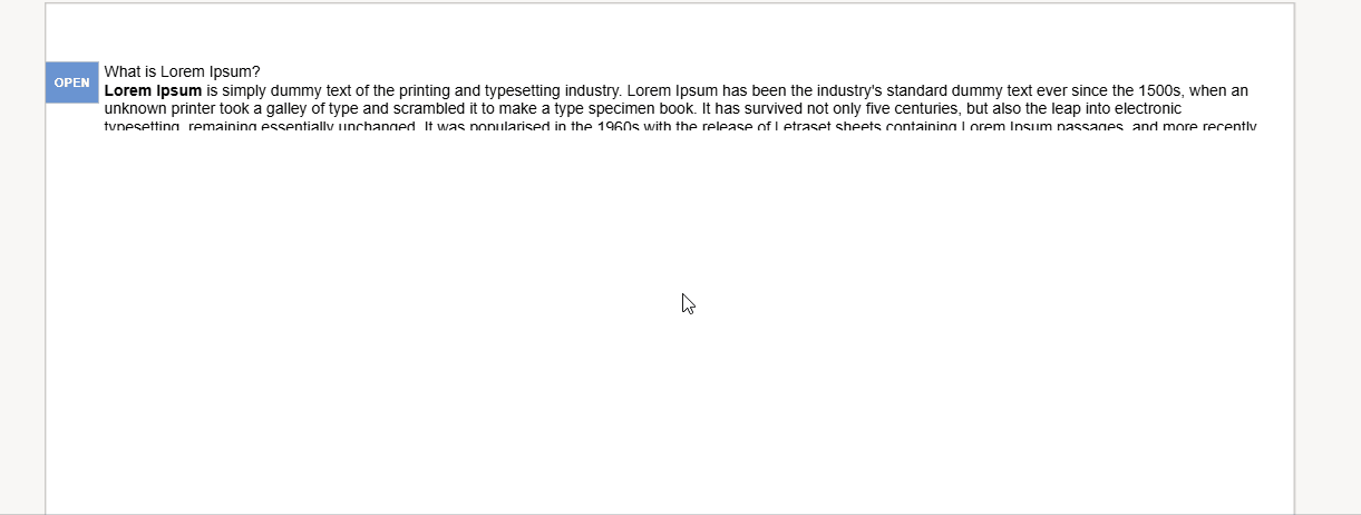
Initial State
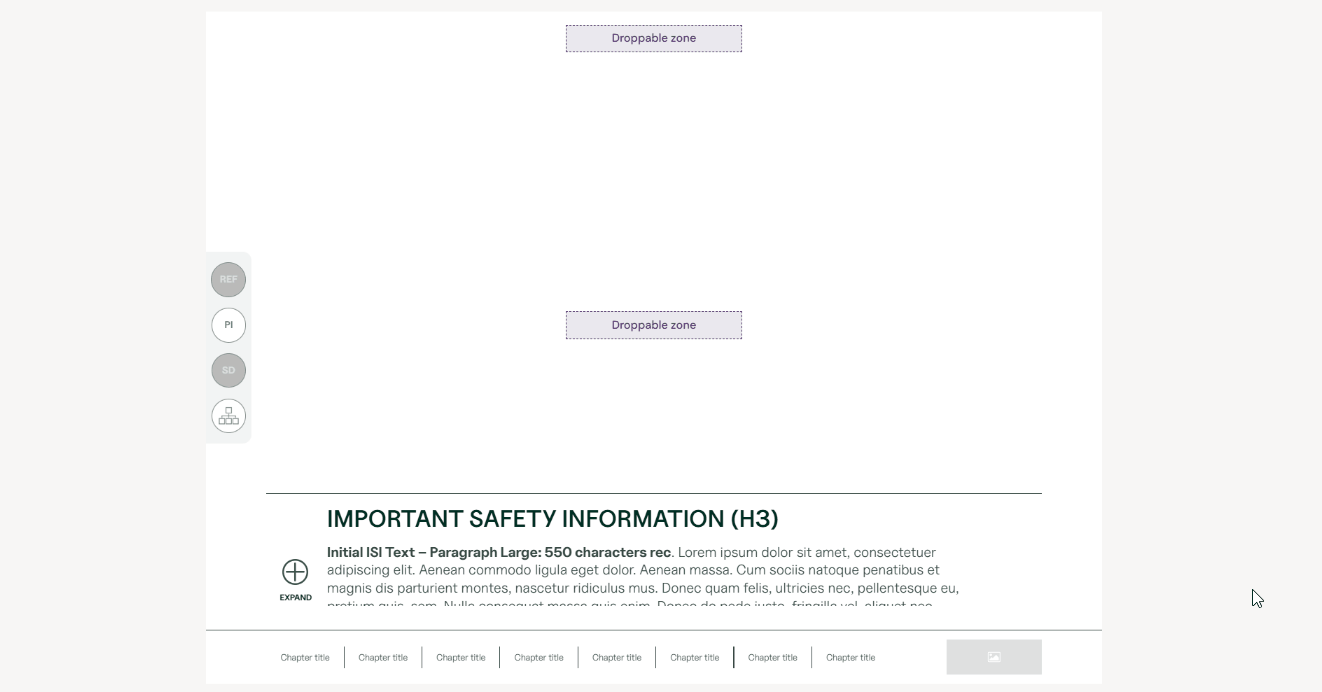
When a slide loads, the ISI Tray appears in its collapsed state, showing only a preview. This ensures the main content remains unobstructed while keeping safety information accessible.
Expanding and Collapsing
-
To Expand: Click the "Open" button. This reveals the full text with scrolling enabled.
-
To Collapse: Click the "Close" button or click anywhere on the slide outside the ISI component.
Configuration Options
The component supports the following customizations in the editor:
-
Position: Button placement at the top, bottom, left, or right of the slide.
-
Dimensions: Adjustable width (full width or specific px/%) and height settings for both states.
-
Styling: Background color customization and optional icons for the toggle button.
-
Labels: Custom text for the "Open" and "Close" states.
Best Practices
-
Concise Preview: The collapsed state should show the first 2-3 lines of critical safety info.
-
Consistent Positioning: Keep the ISI tray in the same location across all slides for better user familiarity.
-
Clear Labels: Use intuitive text like "Expand" or "Collapse".
-
Test Scrolling: Always verify that the expanded height allows for comfortable reading of the full text.