
The Shape element is a graphical component used for visual styling, drawing attention to specific areas, or creating decorative backgrounds within your layouts.
Add Shape
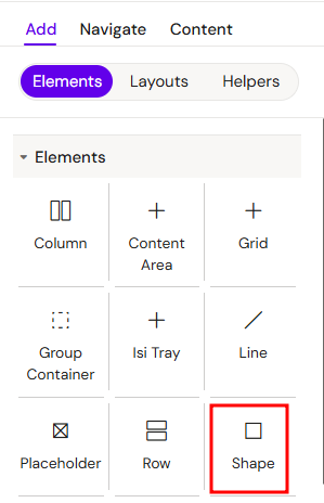
You can add a Shape from the Left panel.
How to style Shape
The right panel for the Shape contains general properties:
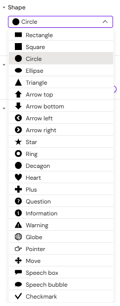
Shape:
You can choose different types of shapes and colour:
Core Concepts
1. Visual Structuring
Shapes help organize content by creating boundaries, dividing sections, or highlighting important information blocks. They can be used as backgrounds for text or as standalone design elements.
2. Shape Types
The element allows you to choose from various geometric forms—such as rectangles, circles, and lines—which can be tailored to match your project's visual identity.
3. Vector Flexibility
As vector-based objects, shapes maintain perfect clarity at any scale. This makes them ideal for responsive interfaces where elements must resize without losing quality.
Usage Scenarios
1. Decorative Accents
Use shapes to create unique graphic highlights, custom icons, or background gradients that add visual depth to your design.
2. Functional Dividers
Shapes in the form of lines or thin rectangles can serve as visual separators between different sections within a Column or a Group Container.
3. Interactive Objects
Shapes can be configured as clickable elements, allowing you to use them as custom buttons, call-to-action areas, or navigational pointers.
Best Practices
-
Place shapes inside a Group Container to build complex compositions combining text and graphics.
-
Use subtle fill colors or borders; often a thin line or semi-transparent shape provides a more professional look than high-contrast blocks.
-
Combine shapes with Alignment settings to precisely position them relative to other elements in your layout.