
The Inline Slideshow component allows creators to build interactive, multi-state content areas where users can swipe or click through different views within a single slide or popup.
Add Inline Slideshow
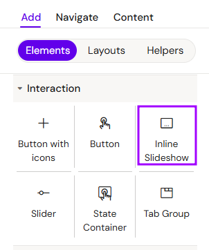
You can add an Inline Slideshow from the Left panel.
How to style Inline Slideshow
The right panel for the Inline Slideshow contains general properties:
-
Animations - three available fields:
-
Entrance/exit animation:
-
Appear from right
-
Appear from bottom
-
Fade in/out
-
-
Duration
-
Delay
-
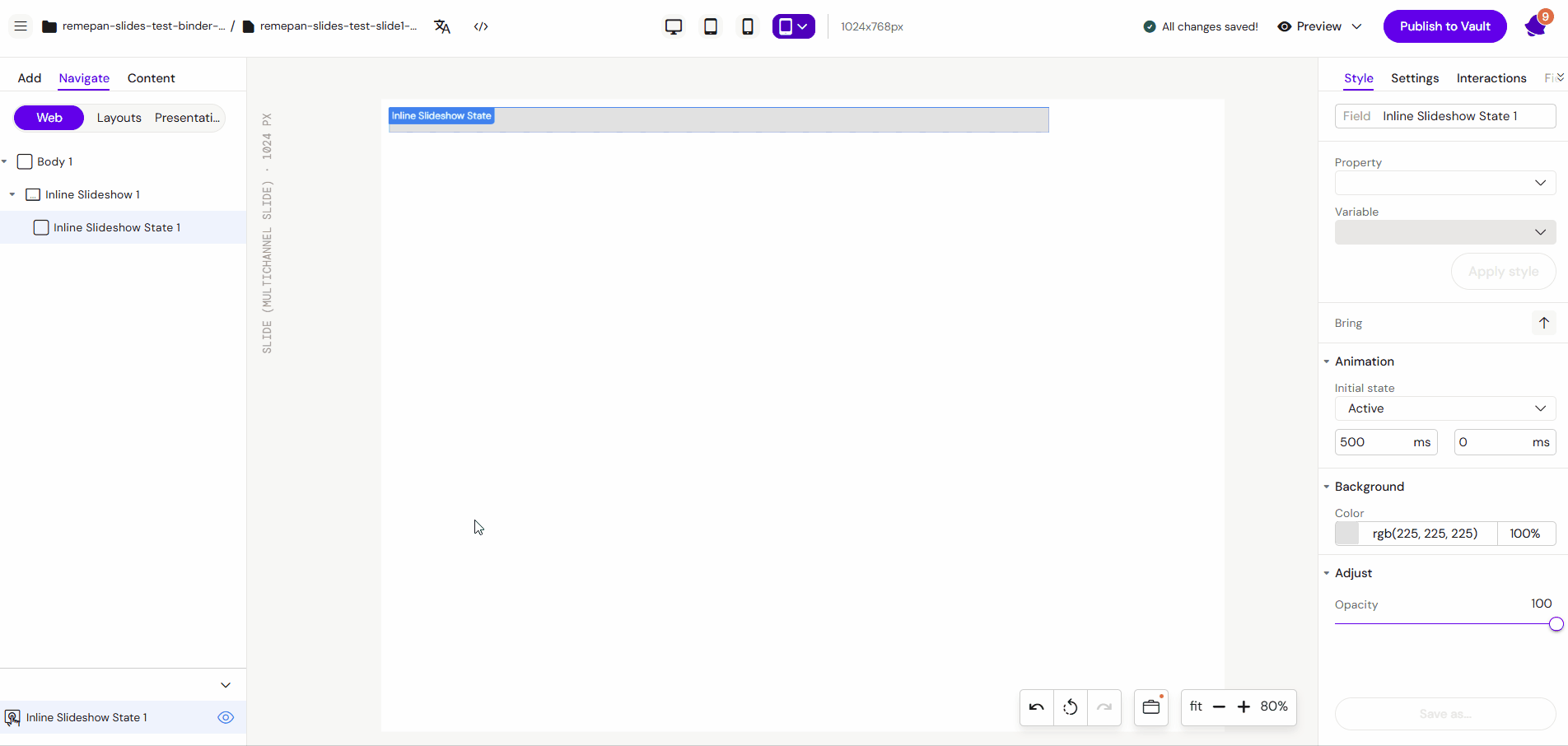
How to style Inline Slideshow State
The right panel for the Inline Slideshow State contains general properties:
-
Animations:
-
Initial state:
-
Active/Inactive (Usually the first state is active)
-
-
Duration
-
Delay
-
-
Background - available field - color
How to style Indicators
The right panel for the Indicators contains general properties:
-
Dot navigation:
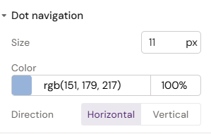
-
Size
-
Direction
-
Horizontal/Vertical
-
-
-
Active State:
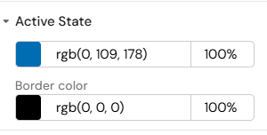
-
Color
-
Border color
-
Overview
An Inline Slideshow acts as a container for multiple "states." It is frequently used to showcase galleries, step-by-step instructions, or detailed product information without navigating away from the current page.
Basic Configuration
Step 1: Adding the Component
Select the Inline Slideshow component from the components list. Upon placement, the system automatically creates the first State Container inside it.
Step 2: Adding Content
Highlight the internal State Container and add your desired elements, such as images, text, or buttons.
Step 3: Adding Multiple States
To create a slideshow effect:
-
Select the Inline Slideshow container.
-
Add additional State Containers from the components list for each "slide" you wish to have.
-
Add Indicators from the components list to provide a visual guide for the user.
Advanced Usage: Slideshow inside a Popup
In eDetailers, Inline Slideshows are commonly used within Popups to provide deep-dive information.
Workflow:
-
Structure: Create a button and assign a Popup interaction to it.
-
Container: Inside the Popup, insert a Row/Column/Group structure to hold the content.
-
Component Insertion: Add the Inline Slideshow into the Popup area.
-
Navigation Elements: Add Arrow Navigation and Indicators inside the Popup to control the slideshow states.
-
State Building: Build out each state by inserting Columns, Text elements, or Images as needed.
Interaction and Testing
-
Navigation: Users can move between states by swiping or using navigation arrows.
-
Testing: Use the Preview Mode to test the swipe functionality. Click and drag your mouse to the left or right to verify the transition between states.

Best Practices
-
State Indicators: Always include indicators (dots) so the user understands there is more content to explore.
-
Grouped Content: Use Column elements inside State Containers to organize multiple text or image elements effectively.
-
Contextual Use: Use Inline Slideshows for related content that fits within a specific theme (e.g., "Patient Case Studies" or "Mechanism of Action steps").
-
Clean Close: If used in a popup, ensure the "Close" button for the popup is clearly visible and does not overlap with slideshow navigation.