
The Tab Group component allows creators to organize content into multiple interactive tabs. Each tab acts as a separate state, enabling users to switch between different sets of information within the same area of the slide.
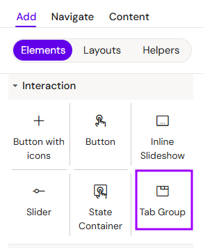
Add Tab Group
You can add a Tab Group from the Left panel.
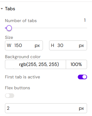
How to style Tab Group
The right panel for the Tab Group contains general properties:
-
Tabs:
-
Number of tabs (1-20psc)
-
Size (Width, Height)
-
Background color
-
First tab is active (toggle)
-
Flex buttons (toggle)
-
Flex buttons gap
-
-
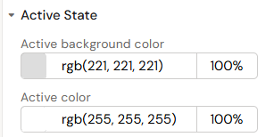
Active State
-
Active background color
-
Active color
-
-
Background - available field - color
-
-
Tab padding left - additional field
-
-
Tab border - the same as Border but for Tab
-
Border - for Tab Group Container
How to style Tab Group Button
The right panel for the Tab Group Button contains general properties:
-
Text - available field - color
-
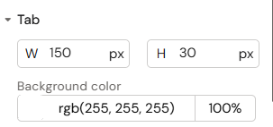
Tab:
-
Size (Width, Height)
-
Background color
-
-
Active State
-
Background color
-
-
-
Enable hover effect (Toggle)
-
How to style Tab Group Container
The right panel for the Tab Group Container contains general properties:
-
Animations:
-
Initial state:
-
Active/inactive
-
-
Entrance/exit animation
-
Fade in/out
-
Appear from left
-
Appear from right
-
Appear from bottom
-
Appear from top
-
-
Duration
-
Delay
-
Overview
A Tab Group consists of two main elements: Tab Group Buttons (the triggers) and Tab Group Containers (the content areas). It is the ideal solution for presenting categorized data, such as different clinical trial phases or various product indications.
How to Use the Tab Group Component
Step 1: Adding the Component
Select the Tab Group component from the components list and add it to the layout canvas. By default, the system adds one Tab Group Button and one Tab Group Container.
Step 2: Creating Additional Tabs
To add more tabs (e.g., to have two tabs in total):
-
Select the Tab Group
-
Use the Number of tabs slider in settings to add tabs.
Step 3: Adding Content to States
Each Tab Group Container acts as a unique state.
-
Select a container.
-
Insert other components (e.g., Text, Images, or Tables) into the container.
-
Repeat this for each tab state in your group.
Step 4: Configuring Visibility
To ensure your content is editable and visible in the editor:
-
Go to the left sidebar (Layers/Outline).
-
Flag the states (text boxes or containers) as visible to work on their content.
Step 5: Styling
-
Select the tabs in the Navigate menu.
-
Use the right-hand menu to change style settings, such as active/inactive colors, fonts, and borders, to match your brand identity.
Step 6: Testing
Go to Preview Mode and click on the different tabs to verify that the content switches correctly between the defined states.
Key Features
-
State Synchronization: Clicking a Tab Group Button automatically activates the corresponding Tab Group Container.
-
Organized Layouts: Helps manage heavy content without cluttering the slide.
-
Responsive Design: Tabs can be styled to behave as horizontal bars or vertical lists.
Best Practices
-
Consistent Styling: Ensure that the "Active" state of a tab is visually distinct from the "Inactive" state so users know which tab they are currently viewing.
-
Logical Naming: Name each Tab Group Container according to its content (e.g.,
Tab_Safety,Tab_Efficacy) in the layers panel. -
Limited Tab Count: Avoid adding too many tabs to a single group; 3-5 tabs are usually optimal for mobile/tablet visibility.