
"Сolumn element" is a layout tool that divides a pages/slides horizontal space into vertical sections, allowing you to arrange content like text, images, etc., side-by-side in a structured, responsive grid, making it easier to create multi-column layouts for various designs, from simple side-by-side text to complex visual hierarchies.
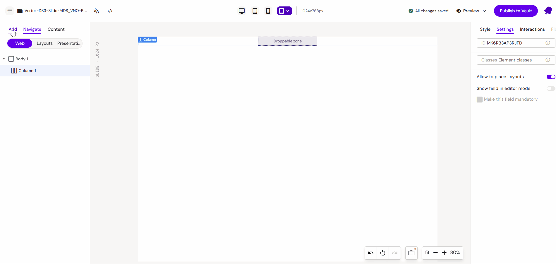
This is the main element that allows other layouts to be dragged into it from the left panel.
Important: For dragging to work, you need to enable the “Allow to place Layouts” checkbox in the right panel in the ‘Settings’ tab.
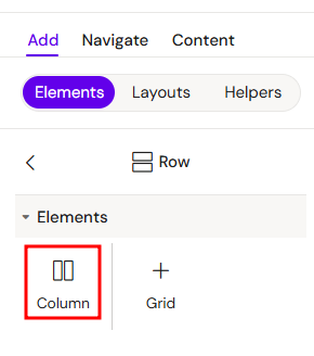
Add Сolumn
You can add a Сolumn from the Left panel.
How to style Сolumn
The right panel for the Сolumn contains general properties:
The Column element is a versatile structural component used to organize content vertically. It can be used as a standalone element or nested within various layout containers.
Usage Scenarios
1. Standalone Column
When used independently, a Column acts as a simple vertical stack. Elements placed inside will follow one after another from top to bottom.
2. Inside a Row
When placed within a Row, the Column defines a vertical segment of the horizontal space. This allows you to create side-by-side layouts where each column can have its own internal vertical structure.
3. Inside a Grid
In a Grid container, Columns are used to map content to specific cells or spans across multiple tracks. This provides the highest level of precision for complex, two-dimensional layouts.
Key Features
-
Vertical Stacking: Automatically manages the vertical flow of child elements.
-
Flexible Nesting: Can contain any other elements, including other Rows or even nested Columns.
-
Responsive Adaptation: Adjusts its width and height based on the parent container's constraints.