
The Button component allows creators to insert interactive elements into a slide, enabling navigation, state changes, or other triggered events within the eDetailer.
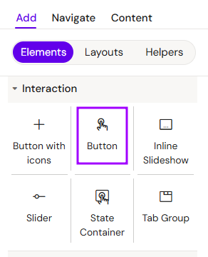
Add Button
You can add a Button from the Left panel.
How to style Button
The right panel for the Button contains general properties:
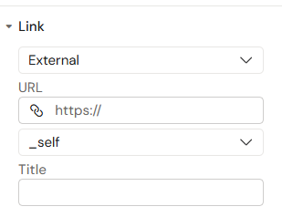
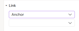
“Settings” tab
In the “Settings” tab, you can add Link:
-
External or Anchor
-
URL
-
link
-
target (_blank, _self, _parent, _top)
-
-
Title
-
Anchor id
Overview
Buttons are the primary tool for user interaction. They can be styled to match any brand identity and programmed to execute specific actions when clicked or tapped.
Prerequisites
-
Interaction Programming: A button requires a programmed interaction to trigger an event. Without an assigned action, the button will remain a static visual element.
-
Logic Flow: Ensure that the target of the interaction (e.g., the next slide or a popup) is available in the project structure.
How to Use the Button Component
Step 1: Adding the Component
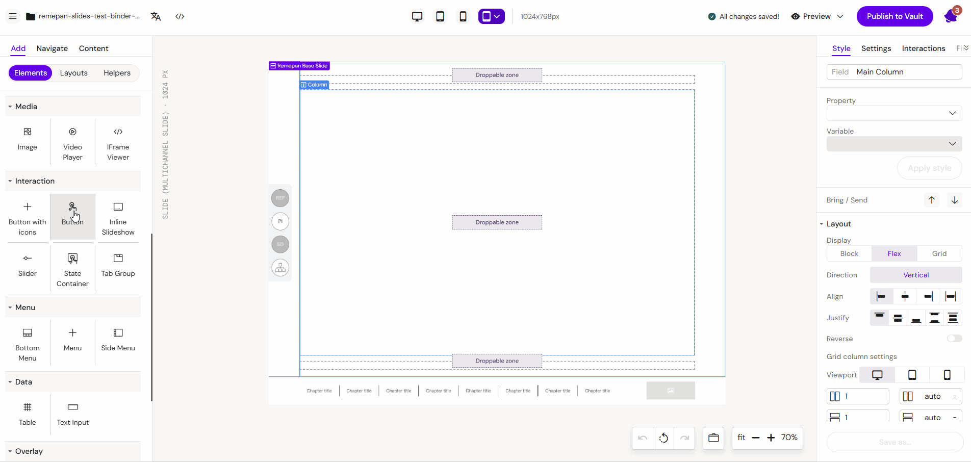
Select the Button component from the components list and drag it onto the layout canvas.
Step 2: Styling and Text
-
Select the button on the canvas to open its properties.
-
Edit the button text in the settings. Note that this text can be localized by editors for different versions.
-
Apply styling such as colors, fonts, and border configurations (e.g., applying rounded corners).
Step 3: Setting Up Interactions
To make the button functional (for example, to navigate to the next slide):
-
Navigate to the Interactions tab in the component properties.
-
Provide a descriptive name for your interaction to easily identify it later.
-
Add a new interaction with the following logic:
-
Trigger: (If) the user clicks (on) button. (Use the "Set by Selected" option for the "On" variable since the button is already active.)
-
Do: Navigate (action).
-
Select: Binder and slide
-
-
Click Create button
Read more about interactions here: Interactions [WIP]
Key Features
-
Custom Styling: Full control over borders, background states.
-
Flexible Logic: Integration with the Activator interaction engine for complex navigation or content updates.
Best Practices
-
Descriptive Labels: Use clear, action-oriented text like "Next Page", "Read More", or "Submit".
-
Touch Targets: For mobile devices, ensure the button is large enough to be easily tapped (minimum 44x44px recommended).
-
Naming Conventions: Always name your interactions clearly (e.g.,
Btn_Nav_Back) to maintain a clean project structure.