
The State Container is a fundamental logic-driven component used to manage custom UI states (such as active/inactive or visible/hidden). It serves as a wrapper for other elements, allowing creators to trigger complex visual changes and events based on user interaction.
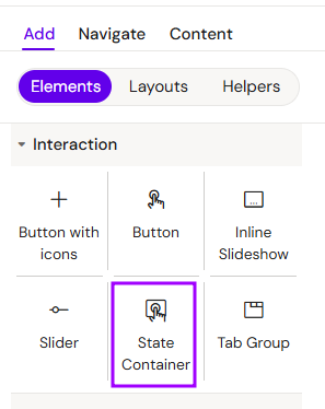
Add State Container
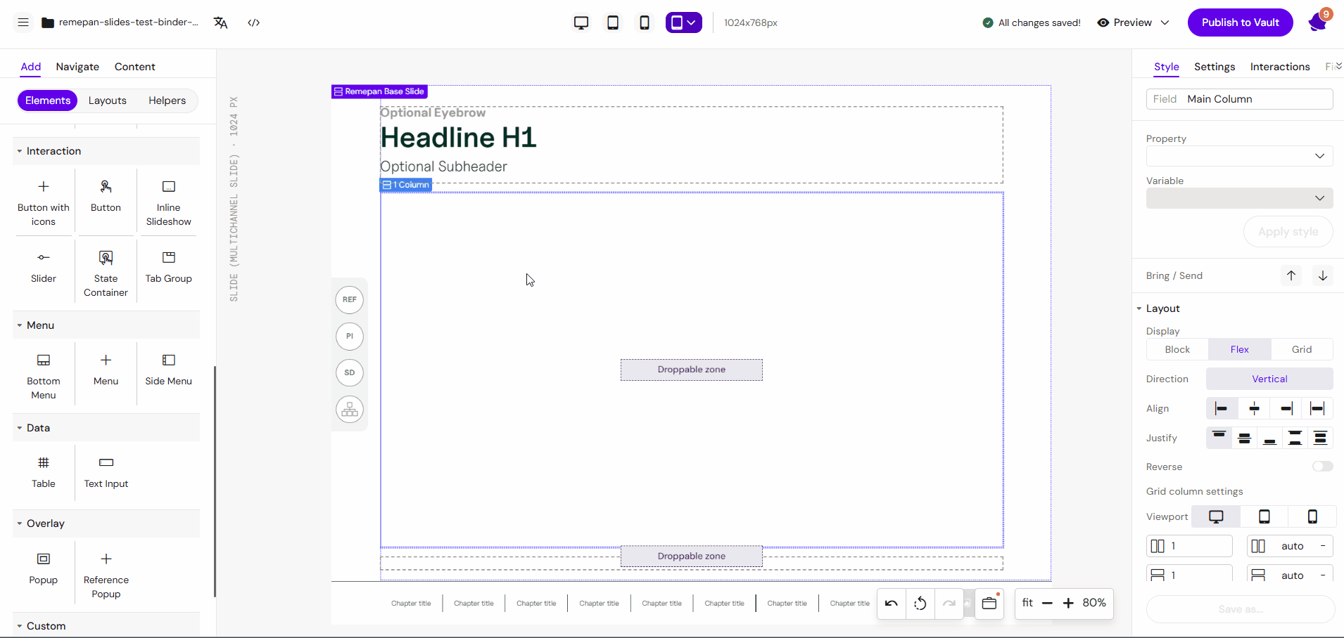
You can add a State Container from the Left panel.
How to style State Container
The right panel for the State Container contains general properties:
-
Animations:
-
Initial state:
-
Active/inactive
-
-
Entrance/exit animation
-
Fade in/out
-
Appear from left
-
Appear from right
-
Appear from bottom
-
Appear from top
-
-
Duration
-
Delay
-
Overview
Unlike static containers, the State Container is specifically designed to respond to the Activator interaction engine. It allows you to group content that should only appear, disappear, or change its state when a specific condition is met (e.g., a button click).
Prerequisites
-
Interaction Programming: A State Container remains passive until an action is programmed in the Interactions tab. You must define a trigger (e.g., a click on another element) to change the container's state.
Read more about Interactions
-
Nested Content: To be effective, the container must have nested components (Images, Text, or Groups) that will inherit the state changes.
How to Use the State Container
Step 1: Adding the Container
Select the State Container component from the components list and drag it onto your layout canvas.
Step 2: Inserting Content
While the State Container is selected and active, add the elements you want to control.
-
Example: Select the Image component to place a visual asset inside the container. This image is now "linked" to the container's visibility/state.
Step 3: Creating a Trigger
Deselect the state container and add a trigger element elsewhere on the slide.
-
Example: Add a Button component to the slide. This button will serve as the "switch" for the container.
Step 4: Programming the Interaction
-
Select the Button.
-
Open the Interactions tab on the right-hand side.
-
Add a new interaction:
-
Trigger: (If) User clicks (on) the Button.
-
Action: (Then) Set State / Toggle of the State Container.
-
-
Name your interaction.
Step 5: Testing
Go to Preview Mode. The image inside the container should follow the logic you programmed (e.g., appearing only when the button is pressed).
Key Features
-
Conditional Visibility: Perfect for "Read More" sections or showing/hiding additional product details.
-
Nested Logic: Can contain multiple components that act as a single unit.
-
State Persistence: Can be configured to stay in a specific state until another interaction resets it.
5. Best Practices
-
Group Related Elements: Use a State Container to manage groups of elements (like a text block + an icon) that need to appear together.
-
Initial State: Always consider the initial state of the container (Should it be hidden or visible when the slide first loads?).
-
Clear Naming: When using multiple containers on a single slide, name them descriptively in the layers panel (e.g.,
State_PatientProfile_1) to avoid confusion during interaction setup. -
Combine with Buttons: Use "Toggle" actions if you want the user to be able to both show and hide the content with the same button.