
The Image component provides a flexible container for displaying visual assets within eDetailer presentations, supporting local, shared, and external media sources.
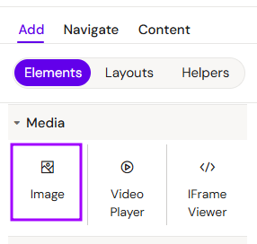
Add Image
You can add a Image from the Left panel.
How to style Image
The right panel for the Image contains general properties:
-
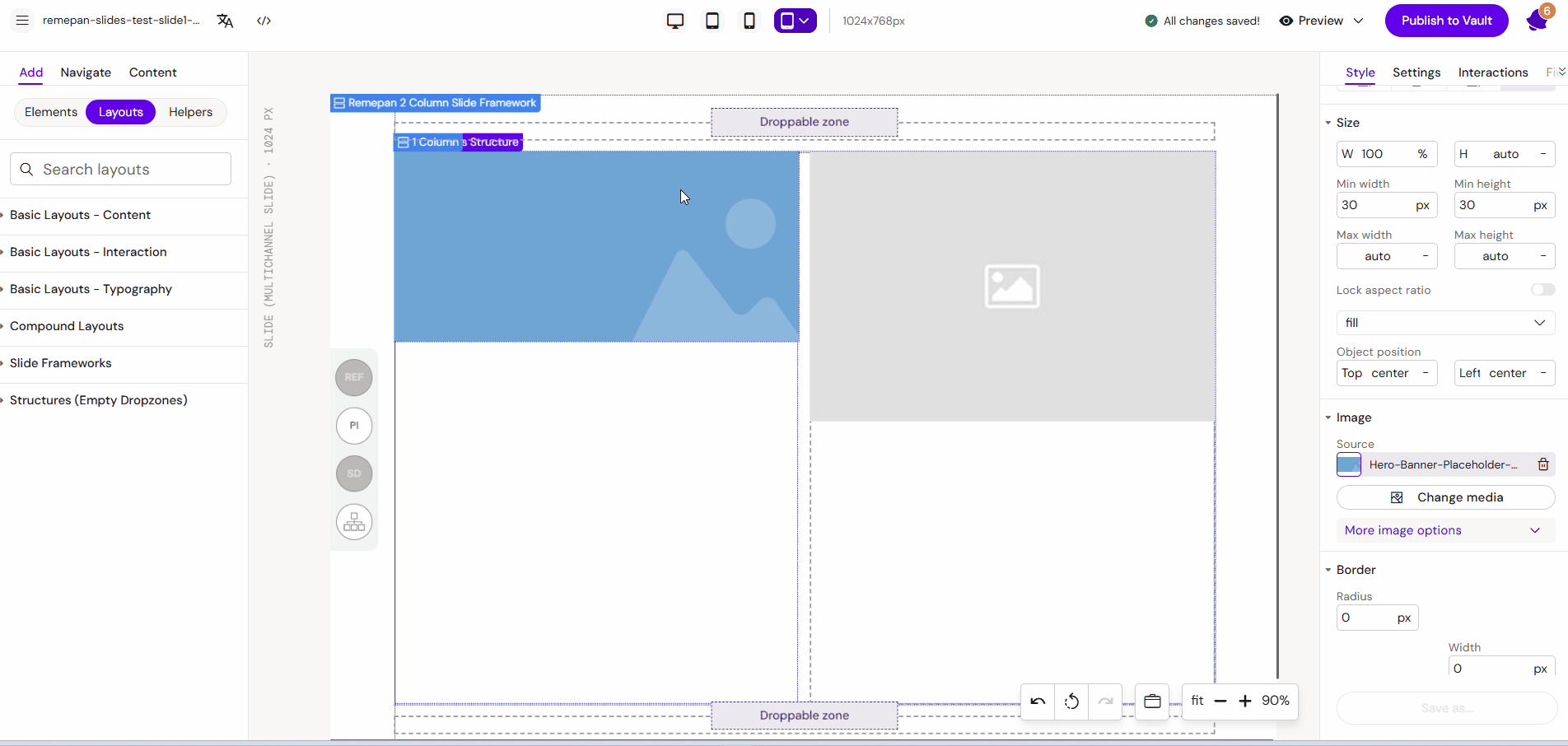
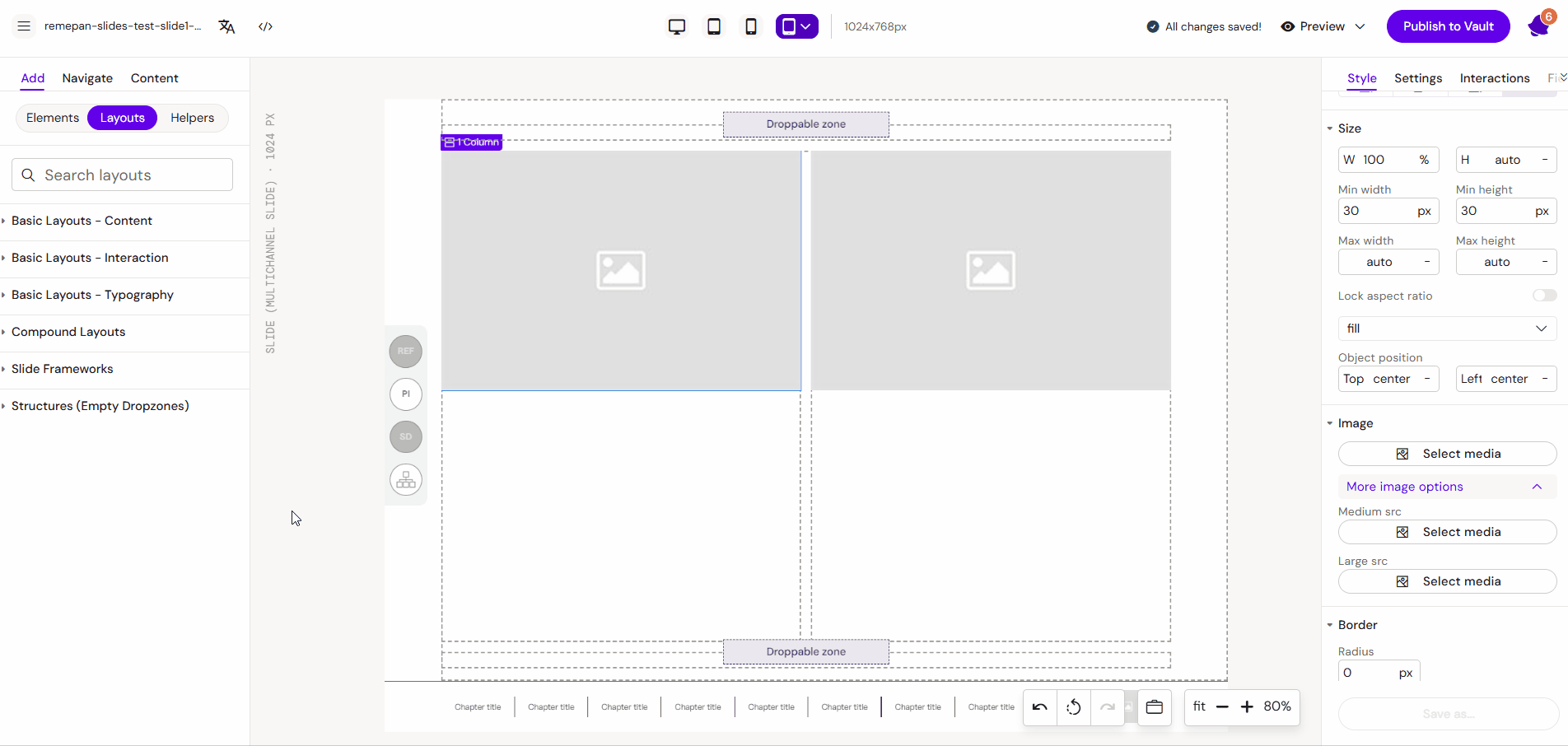
Image - fields that allow user to select images for different resolutions
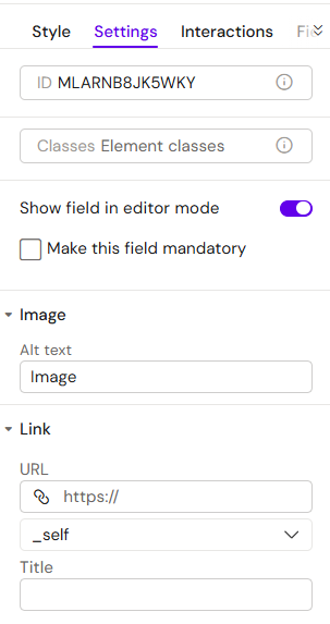
“Settings” tab
In the “Settings” tab, you can add Alt text, link: URL, target (_blank, _self, _parent, _top), and Title.
Overview
The Image component is a fundamental building block used to insert brand photography, icons into layouts. It is designed to be responsive, allowing editors to swap media for different markets or versions easily.
Prerequisites
To ensure optimal performance and compatibility, please adhere to the following:
-
Source Availability: Images must be uploaded to Local Assets, Shared Assets, connected via Vault or using URL link.
-
File Types: Supported formats include
.png,.jpeg,.jpg,.svg, and.webp. -
Recommendations: For better loading speeds, keep file sizes under 2MB per image.
How to Use the Image Component
Step 1: Adding the Container
Drag the Image component from the library onto your layout canvas. You can place it directly on the slide or within structural elements like Columns or Groups.
Step 2: Selecting Media
-
Click the "Select media" button within the component settings.
-
The Media Library will open. You can:
-
Pick an existing image from the library.
-
Upload a new file from your computer by clicking "Upload local assets".
-
Insert the URL link to the image.
-
-
Click the "Select" button to confirm your choice.
Step 3: Styling and Configuration
-
Position & Size: Adjust the dimensions and alignment to fit your layout.
-
Responsive Scaling: Navigate to the "More image options" tab. Here, you can define specific images for different screen sizes (Medium/Large) to ensure the content scales correctly across all devices.
Key Features
-
Localization Ready: Images are placeholders intended to be easily swapped by editors for different country versions.
-
Asset Centralization: Use Shared Assets to maintain consistent icons across multiple presentations.
-
Flexible Layouts: Works seamlessly inside nested containers for complex UI designs.
Best Practices
-
Use SVG for Icons: For logos and simple icons, use
.svgformat to maintain perfect clarity at any scale. -
Optimize for Web: Use
.webpor compressed.jpegfor large background photos to reduce the total presentation size. -
Alternative Assets: Always utilize the "More image options" tab if your presentation will be viewed on both tablets and desktop monitors.
You can read more about supported assets file formats here: Managing Image Assets