
The Side Menu component adds a navigation bar to the side of the slide, typically containing three default buttons. Each button functions as an individual component that can be programmed for specific interactions.
Add Side Menu
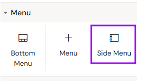
You can add a Side Menu from the Left panel.
How to style Side Menu
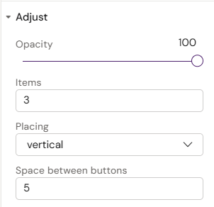
The right panel for the Side Menu contains general properties:
-
-
Items
-
Placing (vertical/horizontal)
-
Space between buttons
-
How to style Side Menu Button
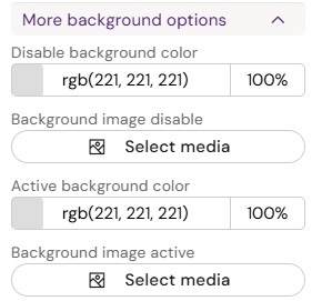
The right panel for the Side Menu Button contains general properties:
-
-
Disable background color
-
Background image disable
-
Active background color
-
Background image active
-
-
-
Enable hover effect (toggle)
-
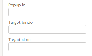
Popup id
-
Target binder
-
Target slide
-
Use Popup id or Target binder + Target slide
Overview
The Side Menu is a persistent navigation tool used for quick access to global tools or information. Unlike the Bottom Menu, each button in the Side Menu is managed individually directly on the slide canvas or on the Slide Fragments.
Prerequisites
-
Interaction Programming: Every button in the Side Menu requires a manually programmed action to trigger an event (e.g., opening a popup or navigating to a slide).
-
Fragment Recommendation: If the Side Menu is intended to show global content (like References, PI, or FAQs) across all slides, it is recommended to place the menu inside a Slide Fragment. This ensures that any change to the menu is updated globally.
How to Use the Side Menu Component
Step 1: Adding and Styling Buttons
-
Select the Side Menu from the components list and add it to your slide.
-
Use the Style menu to adjust its appearance, including size, icons, and colors.
-
Repeat this process for each button required in your menu.
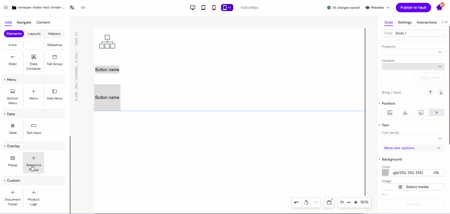
Step 2: Creating a Trigger Target (Example: Popup)
-
Select the Popup component from the components list and place it on the slide.
-
Style the popup as desired (add text, images, or close buttons).
-
Click on the active state of the popup to deselect it before proceeding.
Step 3.1: Programming the Interaction
-
Select the specific Side Menu Button you want to use as a trigger.
-
Navigate to the Interactions tab in the toolbox on the right-hand side.
-
Click "Add Interaction" and input the commands:
-
Trigger: (If) User clicks (on) this Button.
-
Action: (Then) Show / Toggle the Popup state.
-
-
Continue this process for any other buttons in the menu.
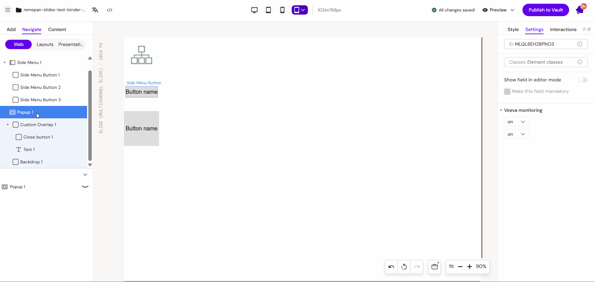
Step 3.2: Programming the ID
-
Select the specific Side Menu Button you want to use as a trigger.
-
Navigate to the Style tab in the toolbox on the right-hand side.
-
Add Popup id in the Adjust section
-
Continue this process for any other buttons in the menu.
Key Features
-
Individual Control: Each button can have unique styling and independent logic.
-
Compact Design: Optimized for side-of-screen placement to maximize the main content area.
-
State Integration: Works seamlessly with Popups and State Containers for multi-layered content.
Best Practices
-
Consistent Icons: Use clear, recognizable icons for each button (e.g., a book icon for References).
-
Fragment Usage: Always use Slide Fragment if the Side Menu should appear on more than one slide to avoid manual duplication of interactions.
-
Testing: Use Preview Mode to ensure each button correctly triggers its assigned popup or navigation event.