
This page covers the end-to-end workflow for producing a publishable email in Activator.
Who this is for
-
Content Editors (primary)
-
Designers/Brand Designers only when building or maintaining templates/layouts
Step 1 — Create or duplicate
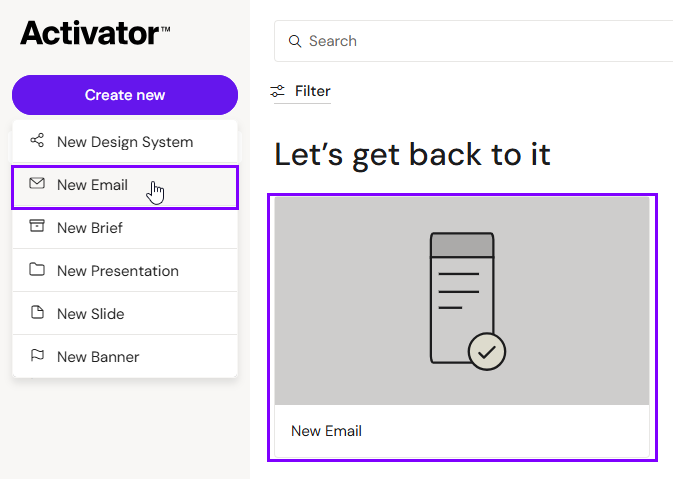
Create
-
Go to the Dashboard
-
Click Create new → Email
-
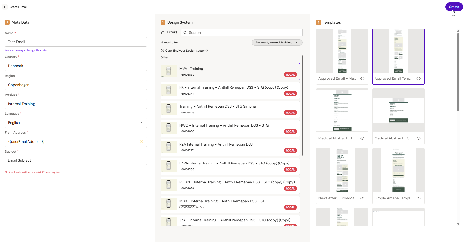
Fill in mandatory metadata (if prompted)
-
Select a Design System
-
Select a template
-
Click Create
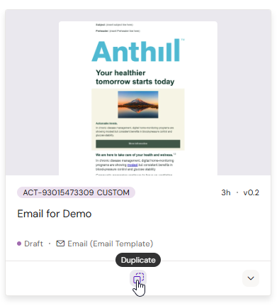
Duplicate
Use duplication when you’re creating a new version, market variant, or campaign variant of an existing email.
-
Locate the email on the Dashboard
-
Click Duplicate
-
Update metadata if prompted
-
Confirm duplication
Step 2 — Build the email structure
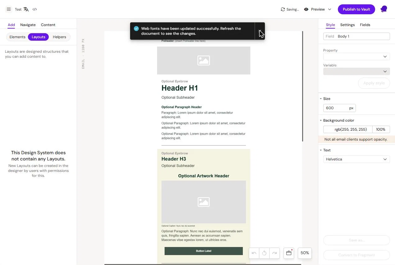
Emails are assembled from reusable building blocks. Depending on your setup, you may use:
-
Layouts (structure blocks)
-
Helpers (layout + prefilled content)
-
Email fragments (reusable blocks stored and maintained separately)
Typical pattern:
-
Insert layouts/helpers/fragments into the canvas
-
Remove any sections you don’t need
-
Reorder sections to match your intended flow
Tip
Get the structure right before you start polishing text. It avoids rewriting copy when layout changes.
Step 3 — Fill in content
Text
Edit text fields directly on the canvas. Use formatting only where necessary.
Links and buttons
Set URLs in the element’s Settings. Always validate links in Preview mode.
Images
Insert images from your Media sources (Design System assets, DAM assets, or local uploads depending on tenant rules). Always set alt text where available.
Tokens (personalization)
Use tokens for personalization (recipient, rep, territory, etc.) when supported.
Modular content (if enabled)
If your tenant uses modular/approved content blocks, link them to layout placeholders where supported.
Step 4 — Preview and test
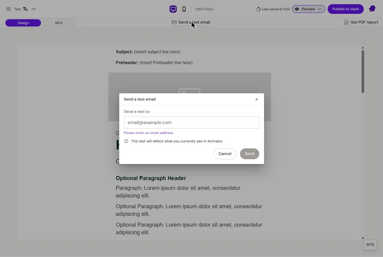
Preview inside Activator to validate structure and responsiveness. Then test in real email clients using:
-
Test send from Activator (if enabled)
-
Your organization’s pre-deployment testing tool (recommended)
Step 5 — Publish
Publishing pushes the current email output to your DAM (Vault/Aprimo/etc.). Your approval workflow happens in the DAM.