
Emails in Activator are built from containers (structure) and elements (visible content). Designers assemble containers and elements into reusable layouts and templates; Editors typically only fill exposed fields.
Important reality check (email rendering): Email clients do not behave like browsers. Many CSS features are partially supported or ignored (especially in Outlook). Always validate output with real client testing.
Varies by tenant (Anthill-managed)
Some settings may be hidden or restricted by role, Design System governance, or tenant configuration. Learn more.
How to read the UI (where settings live)
Most components are configured in the right sidebar under one or more of these areas:
-
Style: visual appearance (spacing, sizes, typography, colors)
-
Settings: behaviour and metadata (links, field visibility, mandatory flags)
-
Fields: optional/mandatory field toggles (primarily used by Editors, enabled by Designers)
A common governance pattern:
-
Designers configure the component and decide what is editable/exposed.
-
Editors edit the exposed content and fields only.
Attributes (v3.6) — applies to every MJML element
From v3.6, the Settings tab includes a new Attributes section. Any MJML element on this page — Layout container, Row, Column, Group, Text, Button, Image, Divider, Spacer, HTML component — supports custom HTML attributes added directly from the editor.
This is the right surface for analytics hooks (data-analytics-id), accessibility attributes (aria-label, role), or downstream rendering markers your ESP or DAM expects on the rendered HTML. The editor writes attributes directly onto the MJML element; they survive through the publishing pipeline into the rendered email.
See Custom Attributes on MJML Elements for the full reference. Each container/element below inherits this capability — it's not called out per component to avoid repetition.
Containers (structure)
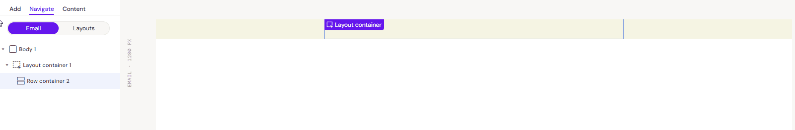
Layout container

What it is
Top-level wrapper used to define a reusable section for Email layouts. In many setups, this is the starting point for an Email layout and may insert a Row automatically.
When to use
Use it to create a section that can later be saved as an Email Layout.
Key settings
-
Padding (top/right/bottom/left): controls spacing inside the section
-
Background (if available): section-level background
-
Field name / description: what Editors see (important for clarity)
-
Show field in editor mode (if available): exposes it in Fields panel
-
Mandatory (if available): prevents Editors from turning it off
Best practices
-
Use layout containers as clean "sections" (hero, body block, footer)
-
Keep padding consistent across layouts to avoid a chaotic look
-
Name the container based on purpose: "Hero section", "CTA block", "Footer"
Common pitfalls
-
Over-nesting containers makes editing painful
-
Inconsistent padding across layouts creates "random" spacing when Editors assemble emails

Key behaviour
-
Rows define the main horizontal grid.
-
Rows often target a standard email width (commonly ~600px), depending on your template/system.
Key settings
-
Padding: spacing inside the row
-
Background (if available)
-
Alignment / justify (if available)
-
Width (if exposed): prefer percent-based layouts unless you have a strict standard
Best practices
-
Think "one row = one band of content"
-
Keep row padding consistent, then manage internal spacing with columns/spacers
Common pitfalls
-
Rows with inconsistent padding create uneven gutters
-
Putting elements directly in a row (instead of inside columns/groups) usually leads to unstable layouts
Column Container

What it is
A vertical slice inside a row. Columns hold the actual content elements (text, image, button, etc.).
-20260520-114932.gif?cb=72185d6f28f7e436659b3451967e3080)
Key behaviour (responsive)
-
Columns inside a row stack vertically on mobile by default.
-
When stacked, they typically become full width.
Key settings
-
Width: percent or pixel width depending on your system
-
Padding: internal spacing for the column
-
Vertical alignment (if available): top/middle/bottom alignment within the row
-
Background (if available)
Best practices
-
Use percent widths that add up cleanly (e.g., 50/50, 60/40, 33/33/34)
-
Use a dedicated "gap column" pattern for controlled spacing when needed
-
Keep padding on columns, not on individual elements, when you want consistent gutters
Common pitfalls
-
If column widths don't add up cleanly, columns may drop under each other unexpectedly
-
Designers often forget mobile stacking order—what looks good on desktop becomes awkward on mobile
Group container
What it is
A wrapper placed inside a row that keeps its columns together as a group.
-20260520-120611.gif?cb=e5c72b2d0fd378a99f73a318997d961e)
Key behaviour (responsive)
-
Columns inside a group container do not stack the same way on mobile (they are kept side-by-side as a group).
When to use
-
Icon + label pairs that must remain on one line
-
Small "two-up" UI patterns that must stay horizontal
-
Tight UI elements where stacking would break meaning
Key settings
-
Width (often 100% of row)
-
Padding
-
Internal column widths
Best practices
-
Use sparingly: keeping columns side-by-side on mobile can reduce readability
-
Use for "must stay together" patterns only
Common pitfalls
-
Overusing groups creates cramped mobile layouts
-
Group contents can become too small on narrow screens
Elements (visible content)
Text
What it is
A text block. It may support both "block-level" styling (applies to the whole text element) and "inline" formatting (applies to selected words).
-20260520-120710.png?cb=d911889ef03c86513d49860457868c9a)
Key settings (typical)
-
Font family
-
Font size
-
Line height
-
Font weight
-
Color
-
Alignment
-
Padding
-
Text field type (if your tenant requires it for mapping/automation)
-
Preserve whitespace (when exposed)
Inline formatting (toolbar)
Common actions:
-
Bold / italic / underline
-
Superscript / subscript
-
Lists (ordered/unordered)
-
Links
-
Clear formatting
-
Insert token (if enabled)
-20260520-120739.png?cb=c9994b4c98bb8f4bfc0aef7fe0fc696b)
Best practices
-
Keep typography controlled at Design System level; expose only what Editors truly need
-
Use consistent line-height; avoid "looks fine on my machine" styling
-
Use inline formatting sparingly: email clients can behave differently
Common pitfalls
-
Mixing multiple font sizes/weights inside one element can render inconsistently
-
Copy/paste from Word/Docs often introduces junk formatting—clear formatting when needed
Button
What it is
Clickable call-to-action. Typically supports label text, link target, and styling.
-20260520-120848.png?cb=b379b230f9e15c885add29e71d1bd9c4)
Key settings
-
Label text
-
Link URL (Settings)
-
Alignment (left/center/right)
-
Width (fit-content vs full width, if available)
-
Height
-
Background color
-
Text color
-
Inner padding (critical for tap target size)
-
Border (width/style/color) and border radius (if available)
-20260520-120911.png?cb=215287bc79ab760574e64da98252f312)
Email client constraints
-
Rounded corners and borders are not consistently supported across clients (notably Outlook).
-
Always test buttons across clients if you rely on advanced styling.
Best practices
-
Make tap targets large enough for mobile (padding matters more than font size)
-
Keep button styling consistent across the Design System
-
Avoid "fancy" button techniques unless you've proven client support
Common pitfalls
-
Buttons that look fine in preview but break in Outlook
-
Tiny tap targets due to insufficient inner padding
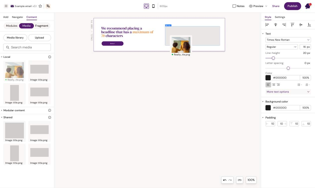
Image
What it is
An image placeholder/container that holds an asset.
-20260520-120941.png?cb=15fce441c9f65830073e1b7f94a5dd7c)
Key settings
-
Source (Design System asset / DAM import / local upload)
-
Alt text (if exposed)
-
Width / size (px or % depending on your system)
-
Padding
-
Fluid on mobile (if available): makes the image expand to full width on mobile
-
Link URL (Settings) to make image clickable
Best practices
-
Always set alt text when your process requires it
-
Prefer DAM renditions when available (right size/crop for the intended use)
-
Use "fluid on mobile" when desktop uses fixed widths but mobile needs full-width readability
Common pitfalls
-
Oversized images causing slow load and layout shifts
-
Missing alt text (compliance/quality issue)
-
Using images with the wrong aspect ratio, forcing awkward padding fixes
Divider
What it is
A horizontal line used to separate sections.
-20260520-121040.png?cb=d3e77c9cdbfaf8c328a948f1be3fad90)
Key settings
-
Thickness
-
Color
-
Padding above/below
-
Width (if available)
-20260520-121058.png?cb=60e76fba86048e4e6879eed05f785eb5)
Best practices
-
Use padding to create separation rather than stacking multiple dividers
-
Keep divider styles consistent across the Design System
Common pitfalls
-
Using dividers as spacing hacks instead of proper layout spacing
Spacer
What it is
An explicit vertical space element. It's a "safe" way to create consistent gaps without relying on margins that some clients ignore.
-20260520-121154.png?cb=755997860fefba69540011f12352144d)
Key settings
-
Height
-
Responsive behaviour (if exposed)
-
Padding/margins (tenant-dependent)
-20260520-121224.png?cb=9731075f4bdbefd27e97caf2b7568811)
Best practices
-
Use spacers for consistent vertical rhythm between blocks
-
Prefer one spacer with a known height over random padding scattered everywhere
Common pitfalls
-
Overusing spacers instead of fixing container padding (creates fragile designs)
HTML component (advanced)
What it is
A custom code block for email-safe HTML/CSS when standard components aren't enough.
-20260520-121249.png?cb=f1a970cb3307cd48b3b8174ebd177fb8)
When to use
-
Custom visual separators
-
Specialized patterns not supported by the component library
-
Edge-case client requirements
-20260520-121311.gif?cb=e2283608f378baa96960efb96a038ebd)
Key settings
-
HTML/code content
-
Show field in editor mode (if you want Editors to edit it)
-
Lock down (recommended for governance)
Risks
-
Non-standard HTML/CSS can render unpredictably across email clients
-
Harder to support and troubleshoot
-
Can break responsive behaviour if misused
Best practices
-
Use sparingly and keep snippets small
-
Maintain a vetted library of approved snippets (Design System governance)
-
Always test in real clients (not just preview)
Governance tip
If end users must edit it, enable "Show field in editor mode". Otherwise keep it locked to Designers.
Component selection rules
-
Structure with rows + columns (and groups only when needed)
-
Put content elements inside columns
-
Use spacers for vertical gaps when padding alone becomes messy
-
Treat HTML component as "expert mode"
Related articles
-
How to read the UI (stacking rules, group containers, spacing patterns)
-
Layouts and templates (how to package sections for Editors)
-
Content reuse (layout + content reuse)