
Responsive emails adapt to different screen sizes (desktop, tablet, mobile). Activator uses MJML under the hood, which handles a lot automatically, but predictable results depend on a few rules.
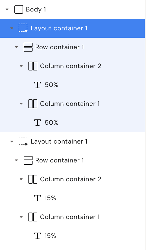
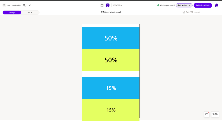
The core rule: columns stack on mobile
-
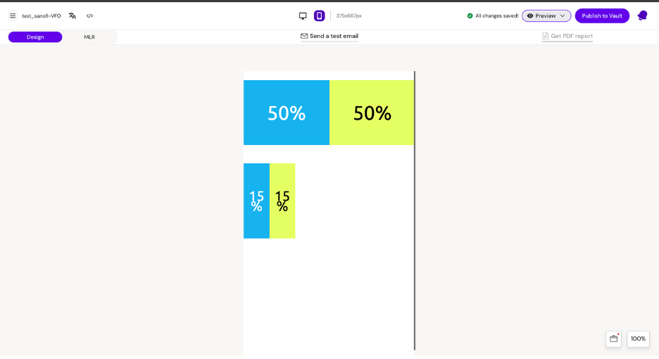
Columns inside a Row stack vertically on mobile
-
Each stacked column becomes full-width, regardless of desktop width
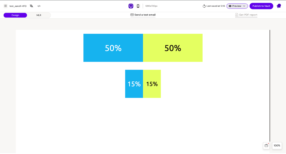
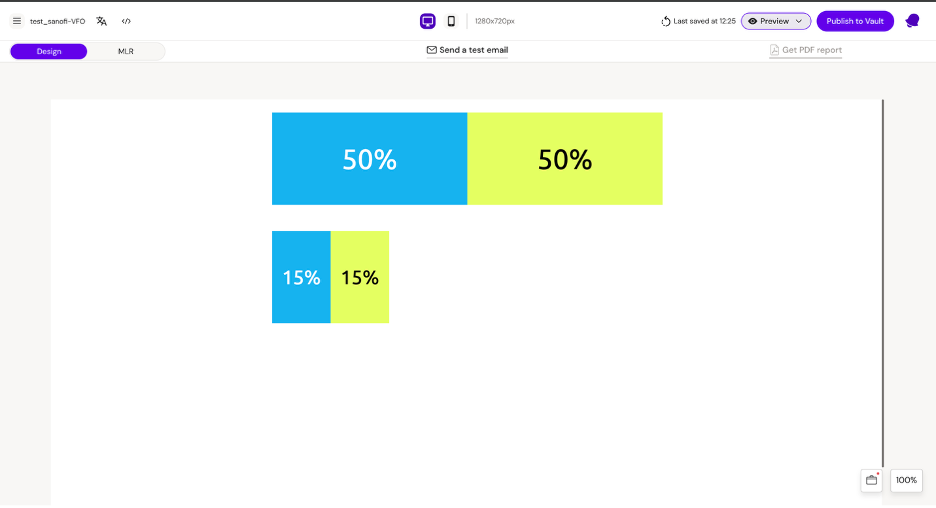
This means a 15/15 column layout behaves the same as 50/50 on mobile: both become vertical full-width blocks.
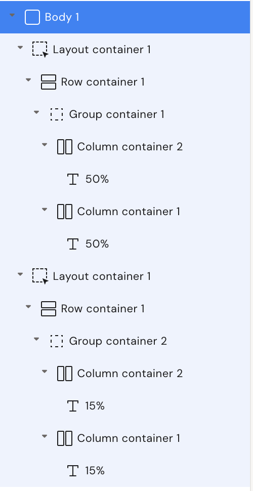
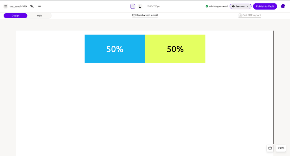
Keep columns side-by-side on mobile (Group container)
Use a Group container when you need columns to stay side-by-side on mobile (e.g., icon + label, price + CTA).
-
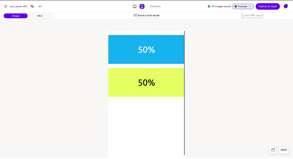
Columns directly inside a row: will stack on mobile
-
Columns inside a group: do not stack (they remain in one horizontal group)
Use group containers sparingly; they can reduce readability on small screens if overused.
Spacing patterns
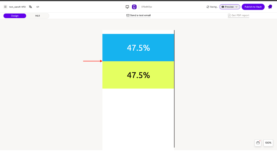
Vertical spacing when columns stack
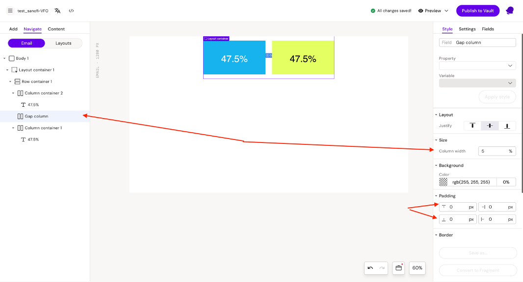
When stacked, sections can become visually cramped. A reliable pattern is a “gap column” that becomes a spacer on mobile.
Example idea:
-
Insert a gap column between content columns
-
Give it 0% width but vertical padding so it acts as a spacer block when stacked
Horizontal spacing on desktop
Use a gap column with a real percentage width (e.g., 5%) and adjust the content columns so the total is 100%.
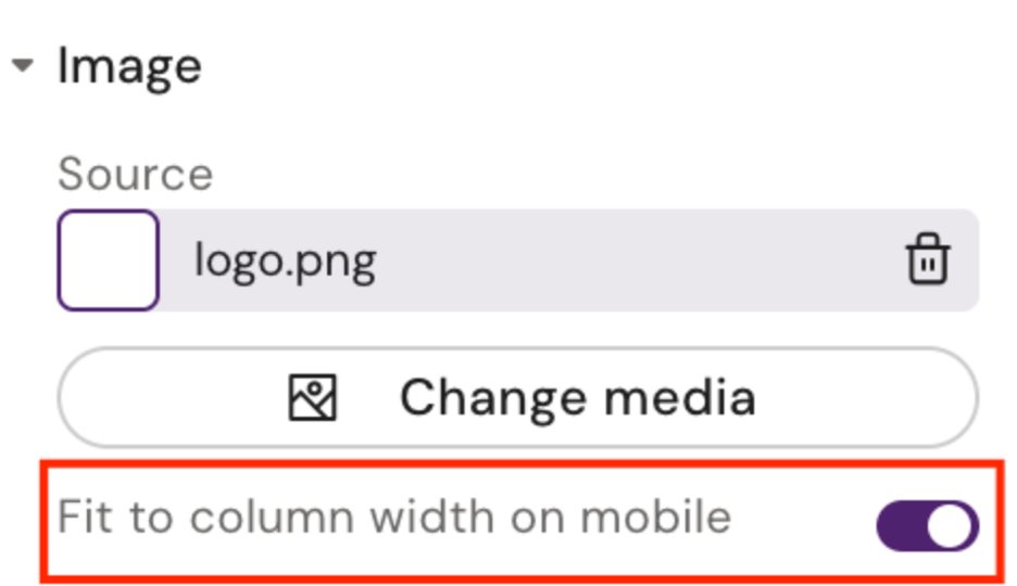
Responsive images (fluid on mobile)
If you want an image to:
-
be smaller/fixed on desktop, but
-
expand to full width on mobile
Enable fluid-on-mobile (where your UI exposes it).
What to test every time
-
Desktop view: width, alignment, gaps
-
Mobile view: stacking order, spacing, image scaling
-
Links/buttons: tap targets and spacing
-
Outlook-specific rendering (if your org supports Outlook)
Related
-
Email Components (Designer reference)