Layouts are reusable, pre-built content sections you can insert into a document to build content faster and keep it consistent. A layout might be a header, a CTA block, a hero section, an FAQ box, an accordion, or a footer—anything that appears repeatedly across documents.
Layouts are created once and then reused across many documents, so teams don’t rebuild the same structure repeatedly.
Who this is for
Content Editors
-
Insert layouts into a document
-
Fill in fields (text/images/buttons)
-
Show/hide optional fields (when allowed)
Content Designers / Brand Designers
-
Build layouts
-
Define what is editable vs locked
-
Set field rules (mandatory/optional) and metadata needed for automation (e.g., modular content)
Varies by tenant (Anthill-managed)
What each role can do (and which panels/tabs are visible) depends on your tenant’s permissions and configuration. Learn more.
Where layouts apply
Layouts are channel-specific and Design System-specific.
Channel-specific
A layout built for Email is intended for Email documents.
A layout built for Slides is intended for Slide documents.
A layout built for Briefs is intended for Brief documents.
You typically cannot reuse an Email layout inside Slides/Briefs (and vice versa), because channels have different structure and rendering rules.
Design System-specific
Layouts belong to a specific Design System.
That means a layout can only be used in documents that use a compatible Design System.
This protects styling, tokens, and dependent assets from breaking.
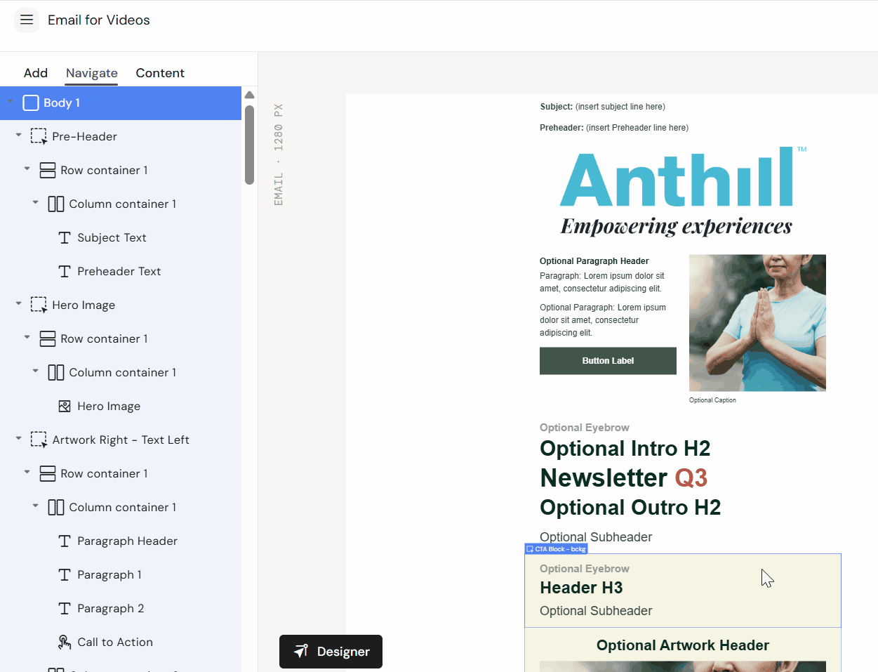
What a layout contains
A layout typically includes:
-
Structure: containers/rows/columns that define placement
-
Fields: named placeholders (headline, body, image, CTA, etc.)
-
Rules: optional/mandatory fields and restrictions (where enabled)
-
Default styling: consistent spacing, typography, button styles, etc.
Use layouts (Editors)
Insert a layout
-
Open your document in the Editor (Workspace UI)
-
Go to Add → Layouts
-
Drag a layout onto the canvas (or insert via the UI control)
-
Fill the layout fields (text/images/buttons)
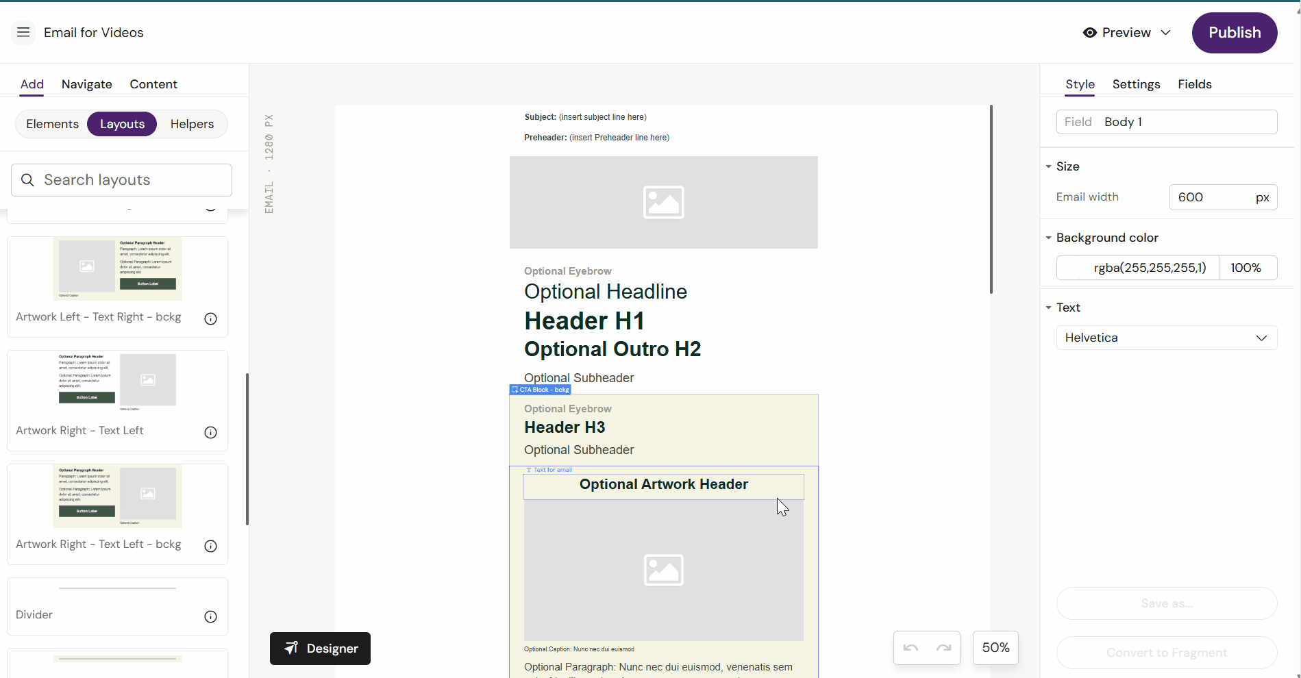
What you should see
-
The layout appears as a section on the canvas
-
The layout’s internal fields become selectable/editable
-
Optional fields may appear in the Fields panel (if the layout exposes them)
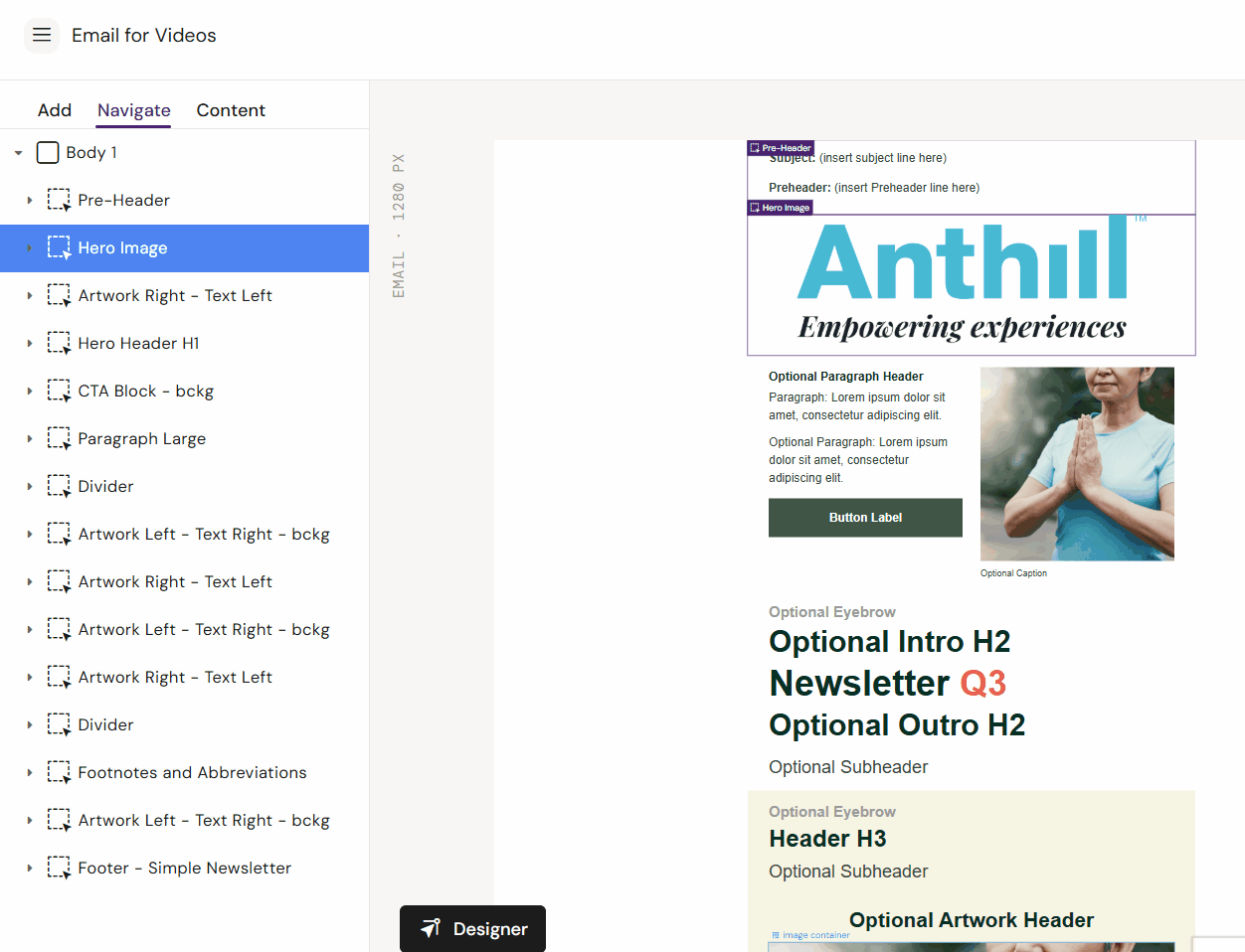
Reorder layouts
Layouts can typically be reordered via the structure tree.
-
Open Navigate
-
Drag the layout section to the new position
-
Save
Remove a layout
-
Select the layout (or the top container for the layout)
-
Press Delete (or use the context action if available)
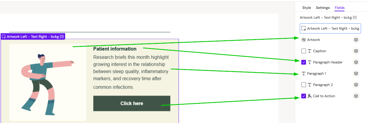
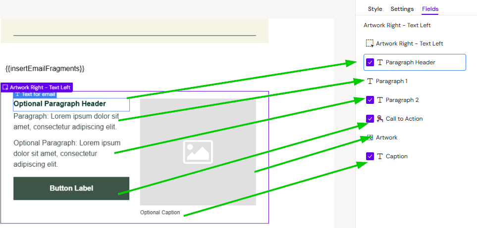
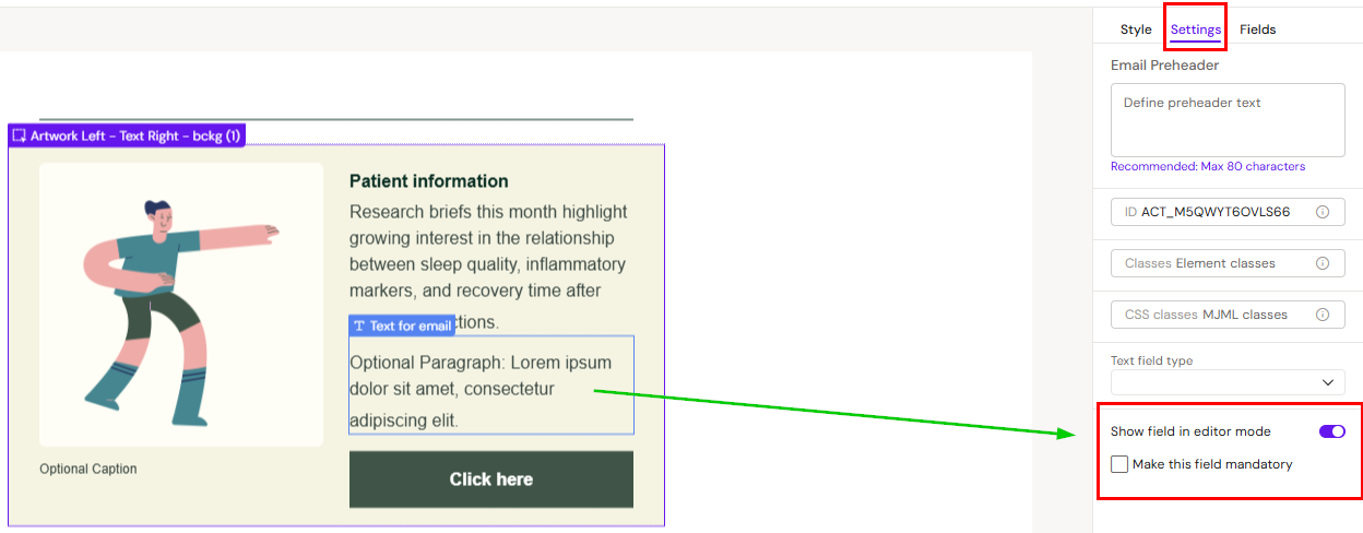
Show/hide optional fields (Fields panel)
Layouts often contain optional elements (e.g., optional image, secondary button, disclaimer). These are controlled through the Fields panel when enabled.
-
Optional fields can be toggled on/off
-
Mandatory fields cannot be toggled off
Tip
If you don’t see a field in the Fields panel, it likely wasn’t configured to appear there when the layout was built.
Build and save layouts (Designers)
Availability
Building and saving layouts is typically restricted to Designer and Brand Designer roles.
Design principles (what makes a good layout)
A good layout is:
-
Reusable: supports common patterns, not one-off campaigns
-
Flexible: supports multiple variants without needing 10 near-duplicate layouts
-
Safe: locks down brand-critical styling where needed
-
Readable: fields are named so editors understand what they’re editing
Best practice 1: One layout, multiple combinations
Instead of creating separate layouts for every scenario, build one layout that supports optional sections. Example:
-
Headline (mandatory)
-
Body text (optional)
-
Image (optional)
-
Primary CTA (optional)
-
Secondary CTA (optional)
Why this matters
-
Fewer layouts to maintain
-
Editors can adapt output without needing new layouts
-
Consistency stays high even with flexibility
|
One layout, multiple combinations |
|---|
|
|
|
Best practice 2: Name layouts and fields clearly
Editors work faster when fields are self-explanatory.
Good field names:
-
“Header image”
-
“Primary CTA label”
-
“Primary CTA URL”
-
“Disclaimer”
-
“Body copy”
Bad field names:
-
“Text 1”
-
“Image 2”
-
“Button”
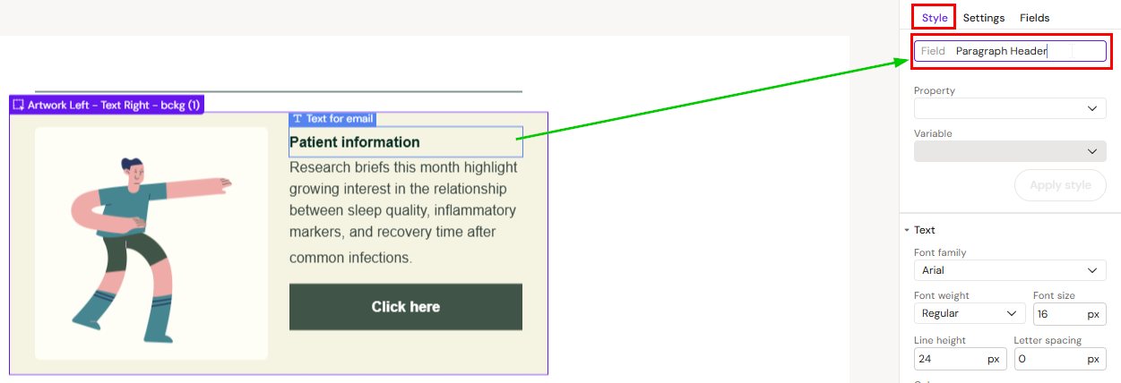
Where you name fields
Select the field/element and set its name/label in the relevant property panel (depends on component type).
Best practice 3: Expose fields intentionally
If editors are supposed to fill or link content into a placeholder (including modular content), the field must be exposed correctly.
Typical controls (names vary by tenant):
-
Show field in editor mode → makes it visible in the Fields panel
-
Make field mandatory → prevents editors from hiding/disabling it
Why this matters for modular content
If the field is not exposed, editors may not be able to link modular content reliably.
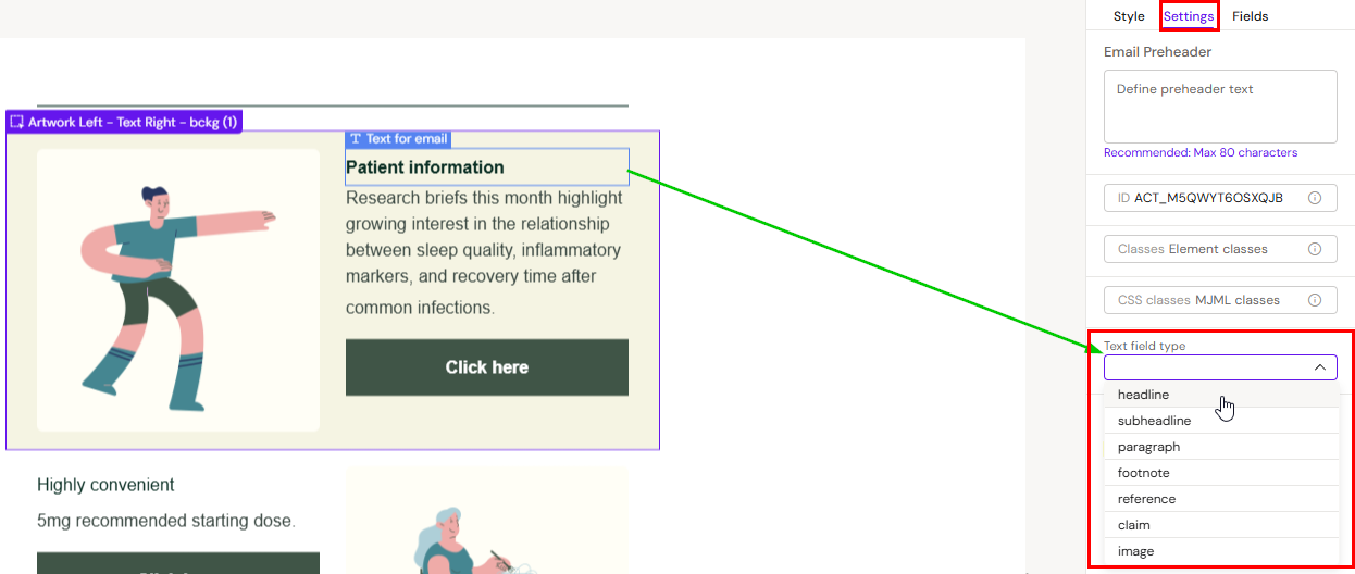
Best practice 4: Set text field type (when required)
Some tenants require text placeholders to be typed (e.g., headline vs body) to support automation and consistent mapping.
If your tenant enforces this:
-
Every text field must have a description/name
-
Every text field must have a field type
If these are missing, saving the layout may fail or automation may not work.
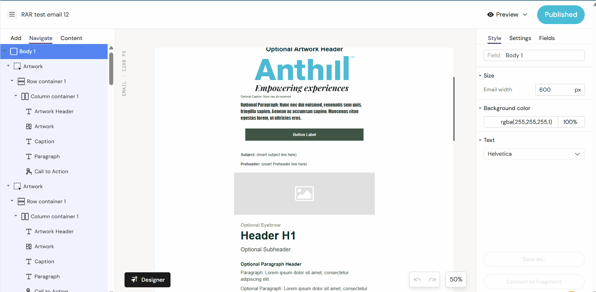
Build a layout: Email vs Slides/Briefs
Email layouts (typical structure)
Email layouts usually begin with an Email-specific container structure (names vary by implementation), then columns/groups inside that.
Typical pattern:
-
Add the email container
-
Add column/group containers
-
Add content components (text, image, button)
-
Configure fields and rules
-
Save as layout
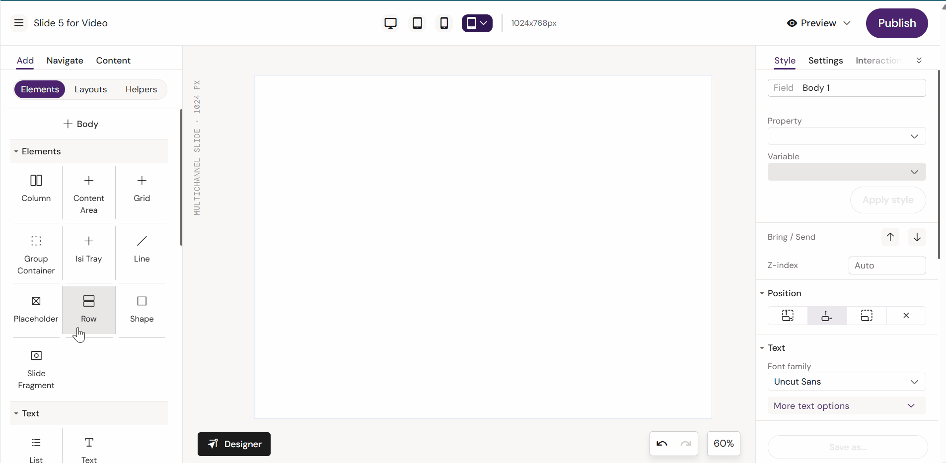
Slide/Brief layouts (typical structure)
Slides and Briefs usually start with rows/columns rather than email-specific layout containers.
Typical pattern:
-
Add a Row
-
Add a Column
-
Add content components
-
Configure fields and rules
-
Save as layout
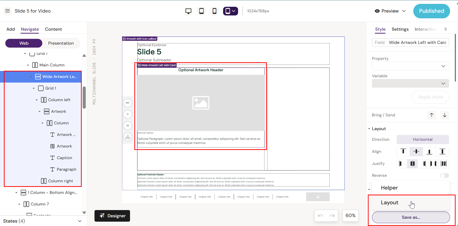
Save a layout
Saving is done from the Save As flow (label may vary).
Save a layout for Email
-
Select the top container that represents the layout section (so the correct scope is selected)
-
Open Save As
-
Choose New layout / Save as layout
-
Name it clearly and save
Save a layout for Slides/Briefs
-
Select the Row (or top-level container) that defines the layout section
-
Open Save As
-
Choose New layout / Save as layout
-
Name it clearly and save
Validate
After saving:
-
Create a test document using the same Design System
-
Insert the new layout
-
Verify fields behave as expected (optional/mandatory, naming, modular content links)
Layout rules, fields, and settings (reference)
Mandatory fields
Mandatory fields:
-
cannot be hidden/disabled by editors
-
are often required before publish (tenant-dependent)
Optional fields
Optional fields:
-
can be toggled on/off in the Fields panel (if exposed)
-
should be used for “nice to have” elements (secondary CTA, optional image, etc.)
Default values
Layouts may include default placeholder content. Treat it as scaffolding—editors are expected to replace it.
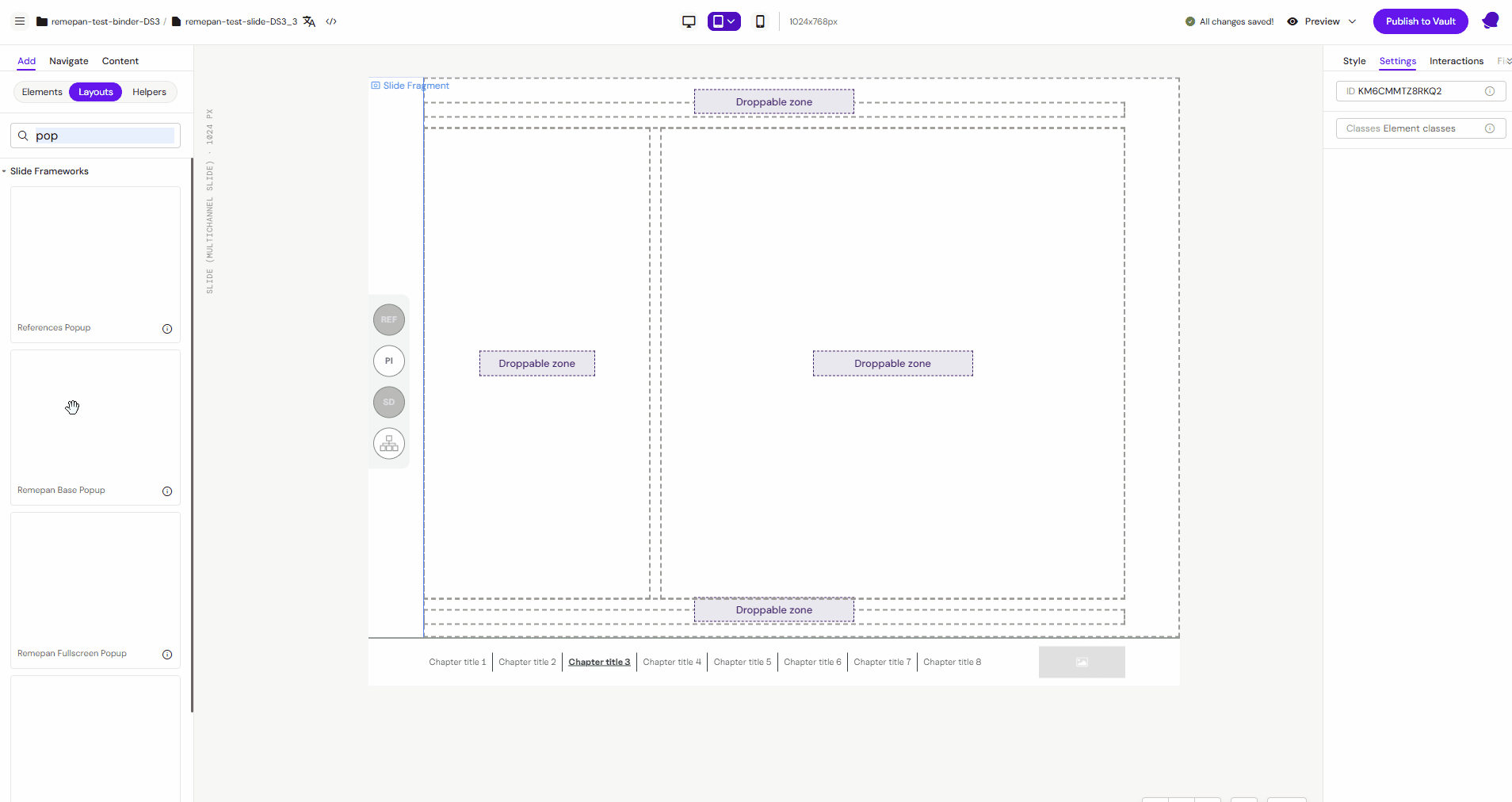
Slides only: droppable zones (if you support this)
Some slide layouts include “drop zones” that allow nesting specific content blocks inside a defined area.
If your slide layout is designed with drop zones:
-
editors can drag certain components/layouts into that zone
-
only allowed items can be dropped (rule-based)
Read more: How to Work With Nested Slide Layouts in Droppable Zones
Popup Layouts
Popup Layouts function similarly to slide templates but are specifically categorized within the Layouts section. They are used to define the structure of interactive overlays and are typically grouped separately from standard slide layouts.
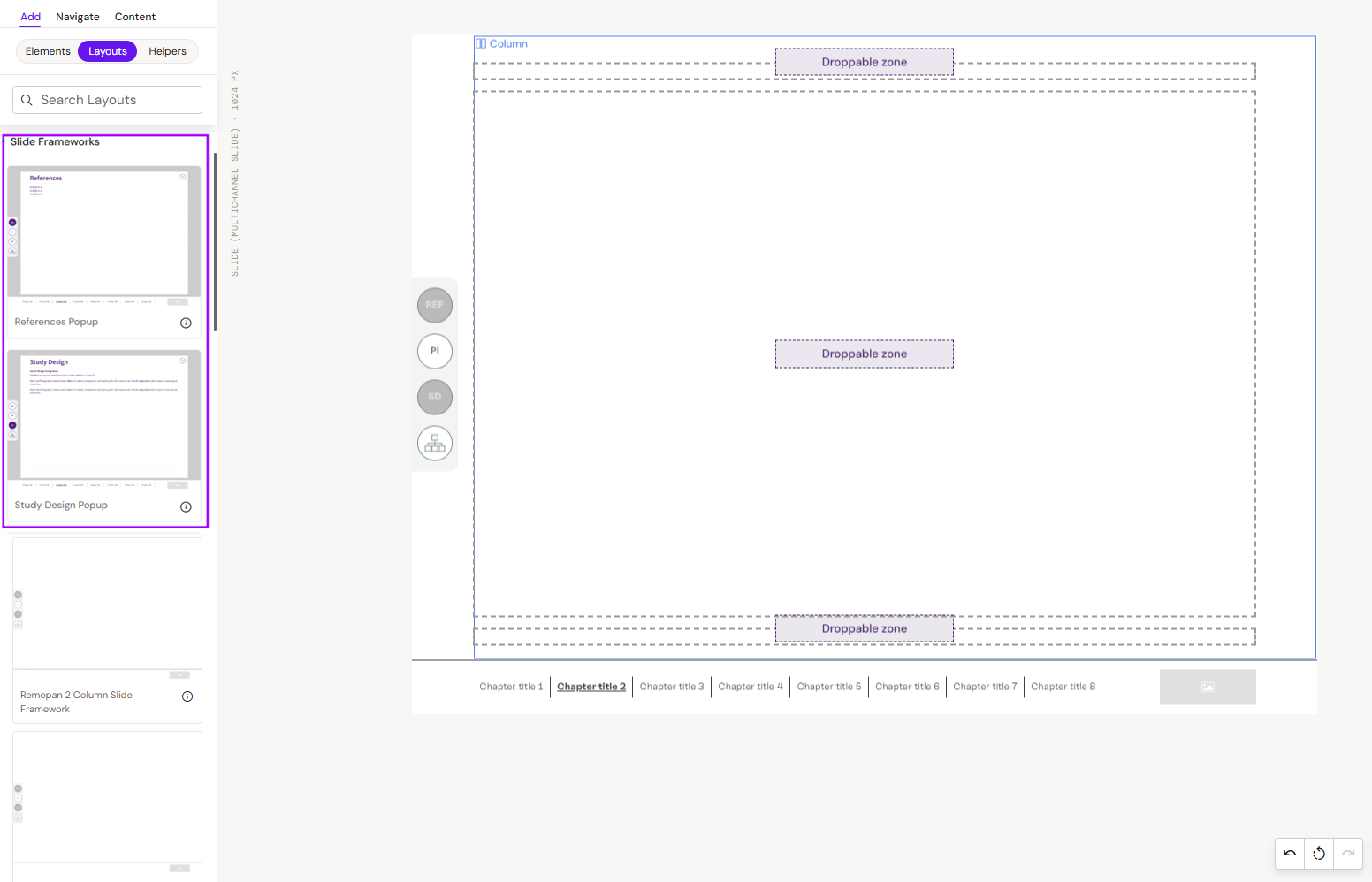
Applying Popup Layouts
Popup layouts are applied to slides by dragging and dropping them into the slide.
-
Navigate to the Add -> Layouts.
-
Locate the Slide Frameworks group (the name of the group can be different in other projects).
-
Drag and drop or select the layout to the slide and add ID to the popup (In this example, the ID is predefined in the side menu.).