
Buttons are used for calls-to-action and navigation. What a button can do depends on document type:
-
Emails: link to URLs or jump to a section (anchors)
-
Slides/eDetailer: navigate between slides or trigger interactions (popups/states), when enabled
Basic workflow (all documents)
-
Select the button on the canvas (or in Navigate)
-
Set the button label text
-
In the right sidebar, open Settings and configure the target/action
-
Adjust styling in Style if permitted
Varies by tenant (Anthill-managed)
Available actions and styling options depend on the Design System and permissions. Learn more.
Email buttons
External link (URL)
-
Select the button
-
In Settings, set the URL
-
Save and preview to confirm behaviour
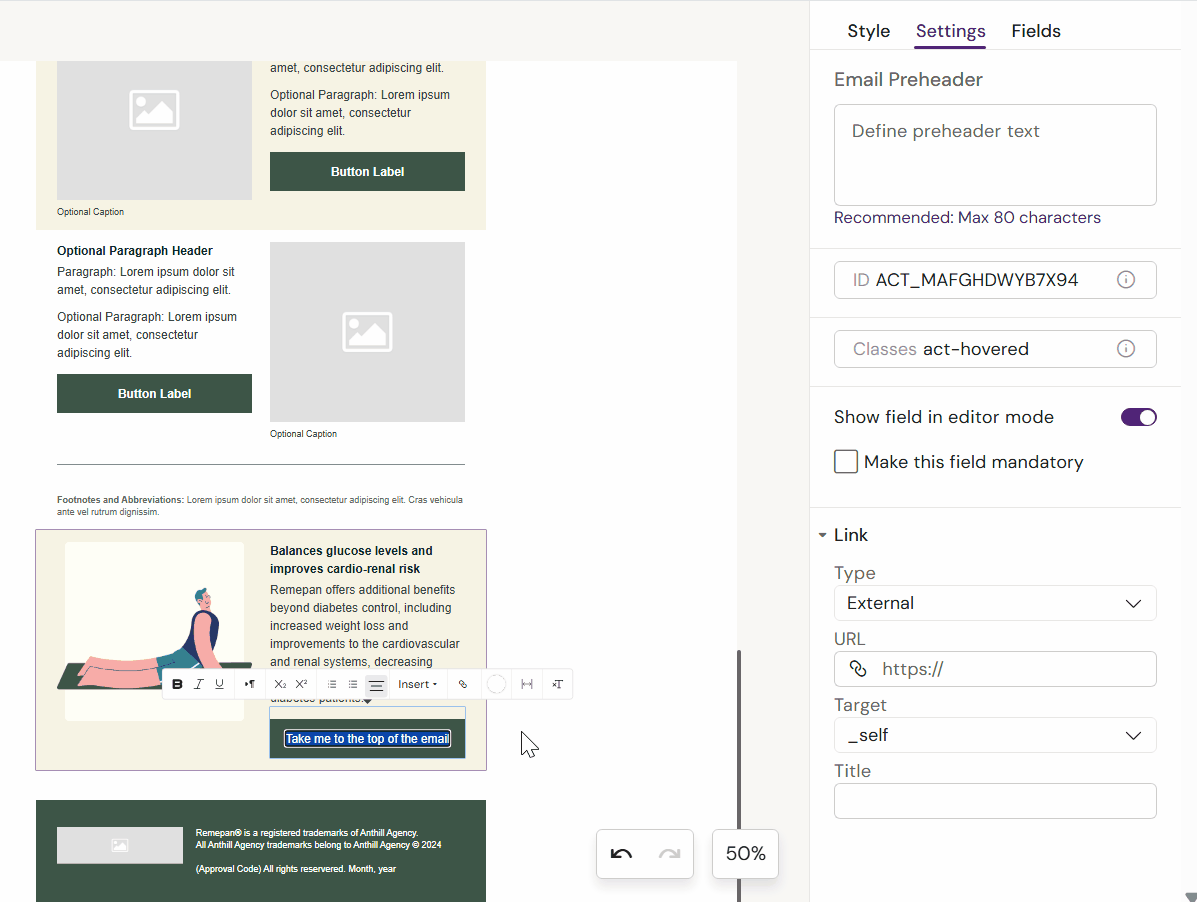
Anchor link (jump within the same email)
Anchor links jump to a specific section of the email.
-
Select the button
-
In Settings, choose Anchor link
-
Select the target section/anchor from the list
-
Save and preview
Note
Anchor targets depend on how the email layout is structured. Some templates/layouts may not expose anchors.
Slides / eDetailer buttons
Navigate to a slide
-
Select the button
-
In Settings, choose Navigate
-
Select the target slide in the Presentation
Trigger interactions (popups / states)
-
Select the button
-
Open Interactions
-
Configure the action (open popup / switch state)
-
Save and preview
Next: See Channels → Slides/eDetailer → How to access Slide Popups