
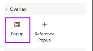
The Popup component allows creators to build interactive overlays that appear on the screen when a specific action is triggered. It is widely used for providing additional details, references, or legal information without cluttering the main slide area.
Add Popup
You can add a Popup from the Left panel.
How to style Popup
The right panel for the Popup contains general properties:
How to style Custom Overlay
The right panel for the Custom Overlay contains general properties:
-
Position (Top and Left)
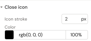
How to style Close button
The right panel for the Close button contains general properties:
-
Position (Top and Left)
-
Close icon
-
Icon stroke
-
Color
-
How to style Backdrop
The right panel for the Backdrop contains general properties:
-
Background (Color)
Overview
Popups function as independent containers that remain hidden until activated by an interaction. Once triggered, they overlay the current content, focusing the user's attention on the specific information within the popup.
Prerequisites
-
Interaction Programming: This component is passive by default. It must be activated by programming an action using the "Add interaction" function on a trigger element (like a Button).
Component Structure (Auto-generated Elements)
When adding a Popup component to a slide, the system automatically creates a specific hierarchy of child elements to handle standard behavior:
-
Custom Overlay: The primary content container which, by default, includes a Close Button to allow the user to easily return to the slide.
-
Backdrop: A background layer that typically dims the main slide content to emphasize the popup.
Naming Conventions (Critical)
To ensure the stability of the presentation logic, every Popup ID must follow these strict rules:
-
Start Character: The ID must start with a letter (a-z or A-Z).
-
Allowed Characters: Subsequent characters can be letters, numbers (0-9), hyphens (-), underscores (_), colons (:), and periods (.).
-
Uniqueness: Each ID must be unique within the entire document to prevent interaction errors.
How to Use the Popup Component
Step 1: Adding the Component
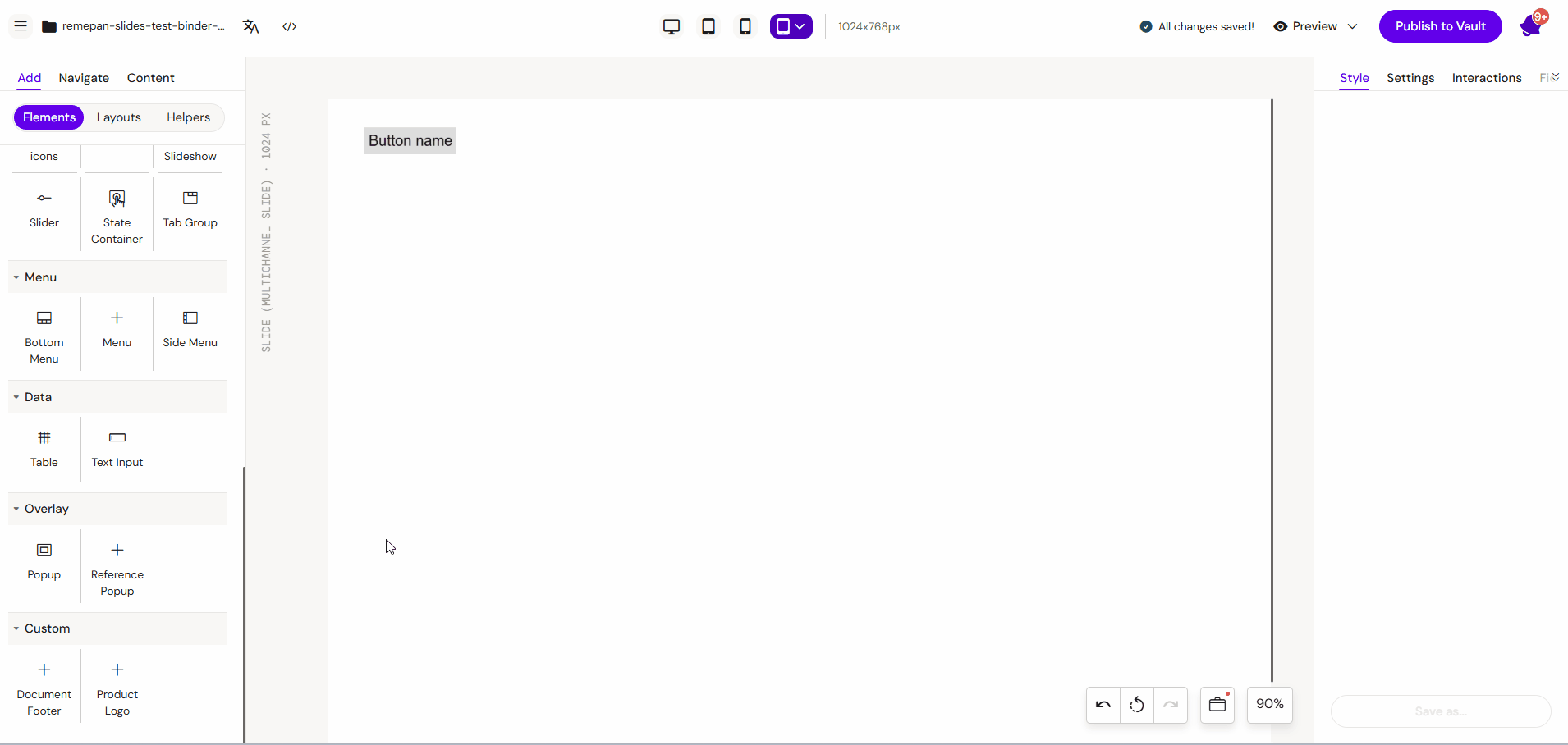
Select the Popup component from the components list. An empty popup container will appear on your layout canvas.
Step 2: Populating the Content
Fill the Popup container with the required elements. You can drag and drop:
-
Text elements for descriptions or references.
-
Image components for visual aids.
Step 3: Programming the Trigger
-
Select the element that should open the popup (e.g., a Button).
-
Go to the Interactions tab.
-
Add a new interaction to "Apply" the state of your named Popup.
Key Features
-
Layered Navigation: Provides a non-linear way to explore content.
-
Template Support: Can be quickly structured using predefined Popup Templates.
-
Auto-Focus: Dimming or blocking the background slide to emphasize the popup content.
Best Practices
-
Descriptive IDs: Use clear IDs like
Popup_Ref_ClinicalDatainstead ofPopup1for easier management. -
Close Mechanism: Always include a clearly visible "Close" button (often an "X" icon) so the user can easily return to the slide.
-
Content Balance: Keep popup content concise. If you have too much information, consider using an Inline Slideshow inside the popup.