
Banner-ready content in Activator is composed from layouts that live in the connected Design System. This page covers what a banner layout is, how layouts are added to a Design System, and the filtering behaviour authors will see in the editor.
What a banner layout is
A banner layout is the same concept used elsewhere in Activator — a pre-coded HTML/CSS unit that authors drag into a document. For banners, a layout can contain multiple HTML variants — one file per supported viewport size — rather than a single file that simply lists which viewports it's compatible with. Layouts also carry additional metadata:
-
the viewport size(s) it has variants for — e.g. a layout might include HTML variants for 300×250 and 300×600 but not have one for 728×90
-
whether the layout is intended for animated banners, static banners, or both
-
an animation description — a short human-readable summary of what the layout animates. This appears in the Layout Preview and in the Scene Manager's layout info pop-up (see Scene Manager), and is also used downstream in the MLR review so reviewers understand the intent of the animation
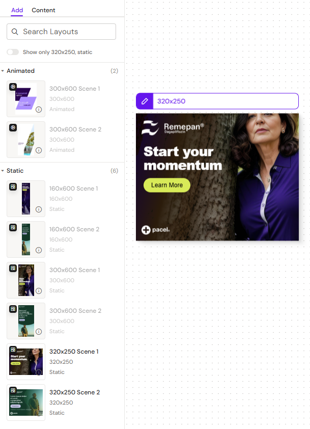
In the editor, the layouts panel is scope-aware: it only shows layouts with a variant matching the active scope (the viewport or viewports currently being edited under sync editing, or the single focused viewport under the focus model). This keeps the layouts panel small and relevant as authors work across sizes. See Banner Editor: Multi-Viewport Canvas for details on sync editing and the focus model.
Adding banner layouts
Banner-ready layouts are added to a Design System through source upload in the Design System UI. Anyone with the appropriate Design System permissions can add them, provided they have the HTML/GSAP knowledge to author the layout source.
When uploading a layout, the author:
-
Uploads one HTML/CSS variant per supported viewport size (and any shared assets) for the layout
-
Attaches each variant to its corresponding viewport size, so the layout is offered wherever a matching variant exists
-
Marks the layout as intended for animated, static, or both types of banners
-
Provides an animation description — a short human-readable summary of what the layout animates, shown in the Layout Preview and the Scene Manager's layout info pop-up, and used downstream in the MLR review
Since banner layouts often involve hand-authored animations (using GSAP timelines), this remains a technical task rather than a fully visual authoring experience. In-editor visual authoring of banner layouts is not part of the current release.
Developer guide. For the full front-end developer walkthrough — concepts, static and animated layouts, multi-variant packaging, content-module fillable regions (ISI), and the checklist to run through before uploading — see Creating a Banner Layout.
Filtering and selection in the editor
When a banner is open in the editor, the layouts panel:
-
Shows only layouts that have a variant matching the active scope (the viewport or viewports currently being edited)
-
Updates as the active scope changes — under sync editing this scope can cover more than one viewport at once, and under the focus model it's the single focused viewport
-
Filters out layouts that don't match the current animated/static toggle when that distinction is meaningful for the layout
If a layout isn't appearing where you expect it to, the most common reasons are:
-
The layout doesn't have a variant for the viewport(s) in your active scope
-
The layout is tagged for animated banners and you're viewing the static representation (or vice versa)
-
The layout isn't yet uploaded to the Design System you're using
For the first two, ask the Design System owner to check the layout's metadata. For the third, either upload the layout yourself (if you have the appropriate permissions and the layout source) or ask the Design System owner to add it.
Templates, Helpers, and Components for Banners
Banner documents are currently built only from layouts. Templates, helpers, and components are not supported for the Banners channel in this release.
Related
-
Creating a Banner Layout — front-end developer guide for authoring banner layouts (static, animated, and ISI/content-module regions).
-
Banners — overview of the Banners channel.
-
Managing Layouts — general layout management across channels.
-
Design System Basics — Design System fundamentals.
-
Create a new Design System / Creating new content for DS3 — DS authoring workflows.