Email Limitations
When estimating and developing emails, platform and client-side limitations must be considered upfront. Some design behaviors cannot be replicated exactly in email due to technical restrictions across mailboxes and devices.
Alignment: Mobile vs Desktop
It is not possible to set different alignments for the same element on mobile and desktop. If an element is centered on mobile, it will also be centered on desktop. This is not a bug. Alignment expectations must be clarified with the client during estimation.
Borders for Text Elements
Due to Activator limitations:
-
Borders cannot be applied to text elements, rows, columns, group containers, etc.
-
Only buttons support border properties
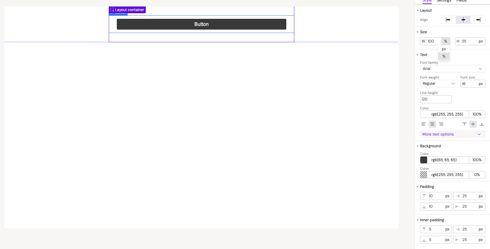
Button Element Limitations
Icons
-
Icons are not supported in email buttons
Recommended solution: Use font symbols instead
Sizing
-
Width cannot be set to auto - only px or % values are allowed. This can lead to text wrapping when button text is updated
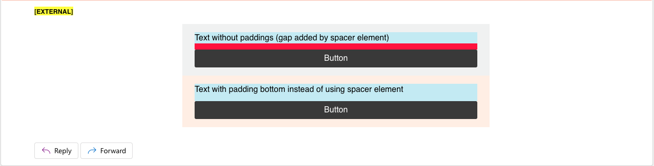
Text and Spacing
-
Letter-spacing is not supported due to Activator limitations
-
This may cause text that appears on one line in design to wrap in Activator
Recommended solution: Increase button width (will differ from design). Confirm during development if unwrapped text is required
-
-
Line-height must be in % instead of px (e.g., 120% for buttons vs 1.2px for text elements)
Column Element Limitations
Column Vertical Alignment
When the tallest column is NOT set to vertical-align: middle, shorter columns with middle alignment will display incorrectly
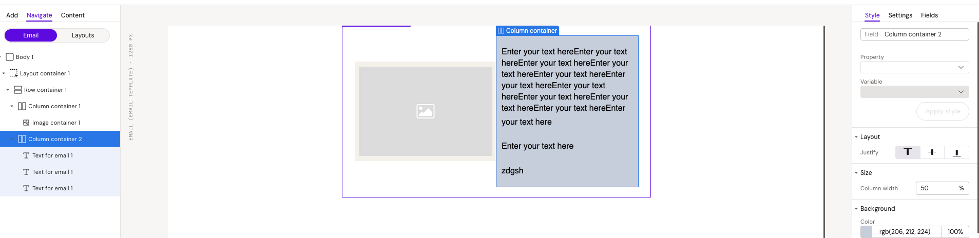
Why this happens: For correct alignment behavior, the column with the highest height must always be set to vertical-align: middle. This is standard CSS behavior for tables.
Recommended solution: Use the default vertical-align: middle for all columns
Column Height Constraints
100% height cannot be set for columns due to email development limitations. Layouts may break when a section contains more content than expected, causing it to exceed the height of the tallest column
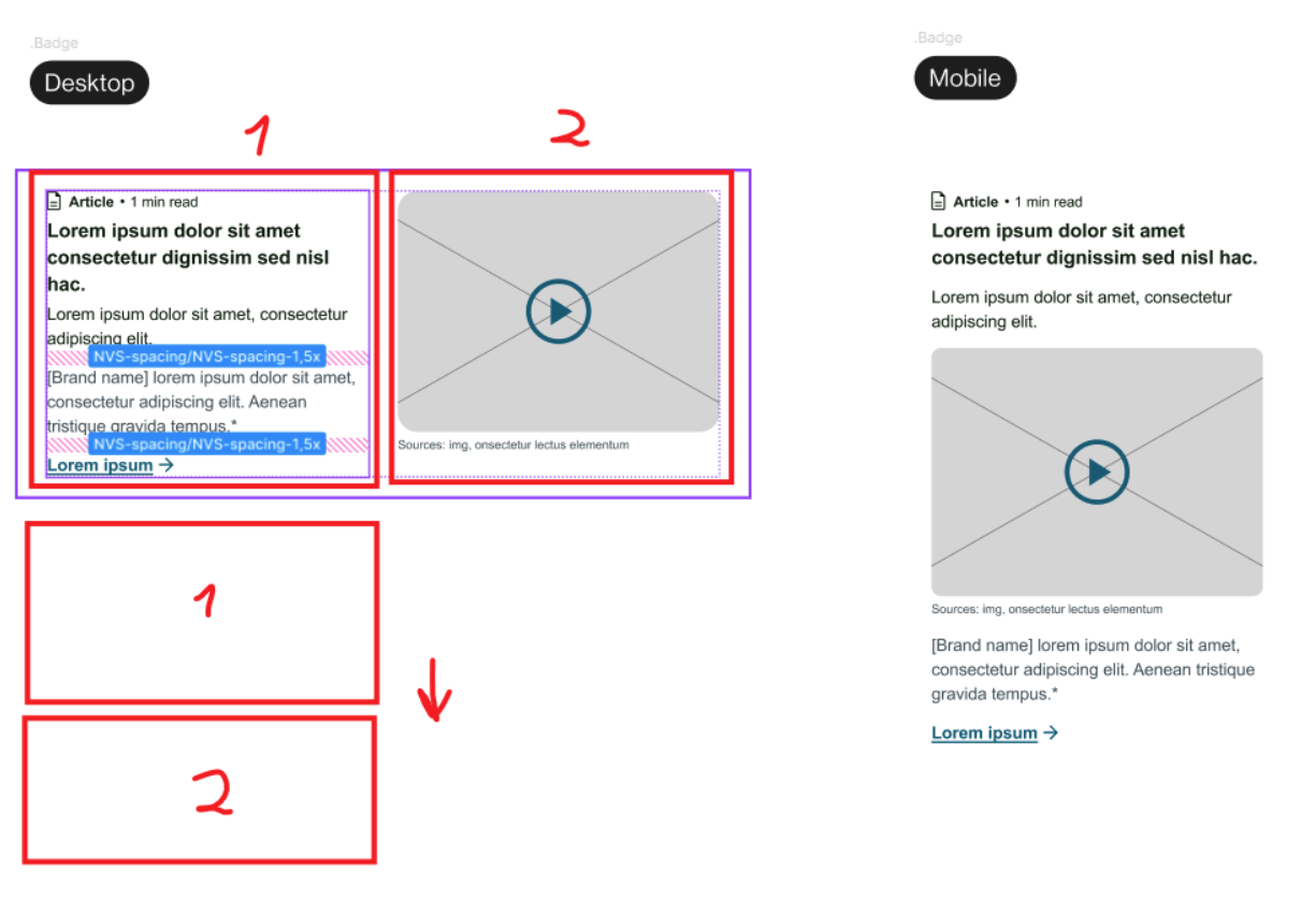
Custom Column Order: Mobile vs Desktop
It is not possible to place elements in a custom order for mobile devices.
-
Mobile maintains the same column order as desktop
-
It is not possible to reorder columns differently for mobile view
-
For example, if desktop displays Column A → Column B → Column C, mobile will show the same order
Dark Mode Support
Emails must be reviewed in both Default mode and Dark mode.
-
Text and background colors may appear different from the original design when rendered in Dark mode
-
Color inversion and contrast adjustments are controlled by the mailbox, not by Activator
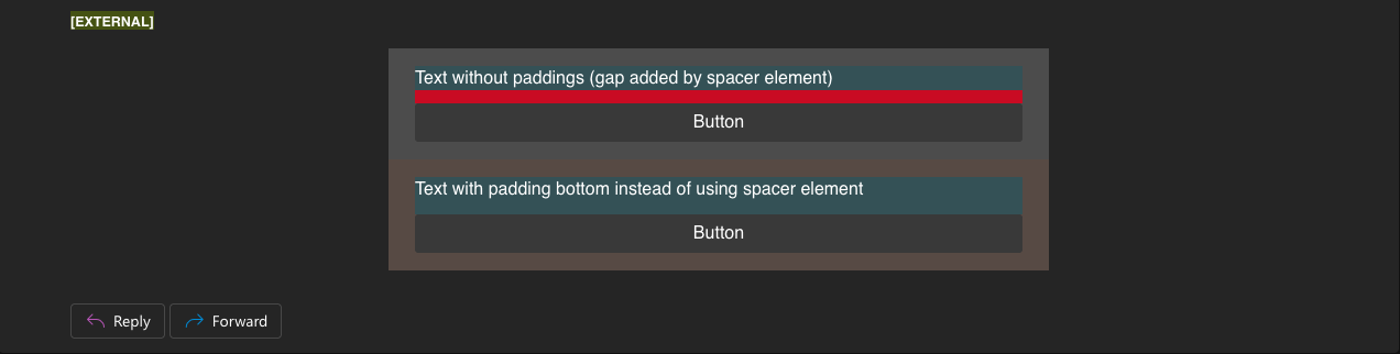
Important considerations:
-
Images with transparent backgrounds will look different. in Dark mode
Default mode 
Dark mode
Images smaller in the mobile view
Due to email images adaptation features, images will be smaller in the mobile devices. This is expected behavior and cannot be fixed.
Link to compound block
Due to email platform limitations:
-
It is not possible to add a link to an entire block or container
-
Links can be applied only to:
-
Text
-
Images
-
Buttons
-
As a result, a whole block cannot be clickable - only individual elements inside it.

Outlook-Specific Behavior
Border Radius for Images
-
Due to the reason that mjml does not support border radius for images, and border-radius does not work in Outlook whole image with this color background should be uploaded.
-
Also, it is not possible to use a container with a background for other mailboxes, because it will work differently for mobile and desktop. We don’t have a fixed height for columns so we can get results similar to this even if we will use a square image

Recommended approach:
Upload the image already containing the desired background and shape (e.g. square image with background color)
Empty Group Container Background Color
When a background color is applied to a group container, and the inner column does not fill the full width, Outlook Classic may only render the column’s background and not the group container’s background.
This occurs because of how MJML compiles group containers with a single column. In Outlook Classic, this structure generates a fixed-width <td width=300px>, which prevents the group container’s background from rendering across the full width. This behavior is specific to Outlook's rendering engine and MJML’s default output.
Recommended approach:
Adding a second column - even an empty one - forces Outlook to render the group container background correctly, ensuring visual consistency across email clients.


Square Buttons in Outlook
The button can have a border-radius, and it will work in many mailboxes, but in Outlook the button will be square.
This is expected behavior and cannot be fixed.


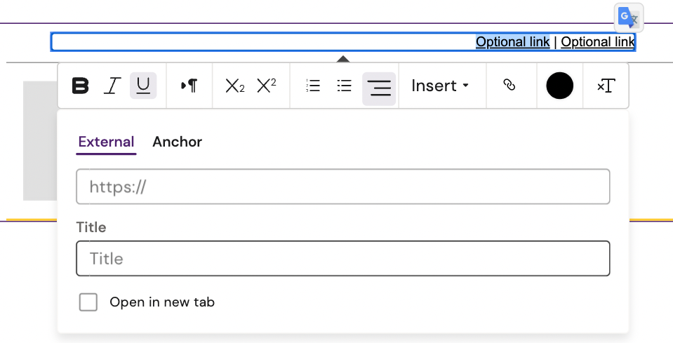
2 or more separate elements with a separator
Due to email limitations:
-
Auto-width columns based on text length are not supported
-
Fixed column widths are unreliable because text can change during editing
Recommended solution:
-
Use one single text element
-
Add multiple links separated by a
|character -
In case, one link has to be added: remove the separator and unnecessary link
This approach ensures correct flow and avoids layout breaks.